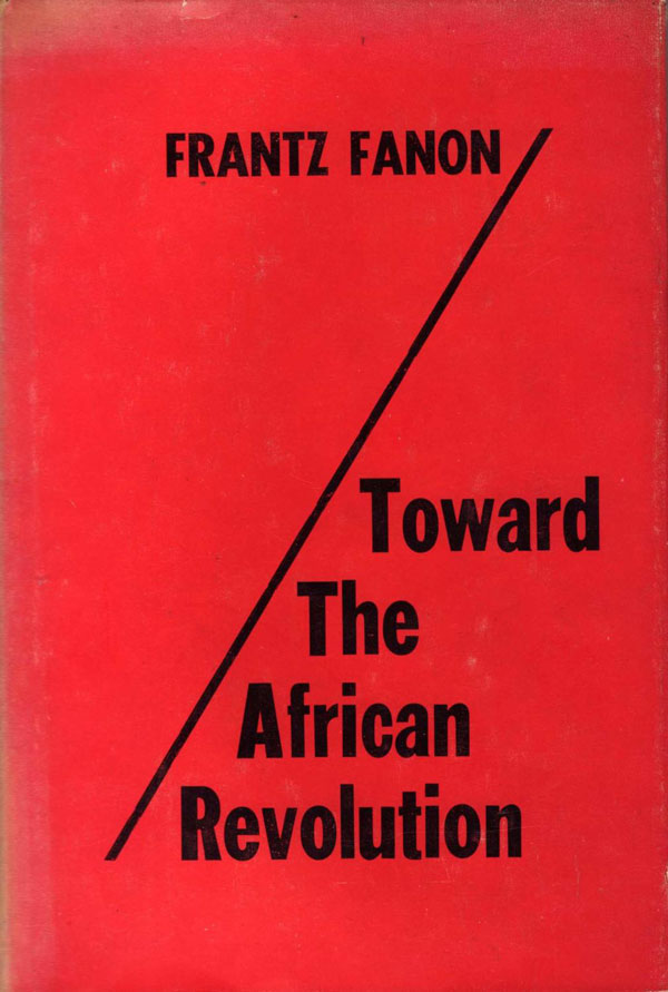
Toward the African Revolution was first published in 1964, after Fanon’s death. It is a broad collection of his short essays, many written while he was traveling across Africa as the Ambassador to Ghana for the Provisional Algerian Government. The first English translation was published in a hardback edition by Monthly Review Press (in 1967). Like Studies in A Dying Colonialism, the cover is largely text-based, even more subdued than Studies. A red field is diagonally bisected by a thin black line. Fanon’s name floats above the line in all caps, and the title, in larger type, sits below it. The font is simple sans serif, some variation on Franklin Gothic. The entire design is a bit reminiscent of a unbalanced percentage symbol.
The paperback was put out by Grove, first as a mass pocket edition around 1969. It is the least creative of the Grove Fanon covers, just a giant block of slab serif text. There is nothing wrong with it, but it certainly doesn’t spark the imagination. I imagine there must be more imaginative and graphic solutions to articulating the space between Black Skins and Wretched than simply writing it in a big hunk of type.
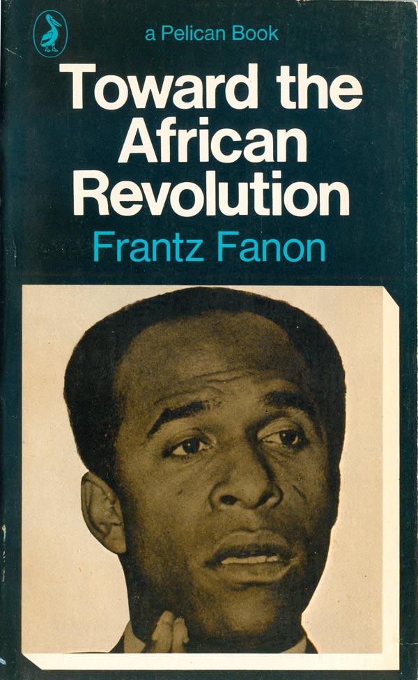
The Penguin edition from 1970 (I believe the only one Penguin produced) follows the same design style as A Dying Colonialism (HERE), which is a slight tweak on standard Pelican protocol. The title sits bold on top in Gil Sans, the author name in Pelican blue. The bottom half of the book is a box with a drop shadow, this time the box filled with a sepia-toned image of Fanon. Nothing fancy, but it works.

The 1988 trade paperback put out by Grove is an interesting transitional design between the old mass pocket paperbacks and the new, larger trade editions Grove started producing in the 80s. This cover feels like it is part of a series, and I would have expected their would be similar covers for editions of A Dying Colonialism and possibly the other titles, but I haven’t been able to find them. The design is very straightforward, author photo in the center, with name and title above, in a classic serifed font. The only interesting bit is the big orange block skewed and stabbing into the frame at the top right. There is no clear reason for it, but it does de-center the design.
The 1994 Grove edition is less lucky. Following the series design of Jackie Seow, it is plagued by an African Orientalism, the font being “jungle-esque” for no justifiable reason. In addition, the pulling out of “African” in black is a little too direct, with its not so subtle nod to “Black Africa.” that makes me squirm a bit. That said, overall these colors are really effective, and make this the best of the covers following this design format.


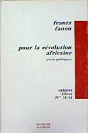
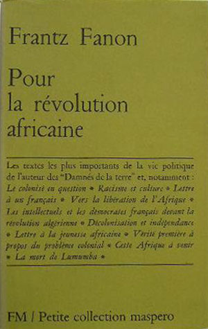
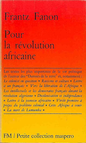
The French editions are once again published by Maspero, and carry their general series design. The 1964 edition has the earlier standard format, with the color bar on the right, and the 1969 edition slides into the late 60s design which still carries over to many current Maspero titles—author at the top, title mid-level, a box of text in the bottom third, and the publisher name and collection at the bottom, all in a tasteful serif. The more recent edition spices things up with a color roll, bringing the cover from bright red at top to bright yellow at bottom. It feels appropriate, and is actually fairly stunning.
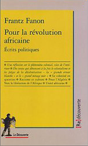
I’m unsure of the date, but fellow Parisian publisher La Découverte has also produced an edition of Toward which takes the Maspero design wholesale, and embeds it into their own frame.
The 2007 La Découverte edition does even less with more, adding that strange and ubiquitous blotchy painting of Fanon to a rather lifeless standard design.
The 2006 Italian edition by Derive Approdi is a companion volume to their edition of A Dying Colonialism (HERE), with a similar design, swapping out one mask-like face for another. There is some potential in these covers, but I can’t really get into the drop-shadow on the text, and the faces are too dough-y and creepy to be compelling.


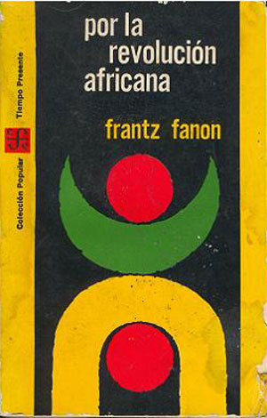
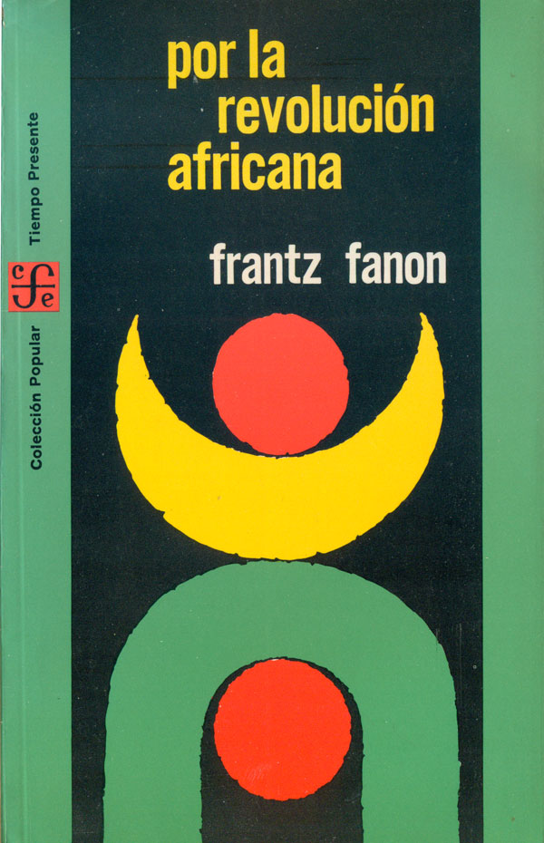
The Mexican editions of this title were produced by Fondo de Cultura Económica, which often has fairly interesting and quirky covers. Toward the African Revolution is more staid than many of their designs, with the 1965 and 1975 editions featuring variations on the same abstract theme, created by Alfredo Hlito. The graphic is interesting, but a bit hard to suss out, simultaneously referencing a human figure and flags of African countries (esp. Algeria).
The 2007 Arabic edition I found has an inscrutable cover in relation to the “African Revolution,” which makes me fear I’ve fallen victim to a google translate failure again. The Japanese edition (from MacMillan Japan, 2008) is from the same series as A Dying Colonialism featured in the last post (HERE), with the same basic design. As the design is largely dependent on the central author photo, this cover is less engaging as the photo of Fanon is far less dynamic.