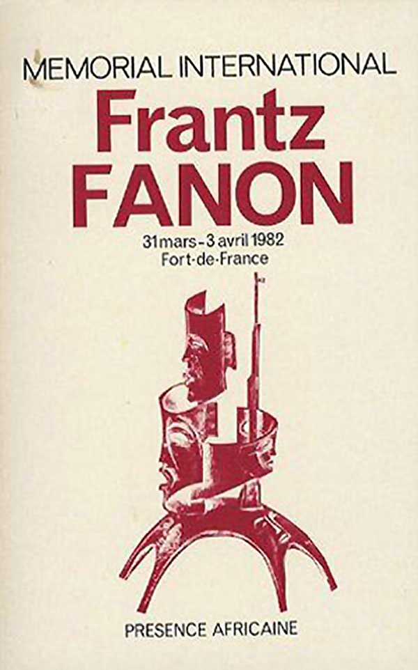
Now that I’ve gone through all the Fanon titles proper, here is a collection of strange odds and ends, books that contain Fanon’s writing, but aren’t standard editions. To start with is this great catalog produced by Presence Africaine for a memorial conference on Fanon in 1982 (although I believe the book didn’t come out until 1984). The central graphic leans on the same African mask trope on so many Fanon covers, but flips the script a bit, but piling the masks on top of each other to make a new sculptural form, and arming that form with a rifle. In addition, the arched figures at the bottom are reminiscent of some of the post-Independence, utopian Modernist architecture that was built in major African cities like Nairobi and Lagos.
Pluto Press in the UK published a Fanon Reader in 2006. At first glance the cover is rather plain and staid, with a fading, browned author photo and straight forward title. But on second glance the titling is a bit more interesting, with a mix of cursive, sans serif, and serifed Clarendon fonts. And the sans serif changes thickness, with a bolder and wider F and N on the ends of Fanon’s name. I’m not sure what it means, but it shakes things up a little bit.
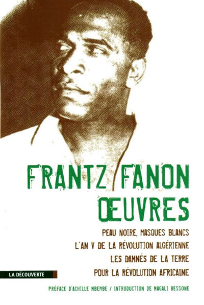
Over in France La Découverte recently produced a single volume omnibus of most of Fanon’s work. The cover uses the most dynamic of the photos that circulate of Fanon, but after seven weeks of looking at Fanon books, I must say I wish the man had been photographed more often, the recycling of the same 3 images has worn them out!

In 1974 the Italian publisher Einaudi put out a two volume set of paperbacks of Fanon’s writing, entitled Fanon 1 and Fanon 2 respectively. Neither the titles nor the cover designs are particularly creative, just standard European fare.


Overall I find the recent Penguin small books series, including “Great Ideas,” “Great Loves,” and “Great Journeys,” one of the strongest coherent bodies of design on contemporary book covers. (For a deeper look at the Great Ideas series, check out this post HERE.) The books are almost all elegant, with appropriate and engaging illustrations, often embossed into the cover stock. That said, the Fanon contribution to the Great Ideas set is a grand disappointment. There is simply way too much going on here, and even within that, many of the graphic elements fail at their intentions. The typewriter conceit doesn’t do anything for the content—what does this flattened and awkward representation of the writing machine have to do with violence? The quote on the paper certainly doesn’t illuminate. The hiding of Fanon’s name behind the piece of paper and the title sitting within the typewriter keys service the overall design frame, but are meaningless and overly complicated. It’s hard to say much more other than “yuck.”
The Italian Ombre Corte Editore have done slightly better, but only by sticking to the basics. Their oddly titled Decolonize the Madness does nothing special, simply serving up a rudimentary design with author photo and clean titling.


Reclam’s 1986 title, The Colonized As Objects, may or may not be a version of A Dying Colonialism or Toward the African Revolution. The subtitle simply reads “Selected Writings.” The cover is standard continental design.
On the right is a book published by Madrid’s Editorial Zero/ZYX, Africa: The Trap of Nationalism. The cover design piques my interest, from the black and neon green color scheme to the strange graphic. What appears to be an African woman stands looking down, with either an empty basket or a bass drum in her hand. She is also mirrored, so looking not only down, but away from herself. She stands on the kind of blank white tabs standard on paper dolls, adding another interesting layer. Is this simply a reproduction of a paper doll from some sort of African doll set? How does that relate to the title? Is this a savvy commentary on African independence and neo-colonialism?


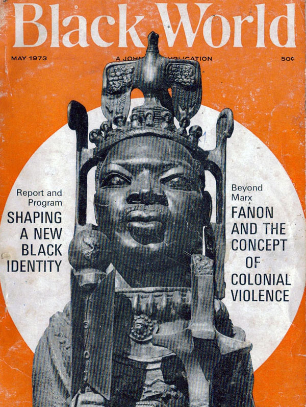
This cover for Black World magazine (May 1973) is a more interesting use of African masks/sculpture than many of the actual Fanon book covers, with the object being contextualized by not only Fanon, but the title “Shaping a New Black Identity.” In this frame, the sculpture isn’t simply a cheap stand-in for “Africa,” but embodies a more complex set of relationships between Black diasporan identity and traditional conceptions of African self-representation.
Just for kicks, here are the covers of two literary works that reference Fanon in the title. The first, Frantz Fanon’s Uneven Ribs, is by Taban Lo Liyong and is part of the rightfully highly regarded African Writers series from Hienemann (this edition is from 1971). The cover is a tricky visual game, with a shadow on a roof, looking over at a neighboring building. At least that’s how I read it, but it seems open to fair amount of interpretation.
The cover of John Edgar Wideman’s Fanon (Houghton Mifflin, 2008 )is more direct, with the simple bold text graphic of Fanon’s name, disassembling on a black field, with gritty, vaguely threatening overtones.


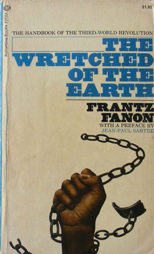
While further scouring for Fanon-related material, I’ve dug up two additional covers for Wretched of the Earth (the other 32 covers can be found HERE and HERE). The one on the left is a 1967 edition from the German publisher Suhrkamp. A nice solid design, read and white text on a black background. The cover on the right is much more interesting to me. It is from a 1973 edition published by Ballantine in a mass-market paperback edition. You would think a mass-market title like this would be easy to come across, but it’s extremely rare and took me years to track down. It has the great vibe of ’60s mass-market Black Power books, the Black fist simultaneously breaking its shackle and converting the attached chain into a weapon. The slab serif title works well, and the black and blue complement the image.

Over the next couple weeks I’ll take on the abundance of Fanon biographies out there.


excellent work in a very interesting series you are creating. I have a doctorate on Fanon and it might be of interest that his first 2 books have titles that Fanon did not want. The first, black skin white masks was originally titled The disalienation of the black man, this was rejected by the publishers. The second year 5 of the Algerian revolution, Fanon wanted it to be called The reality of a Nation again this was rejected by Maspero. Only les damnes de la terre was his chosen title. Thanks David.