This week I’m going to continue working through the covers of the Penguin African Library, started last week HERE. Once again, one of the things I find so compelling about this series is that a major English-language publisher was committed to consistently publishing and keeping in print books written largely by Africans about contemporary Africa. Over a dozen years, over forty titles were printed, and others planned. This is simply unimaginable today. Within the popular imaginary Africa has fallen back into an undifferentiated mass of dictatorships, child soldiers, and AIDS victims. We would do well to have a new Penguin African Library today.
Jack Halpern’s South Africa’s Hostages (AP8: 1965) is the next, and seventh, book in the series. It’s cover follows the series design and grid, with a brown top square overlapping a square of highly saturated black photo on blue background. In particular this cover reads like The Politics of Partnership (AP5) with the blue background and titling. The choice of image is interesting, a line of Black soldiers, which implies a certain amount of control, and doesn’t exactly reflect the concept of hostages in the title.
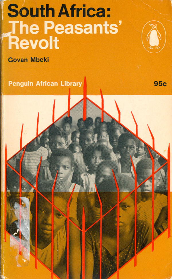
Govan Mbeki’s South Africa: The Peasants Revolt (AP9: 1964) and Ruth First’s South West Africa (AP10: 1963) are both also about Southern Africa, not surprising considering the anti-Apartheid focus and South African origin of series editor Ronald Segal. The Mbeki cover is a nice progression, with the same basic structure modified by an illustrative element and a color switch. The box of children is literally penned in by a crudely drawn red fence, adding a nice touch of the hand to the overall cover structure. And for the first time the center third is not the overlap of the top and bottom, but an autonomous strip, this time white, with the brown relegated to the bottom third. The type is also a mix of black and white, bringing “South Africa” to the forefront, and immediately associating the name with the imprisonment visualized. Although a compelling cover overall, there does seem to be some dissonance between the capture imaged and the “revolt” spoken of in the title. Mbeki played an important role in the African National Congress and the South African Communist Party, and was imprisoned with Mandela the year this book was published. He is only one of the many revolutionaries Segal would get to write books for the Penguin African Library.
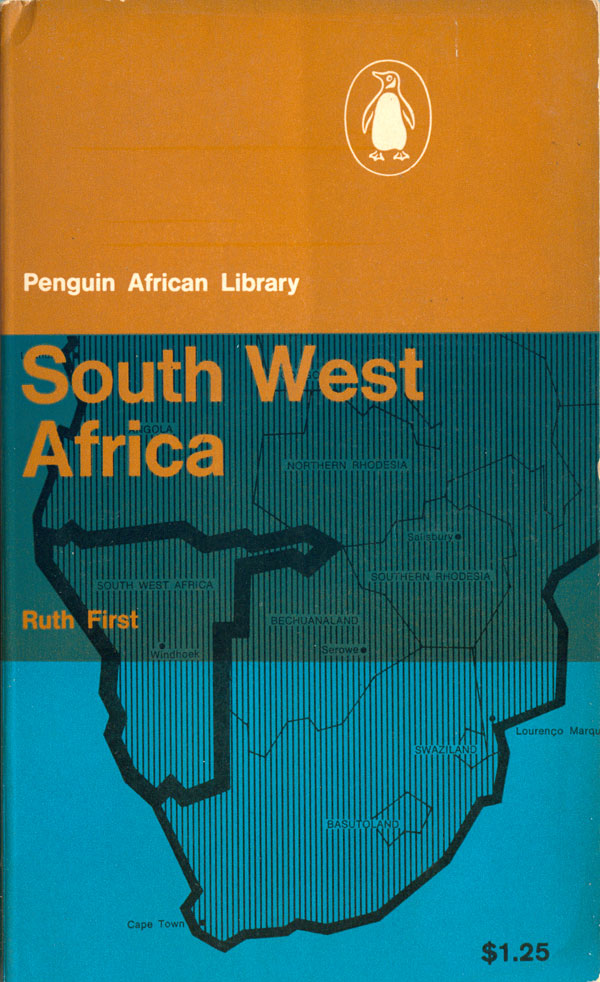
First’s cover is another map (see Portugal in Africa/AP3 HERE), but this time backgrounded in the bright blue used on AP5. We’re back to the overlapping squares creating thirds, and this time the title is in PAL brown. Like Segal, First is a white South African, and committed anti-Apartheid activist. Like Mbeki, she was a member of the South African Communist Party (of which her parents were founding members), and a founding member of the African National Congress herself.
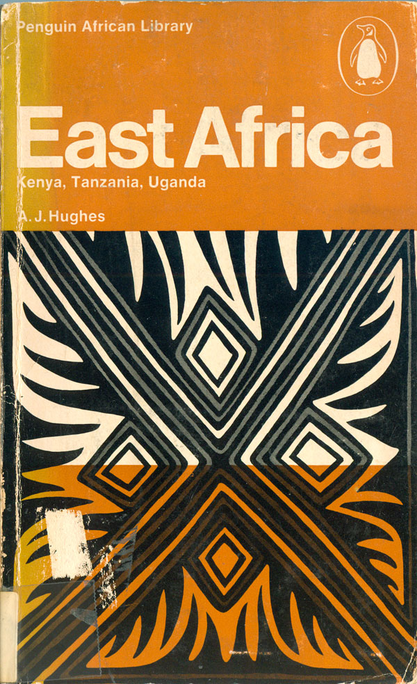
Two different editions were produced of A.J. Hughes’s East Africa: The Search for Unity (AP11: 1963, then AP11a: 1969). The first is from before Tanganyika and Zanzibar joined into Tanzania, the other after. The cover from the first edition is one of my favorites from the series. The red background for the background square compliments the brown much better than the blue used on earlier books (which tended to highlight it), and the brown and red overlap creates and even richer color, giving this cover a depth missing from many of the others. The four spear points function well as a photographic image, but simultaneously construct a compelling abstract pattern.
The second edition I find much less successful. While I like the pattern, the lack of color is obvious in comparison—you wouldn’t know it was missing until you see otherwise, which is why it is interesting that this cover follows the first edition, instead of the other way around. Outside of color, it is the same inverse grid as the Mbeki book, with the brown along the top and bottom, and white in the middle.

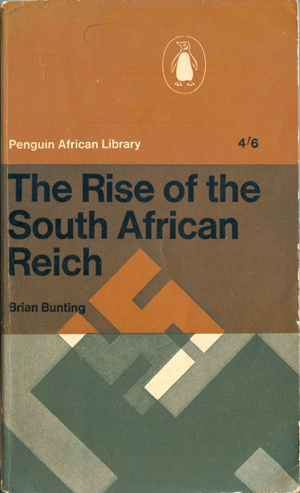
The next book is Brian Bunting’s The Rise of the South African Reich (AP12: 1964). The main graphic element here is the swastika, hedging no bets with the reader about just how to interpret the South African government. The series design is in full effect, with the interesting exception that the larger swastika at the bottom actually cuts off at the top of the bottom third, and doesn’t carry over into the center third as the design would normally dictate. It’s visually not particularly interesting either way, but it shows an increased fluidity in manipulating the grid system.
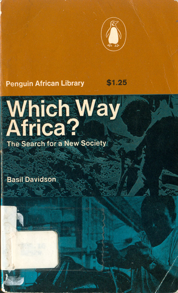
Basil Davidson’s Which Way Africa: The Search for a New Society (AP13: 1964) also breaks the pattern, by featuring two separate and disconnected photos in the middle and bottom thirds. The two color squares, blue and brown, are still there, and overlap to create the darker blue in the middle. In fact, the shades of blue are a little too dark, and make it difficult to suss out what is happening in the images (digging on top, but I’m unsure about the bottom image).
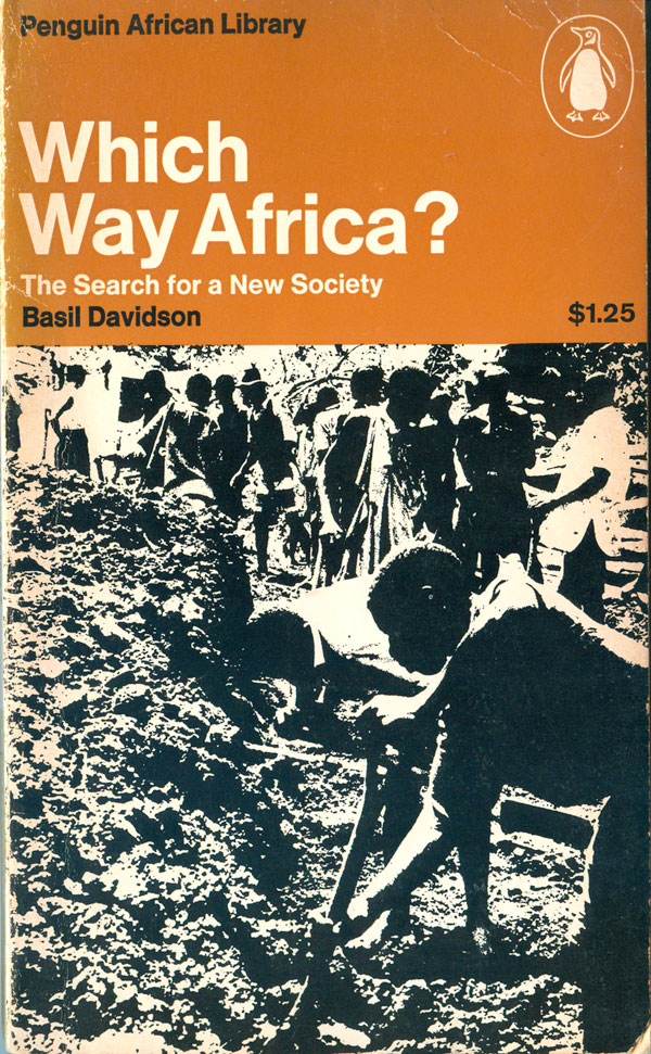
Like A Short History of Africa, Davidson’s book was popular, and was reprinted in multiple editions. I’ve found two in addition to the first. The 1967 edition looses the bottom image and the color, leaving a brown rectangle at the top, and an over-saturated black and white image of people digging at the bottom. It’s a bit obtuse as to the relationship between searching for a new society and digging?
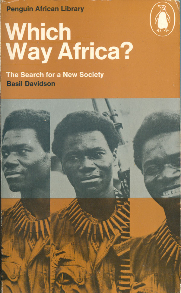
In 1973 a third edition was published, and this one has the most handsome cover of the lot. The design returns to the trisected grid, with brown on top and bottom, and the bottom 2/3rd filled with three vertically split images of an Angolan guerrilla. This holds a much clearer tether between visual and title. In addition, the center bar is printed in silver, which complements the brown well, and frames the faces of the guerrilla.
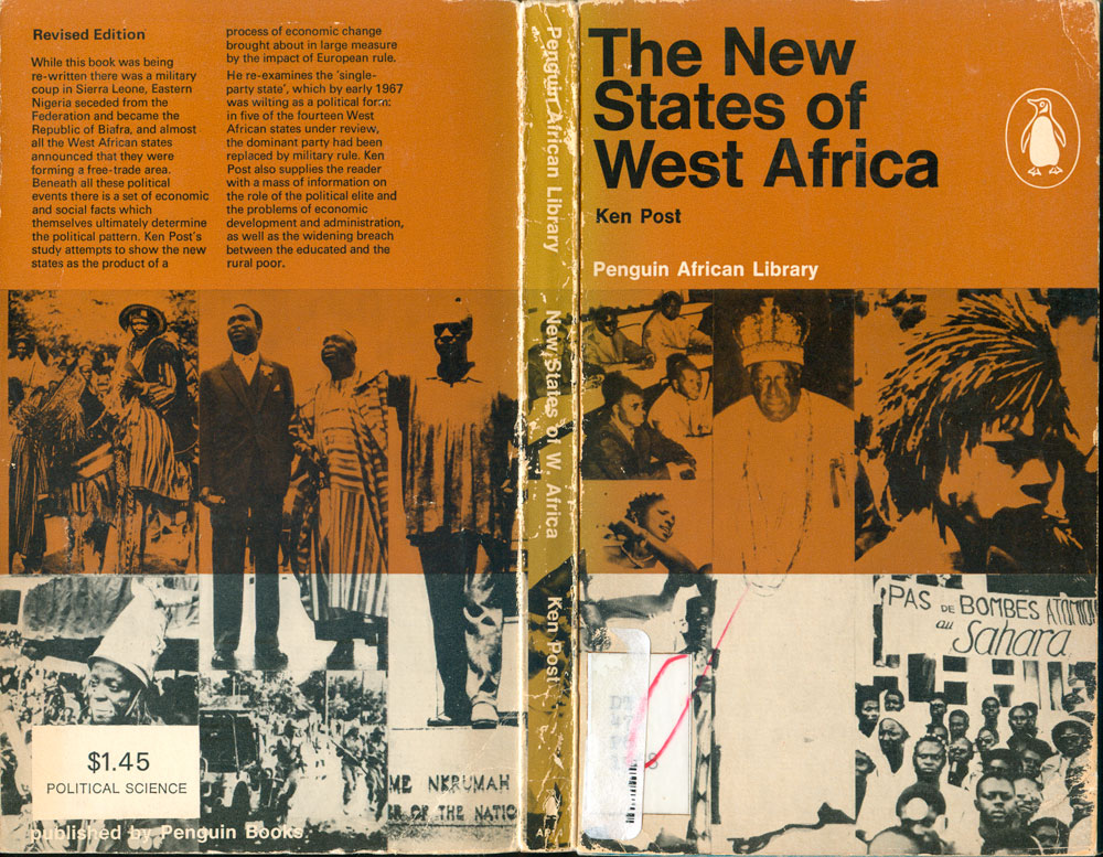
Ken Post’s The New States of West Africa (AP14: 1964) brings us back to the first covers of the series, using on brown and black spot colors. The montage of photos is an interesting addition to the overall design tools used for the cover designs, but there is nothing particularly compelling about this specific collection of images. The copy shown below is a revised edition from 1968, but as far as I can tell, there were no significant changes to the cover.
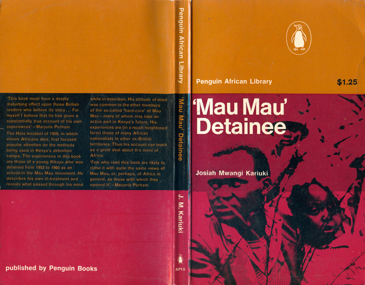
‘Mau Mau’ Detainee: The Account by a Kenya African of His Experiences in Detention Camps 1953-1960 (AP15: 1964) by Josiah Mwangi Kariuki is a predecessor to the recent popular accounts by “Lost Boys” of Sudan, a first person account of extreme violence based in colonial intervention in Africa. The cover follows the PAL grid, and returns to the nice red/maroon of the East Africa: The Search for Unity. The back is worth noting, with the central third being filled in black, and holding the text in brown. The bold colorful stripes make for a strong and compelling design. Although not an exact correlation, there does seem to be a nod to regional color coordination, as AP11 and AP15 are the two titles about East Africa and both feature red as a primary cover color, while AP8, AP10, and AP12 feature shades of blue, and are all focused on Southern Africa. (Yet so is AP9, which has no blue on the cover at all.)