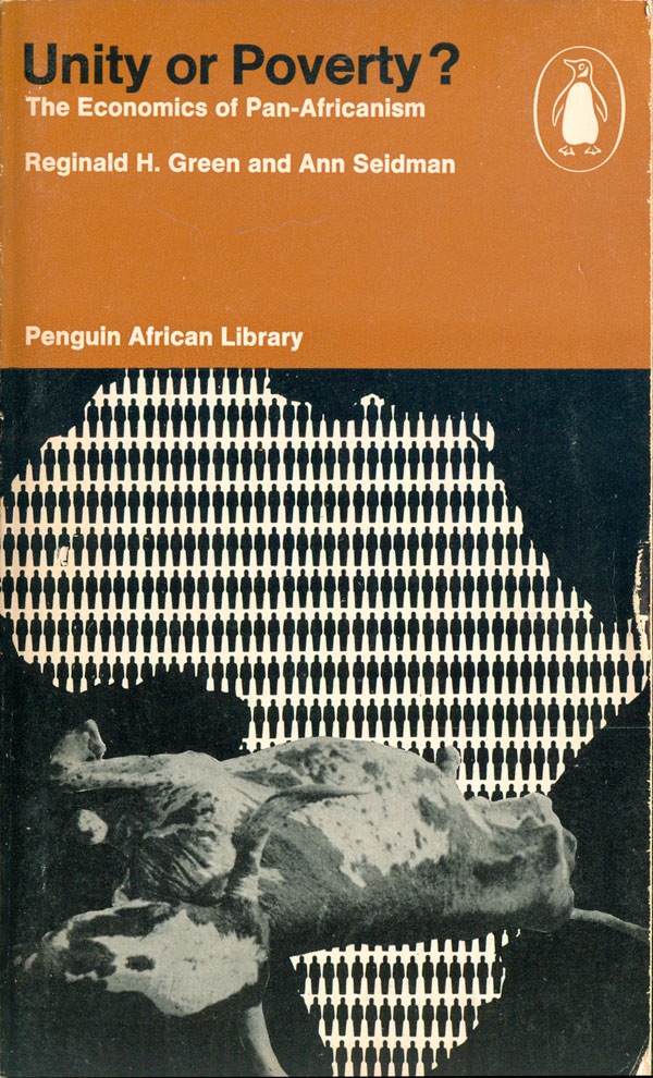
I guess will start this week off with one of the darker—in content and color—covers for the Penguin African Library. Reginald H. Green and Ann Seidman’s Unity of Poverty: The Economics of Pan Africanism (AP23: 1968) doesn’t imply much promise for Pan Africanism, with an outline of a continent stuffed full of people, and a dead and diseased bull laid out as the only food. Usually the PAL covers are more open ended, but the message here seems both clear, and quite grim. Aesthetically it is well balanced, the montaged animal giving depth and meaning to an otherwise fairly static and open-eneded info-graphic of Africa. This is the only cover in the series where the bottom 2/3rds are only black and white, and mostly black, without any other colors to add nuance.
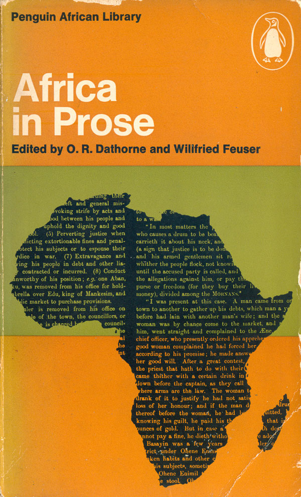
Africa in Prose (AP24: 1969), edited by O. R. Dathorne and Willfried Feuser, is another cover that relies heavily on a map of Africa. This time the map is filled in with text, a simple graphic reference to the title. At this point this is the fifth title in the series with a cover featuring a map, which raises the interesting question of whether the designers are getting lazy, or assuming that the audience for these books knows so little about Africa that a basic outline of the continent can become a canvas for them to project their own ideas and conceptions?
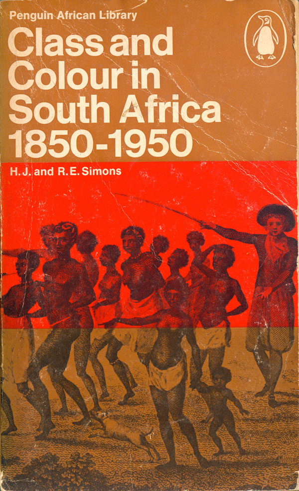
H.J. and R.E. Simons’ Class and Colour in South Africa, 1850-1950 (AP25: 1969) features an historical engraving of a white colonizer driving semi-clothed Africans with a switch. It seems an effective choice, as it implies historical accuracy and gravity, which is appropriate for this title, which is much more academic—and longer— than many of the books in PAL. The trisected series cover design functions in a strange way here. Since the brown fills the top and bottom thirds, the center becomes a band of red floating on top of the image, which fulfills the needs of the design framework, but doesn’t really do much to drive the overall cover design.
Religion in Africa (AP26: 1969). by Geoffrey Parrinder has one of the most quixotic PAL covers, and one of the last that sticks to the original 3 part cover design. A box of concentric rectangles piled on top of each other is bisected by the brown bottom third of the cover. Abstract and geometric at first glance, the image is also a view of a golden pyramid from on high, not photographic, but still referential to the pyramids in Egypt.
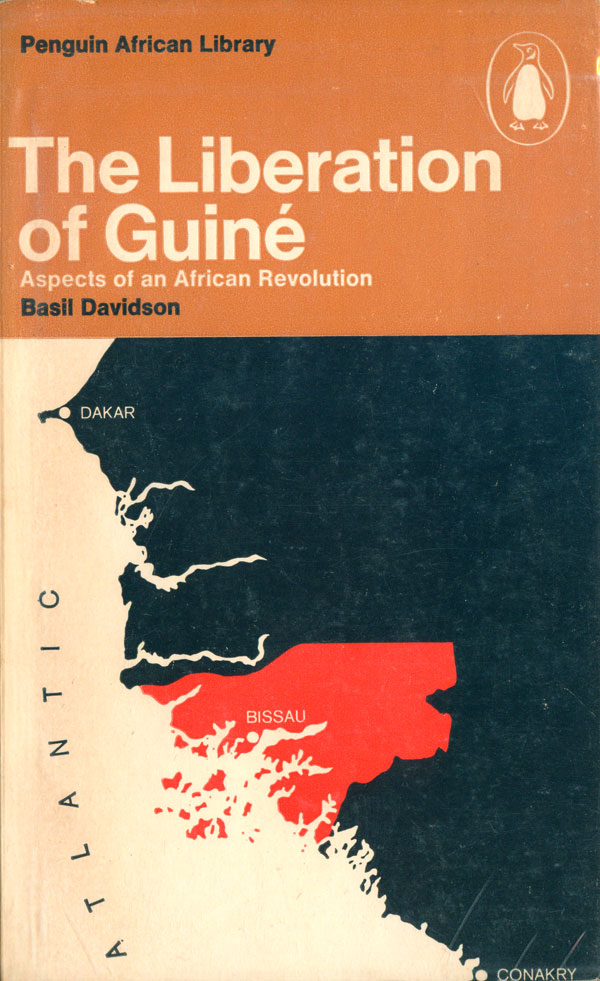
A strident call for continued African Liberation, especially from Portugal, Basil Davidson’s The Liberation of Guiné: Aspects of an African Revolution (AP27: 1969) is a great read, and even includes a rye and insightful introduction by Amilcar Cabral, murdered leader of the struggle for Guiné-Bissau and one of the most interesting of the African liberation theorists. The cover design features another map, which does little but provide some geographical context for the subject of the book, but even so, the black, red, and white map elements are crisp, handsome, and pleasing to eye, so it’s not a total loss.

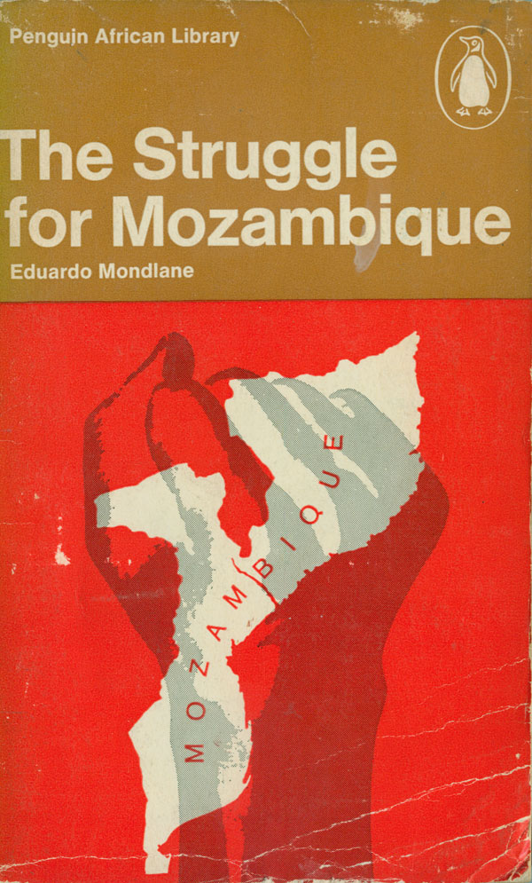
The very first book I picked up from the PAL was The Struggle for Mozambique (AP28: 1968) by Eduardo Mondlane. It must have been almost 20 years ago, while I was living in Ohio. Mondlane was not only one of the founders of FRELIMO, the group which liberated Mozambique from the Portuguese, but he had actually studied at Oberlin College, a small liberal arts school an hour outside of Cleveland and also the reason I was in Ohio. Like The Liberation of Guiné above, This is another great, and clearly partisan, book which articulates powerful arguments for African liberation.
Although I’ve generally come to dislike the fist as a graphic stand-in for relatively meaningless terms like “resistance” and “radical,” I must admit to really digging this cover (both then and now). The fist is hand done and unique, and the map overlays well with it, creating balance in some spots and dissonance in others. The brown third at the top operates purely as a series marker at this point, but it works with this particular design, and many of the others, especially because it is clean, easy to read, and unassuming.
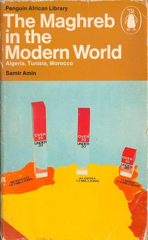
Samir Amin’s first book in the PAL, The Maghreb in the Modern World: Algeria, Tunisia, Morocco (AP29: 1970) is only the second cover to utilize full color, but unfortunately not to great effect. As is an unfortunate tendency in the series as a whole, rather than tackle complex design problems in rich visual ways, there is a default to maps, charts, and more mechanical visual shorthand. I have to believe there is a more interesting way to illustrate the youthfulness of the populations in the Maghreb than a hoakey photograph of a map with weird glass towers representing population size.
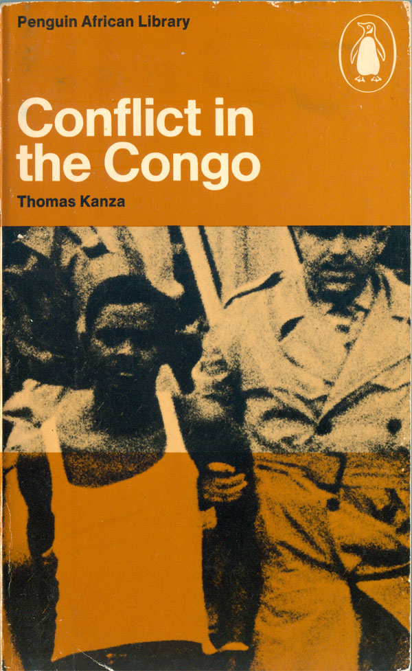
Thomas Kanze’s Conflict in the Congo (AP30: 1972) is another transition cover, returning to the original three striped grid and a dependence on the PAL brown. The photo is blown up and grainy news image, which makes for a compelling visual and squarely places the conflict as a struggle between white colonial forces and black Congolese.
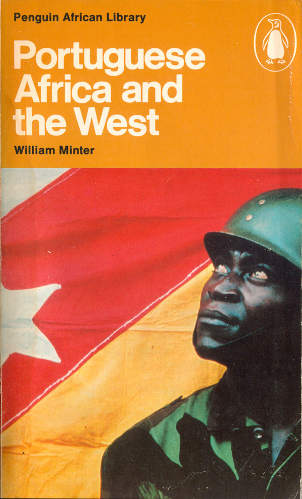
Portuguese Africa and the West (AP31: 1972) by William Minter marks the clean break from the original PAL trisected design. The brown top third remains, but the bottom square is now just a single image, in this case a strong full color photograph. The soldier looks up and to the left (West), staring intently and suspiciously at the title of the book. His dark uniform and skin tone a striking alternative to brightly colored flag in the background. I spent hour upon hour trying to figure out what that flag is from, it isn’t the flag of any contemporary African state, Portugal, or any of the former Portuguese colonies in Africa. Turns out it is the flag of the FNLA (Frente Nacional de Libertação de Angola), one of the smaller, and more opportunistic, of the Angolan guerilla groups that fought against the Portuguese. Supposedly they were funded by just about everyone at one point of time or another, including the China, South Africa, the US, and Israel. They have since become a vaguely center-right electoral political party. Thanks to Peter Cole for connecting me with the author, William Minter, who cleared up the flag mystery!
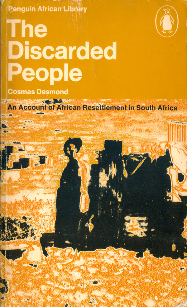
In comparison, The Discarded People (AP32: 1971) by Cosmas Desmond feels a throwback to the older covers, but without any of the charm. The image is muddy in orange and black, and appears to have been inverted and polarized, some sort of pre-computer photography trick that completely fails. It is actually quite reminiscent of the manipulated covers on the Penguin Latin America series, which often feature similarly stressed and oddly colored images. This cover is a complete failure, as it is neither attractive nor communicative, it’s unreadability conveys little about the subject.
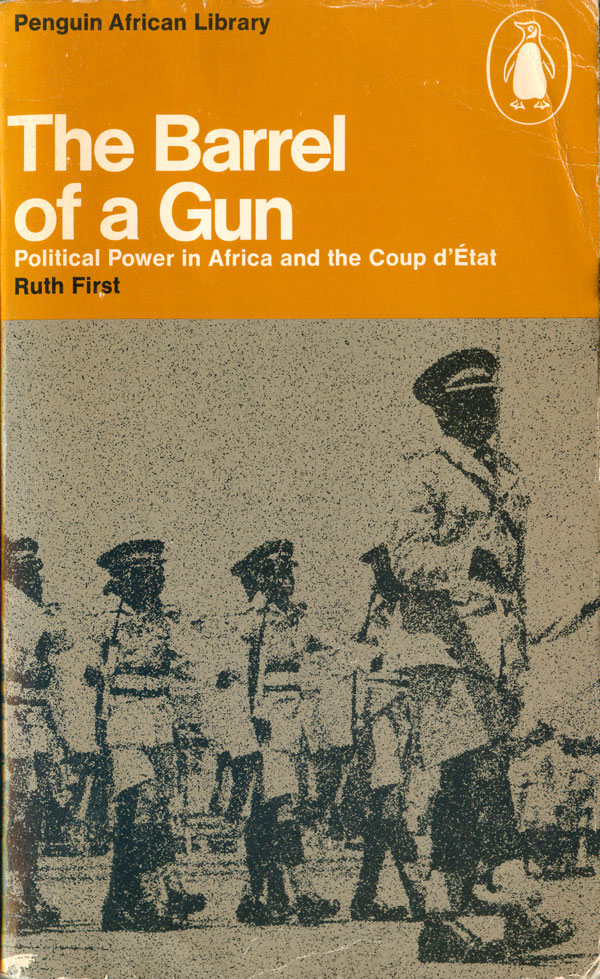
The Barrel of a Gun (AP33: 1972) is Ruth First’s study of the use of the coup in African politics. It’s cover follows the same basic pattern of it’s immediate predecessors. The photo is of an African military regiment, and provides an image of discipline. At the same time, the photo is fuzzy, with a layer of static on top, and the soldiers emerging from a dark grey field. I’m not sure if this is intentional on the part of the designer, if we are supposed to glean insight into coup d’états from it’s muddiness, but I would have preferred more contrast. A image of soldiers in strength and command might have better illustrated the subject.
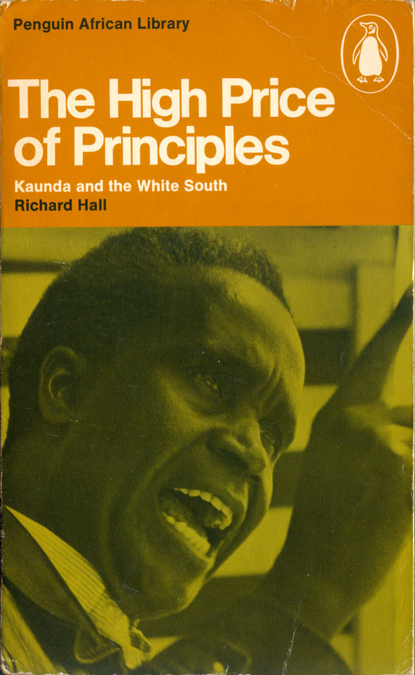
The last book this week is Richard Hall’s The High Price of Principles: Kaunda and the White South (AP34: 1973). The design evolution visible here is in color. The photograph of Kaunda is on a bright, almost neon green background, which really brightens the book up, and looks towards a cover we’ll see next week.