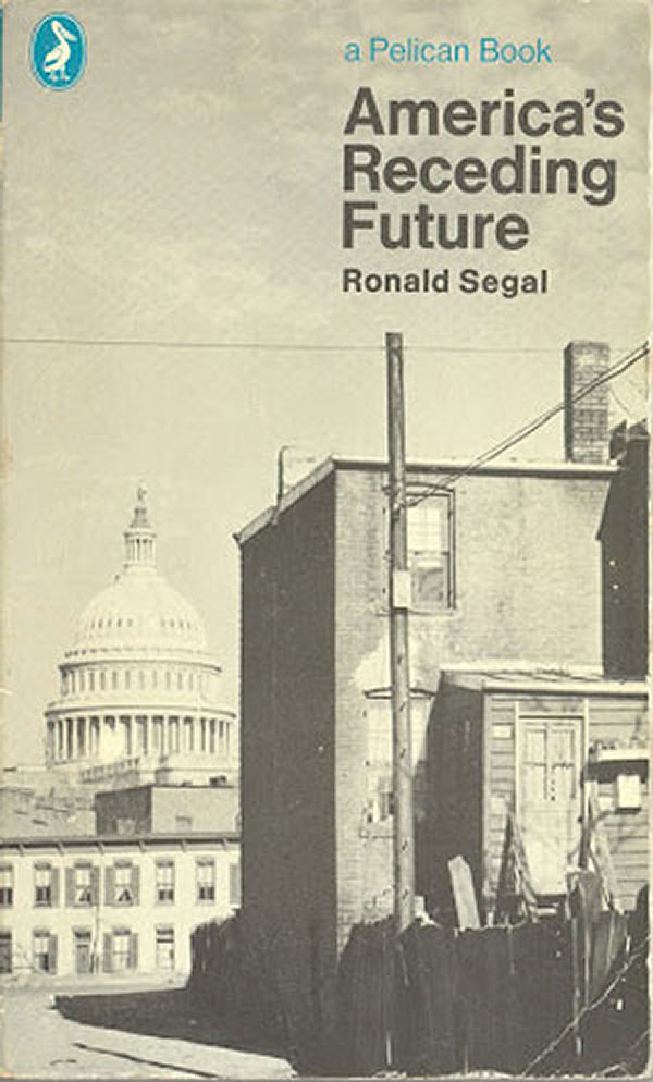
This is the 9th part of my series on the covers of the Penguin African Library and associated titles, and the second part on the covers of series editor Ronald Segal. You can see all the previous posts in the series HERE. In 1968, Segal took on the United States, with America’s Receding Future (Penguin). I haven’t read the book, but the cover photograph says plenty, dilapidated buildings in the shadow of the Capitol in DC. The use of a black and white photo adds to the sense that the US—or at least its dominance—may in fact be receding into the past, instead of forward into the future.
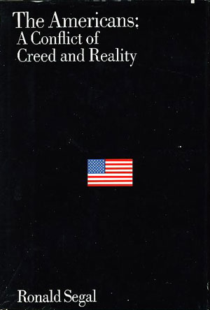
I’m unsure if The Americans: A Conflict of Creed and Reality (Viking, 1969) is a US published version of the above book. If so, the cover design takes a very different visual tack, although there are conceptual connections. The tiny US flag in the vast field of black raises similar questions about the status of US dominance and power. That said, I still don’t find it that interesting or compelling. This is a good example of a book cover which accomplishes its job of embodying the general idea of the book, and even in a relatively clever way, but fails to capture the visual imagination.
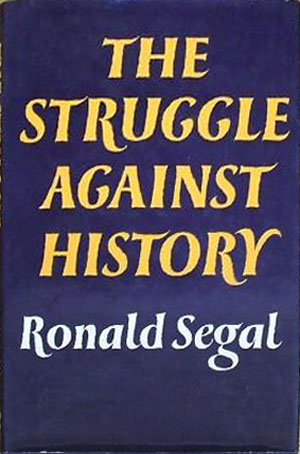
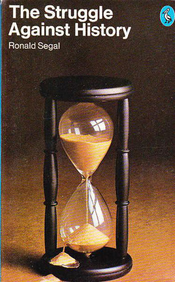
But it still works better than either cover for Segal’s The Struggle Against History. The dust jacket for the 1971 hardback published by Weidenfeld and Nicolson is practically a non-cover. If I saw it in a store, my eyes would likely pass it over and not even register it as a book. The semi-serif font is awkwardly ornate, and ill-equipped for an all-capitalized job. The 1974 paperback by Penguin is better, but not much. The mid-70s seem to have been the dark days for many Penguin covers, and this is no exception. The color photo of the hourglass feels completely dull and static, and the sand breaking out of it just adds confusion rather than energy. If the hourglass represents time, than somehow the broken hourglass represents history? History is time, broken out of its constraints? Or to struggle against history is to break out of time? All these questions are raised, but none clarified, by this cover. Meanwhile I don’t think any of the questions are relevant to the actual book. I’m not a firm believer in the idea that a cover has to illustrate a book’s contents, but I don’t think it should distract from it.
Also in the early 70s Segal turned his eye on the Middle East, writing Whose Jerusalem? The Conflicts of Israel. I suppose one intractable land struggle at home in South Africa wasn’t enough for him, he had to take on this one too. The initial hardback was published in 1973 by Jonathan Cape in London, and has a very 70s cover. Heavily stylized and drop shadowed type sits on a white field. Although a bit baroque, it’s nice to see such unique font usage, as so many titles these days stick to a small stable of relatively conservative typefaces. There is also a little visual play in the type design, with the subtitle and the word “Conflicts” shoving into “Jerusalem,” forcing it up and over and visualizing some of the struggle and tension in the subject matter without being heavy handed.
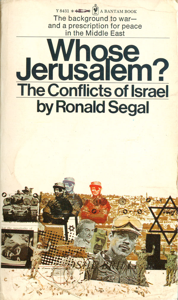
I haven’t been able to find a cover for a US hardback edition, so I think the book might have gone straight into a Bantam paperback in 1964 for a US audience. The cover again is mostly white, but rather than type trickier, this design uses a complicated photo montage at the bottom to carry the cover. Images of Jerusalem, soldiers, Golda Meir, Moshe Dayan, tanks, Stars of David, Arabs, text, and televised violence jostle for dominance, creating a visual effect communicating complexity, tension, and messiness. It has a 70s feel, and fits comfortably in the mix of that era’s non-fiction mass market paperbacks.

The Penguin paperback of Whose Jerusalem? came out a year later, 1975, and takes a completely different design angle. A Star of David dominates the cover, but on second look you can see that the star is also a series of walls, and it is unclear exactly what is being kept in or locked out. I find this cover the most interesting of the three because it is the most direct, but also ambiguous. I can see how it could be read as a show of strength of Israel, i.e. “We are an impenetrable wall,” or seen as a clear and crisp representation of Israel’s racism and xenophobia. I can imagine that in the mid-70s the graphic would have been just as at home on a Cuban OSPAAAL poster denouncing Zionism as it would on brochure advertising the idea that the settlements will never leave the West Bank. Now the imagery of a wall is a bit over-determined by Israel’s current major construction project, converting Fortress Israel from theoretical bugaboo to painful reality.
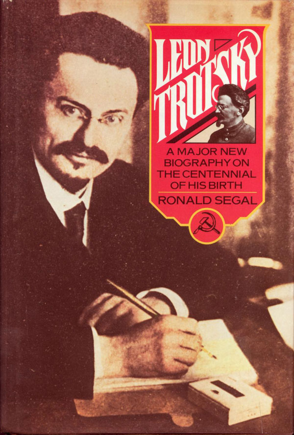
His mind always wandering, Segal quickly moved from Israel to Trotsky, writing a biography that would be published in multiple editions and multiple countries with various titles. Although over a half dozen different versions exist, I was only able to track down three covers for Leon Trotsky, or alternatively, The Tragedy of Leon Trotsky. The US Pantheon edition was published in 1979, and has a relatively effective but unremarkable cover. A large photo of a young Trotsky is looked over by a smaller photo of an older Leon, popping out of an ornate titling box. The obligatory hammer and sickle is there, as is the red and yellow.

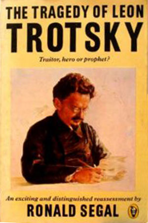
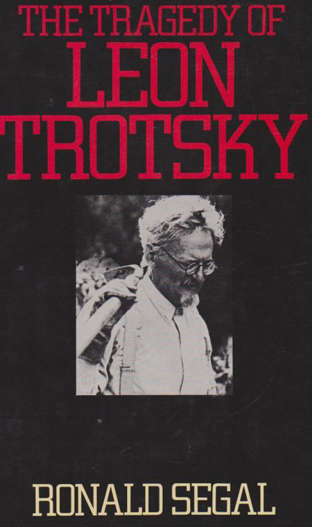
A New Zealand Peregrine edition (a sub-series published by Penguin) is even more conservative, with a painterly portrait on a field of yellow. The addition of “tragedy” to the title is not reflected in the cover, other than the addition of a subtitle, “Traitor, hero or prophet?” The Australian edition by Hutchinson (1979) takes the tragedy part more to heart, with a much stronger typeface in red and an inset photo of Trotsky looking small and cramped on the black cover. In addition, the photo choice is interesting—it appears as if Trotsky is gardening, or holding up a hoe, but at a quick glance it looks like their is a rifle pointed at the back of his down turned head.
In the 1980s Segal was involved in a series of world almanacs and atlases, all of which had pretty straight forward info-graphic covers, so I’ve spared everyone the specifics, but any true completist can easily find them online.
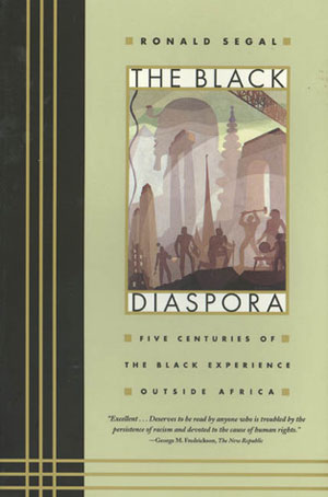
In 1995, Segal published one of his most important books, The Black Diaspora: Five Centuries of the Black Experience Outside Africa (Farrar, Straus, and Giroux/FSG). The cover designer, Michael Ian Kaye, would have had a hard time not coming up with something good given that he had a fabulous Aaron Douglas painting to build around. The Deco effect is well done book design post modern, creating a cover both steeped in the Harlem Renaissance and also seemingly timeless. My only suggestion is that the Douglas image could have been much bigger, the borders are nice, but why not give the real estate to a real master?
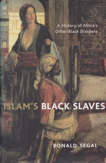
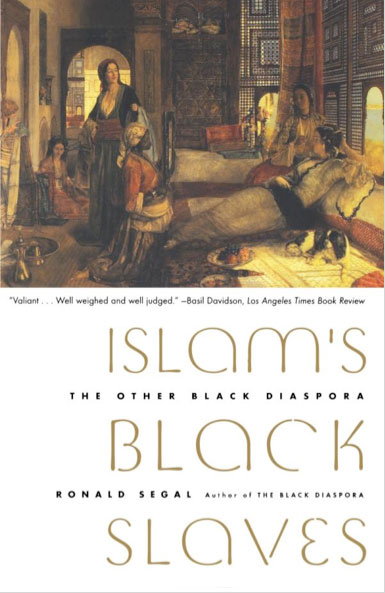
Building on this book, Ronald Segal’s final project before passing on was a grand-scale writing and research project which came together as Islam’s Black Slaves: The Other Black Diaspora. All three editions, the UK cloth and paperback from Atlantic and the US one from FSG, have covers built around a painting entitled The Harem by John Frederick Lewis. Lewis was a nineteenth century British orientalist painter. The interest in the painting from Segal’s perspective is the central figure, a Black slave, who is holding up a mirror to a harem of women. (As if that wasn’t clear enough in the cloth editions, the Atlantic paperback shoves it in our face by literally removing all the rest of the painting. This seems to be one of those rare, rare instances where a US edition is designed with more nuance and respect for its audience.) Assuming the painting is a legitimate portrait of life in the Arab world at the time (which seems questionable), this image exposes a hierarchy in which the women in the harem are no longer fixed at the bottom. The complexity of using this painting and what it could possibly mean is enough for me to want to read the book and find out what’s really going on.

To finish up, there was a thoughtful obituary for Segal in the Guardian, which you can read HERE. It was written by Denis Herbstein, author of White Man, We Want to Talk to You, the cover of which we’ll look at next week. In the obituary Herbstein states that the Penguin African Library ran to 65 titles, including his. This likely means that the PAL only numbered books up through 46, but then continued as a more subterranean editorial project, where Segal brought titles to Penguin, even though they no longer were publicly acknowledged as part of the PAL.