While collecting books from the African Writers Series published by Heinemann (I’ll be featuring those books in a future post), I stumbled upon a small series of African novels produced a little closer to home. Collier Books was originally a spin-off from Collier’s Magazine, but by the late 1960s it had largely become a paperback subsidiary of the Macmillan Company, at the time one of the oldest and largest independent book publishers in the US and UK. In 1969, Collier launched the African/American Library, a collection of inexpensive (most for $1.50) mass market paperbacks consisting of contemporary African and Caribbean fiction, as well as excellent African-American novels from the Harlem Renaissance and earlier. My rudimentary research has turned up thirty eight books published in the series, of which I’ve found copies of thirty two, and cover images for another four.
The entire series was edited by Charles R. Larson, a professor of Literature at American University in Washington, DC. Larson is white, and was introduced to African literature while in Nigeria with the Peace Corps in the early 1960s. His experiences in Africa also encouraged him to start reading books by black Americans at home. In the late 1960s, there was still a large separation between hardback book publishing and paperbacks. For the most part, initial editions of books were published in cloth editions by large publishing houses, and then the paperback rights were sold to smaller outfits which specialized in either educational publishing —where books would be sold for school use —or mass market paperback publishing—where books would just as likely be sold at drugstores and five and dimes as specialty book shops. By this time some paperback companies had been bought up by larger publishers, but they were run separately, and often rights to books would be sold to outside presses.
I don’t know for sure, but it appears as if Collier encouraged Larson to by up the rights to print mass market editions of African novels which didn’t already have US paperback editions (although most of them were either already, or soon to be, published in the above mentioned African Writers Series in the UK and Africa), as well as choose older African-American novels which were likely out of copyright, and free to reproduce in new editions. The few Caribbean novels published in the series are also older books, originally published in the 1930s and 40s, and not available in paperback at the time. In edition to re-circulating this impressive collection of books, Larson also found sympathetic authors and peers of the writers to pen introductions to each book, including Richard Wright, Ezekiel Mphahlele, and Austin C. Clarke. I’ll publish a complete bibliography of the series in a couple weeks once looking through all the covers.
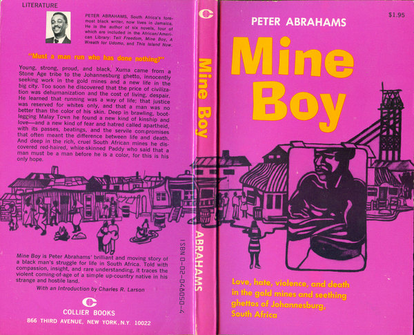
So let’s jump into the books. I’m going to start out with the African literature, and the seeming anchor of that part of the collection, Peter Abrahams. Abrahams had four books published as part of the collection, the breadth of which illuminate Larson’s editorial ability to tie-together many complicated aspects of the African diaspora. Abrahams was born and raised in Johannesburg, South Africa, but lived for years in England, and eventually settled in Jamaica. Mine Boy, his most well-known novel, is the story of Black workers in the gold mines and ghettos of Johannesburg.
The book’s cover is paradigmatic for the Af/Am Library, with its bold pink and yellow color scheme and flowing, 60s-style core illustration. Like many other of the series’ titles, the cover is not amazing, but strong and functional. None of the cover designs or illustrations on any of the books are attributed, which makes me believe they were either done by in-house illustrators at the publisher, or freelance people that did bulk work for Collier/Macmillan. The illustration is stylish, and has a nice wrap-around to the back cover. The central, muscular African figure with his arms crossed expresses a combination of defensiveness and power appropriate for the story, and the shanty town that sprawls out behind him gives us context to understand the setting for the novel. The type is unfortunately not as compelling, with the title in a font both awkward and a little childish, and the tag line heavy at the bottom, neither large enough to fill the space it is holding nor small enough to be out of the way.
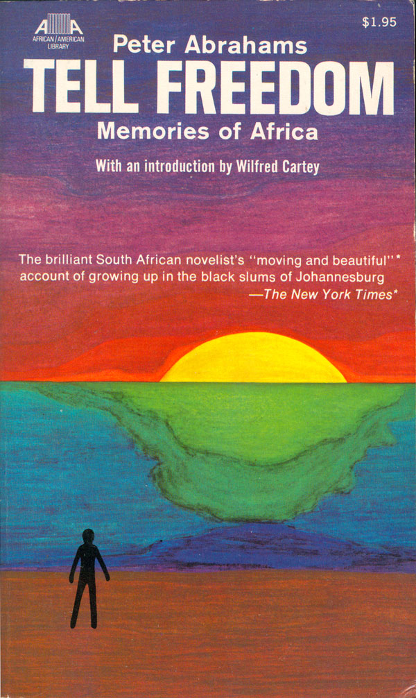
All the above said, Mine Boy looks downright brilliant compared to the naive and strange cover to Tell Freedom, Abrahams’ novelistic autobiography. A black stick figure looks on (or out from) a sun setting beyond what may be the ocean, or green continent, or submerged iceberg. Possibly this rudimentary imagery is supposed to be transcendent, or inspire contemplation, but instead it provokes feelings of elementary school drawings tacked up on the refrigerator by overly proud parents. It works for the Frigidaire, but a book cover?
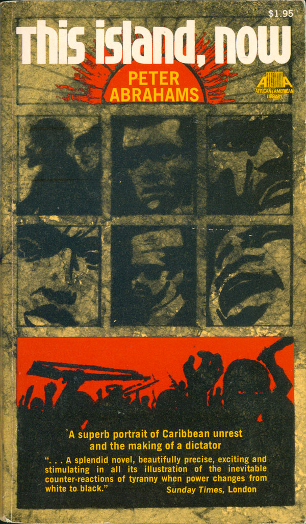
The covers to Abraham’s next two novels are much more accomplished. Both use grids of hazy portraits to imply a level of complexity and interlocking parts, a simple and effective graphic tool. The novels themselves tie together some of Abrahams complexity, and the cauldron of interchange between Africa, the Caribbean, and the West in the 1950s and 60s. This Island, Now tells the story of violent, black-led revolution on a colonial Caribbean island. The cover does the same. Unlike on Tell Freedom, this sun on the cover below speaks to heat and power, locking the matrix of people between the title and the red-rimmed action of the uprising below. The title is in tight block lowercase, giving it a slightly claustrophobic feel, and adding to the tension on the cover. My only complaint here is that the canvas of a mass market book is so small, it’s hard to have this many elements functioning and still be legible. This is a great cover, but would work much better at a larger size where each piece could be read better.
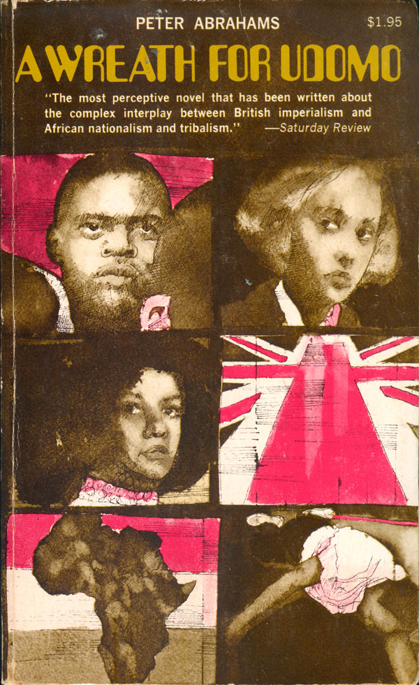
A Wreath for Udomo is a novel of African revolutionaries in exile in the UK, and the knotty realities and conflicts between duty to nation and ideals, the comfort that comes from living in the colonial seat, and the space between high liberation ideology and real politic. Once again we get a grid of images, or vignettes, which if we read from left to right, lead us from strong African male to white woman to African woman. The Union Jack as a road forward (or back) to Africa on a flag to death, a man down.The illustrations are rendered in sharp line and pink and grey wash, making the cover look both old and etched, as well as up-to-date and hip, merging old and new in the way Push Pin Graphics was famed for.
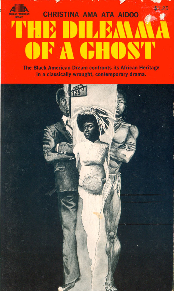
Ama Ata Aidoo has become a big name in the world of Third World Feminism, but in 1971 when The Dilemma of a Ghost was published she was still using the first name Christina. Dilemma is a play, the only one in the series, and the cover is quite dramatic. A solid black field is torn in half, splitting a central male figure down the middle, one half in Western suit, the other in “tribal” African garb. The tear reveals a woman in a wedding dress. The implications seem clear, a woman stuck between the traditional and modern aspects of her man. The illustration is strong, if a bit literal, but it feels diminished by the overall design. The large red box holding the titles doesn’t interact with the image, and since the split doesn’t run top to bottom through the entire cover, it feels less remarkable.
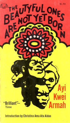
Collier published two novels by Ayi Kwei Armah, another Ghanian (like Ama Ata Aidoo). The Beautyful Ones are Not Yet Born is his most well known book, and this cover does it some justice. The color scheme is great, and the central flower simultaneously makes for a nice pattern, gives the book an “African” feel, and references the central floral image on the dust jacket of the original cover hardback edition. The title is hand-drawn, a huge improvement from the very rudimentary and machined type-work on most of the titles in the series. And the pile of faces in the center are really evocative, pulling out a wide range of emotions and seeming character types. A really well done cover.
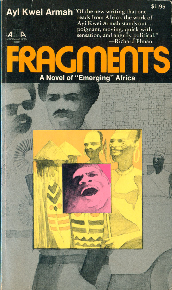
The cover of Fragments has a really different feel. It’s much less bold and immediately powerful, and also feels more dated. The title at the top is once again completely separated from the central image, doing it no favors, while Kwei Armah’s name is squeezed into the top left, barely noticeable. The washes and muted colors are kind of cool, but give the book a real 70s feel, which doesn’t make much sense given that it is set earlier.
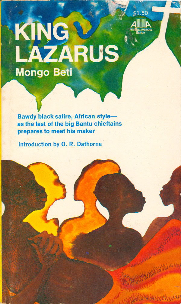
Mongo Beti is an exceptional novelist from Cameroon known for his satirical stories. King Lazarus is the first of his books published by Collier, and has an unfortunately unimpressive cover. It is bright and colorful, but neither specific enough to be compelling nor decorative enough to engage with powerful shapes or patterns. The title is also simply plopped on top, in basic sans serif, and gets lost in the swirl behind it and the large white space below. The novel itself is full of interesting ideas and plotting, yet none of this is captured here. I have a hard time understanding how covers like this make it to press. It seems unlikely that something like this would be printed today, since marketing departments are so much more involved in all aspects of book production—for better and for worse.
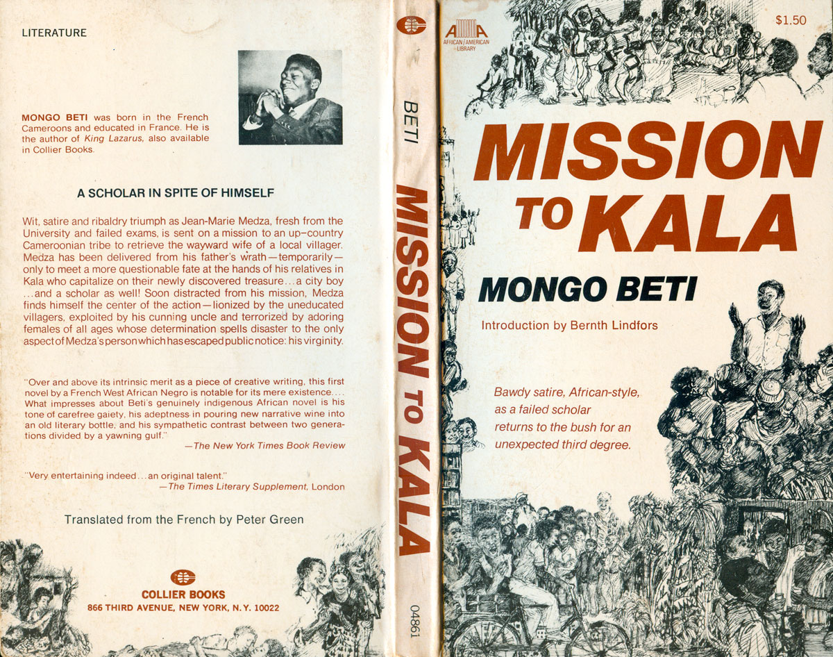
The cover to Mission to Kala fairs better. A montage of scribbly drawn scenes surround the edges of the front and slip onto the back. None themselves accomplish much, but as a whole they make a nice fabric, bringing the eye from one set of characters and actions to another. It would have been more interesting to stock the entire cover, side to side and top to bottom, with these little bits, and drop the titles in a small box on top, but that would have demanded a level of coordination between illustrator and designer that likely didn’t exist.
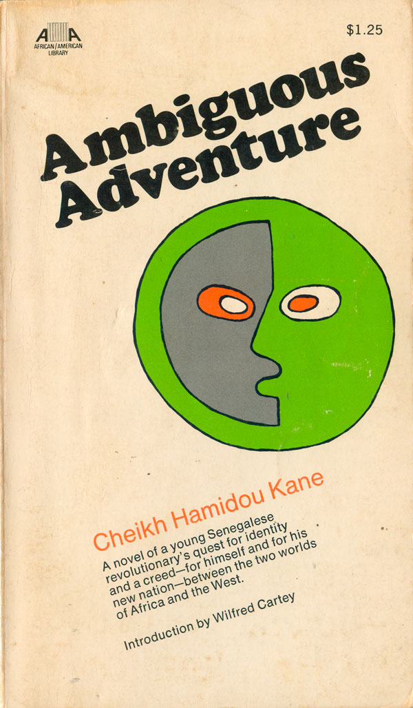
The cover to Cheikh Hamidou Kane’s Ambiguous Adventure is a bit of a throw-away. Although technically the green/grey face featured represents in some ways the complexity of the novel’s engagement with the hybrid African/European reality of post-colonial Africa, it’s too simple and awkward to be convincing. In theory I would like all the elements of this cover: its simplicity, the angle of the type, the use of Cooper Black for the title (which was only beginning to come back into style in the early 70s), the off-center and central image, the willingness to let the majority of cover ride as plain white background. But it just doesn’t come together for me.
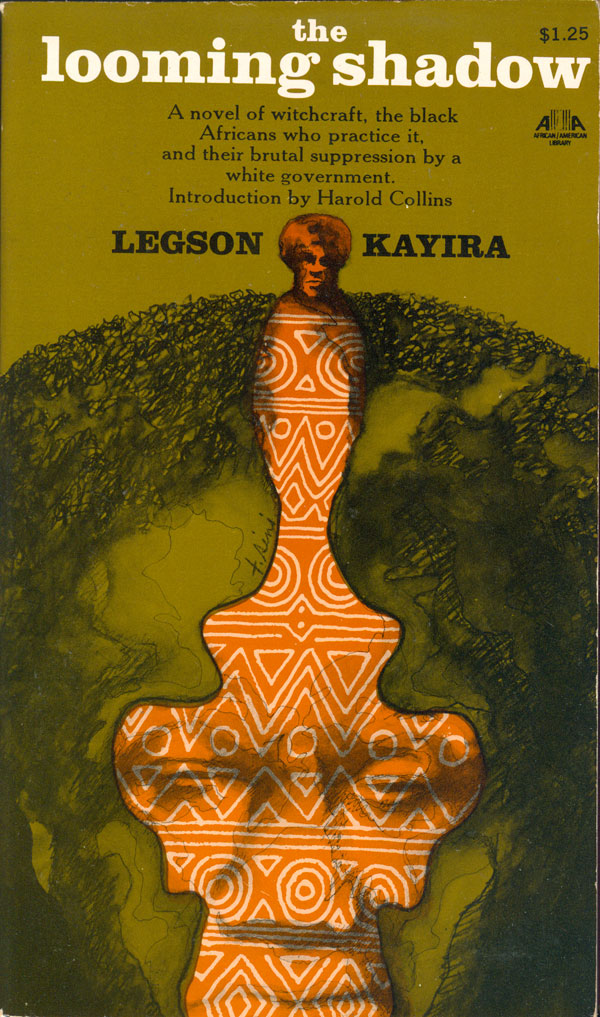
Legson Kayira’s novel The Looming Shadow has quite a surrealist cover. A green globe – which triples as Earth, Africa, and a man’s face – splits down the center, revealing an orange figure—which itself triples as a trophy, an African-patterned sculpture, and a central man emerging from the center of the Earth. Taken as a whole the image feels somewhat like those visual games, where an image of a young woman turns into an old crone, yet here the options are so varied it’s hard to focus in on such a simple binary. The image is dark for a book cover, pushing the orange figure forward as the central element, balancing out the white title at the top. The image has a small signature on it, “T. Simi,” likely the illustrator.
It’s unfortunate that the illustrators of all these covers were not appropriately attributed. Many of the images seem hurried or low-quality, but others are smart and well-down, especially for what was likely a quick turn around and low budget. It is impressive that a major publishing house was able to roll out almost forty African and African-American literary works in accessible editions in a three year period. At the same time I have a distinct feeling that these were done on a shoe-string budget and were intended to cash in on the more intellectual side of the then cresting black liberation movement.
Next week I’m going to go through the rest of the African novels in the series, and take on the handful of Caribbean books. Come back and check it out! Also, if you know anything more about this series, please send me an email: josh at justseeds dot org.


Interesting how many of these (good, bad, and weird) share an aesthetic similarity with mass-market new wave sci-fi from the same period. Put a sword in the stick figure’s hand in Tell Freedom and you could easily have some crappy fantasy novel…
(speaking of, if you’re not aware of him, you should check out Leo Dillon (http://leo-and-diane-dillon.blogspot.fr/), 60s sci-fi artist extraordinaire!)