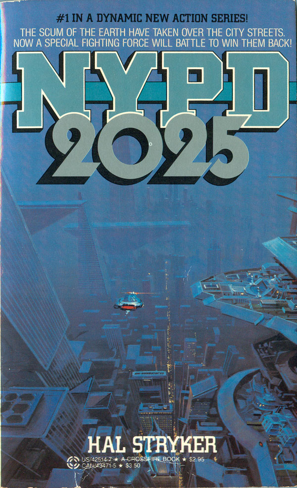
Are you worried about global warming? Don’t fret, because in twelve short years you’ll have much bigger problems to deal with: The scum of the earth will have taken over our streets! Or so says “Hal Stryker” in his 1985 page turner NYPD 2025. I grew up a sci-fi fan, and I’ve always been attracted to the kind of fantasy where the author changes some small detail about our world, and then uses the form of the novel and the conventions of the genre to generate an entirely different set of social relations that spawn from that small change. Ursula Le Guin is one of the best examples of this, but Eleanor Arnason, Samuel Delany, and even Phillip K. Dick basically do this as well. But as in many things, there are lots of other kinds of sci-fi. Of late I’ve been collected books from the 70s and 80s that are supposed to be about the future, but are either so close to our current reality—or so completely ridiculous—that they seem to not even function as social criticism, but instead right wing prescriptions of the future.
NYPD 2025 is a perfect example. The back copy is amazing, including zingers like “The bleeding heart lawmakers have taken lethal weapons out of the hands of the law enforcers—and in the world’s largest city criminals are on perpetual holiday.” Funny thing is that the cover is ridiculously boring. A sea of blue cyber-buildings with a lone space car zipping through the air—where are the scum of the earth? Where’s the battle to win back the streets? What a complete failure of the right wing imagination. I know this is pre-Limbaugh, Cheney, and Beck, but there had to be some creepy neo-con that could of sold this story better?
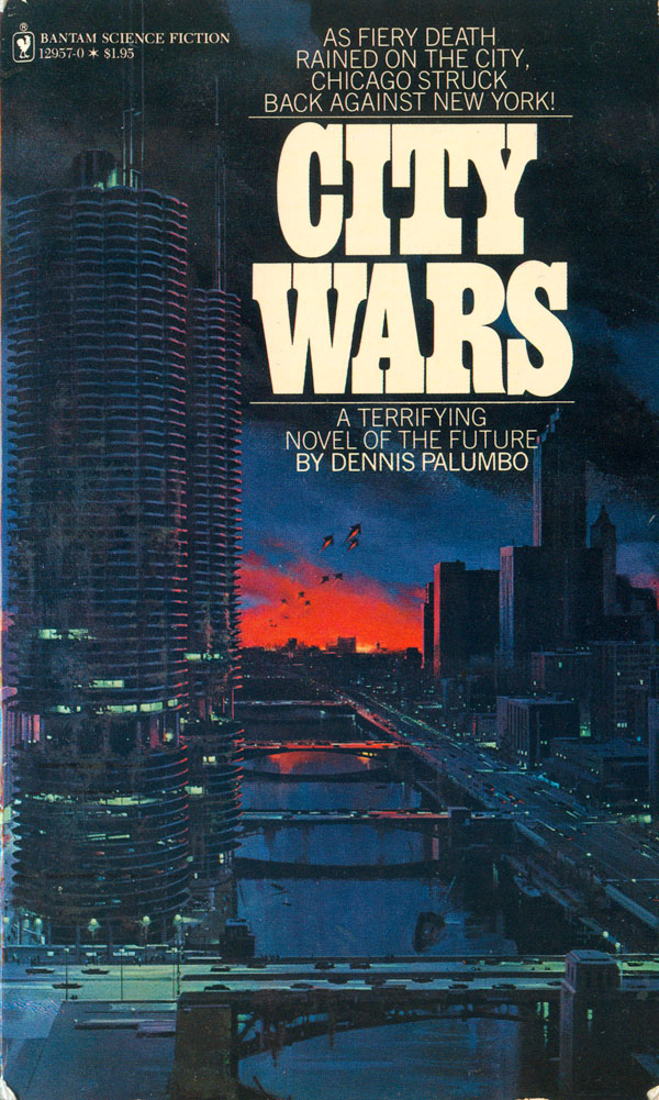
Dennis Palumbo’s 1979 book City Wars has a surprisingly similar cover. A slightly-future Chicago sits in wait for a fleet of spaceships to attack, from New York! But it is hardly the “fiery death” promised by the cover blurb. Having lived in both Chicago and New York, I must admit to loving the idea of the two cities squaring off in a giant battle royale, especially with a New York run by robots. It’s hard not to vote for New York, especially since according the to painter of this cover, the most distinguishing characteristic of Chicago are those ridiculous circular towers that are half parking garages. If goofy modernist car cubbies is the most a city has going for it, no wonder it’s getting crushed in the City Wars!
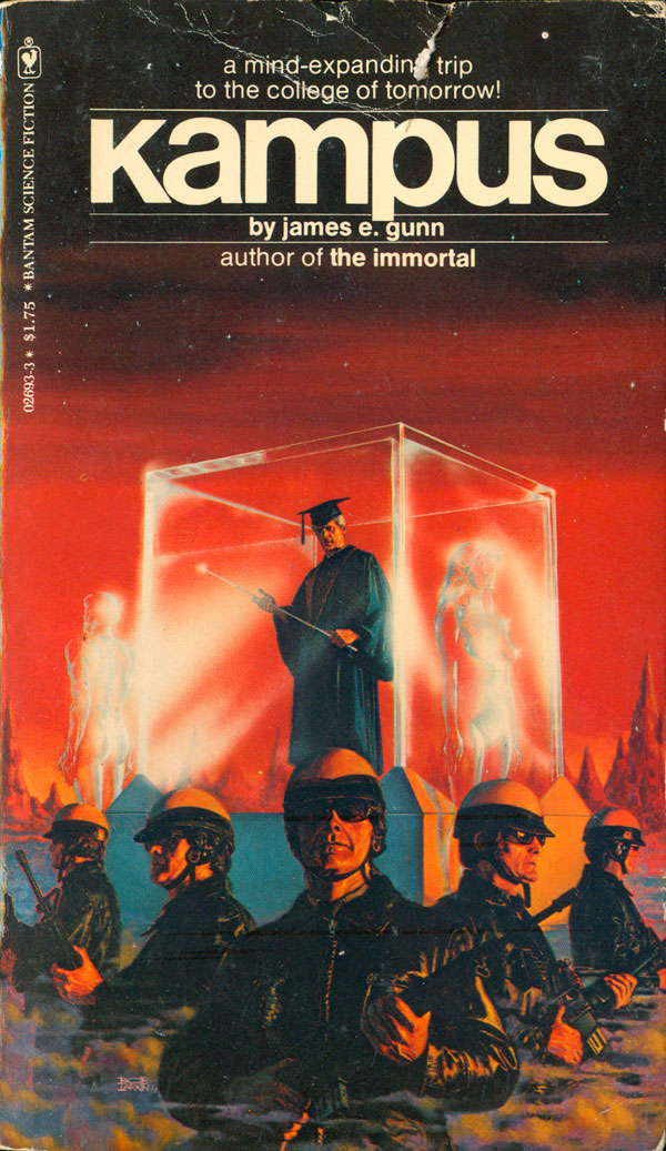
Kampus, a 1977 title by James E. Gunn appears to be a reinterpretation of the student unrest of the first half of the 70s. Cloned and evil cops secure the academic glass cube, which holds a creepy professor with a magic wand, of course. Crystalline male and female forms stand at attention in front of the cube, all of which appears to be on a red, Mars-like landscape. Huh? Anyone else out there have a clue as to how to interpret this mess? I’m not even sure why, but this cover does seem to successfully tap into the conspiracy about university campuses being physically rebuilt and re-planned in the 70s in order to stop the a recurrence of the earlier unrest.
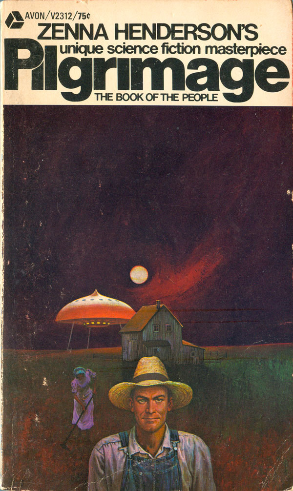
The covers of the next couple books exploit older visual troops popular in the US. Zonna Henderson’s Pilgrimage (originally 1952, but this Avon edition 1971) reps Grant Wood’s “American Gothic,” but with added spaceship in the background. The placement of the hunched over woman raking in the mid-ground adds another whole layer. It appears that she’s possibly black, implying a re-emergence of slavery in this future of the American pastoral. This cover adds a deep, dystopian spin, not just on the perception of the novel, but also on the original painting it is riffing off of.
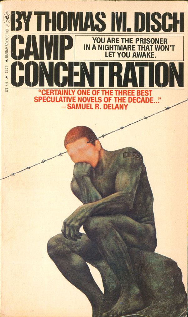
Finally, Thomas M. Disch’s Camp Concentration (1980) cover strips away all background noise, framing the novel with a reinterpretation of the Thinker. But this statue is part live and actually thinking, with the thinking pierced by barbed wire. In addition, figure is stamped “US Govt,” bringing the question of property relationships into the image. In further proof of the “less is more” maxim, this cover is much more compelling than all of the others above, simultaneously communicating a lot of possible meaning through a much more efficient set of symbols. The design is evocative of Polish poster design, and seems to operate in similar ways, offering up multiple interpretations.
As you can tell from above, I don’t have a ton to say about these, it’s mostly just been fun collecting them over the past couple months. Also, just FYI, not a single one of these books attributes either the painter or designer of the cover. See you next week.