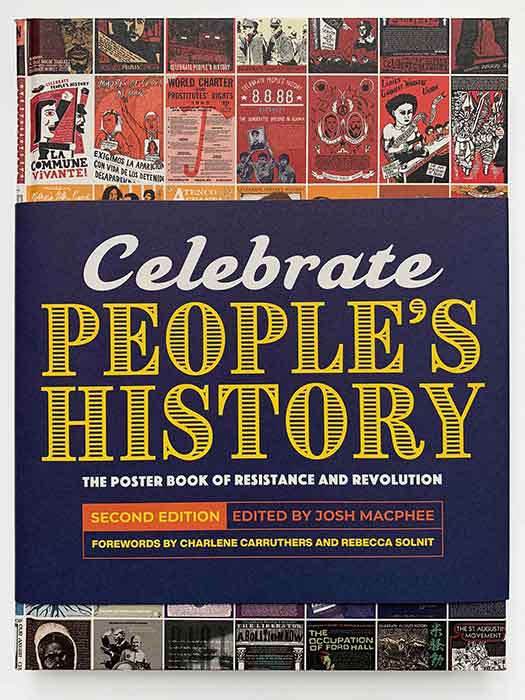
From the early 20th century through the early 1960s, one of the largest Left organizations in the US (if not the largest) was the Communist Party USA. The propaganda wing of the Party created multiple publishing arms, including New Century Publishers (which I featured HERE back in 2011) and the still-publishing International Publishers. International was by far the largest operation, and in the 1950s and 60s they spun off a paperback imprint called New World Paperbacks. I started looking at this on this blog way back in 2010 (see here and here). Well, in the four years since I’ve been collecting more New World books, and in particular have had an eye towards an imprint of that imprint: Little New World Paperbacks. In 1964, New World spun off its own series of mass market paperbacks, a format that at the time was hugely popular in publishing. Most US mass markets were sold at newstands and on racks in grocery stores, so they were designed to appeal to a broad audience of people that wouldn’t go into a book store. Because of this, they tended to have lurid covers, with full-color paintings (which would eventually evolve to photographs) of crime, sex, romance, and early self-help. Giant titling fonts and eye catching graphics were also popular.
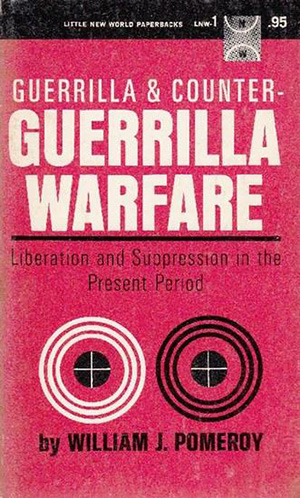
It’s possible that’s what Little New World (LNW) was going form but if so, they missed the mark, widely. The first title in the series, William J. Pomeroy’s Guerrilla and Counter-Guerrilla Warfare has a very staid, almost clinical, cover. While the title is bold and yells out “GUERRILLA WARFARE!”, the rest of the cover is so clean and precise that it almost takes away any potential edgy appeal of the giant type. The mechanical bulls eyes and full sans serif treatment make this look more like a government report than a pop expose. Sadly their is almost nothing about LNW I could find through basic research, so the motivations of the publishers remain pretty opaque. Was this an attempt to popularize Communist ideas to a broader audience? Was guerrilla warfare chosen as the topic of the first book because of its potential gritty, fringe appeal? Or did the publishers just want to make a book that fit in the reader’s pocket?
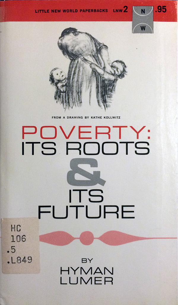
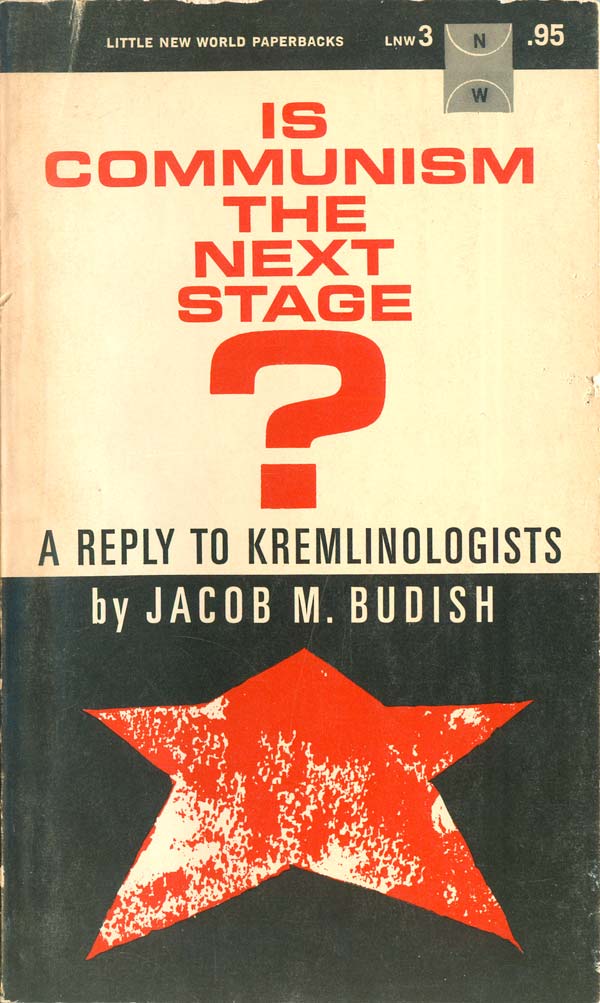
The next books, and most of the ones produced in the 1960s, have similar covers, with elements reaching for pop appeal, but for the most part coming off as an awkward combination of old-school political pamphlet and 50s modernist book cover. The Lumer book below uses an image by Kathe Kollwitz, but to no real effect (although she is interestingly credited directly on the cover below the image…), and the Budish book is similar, with a distinctive confusion as to whether to play up the typographic elements or the rudimentary graphics.
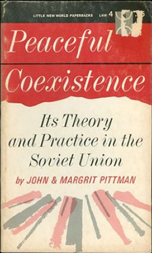
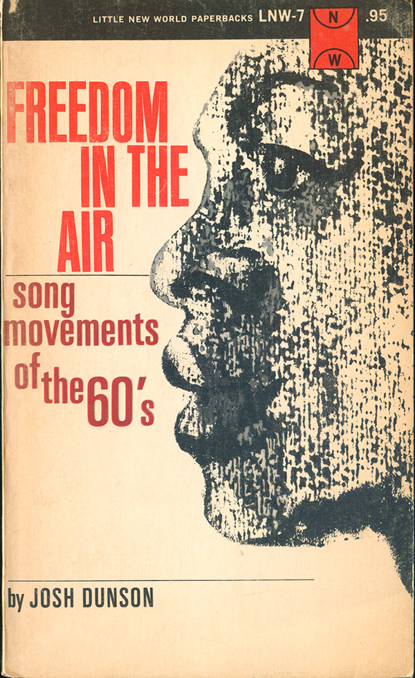
The Pittman book below is a great example of leaning towards more traditional Modernist cover design. The Dunson book is interesting, because the subject matter is clearly trying to be popular, much more so than any of the other books so far, but the cover feels so dated. Pop art has really started to explode by the mid-60s, but there is no evidence of this here. Although the book is about pop music, it feels much more folk/beatnik than the more dynamic energy that is already emerging from the Civil Rights Movement. Which isn’t to say I don’t like the cover, there is actually something quite nice about it, with the tall sans serif justified left, right, and center, and the subtitle appearing to emerge from the lips of the face.
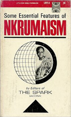
This cover is for the first of a series of books LNW would produce by and/or about Kwame Nkrumah. It is cast in the same mold as the initial Pomeroy cover. Reddish-magenta and black and the main colors, the type is bold and tall, and the graphic elements are largely subdued. Here the targets are replaced with a globe, Nkrumah taking up half of it. I like the black triangle at the bottom, which functions both as an arrow pointing towards the cover’s content, and a base for the sphere, converting into a spinning, desk-top globe.
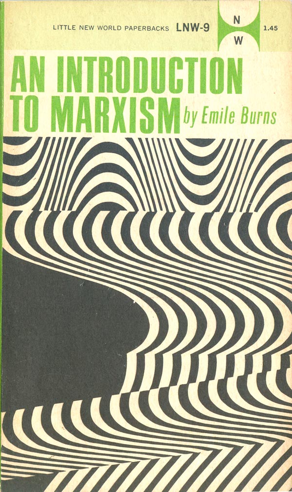
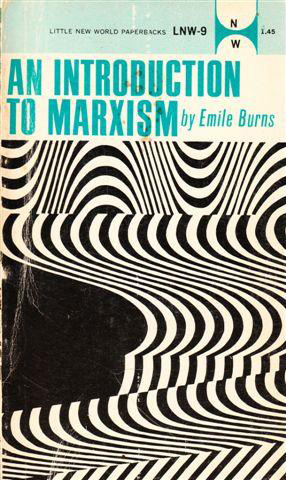
Burns’ Introduction to Marxism (LNW-9) is the first cover to start to break out of a real 1950s mold. The op-art cover borders on psychedelic, but doubles as a nice abstraction, and way to avoid having to put old grandpa Marx on the cover, which would certainly be a turn off to a general audience. This is also the first time I’ve seen a change in color printing on different printings: the green copy on the right is from 1972, the blue on the left from 1975.

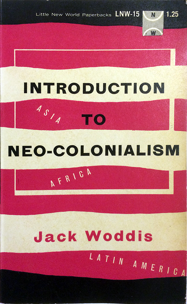
Introduction to Neo-Colonialism (1967) has a cover with a real dated-feeling design, but I find it really compelling. The black at the top and bottom compresses and contains the content, keeping your eye moving back and forth across the horizontal lines, with the continent names acting as little bridges that bring your eye from one line to another.
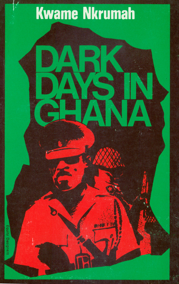
Now on to the rest of the Nkrumah covers. I love Dark Days in Ghana, for all of my usual reasons. The illustration with evidence of the human-hand, the red and green duotone, with the overprint making that rich brown, the general’s cap poking into the word Ghana—it all just reads as powerful, creepy, and compelling, like any book about a coup should.
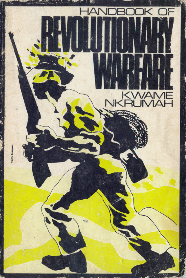
The Handbook of Revolutionary Warfare was designed by the same group, Equity Designers. Not surprisingly, there is nothing about them online, and I’ve never seen the name on any other books. This cover doesn’t work quite as well as Dark Days, but is still very strong. The soldier is guerrilla is captured in motion, and although detail is scarce, the overall picture is clear: a strong and motivated African, armed and moving forward. The image is reminiscent of the illustrations of Emery Douglas, but appears to predate them.
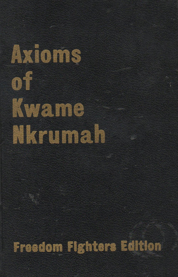
If The Handbook of Revolutionary Warfare is Nkrumah’s answer to Che Guevara’s Guerrilla Warfare, then Axioms is his answer to Mao’s Little Red Book. Shown below is the “Freedom Fighters Edition,” which is the only one I can find. The cover is simple, gold embossed onto a textured black cover. This book is listed as being published in the Little New World series (as LNW-18, in fact) but I have yet to be able track down a unique LNW edition.
That’s all for this week. Next week I’ll finish up the rest of the Little New World’s I’ve found, and provide as close to a full bibliography for the series as I can compile.