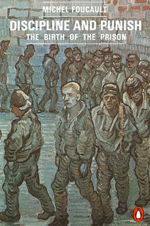
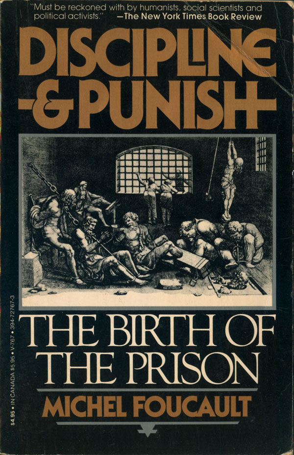
The real game changing book for prison studies was Michael Foucault’s Discipline and Punish. Interestingly, the covers of the book in English, from the first hardback to the current paperback, don’t focus on it’s inventiveness or trailblazing qualities, but seem to want to brand it a classic straight out of the box. Over the covers I’m only going to show three, but they are a fair sample of all the English-language editions I’ve seen. The one to left us the first (I believe) Penguin edition. The classic penguin style laid over the expressionist painting of the prisoners really works for me. I don’t have the actual book for this edition, so I am unsure of the painter, but it is almost reminiscent of Van Gogh, and carries with it that sense of being classic. The early American hardback (not shown) and paperback (below to the left) use historical etchings to evoke the classic quality. I do like the inventiveness of the type of the paperback, if it does feel a little dated today. And finally the current American edition, which follows the post-modern style of the entire series of Vintage-published Foucault trade paperbacks. Objects referenced by the text float in a empty space that is given depth through shadow, and then a classic (yup, there’s that word again) titling box is laid on top. As a whole series, these are quite nice, even if as a one off this cover doesn’t do to much for this particular title.

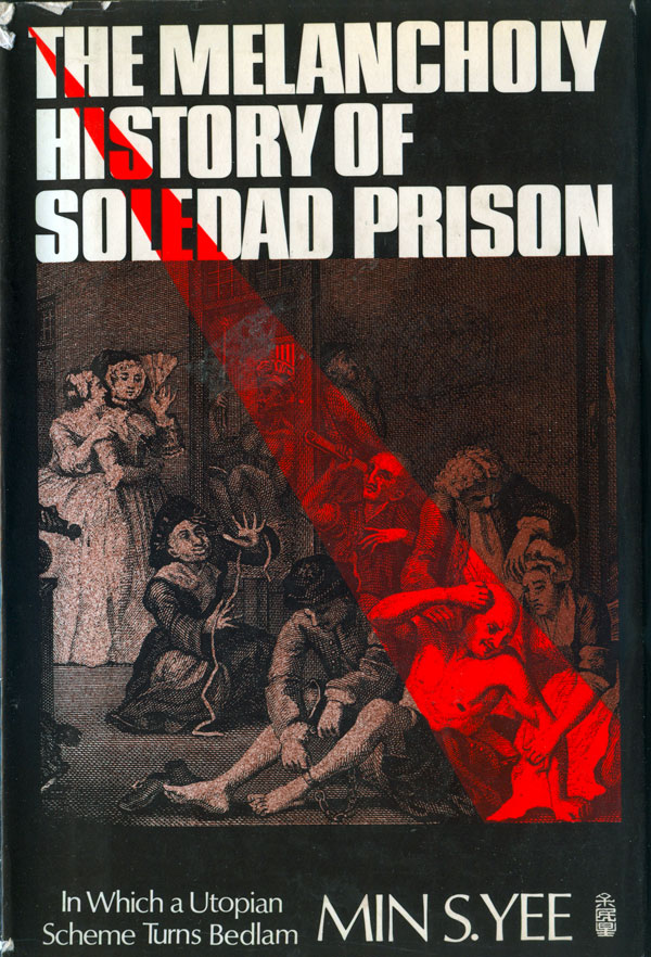
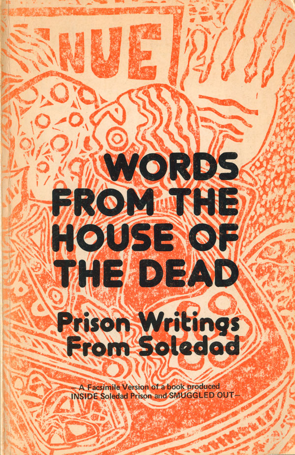
Another cover that evokes the classic, but in some ways is much more challenging, is the Yee book to the left, below. The historical etching of a prison is both illuminated and split by a bold red spotlight, the book’s contents shining the light of public scrutiny into Soledad prison. The image literally holds up the title of the book, with not even a hairline between them, while the subtitle and author’s name have plenty of space below the image. The Soledad book to the right couldn’t be more different. The image is reproduced in a bright attractive orange, and the text is rounded and bold, almost friendly. I wonder if the designer was trying to lighted up the dark subject matter—”the House of the Dead”:
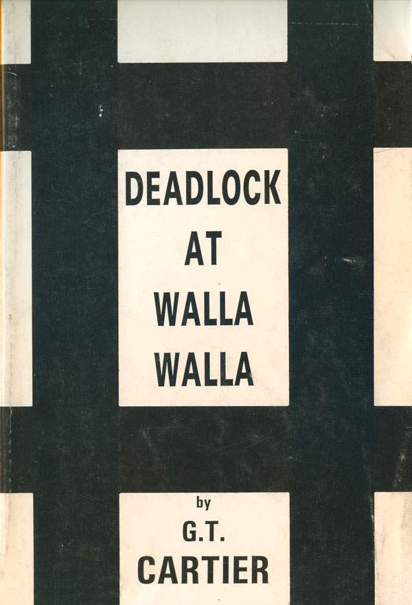
The book to the left here is the simplest of all the prison covers I have and am looking at in this series. Black bars on a white background close in the title, which is typed in a simple tall trade gothic. No frills from this self-published work, but it is actually kind of nice and effective (other than the fact that the thickness of the bars doesn’t quite resonate write with the thin title). The cover to the right is also austere and effective, the guard tower dominates the page, shoving the text up and cramming it in at the top:

Both of the books below are classics of the 70s prison exposé genre, and both covers represent people caught within the confines of the prison system. The Minton cover to the right is the more straightforward of the two, with a portrait of a prisoner that invites you “inside,” just as the bold red title says. The Mitford book is more of an anomaly. A specific prisoner’s face is front and center, which is rare for these books, and the eyes are barred out, leaving us only a number to identify the person by. The use of the painting as opposed to a photograph is quite smart, make the person seem softer and more unique, yet also more unknowable, which sits well with the black bar across the face:


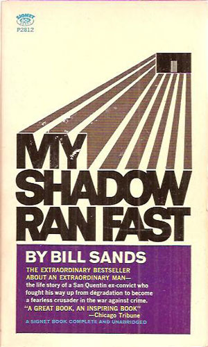
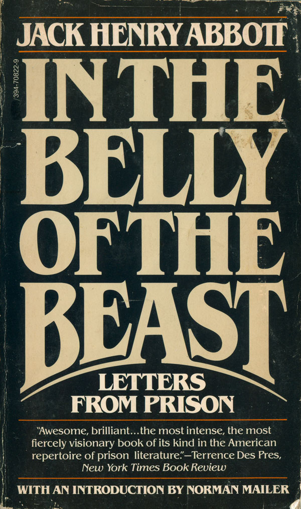
And last but not least, one of the big genres of prison books of this era are the prisoner confessionals. They are not something I ever read much of or collected, so I only have a couple examples. The Sands cover returns to the trope of bars, but they double as the shadow of the title, running away from the prison. The Abbott cover is an 80s pocketbook toss off, my guess is the designer had to do it quick, so they used a bold type treatment and made some tweeks to the key word, “beast”:
Next week I’m going to focus on the more recent rash of prison books, from the mid-90s to the present.


Awesome post Josh! You guys are doing awesome work!
Just to clarify, the painting on the Penguin edition of Discipline and Punish at the top IS a Van Gogh painting, based on the engraving “Newgate—Exercise Yard” by Gustave Doré.