Following up on last weeks post, and some of last years covers that slipped through the cracks, here is a cool selection of New World Paperbacks (NWP) covers. The original NWP posts, including their story and a dozen covers can be found HERE and HERE. Since those posts, I’ve picked up a half dozen additional NWP books and found a clutch of good images online.
To start with, I found 3 books of poetry, one from 1968, one from 1971, and one from 1982. The first (to the left), The Portable Walter, is definitely designed to appeal to youth culture, and their attraction to psychedelia. The color scheme of pink and purple, and the watery letter forms and shapes are reminiscent of the Haight-Ashbury rock posters so popular in 1966 and 67. It’s actually quite suprising to me that the Communist Party would so quickly pick up on the aesthetics of the counter-culture, especially since they were simultaneously expelling young members they felt were becoming to anti-authoritarian. At the same time, there is still something awkward and staid in the cover. The figure, who I’m assuming is Walter Lowenfels, isn’t wearing tie-die, or even jeans, but looks like he’s at the beach on break from his office cubicle.
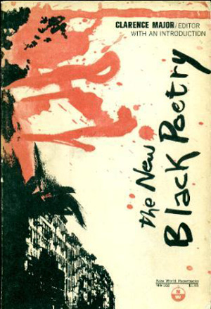
Below is The New Black Poetry, which is also an active cover, the black apartment building at the bottom fading into a large erratic splash of red and black, calling up images of fire and/or blood. Like how the Lowenfels book seems to be reaching out to white youth, this cover seems to speak to the militant mood in the Black community. Maybe it is even trying to capture some of the anger so effectively being used to propel things like the Black Panther Party, which had laid claim to being the legitimate vanguard of the Black revolution, leaving behind older models of organizing like those used by the CP.
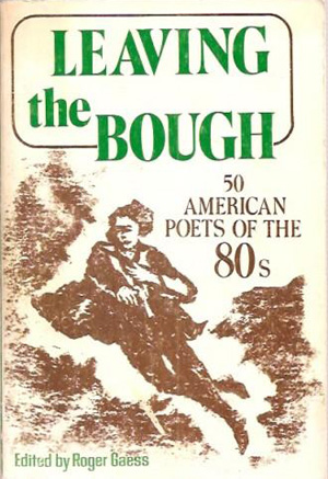
Next is a cover from the 80s, Leaving the Bough. Although it is a collection of contemporary poets, there is no attempt to try to capture an “80s” aesthetic or feel, instead reverting to a blockprint-like image of a youth throwing a rock. This seems to be a nostalgic nod to the protest movement of 60s, but captured in an aesthetic from the first half of the 20th century, maybe a nostalgic nod to the height if the party’s influence? Of course I could be, and probably am, reading way to much into this, but all in all it is a strange cover. At first look it is cohesive, the image is pleasing, the type is almost classic, and the colors are subdued. But if these are poets of contemporary protest, are they classic? Do they warrant the serifed type? Why does their protest look so old?
Another set of interesting covers are the ones that are more “classical communist” or theory and economics based. Since the content of these books is largely abstract and theoretical, the covers forgo representational images for shapes and patterns that seem part op-art, part constructivist. The covers of six books below all fall into this camp, to varying results. The black and white line patterns on the Burns book are fabulous, but seem almost quintessentially 1950s—the book was published in the 70s, especially in concert with the light turquoise of the title. Although I like the cover, I’m at loss about its relationship to Marxism. I love the cover to Engels’ The Role of Force in History (1968). The designers restraint in only using red and blue is well-taken, and the constructivist gallows-like is thrust off the page by the blue concentric circles in the background. The spiky and brutal mechanical shape also calls to mind hammers, knives, and axes, without any direct or specific reference.
While containing similar abstract shapes and patterns, the On Historical Materialism cover flops where the Engels’ cover succeeded. The folded-paper shape is maybe too specific (yet meaningless?) and the type treatment is too brutal. The angled red lines vibrate against the backdrop in a way that seems very 1980s, and the whole cover feels a bit Max Headroom-ish to me. Maybe this would have been a better cover for the 80s poetry collection?
And finally, I’m really interested in the Selsam cover, What is Philosophy? Unlike the Historical Materialism cover, it doesn’t feel locked in to a dated aesthetic. Being published in 1962, if anything it seems way ahead of it’s time. The color rolls look almost like spraypaint, and the type and symbols are so bold they seem almost stencil-like, giving the cover a hip street art-vibe. It sounds a little crazy, but there is something about it that reminds me of an 80s hip-hop album cover, like a Public Enemy single. The bold sans serif, the question mark inverted and dropped below the rest of the title, the logo with the triangle, circle, and arrow, all contained in a box. Very cool.


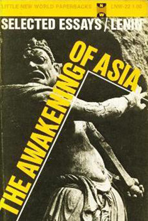
Here are a couple very different Lenin covers. Both have elements like all the abstract and/or type driven covers above, but they also incorporate representative imagery. The first, The Awakening of Asia, builds the cover on top of a brown-tinted photo of an ancient Asian sculptural figure. I’m not that familiar with this type of sculpture, but it seems like possibly some sort of Japanese soldier-figure. The angled line and type echoes the movement of the figure, but also cages it, making the awakening of the title seem eminent, but not yet arrived. The Emancipation of Women cover is much more traditional. Although the font is the same (Franklin Gothic?), it is safely horizontal, and the image, a reproduction from a Kathe Köllwitz poster image, is boxed within a thick orange frame. A half-toned fade of white to black in the background connects Emancipation to Lenin, but in a funny way also inverts the two, visually making the opposites.

I love the cover of the early NWP editions of W.E.B. Du Bois’ John Brown. The black form of the tree is haunting, and the red overprinted type of his name seems like it is almost hanging from the tree, executed like brown. It somehow both pops off and seeps into the blue background, and the blue portrait of Brown centers and grounds the entire cover. At first the portrait seems awkward and oddly placed, but after really looking at the cover as a whole, I think it actually makes Brown seem otherworldly, on a separate plain from everything else. For some unknown reason this version (from the early 70s) is hard to find these days, and at some point in the 80s they began printing the book with a similar cover, but all the elements are in red, completely flattening the image and losing all the dynamism.
Next to it is a cover for another Du Bois book, The World and Africa. Not the most interesting or challenging, but the rust and clay color palette is nice, as is the fill in the spaces between the letter forms of Africa. I think this cover could have been much more powerful if there had been fewer horizontal lines and they were pushed further to the bottom of the page, allowing the word Africa to be elongated and fully fill half the page or more. They already largely hinged the success of the cover on that single word, they should have fully taken advantage of it.


I’m not even sure what to make of Harry Wells’ The Failure of Psychoanalysis (1963). The cover is bisected vertically with a jagged line separating light blue and white sections, and then minotaur fills the bottom half the page, leaning in the shadow of a dark rock-like shape. Maybe I don’t know enough about psychoanalysis to get the reference? Is its failure that it turns men into half-bulls?
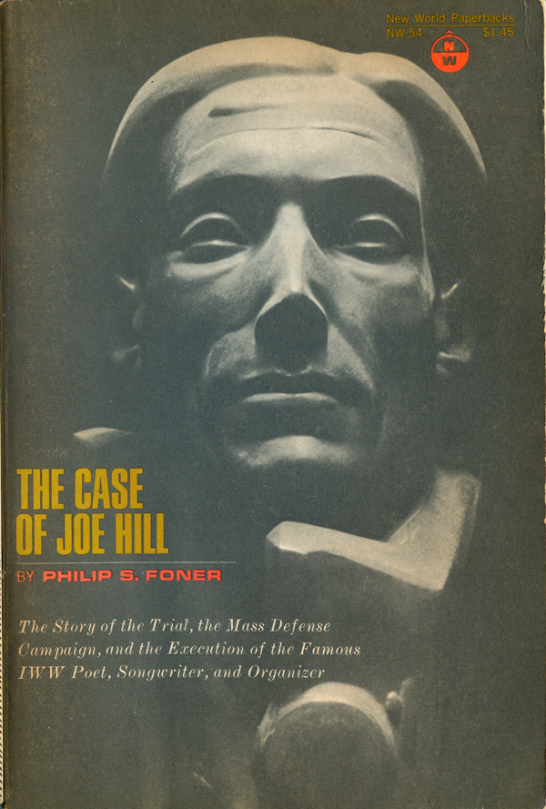
The cover of Philip Foner’s The Case of Joe Hill is troublesome for a whole different set of reasons. Hill was a musician, an agitator, a cartoonist, and all-around rabble rouser, yet the designer made a decision to not show Hill as any of these things, but instead as a statue. Stiff and dull, the statue (attributed on the back of the book as “Cover Portrait of Joe Hill by F. J. H.”—but it is unclear if F.J.H. made the sculpture or just photographed it) does nothing to communicate the liveliness of Hill. Rather, it looks like deathmask of nobility.

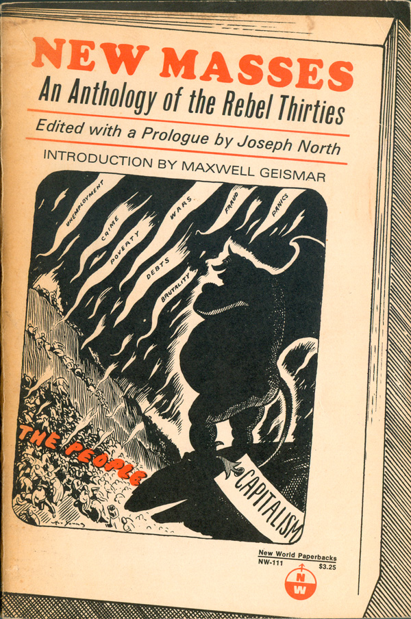
These last two books are fairly straight forward, both featuring old-school comics on their covers. The cover of the collection from the New Masses is pretty cool, the Art Young comic brought to life by the book-within-a-book framing, bringing the New Masses up to date for the underground comics age. The comic on The Bolshevik Revolution isn’t attributed, but the signature looks like it says “Ward,” so maybe it’s by the wordless book artist Lynd Ward.