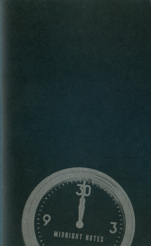
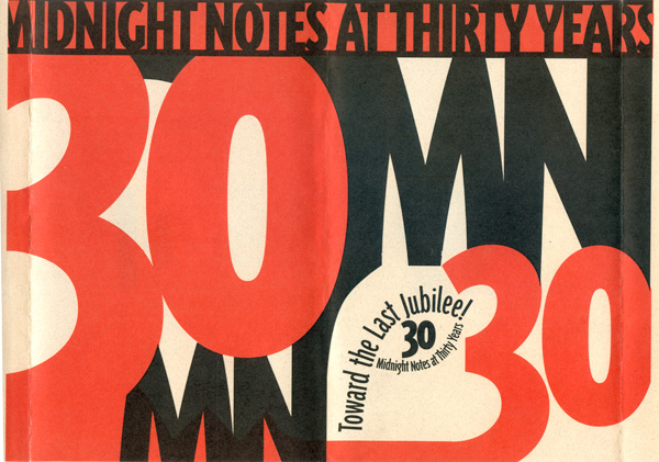
Welcome to part two of my series focused on the Portland, OR printer and publisher Eberhardt Press. Over the past 7 years Eberhardt has developed a series of signature stylistic flourishes that are often very effective design-wise, and highlight the synergy between content, design, and production that a joint designer/printer/publisher can bring to a book project. As an example, the Midnight Notes pamphlet, Towards the Last Jubilee! (to the right is the pamphlet cover below the dust jacket, which can be seen below) successfully pulls together Charles Overbeck’s (the principle behind Eberhardt) use of metallic inks on black paper, dust jackets on pamphlets, and strategic use of spot colors.
The dust jacket is a strong use of black and red, lots of negative space, and a type treatment that works graphically, references Modernism, but is also creative and a bit quirky in its own right. The text completely dominates the cover, wraps around from front to back, but the creative repetition of both “30” and “MN” allows for the jacket to work as a whole, or simply as a front cover. Below the dust jacket is a clock striking midnight, the silver on black evoking the shimmer of moonlight. But the clock isn’t ornate or romantic, it’s clean and utilitarian, midnight is a fact, not an event.
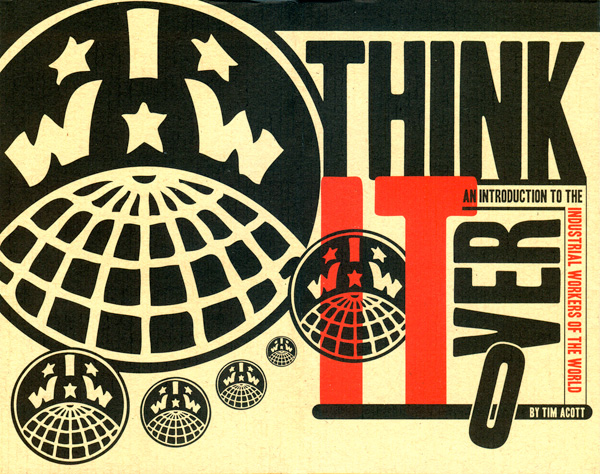
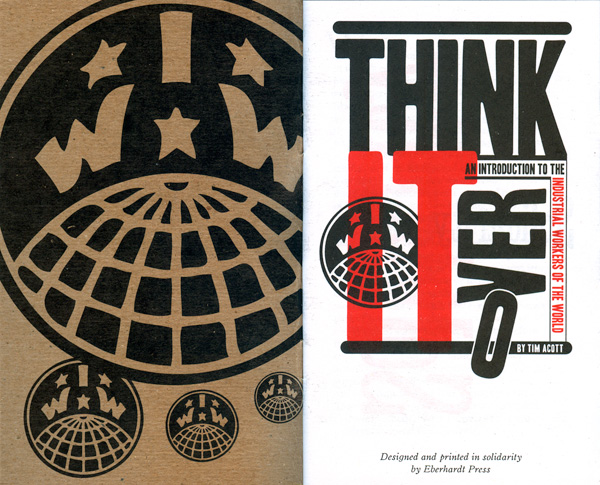
Possibly even more compelling is the Industrial Workers of the World pamphlet Think it Over, also published in 2010. Once again there is a dust jacket, black and red on an offwhite/tan paper. Once again the type acts at the primary graphic element on the front side of the jacket, a variation on Block Berthold, artfully arranged, angled, and overlapping with underlines and overlines, at once calling to mind both Constructivism and more German Modernist design. The “O” in over is falling out of the frame, highlighting the goal of the pamphlet to challenge people’s assumptions, and possibly even a tongue-in-cheek anarchist joke about breaking up the word “over,” as in power over.
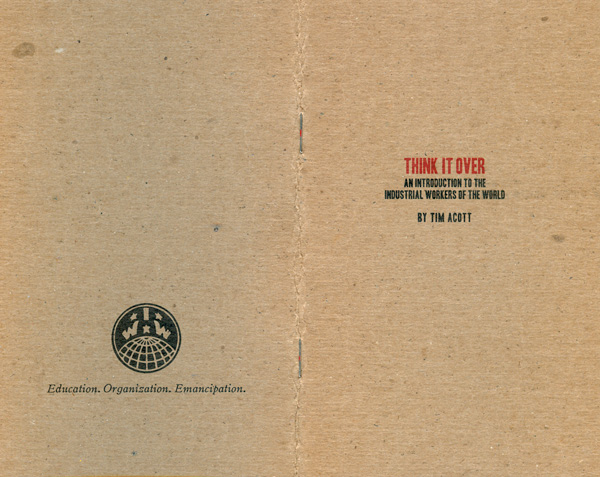
The cover below the dust jacket is black and red on chipboard, the paper stock something unique for Eberhardt but very effective in relation to the content and overall design concept. The rough cardstock and simple centered titling gives the booklet a real utilitarian feel underneath the lavish-seeming dust jacket. The inside printing on the cover is the opposite of subtle, with a giant IWW logo surrounded by smaller logos, facing a recap of the dustjacket cover as the frontispiece.
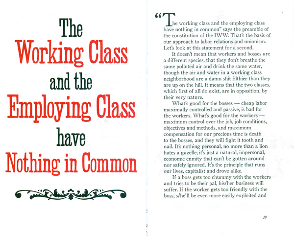
And you can tell from the sample spread (shown below the covers) that Charles didn’t skimp with the internal design and printing either, each section is begun with a black and red full page graphic, mostly type-based reworkings of labor slogans, with a couple additional illustrations. The type treatment harkens to the 19th century, but the layout of much of the titling is decidedly contemporary, both pulling the reader into past, and pulling the subject—the IWW—into the present.
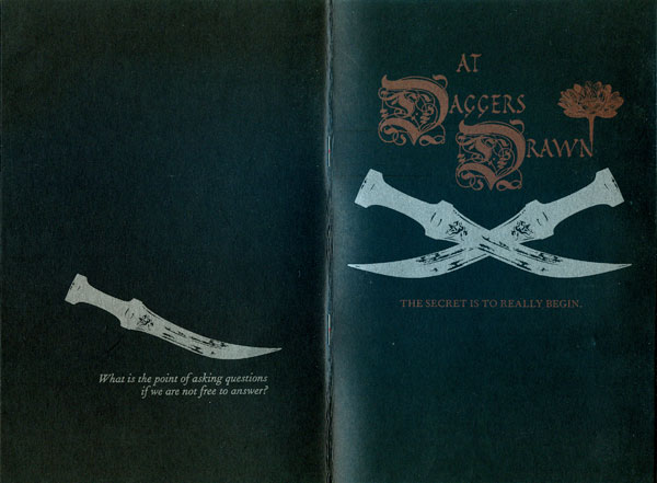
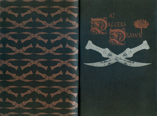
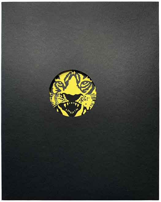
By far the most extreme use of metallic ink on black is Eberhardt’s 3rd printing of the At Daggers Drawn pamphlet. Not only the cover, but the entire publication is printed in metallic (mostly silver) on black paper! It makes for a beautiful object, the combination of the shimmering ink, the exotic daggers, and the ornate lettering. You can see from the inside cover and frontispiece spread (see the image after the cover below), the crossed daggers from the cover and reworked into a repeating pattern printed in bronze for the inside of the cover. Verging on orientalist, the entire design gives the publication an aura of mystery and otherness, which nicely echoes the insurrectionist philosophical ramblings of the text. Although a call to action, the work is rendered an object by the production process, possibly a parallel to how capitalist logic converts most political theory into an academic pursuit, divorcing it from everyday life.
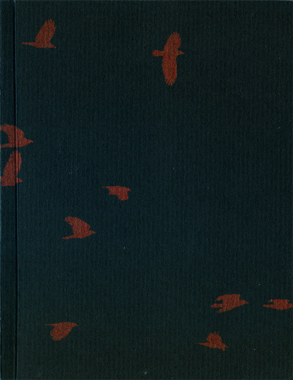
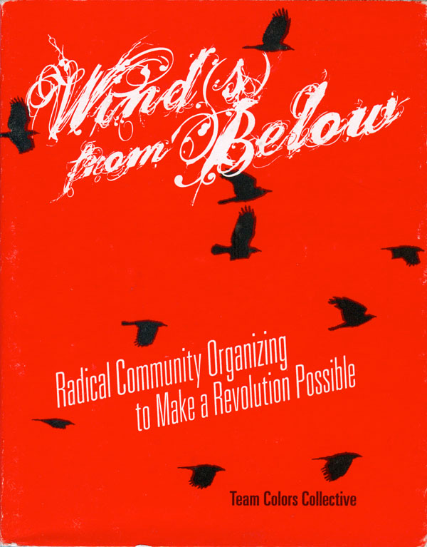
2010 was a busy year for Eberhardt. Charles also designed and printed a booklet for Team Colors, Winds from Below. Once again we have a dust jacket, and black and red spot printing. The cover on the dust jacket (to the right, below) is most reminiscent of the Swift Winds cover (see last week’s post). A solid color, in this case red, with text in white (the paper color) and sparse imagery in black. The flock of birds first seen on the No Hope cover also show up here again. The type-treatment on the title is a bit ornate for my taste, but the rest of the cover is so clean that it works, and the tall, tilted sans serif of the subtitle is strong. Under the dust jacket, on the cover proper (below to the right) we’ve got printing on black again, this time a metallic red. The birds don’t pop as much as they could, but it actually makes for a nice subtle image.
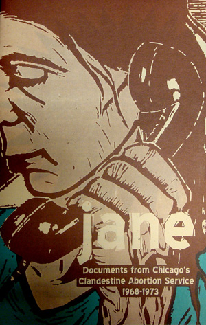
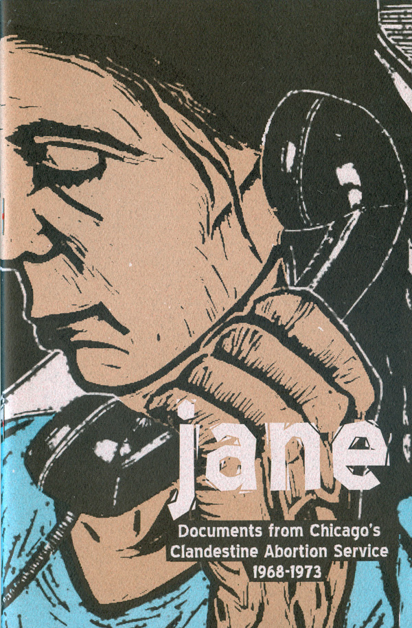
Returning to another of Eberhardt’s focuses, below is the third pamphlet produced around the issue of women’s reproductive rights. Originally produced by Firestarter Press, an anarchist project that created a large number of pamphlets reproduced via photocopier, Eberhardt has teamed up with Radix Press and produced three different reprint editions of Jane: Documents from Chicago’s Clandestine Abortion Service. Much less designed than many of the other booklets, Jane is a fairly simple production, a close-up of Meredith Stern’s image for her Jane Celebrate People’s History with basic text laid on top. The first couple printings were done in 2 color (brown and blue, see below left), and the more recent 3rd printing is a three color job, with black added to trap the image and make it stand out more. Overall both work as covers, I like the cropped image, but I’m not convinced by the font choice.
Once again, you can read more about Eberhardt and order/download some of these titles HERE.


Nice article, thanks for the information.
Eberhardt’s design work is is really strong. I gravitate to simple, 2-3 color design work and this is some of my favorite work that you have profiled thus far. Good to see the constructivist influence at work.