This week I’m looking at the final bits and pieces from Eberhardt Press. I’ve got a couple book and pamphlet covers here, and some things Eberhardt printed but didn’t design. Also, over the past couple years I’ve collected a bunch of other Eberhardt printed ephemera which I’ve included.
No printer in the U.S. can survive on printing political books and pamphlets alone. The way Eberhardt has dealt with this problem is two-fold. Charles does a lot of “job work” or printing for other people, to make ends meet, and has been lucky enough to carve out a very diverse client base which produces much that he is at least sympathetic to. He regularly prints for Microcosm Publishing, he has printed or helped print the magazine Communicating Vessels, he prints Anarchy Magazine for Ardent Press, and he has done a lot of printing for us here at Justseeds, including the calendar we co-published with AK Press and our yearly organizer.
In addition to the job work, Charles designs and prints a wide array of notebooks and cards which he sells. His design aesthetic is strong and unique, a combination of Victorian figures in action (with a steam-punk-y vibe) and naturalistic, graphic representations of animals. The notebook cover to the above left is a good example, a 19th century man experimenting with a light-bulb helmet!
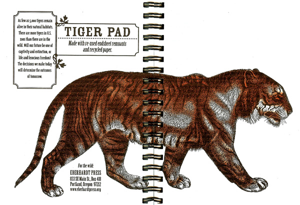
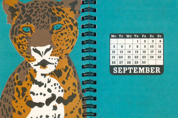
Below is representative of the animal pads and notebooks. The spot-colored tiger strides from back to cover across the binding, the paper is earthy, and the design strong but subdued. The titles are usually in Rosewood Fill, a popular Eberhard font (see the Os Cangaceiros books two weeks ago). The animals are attractive, and double as a environmental political statement.
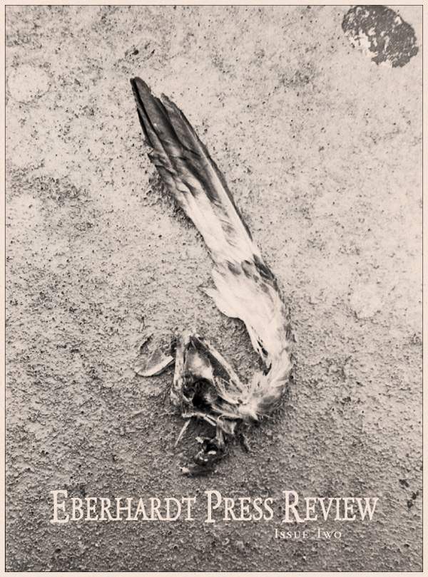
For a brief time five years back Eberhardt attempted to put out a house journal, the Eberhardt Press Review. Two issues were produced, cleanly designed and containing atmospheric photography, short articles, and reviews of political publications. Compared to much of the publishing output, these are modest and restrained, printed in only one color (black) with few frills.

I had originally thought Fire to the Powderkeg had been the first book Eberhardt had printed, but I noticed a claim elsewhere that Shon Meckfessel’s Suffled How It Gush was their first book. It is definitely possible, as Suffled is a real outlier design-wise. Rather being a small or unique size, it is a standard trade paperback, and the cover is 4-color process, the only use of CMYK I’ve seen on an item published by Eberhardt. In addition, the font is not from the usual stable, although the angling of the title and the extensive use of this more-decorative font on the inside seems like something Charles might design. I’ll have to ask what the order of printing was.
I do know from talking to Charles a couple weeks ago that the first pamphlet he printed was Fredy Perlman’s Progress and Nuclear Power. This is a tiny little booklet, 3 inches tall, printed on a single sheet and cut down multiple times. Although the idea is simple, the actual production is quite labor-intensive, with lots of cuts. Each mini-booklet is hand-sewn together for binding. The cover design is quite simple- straight text, Badhouse font, in white on top of a dark image of a nuclear explosion.


A couple more books and pamphlets: Taylor Sparrow’s “A Problem of Memory” has one of the most complicated covers Eberhardt has done, a collage of two images. On top is a photo of a wrecked New Orleans house rendered in blue, green, and black, creating a sickly mirror of a full color CMYK image. Below is an old engraving of a slave revolt, made even more graphic by being flattened as black on a field of green. A tear with the subtitle separates the 2 images, and the title is laid on top of both in giant white serifed lowercase. There is a lot going on here, which is interesting but challenging for a viewer. When studied, I can see the connections being made to the history of slavery and current events such as the abandonment of New Orleans, as well as the more activist message that possibly the response necessary for a situation like Katrina is something akin to the slave revolts of the past. This is a lot to try to cram onto a cover, and I appreciate the ambition but wonder how it is read by people that simply give it a quick look on a shelf at a friends or a table at a bookstore? The blue, green, and black also take on a certain similar shade, so at a glance the cover really flattens out, with all the colors, images, and text competing for your eye, none of them strong enough to command it.
A simple and stunning printing of Isabelle Eberhardt’s Criminal (the press’s namesake) is the exact opposite. Nothing clutters the cover, a basic gold title and blade grace the black page. The simplicity is exciting and inviting, cajoling the reader to open the page and become a conspirator, to embrace the “criminal.” The insides are also seductive, a rich brown ink on tan paper, with attractive decorative edges on each page.


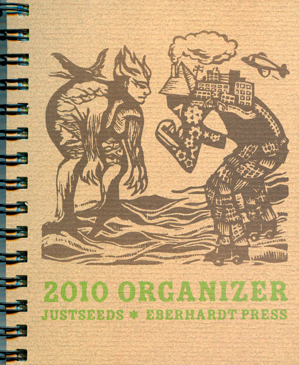
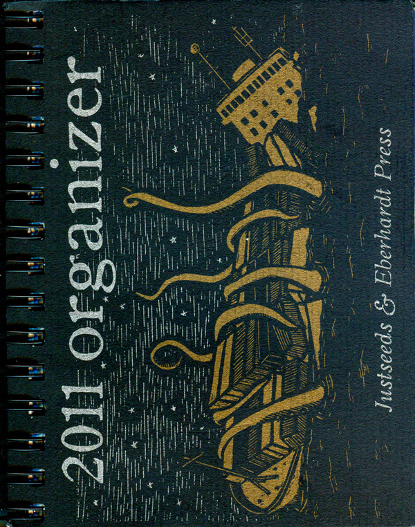
For the past couple years Roger Peet from Justseeds has been working with Charles at Eberhardt to create solidly produced and easy to use pocket datebooks/organizers. Roger chooses the artwork from a broad range of Justseeds artists, and Charles color-separates it and fits it into a more comprehensive design. The 2010 edition was an experiment (below to the right), printed in a small run, but was so successful they doubled the print run and really stepped up their game on the 2011 edition. For 2011 we see the cover sporting classic Eberhardt metallic on black printing, and the insides are much more lavish, 2 to 4 color spot jobs for double-page spread intros to each month. Roger and Charles are already working on the 2012 edition, which should be phenomenal. You can still pick up a version of the 2011 one HERE.
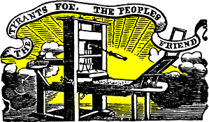
Here are a couple of the graphics and logos that Eberhardt has been using since the beginning. The burning book is the main logo, and shows up on most of the publications. The image of the press has been used on many price sheets, flyers, and catalogs. I’m not sure of its origin.
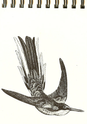
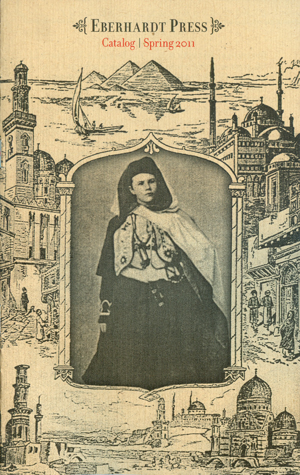
And some last bits: another animal pad, this one a humingbird, and then the cover of the 2011 Eberhardt Catalog, an image of Isabelle Eberhardt ensconced in orientalist framing with a small bit of red spot-color text popping off at the top.