OK, I couldn’t help myself. Even though I went through the eight Boni Paper Books I actually have over the past two weeks (HERE and HERE), I started getting so curious about what the others looked like that I tracked down (online) covers for a bunch of them. Few of the images are as nice as my scans, and I don’t have any of the back covers or endpapers, but here are some of the other Boni covers. Where possible I’ve attributed the designer (unfortunately not very often).
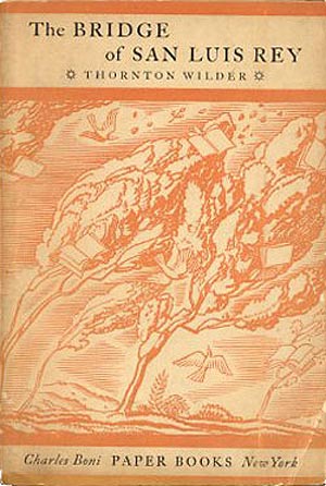
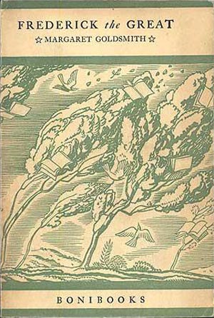
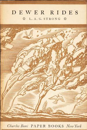
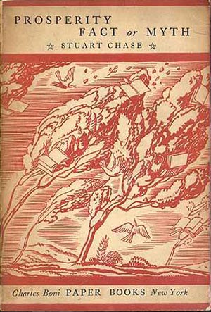
It turns out that the first five books in the Paper Books series all share the same basic cover design by Rockwell Kent (see JBbTC 85), printed in various colors. I assume that since the books were largely sold via a book club subscription service through the mail, it was initially thought that the covers were more important as a marker of the series than as a unique representation of the books contents. Since the series was launched just as the Great Depression was hitting hardest, it did not sell as well as the Bonis had hoped, so I suspect that caused the shift after Stuart Chase’s Prosperity: Fact or Myth to individual and unique covers. These appear to have first been all illustrated by Rockwell Kent again, but then were spread out to a wider array of illustrators. Below is Thornton Wilder’s The Bridge of San Luis Rey, the first “test” Paper Book printed in May 1929 that set the style for the rest of the series. After Wilder are three of the initial four books printed in the official series (numbers 2-4, all from 1929—number 1, The Golden Wind, I featured a couple weeks back).
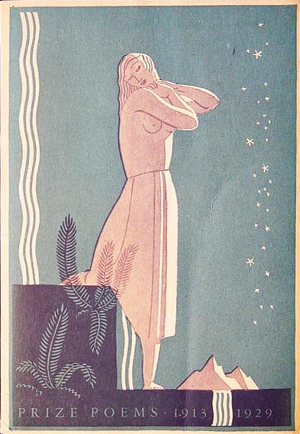
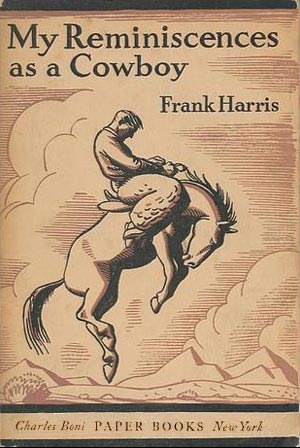
Deneys Reitz’s Commando was the first book in 1930, and the first to feature a unique Rockwell Kent cover (see HERE), below is Frank Harris’s My Reminiscences as a Cowboy (February 1930), which supposedly is illustrated by William Gropper, but the cover is so Kent-like, I wonder if Gropper did internal illustrations. Next was the anthology Prize Poems, 1913-1929, edited by Charles A. Wagner (April 1930). This cover is Kent at his finest, and high American Deco. The merging of figure, objects, and design elements is inspired, and the spot color printing and overprint pushes the overall cover into the sublime. I like it so much I featured it up top.
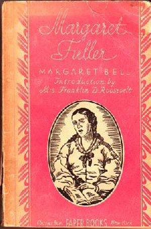
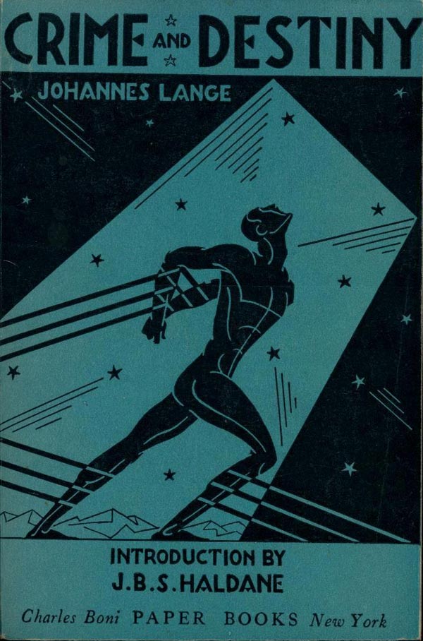
Margaret Bell’s Margaret Fuller (August 1930) falls on the other end of the covers, the pattern seeming uninspired, the color scheme a little quesy, and the illustration overdrawn. Johannes Lange’s Crime and Destiny (1930, must be November or December, and one of the last actual “Paper Books”) is a return to the strength of the series, a Metropolis-esque Deco hero being held back from his launch into space by ropes. This could be another Rockwell Kent cover, but may also be illustrated by John Barbour, who did the covers for some of the later Paper Books.
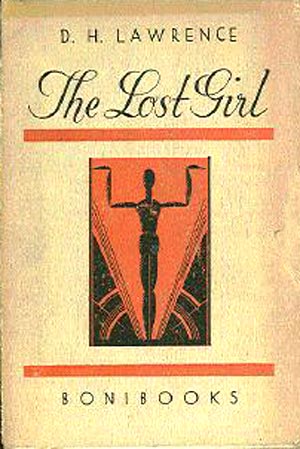
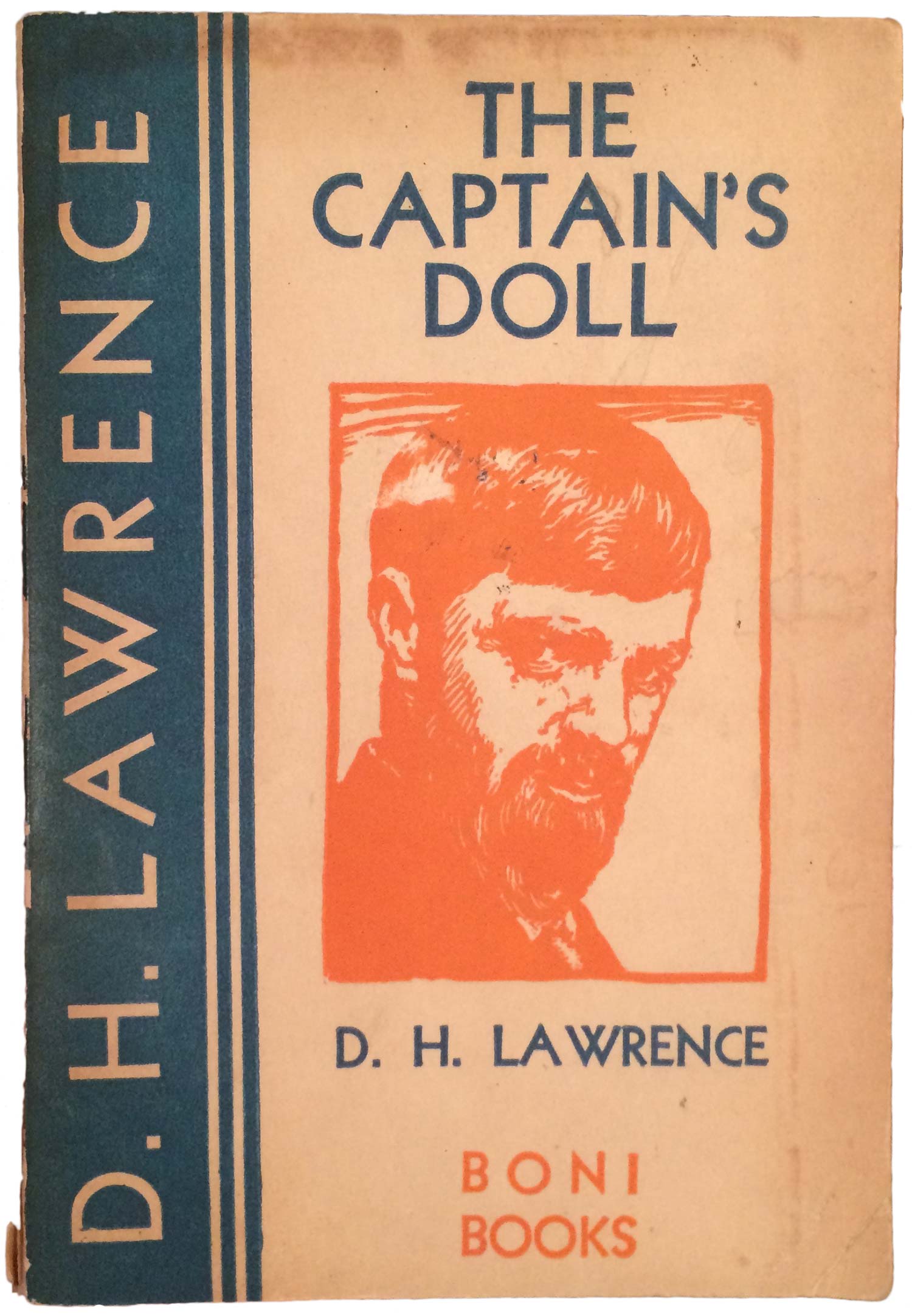
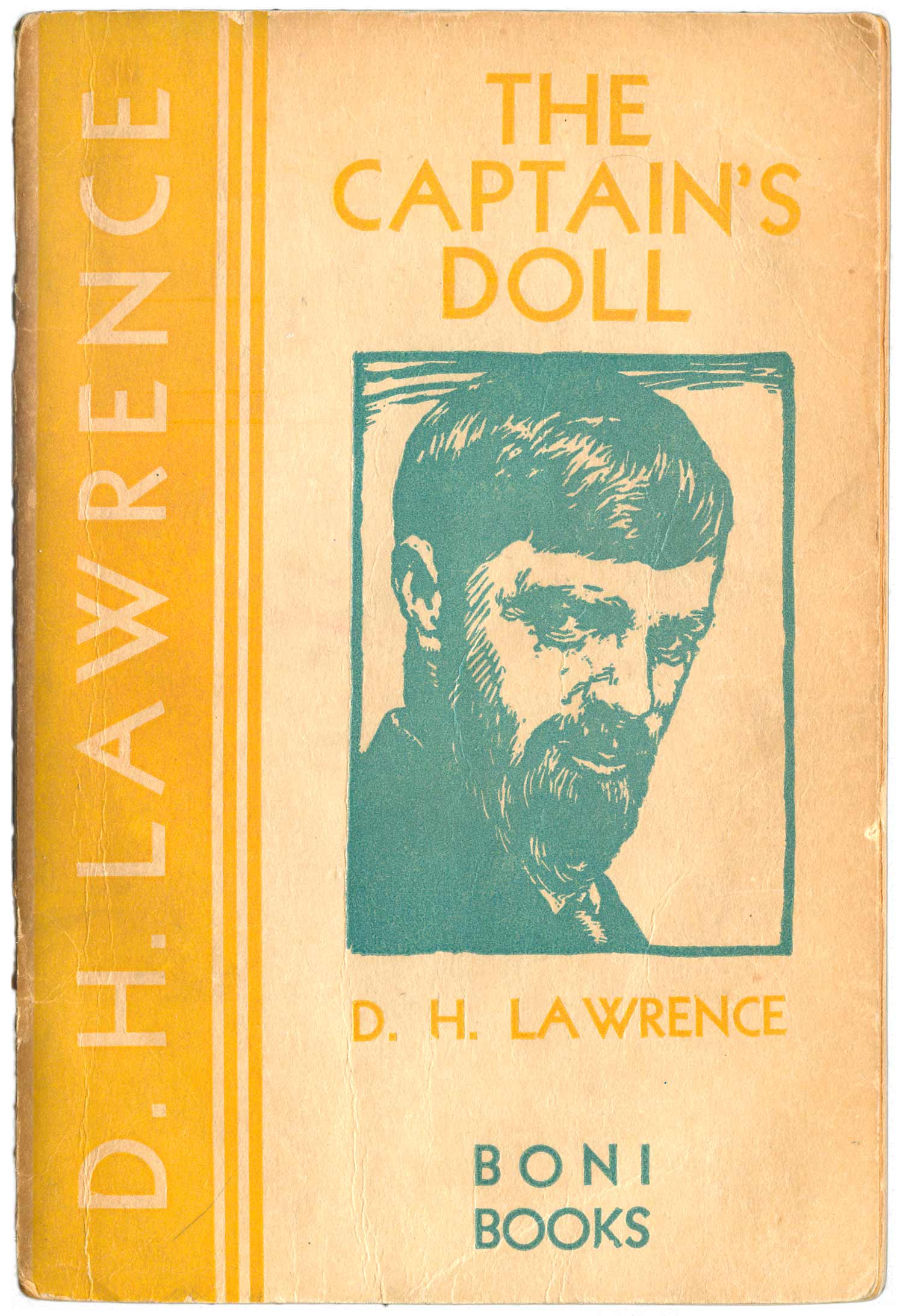
While the Paper Books series was running, Boni decided to print a series of their more popular hardcover books as inexpensive (50¢) paperbacks. Here are two different D.H. Lawrence books that are part of this Boni “paperback reprints” series. Lost Girl (1930) has it’s own unique, and very Deco, design, while The Captain’s Doll (1930—blue & orange cover/1931—yellow & blue cover) shares the same cover design style with the Boni hardcover Lawrence editions. The illustrator is uncredited, but the overall design seems likely done by Kent, again.
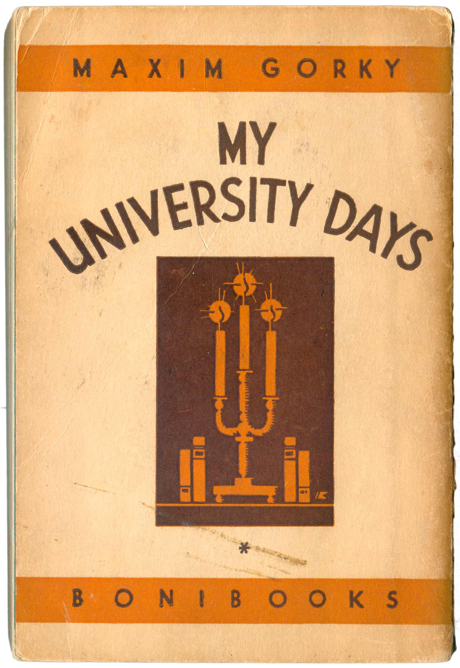
One of the nicer of these editions is Maxim Gorky’s My University Days (1930). The covers on many of these titles, including this one, are identical front and back. An interesting design choice, which seems likely rooted in the idea that these titles have proven themselves as hardbacks, so there is no need to advertise the content beyond the cover image.
Below are four more of the Boni paper reprints, all of these are listed as forthcoming on the backpage of Margaret Sperry’s Sun Way (see HERE) While the books are diverse in subject, ranging from fiction to history to criticism, in cover style they share a similar range as the Paper Books series, variations on 1920s modernist design.
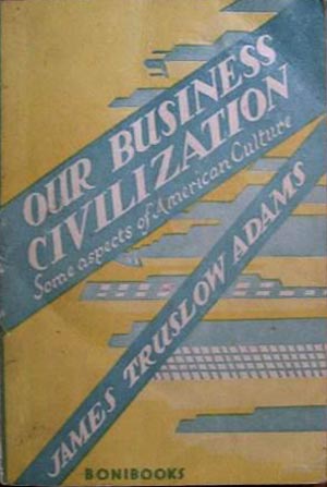
The cover for James Truslow Adams’s Our Business Civilization (1930) appears strange at first, it is only after I let my eyes be dragged to the top right corner by the titles and then resettle over the image that I start to see the cityscape turned on it’s side. Because I don’t really know what the content of the book is, I can see this shift of perspective going a long way to either (a) unsettle assumptions about business in this country, or (b) articulate skyscrapers as fundamental steps, or blocks, that lead up to our “civilization”—two very different conclusions. The light blue, yellow, and white are bold color choices, ones I can hardly imagine a publisher making today.
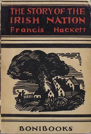
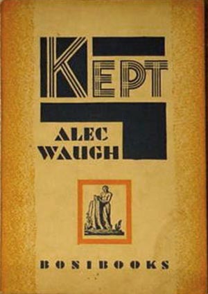
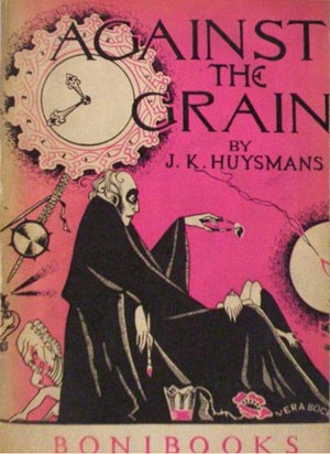
I believe the chunky block print cover illustration on Francis Hackett’s The Story of the Irish Nation (1930) is by Harold Toksvig. It is a nice image, but overall reads as a fairly conservative cover. Alec Waugh’s Kept (1931) has fabulous type treatment, the black blocks and maze-like letter forms graphically illustrating the title, but the image seems strange, why paste the Boni logo in the middle on the cover with an orange box around it? This is the only cover like this I’ve seen, so it doesn’t appear to be any sort of house style. J.K. Huysman’s Against the Grain (1931) is definitely the most “far out” of the covers. The illustration is both Gothic and cartoon-y—it seems to presage Tim Burton—and the pink and black color scheme add to the strangeness.
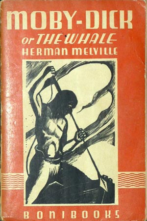
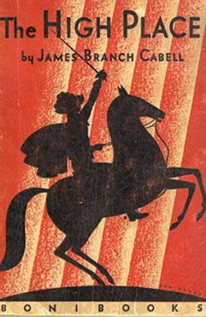
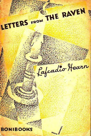
And here are a handful more Boni paperbacks from the early 1930s. None of these are listed in any of the books I actually have, so I am unsure how they fit into the Paper Books and reprints series’. These include Herman Melville’s classic Moby Dick (Boni edition, 1931), with woodcuts by Harvard Simon—including one on the cover, which features the print wrapped in a clean, yet sumptuous orange and white decorative frame with title. For the last couple, the Lafcadio Hearn (1931) cover is by Hugh Donnell, but is also immediately forgettable, and I can’t read the name of the illustrator on Cabell’s The High Place (1931), but it may actually be by Donnell, and is similarly generic, if a bit stronger.
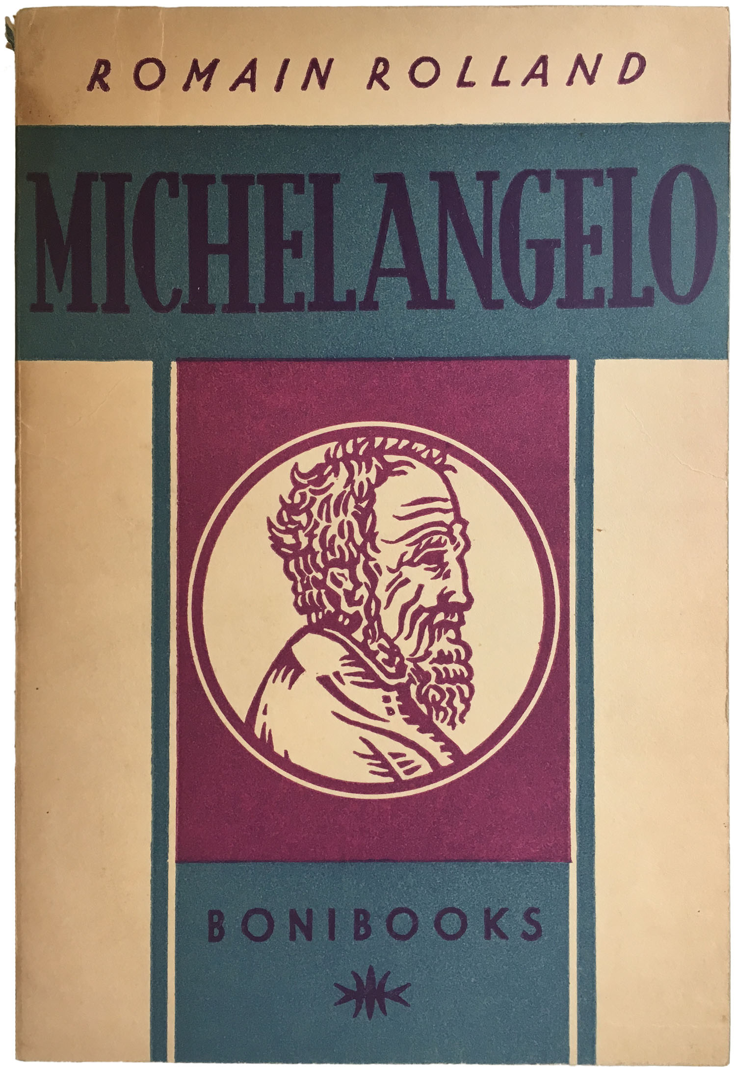
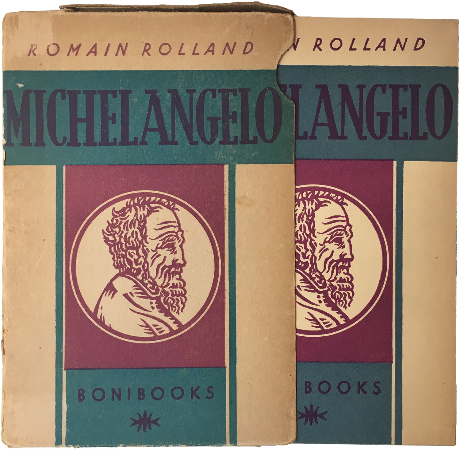
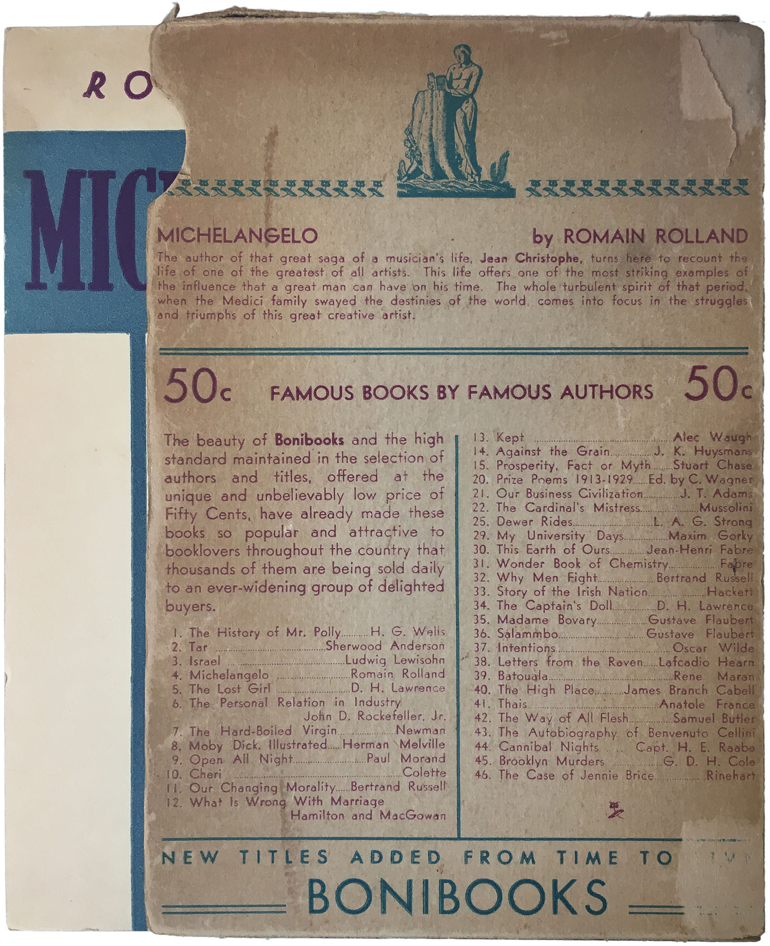
Rolland’s Michelangelo (1931) also has a classic look, and has a similar feel to what Penguin would later create with their classics series. The blue and purple are interesting colors, but not overpowering, the title is tall and serifed, but not generic, and the italicization of the author’s name gives the cover just enough motion to escape a sense of static. I recently found a copy of this book that was housed in a cardboard slip case, which featured the cover on the front and a promotion for Boni Books on the back.
