Last year I worked on creating a logo and graphics for a group in Belgium. The group, LABO, in their introductory email described themselves like this: We are mainly going to give emancipatory workshops, using tools coming from Freire’s Popular Education and Boal’s Theater of the Oppressed. Our organisation is called “LABO”, which is a letter word meaning in Dutch “Learning, Agitating, Moving, Organising” but at the same time the name illustrates how we consider ourselves as a social laboratory.
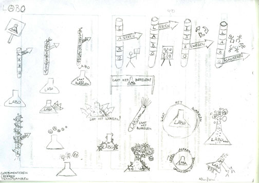
They gave some loose outlines of what they had in mind (images of chemistry, but also trying to incorporate the ideas of learning, agitating, organizing, and moving). I think they also asked for something not too militant looking (no guns) and no black-n-red color schemes. My initial sketches were pretty basic:

These I developed a little further and then sent them some rough ideas:
Though we had agreed on a chemistry motif, I still kept trying to soften it a little using natural elements. There’s a Marx quote I like: In history as in nature, decay is the laboratory of life. From that quote I put the name LABO superimposed on autumn leaves. But the winners for them were the simple beakers.
They sent me back some of their ideas, most of which I tried to adapt but most of them didn’t work out. Here’s a return sketch from them:
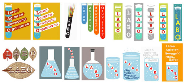
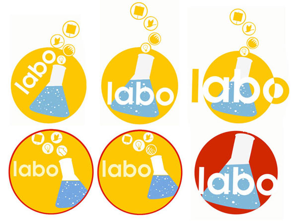
We agreed to move forward using the conical bottle. I also decided to work within a circular format. Now that I think about it, of the three logos I made last spring I designed them all with circles in mind (some primal urge towards roundness as I trudged through the straight lines of nursing school and NCLEX preparation?). I still kept thinking of incorporating ‘nature’, so I drew a beaker made of ivy and another where the name LABO was superimposed on a flock of geese, neither of which went anywhere further.

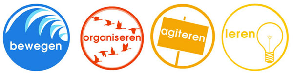
I was also trying to figure out how to incorporate symbols representing learning, agitating, moving, and organizing into the overall symbol. Here were some rough ideas for how those could be represented:
And here were some ideas of the symbols in the overall design:
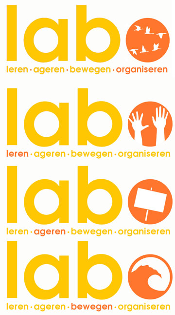
Feeling pretty settled on a design and font, we worked on color choices:
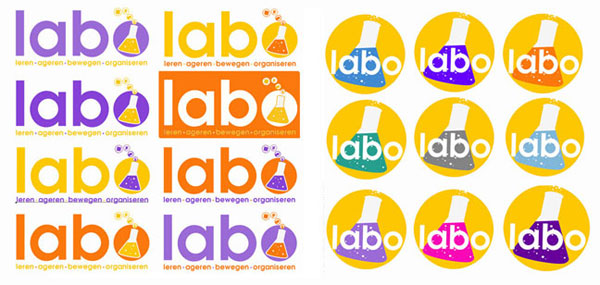
They chose an orange and a purple. So here we have, finally, the finished results:
LABO vzw is active in Belgium… check them out here: http://labovzw.be