Welcome to the second week of my Ben Shahn book cover posts. You can check out week one, my stroll through the covers Shahn designed in the 1950s and 60s for Vintage and Doubleday, HERE. I must admit, although I’ve got a baker’s dozen covers here this week, there easy to run through, as all of them are from the 1970s, after Shahn died (in 1969). So none of these are total designs created by Shahn, or even illustrations made for these titles, but other designers re-purposing existing illustrations. Not that anyone is complaining, Penguin have been the masters of this—giving old works of art new life as cover illustrations.
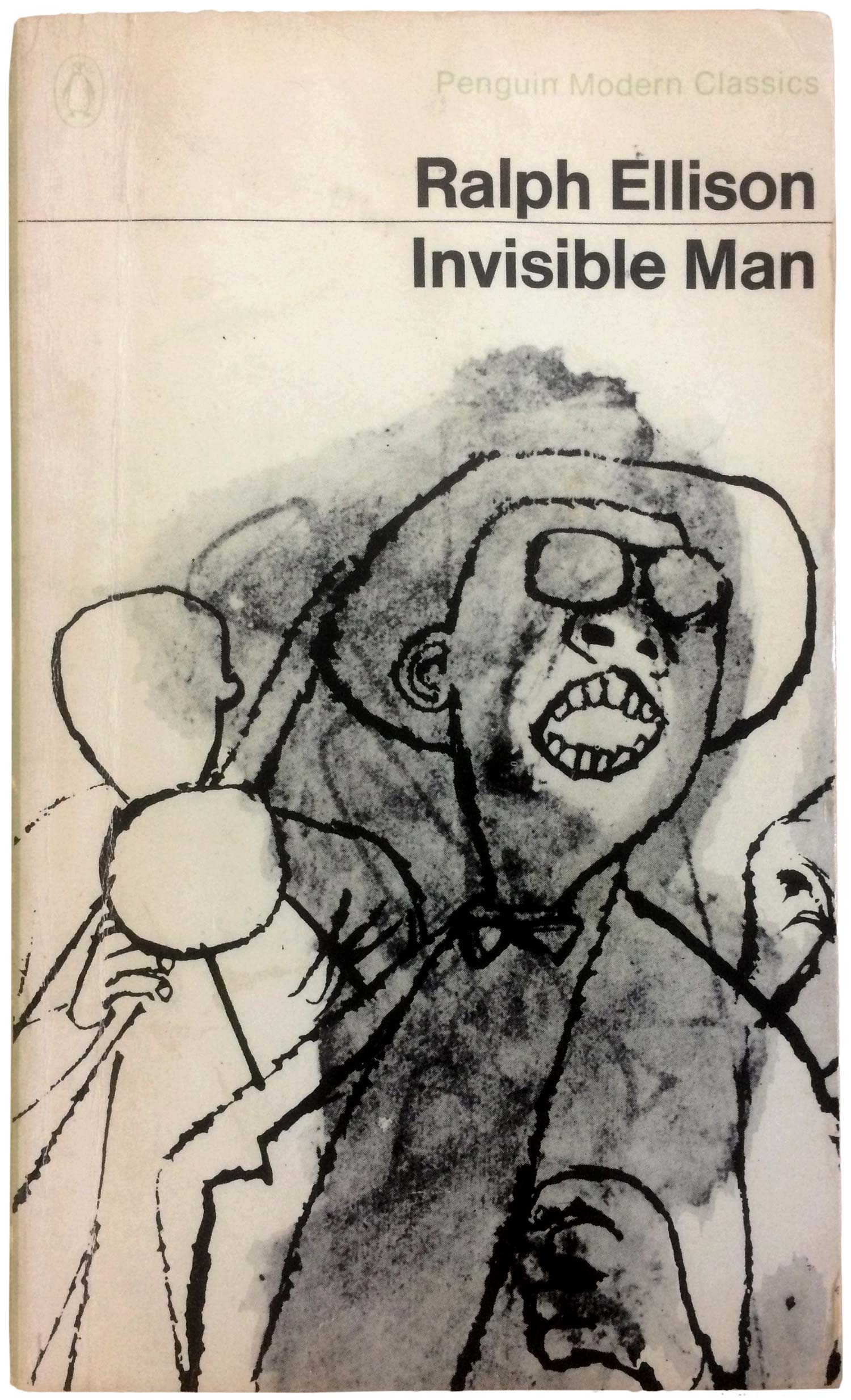
Case in point is the design above. The back cover states that image was originally part of a suite of illustrations created by Shahn for the film Ambassador Satchmo. It’s strange, I can find evidence of albums and books by that title, but no film. Other drawings in the series are published in collections of Shahn’s work, and the images are credited as commissioned for the film by Edward R. Murrow and Fred W. Friendly in 1956 . Regardless the original intention of the image, it is brilliantly used here. The trumpet that appears to have been painted then washed out in the background captures a sense of Ellison’s theme of erasure. The decision to place the Penguin logo and series name in light, light green on white, so that it almost disappears from the visual field, does a similar magic, creating an overall sense of struggle between presence and absence while simultaneously taking advantage of how striking the illustration is. It makes the image new, giving the impression that it was created for this purpose. Smart, smart cover.
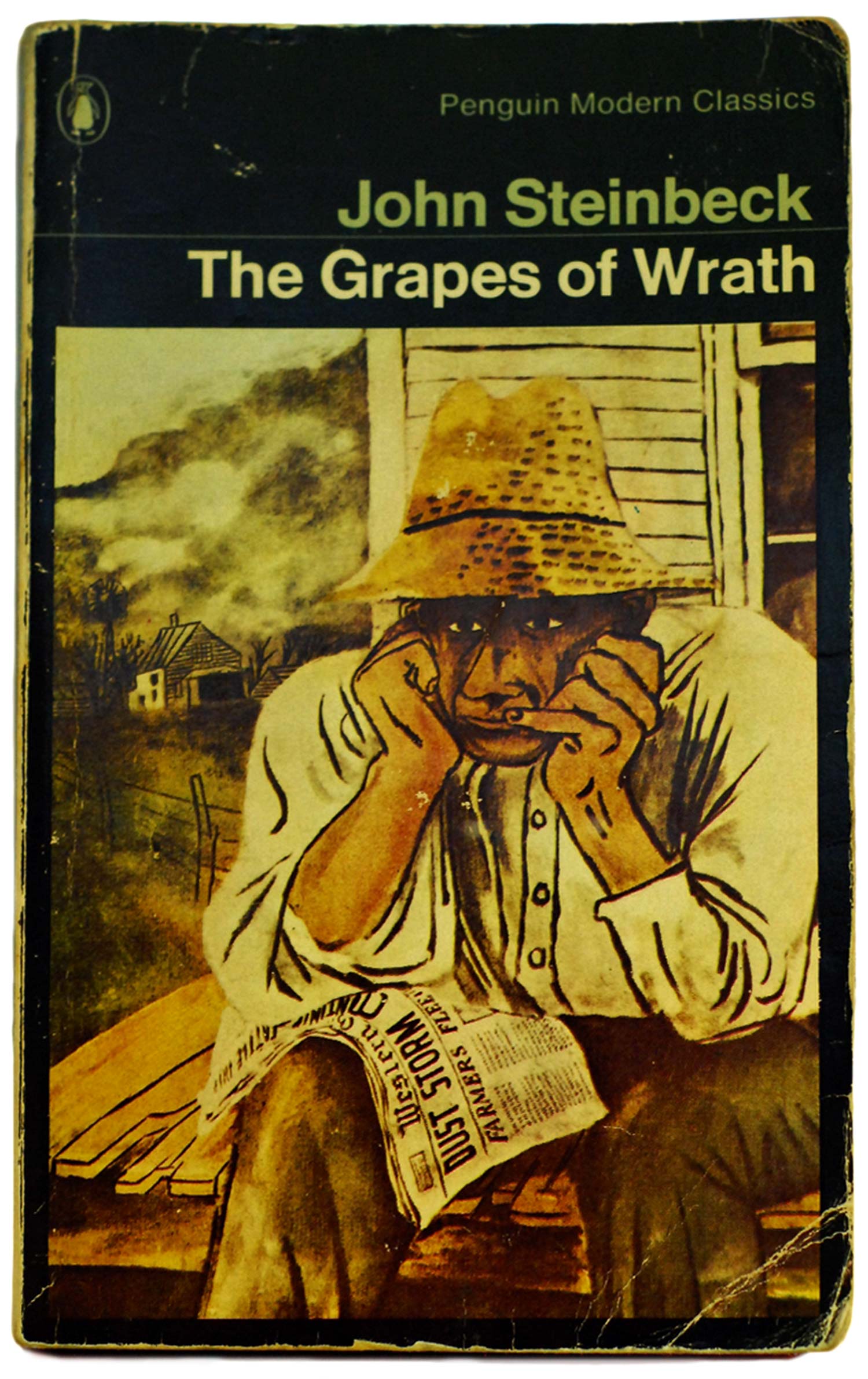
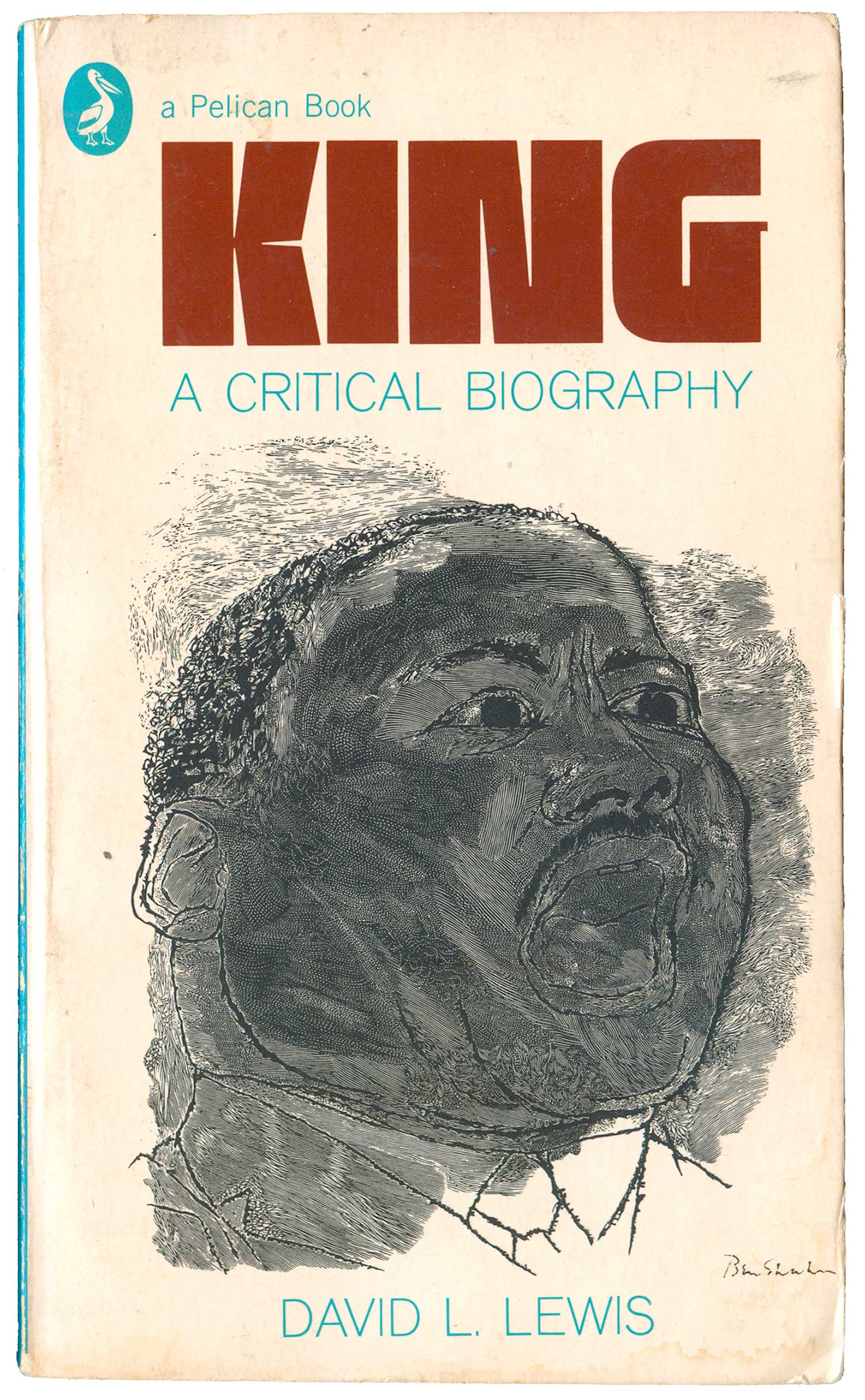
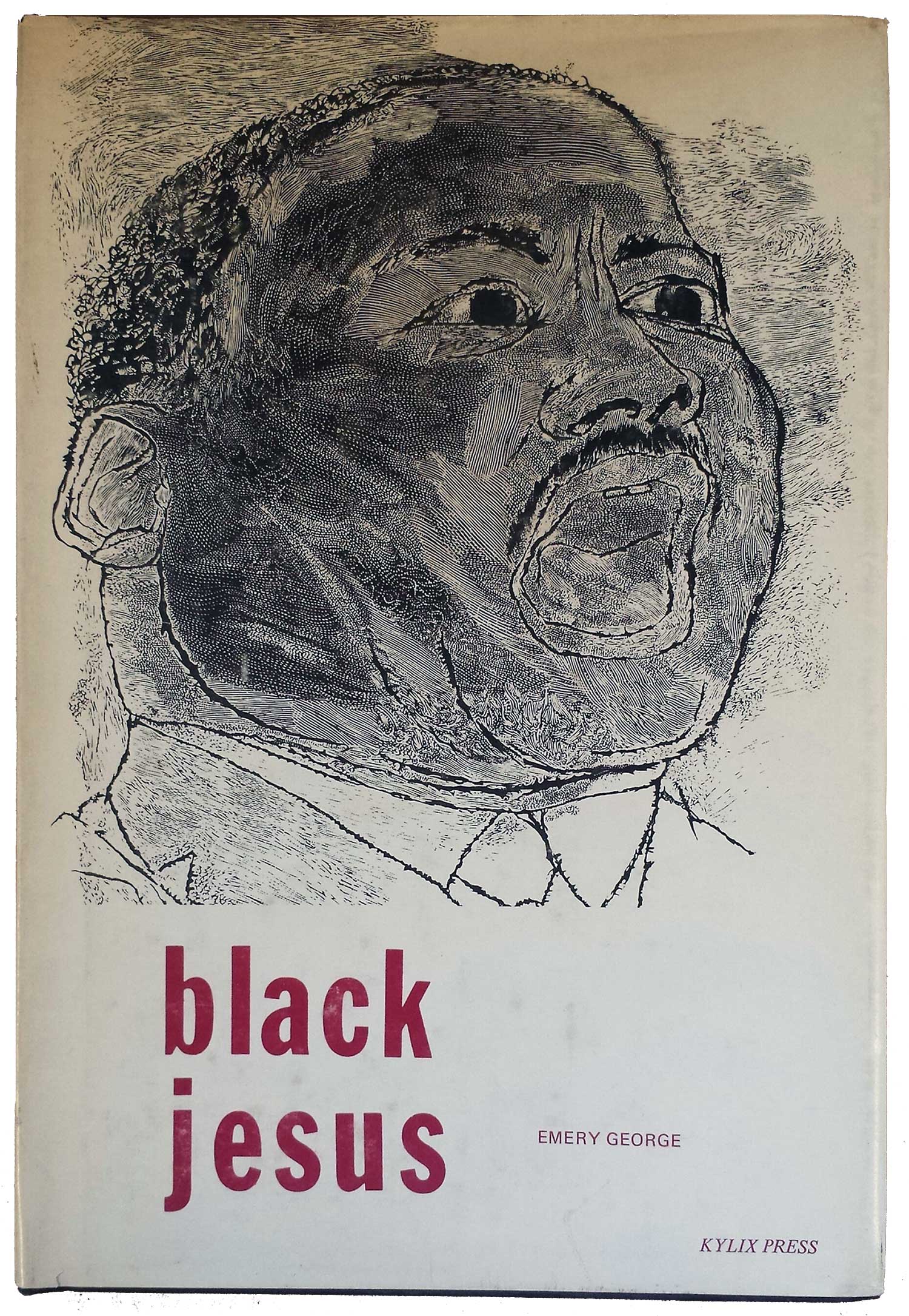
Not sure the same can be said for the use of Shahn on the edition of the Grapes of Wrath below. The image is from a painting Shahn did for a 1937 WPA poster, but here, framed in black, it feels heavy and diminished. Maybe that’s appropriate for the book in some ways, but it still seems an opportunity wasted. The same might be said for the use of Shahn’s 1966 wood engraving portrait of Dr. Martin Luther King, Jr. on the cover of David L. Lewis’ biography. The portrait comes from a stunning print, but much of the detail and texture are too crammed here to get a real sense of. And the giant, heavy word KING, while ostensibly useful for selling the book, feels redundant. The portrait itself tells us what the book is about, we don’t need his name screamed at us as well. In comparison, the print is better used on the cover of Black Jesus (Kylix Press, 1974), where it is given primary billing, and more space to breath. The design still isn’t great, the titling is awkward and adrift on the bottom of the page, but at least the image is bold and appears to be breaking free of the limitations of the cover.
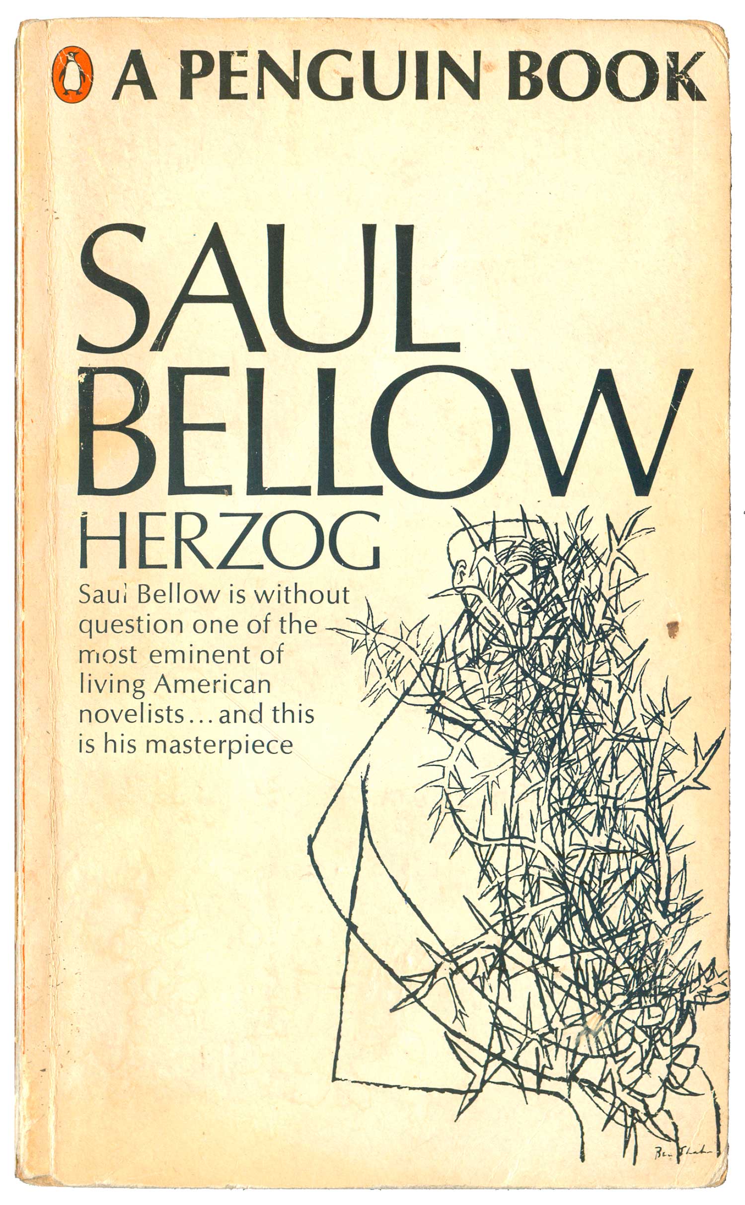
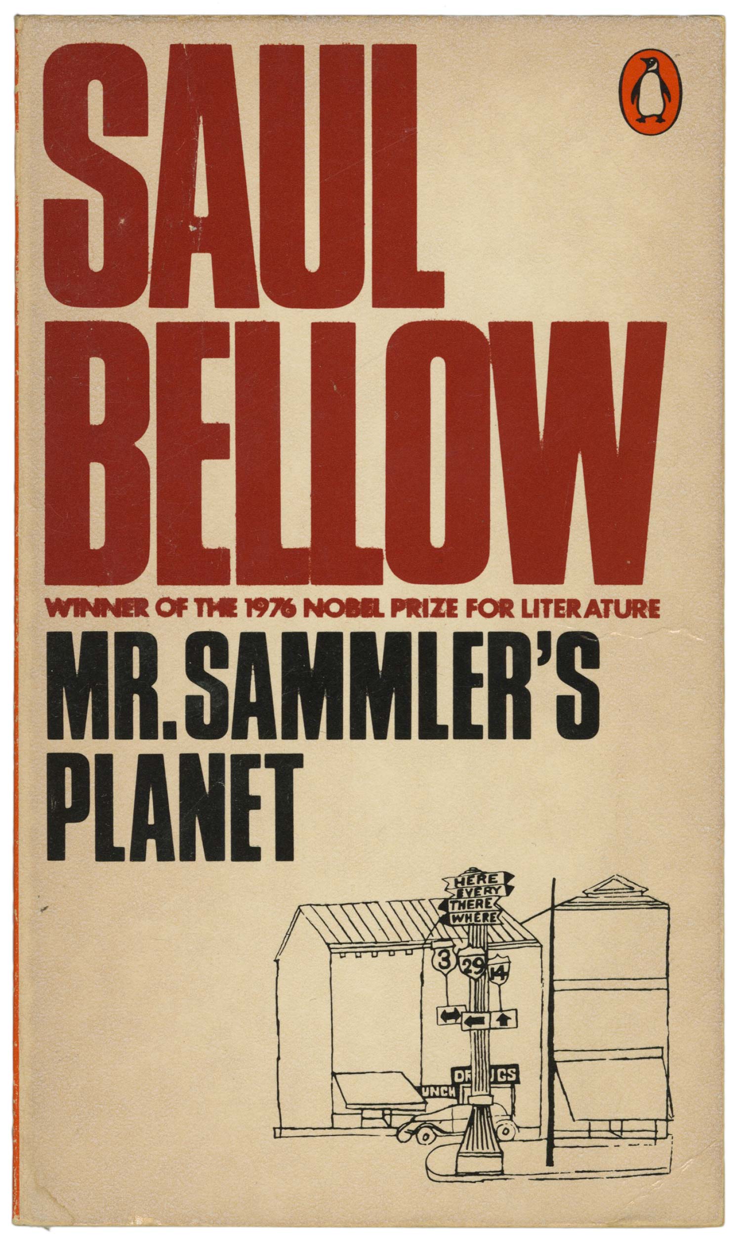
The majority of Shahn imagery Penguin used appears to be for their redesign of the entire Saul Bellow library in 1967 and 68. Although Shahn didn’t die until 1969, I doubt any of the imagery was made specifically for the Bellow covers, as most of it appears to be derived from drawings Shahn did in the 50s. The two covers below, for Mr. Sammler’s Planet and Herzog, are good examples of how the original design looked. The Shahn drawings took up around 1/2 the cover real estate, with title and author filling the other half in a large point semi-serif. This works, although the type and image feel too equally weighted, so they compete for attention.
I’m not sure where the image on the cover of Mr. Sammler’s Planet comes from, but the one on Herzog is a well-known drawing from 1954 called Blind Botanist. I’ve never actually read any Bellow, so I can’t speak to the relationship between content and image, but both illustrations are striking and handsome.
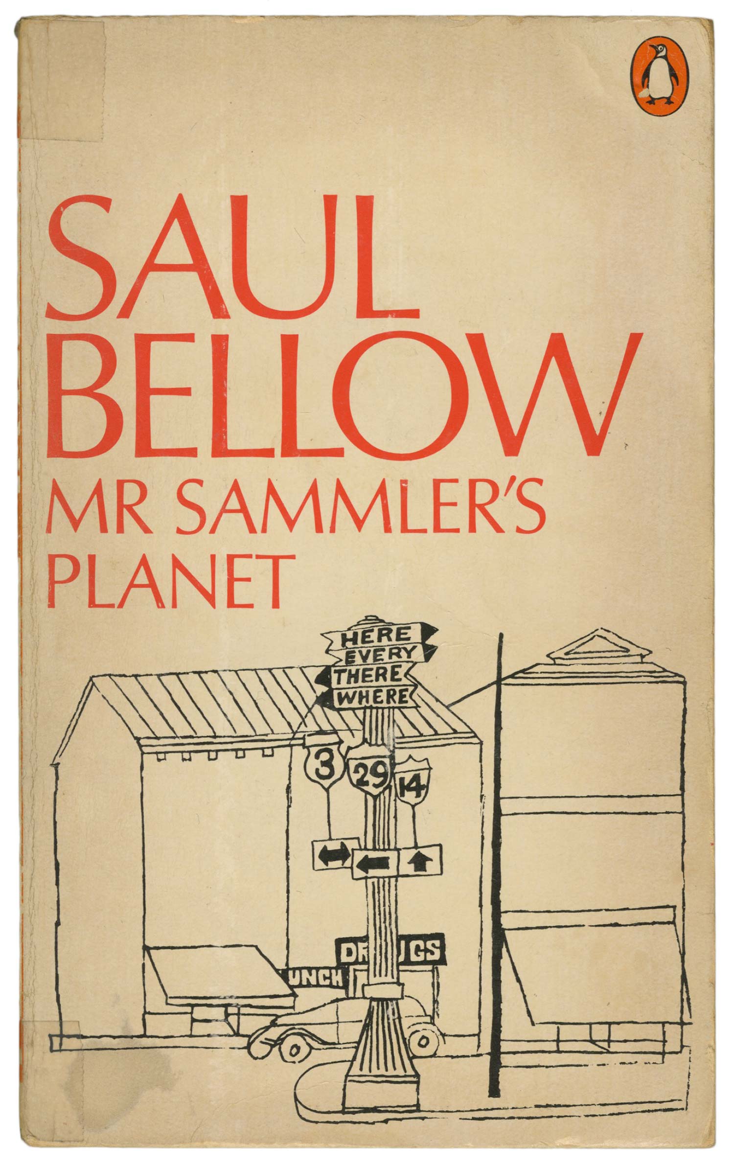
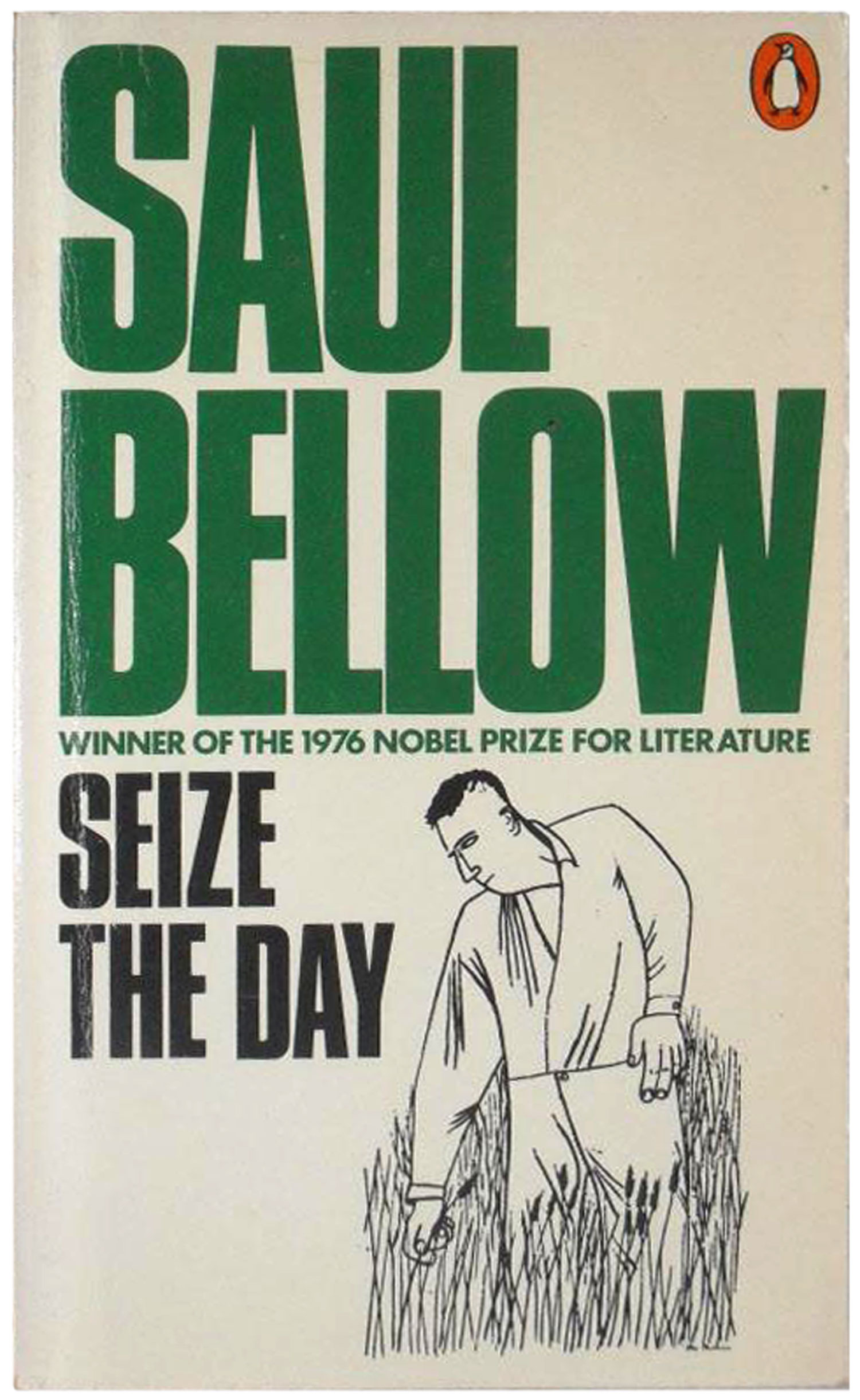
About a decade later Penguin did another redesign of all the Bellow titles. They kept the Shahn imagery, but shrunk it down, making it subservient to new massive, and colorful, titling. You can see the difference between the two editions of Mr. Sammler’s Planet. In this case I think the original is stronger, but I’m not sure that’s true series wide. On the cover of Seize the Day the 1950 drawing Man Picking Wheat tucks under the title nicely, accenting the cover without needing to dominate. I can only assume this is a conscious design decision, where it was decided that it was Bellow as name, rather than the specifics of any individual title, that was going to sell the books. Although the 60s editions might be nicer for some of the titles, I found a big stack of all these copies from the 1970s at a church book sale for 50 cents each, so I scooped them all up at once!
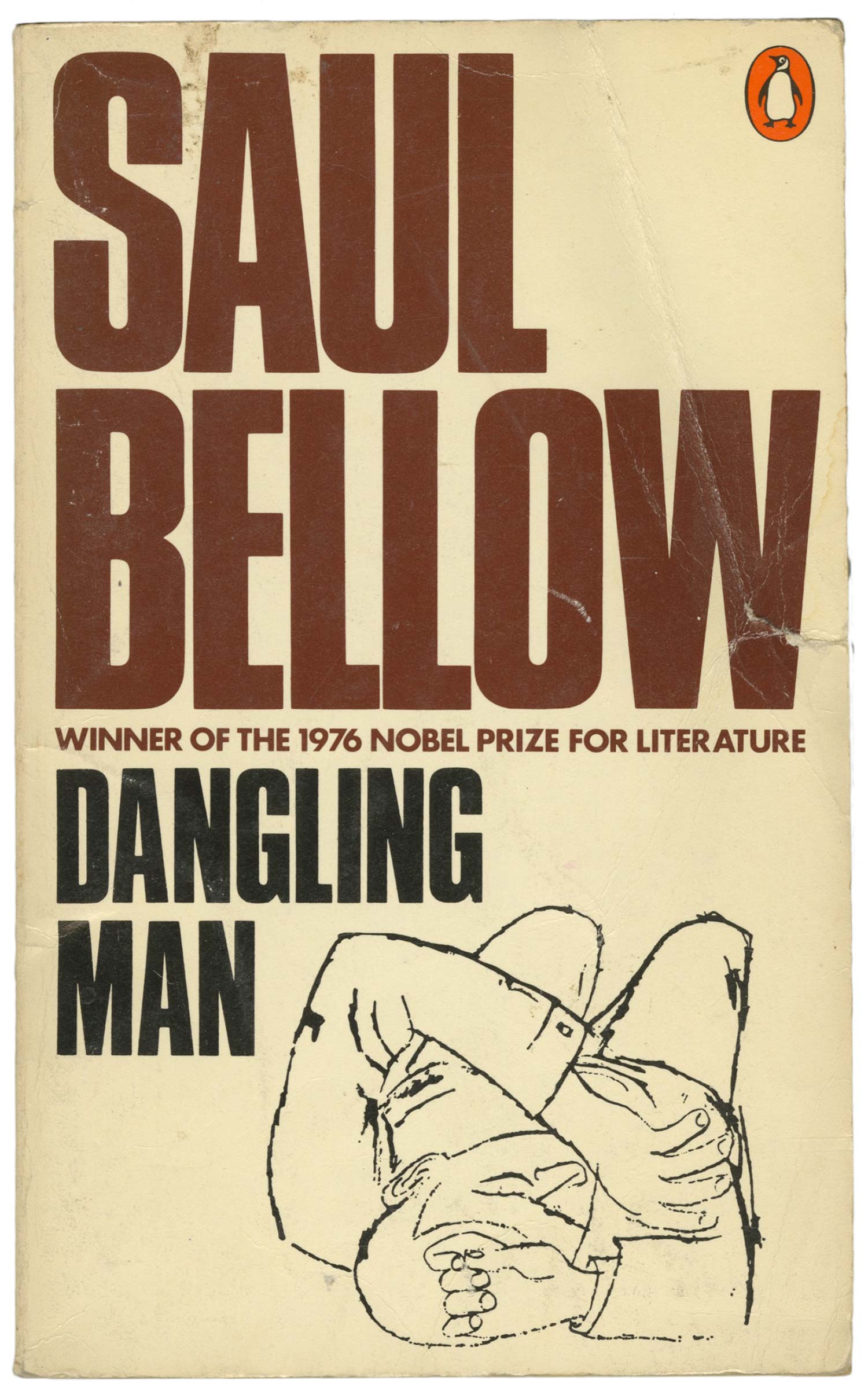
As you can see below, Penguin chose images which were drawn with Shahn’s strengths, including a plethora of hands. The image on the cover of The Dangling Man is an illustration originally created in 1952 for a pamphlet called The untouchables published by The Southern Conference Educational Fund.
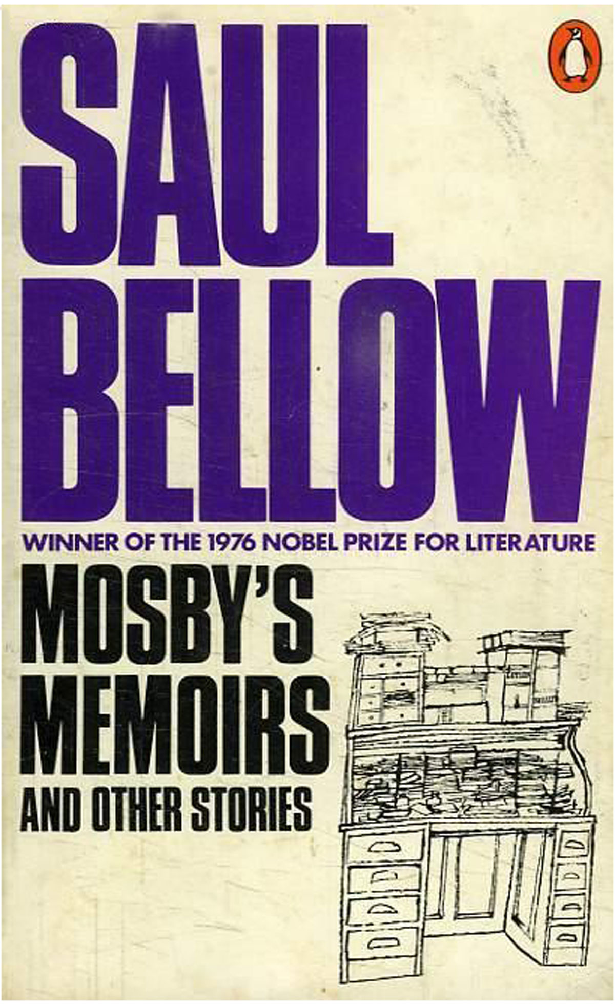
The desk on the cover of Mosby’s Memoirs was originally published in 1954 in Charm magazine, accompanying a Ray Bradbury story.
I know there are other Penguin’s that use Shahn’s work (including a Nooteboom book and portrait of Shakespeare you’ll see on a different cover next week), but I haven’t been able to track down the actual books. If you’ve got ’em, feel free to send images over to me at josh (at) justseeds.org! And once again, I’ll run a full bibliography of all these books at the end of the series.