While collecting books from the African Writers Series published by Heinemann (I’ll be featuring those books in a future post), I stumbled upon what I first thought was a small series of African novels produced here in the U.S. Picking up $1 copies of mass market novels by South African Peter Abrahams and Guinean Camera Laye, I discovered the “Collier Af/Am Library.” Collier Books was originally a spin-off from Collier’s Magazine, but by the late 1960s it had largely become a paperback subsidiary of the Macmillan Company—at the time one of the oldest and largest independent book publishers in the U.S. and U.K. In 1969, Collier launched the African/American Library, a collection of inexpensive (most for $1.50) paperbacks consisting of contemporary African and Caribbean fiction, as well as excellent African-American novels from the Harlem Renaissance and earlier. My rudimentary research has turned up thirty eight books published in the series, of which I’ve tracked down copies of thirty seven. These are mass markets, and were produced in large volumes, so most are still fairly easy to find.
The entire series was edited by Charles R. Larson, a professor of Literature at American University in Washington, D.C. Larson is white, and was introduced to African literature while in Nigeria with the Peace Corps in the early 1960s. His experiences in Africa also encouraged him to start reading books by Black Americans at home. In the late 1960s, there was still a large separation between hardback book publishing and paperbacks. For the most part, initial editions of books were published in cloth editions by large publishing houses, and then the paperback rights were sold to smaller outfits which specialized in either educational publishing—where books would be sold for school use—or mass market paperback publishing—where books would just as likely be sold at drugstores and five and dimes as specialty book shops. By this time some paperback companies had been bought up by larger publishers, but they were run separately, and often rights to books would be sold to outside presses.
I don’t know for sure, but it appears as if Collier encouraged Larson to buy up the rights to print mass market versions of African novels which didn’t already have U.S. paperback editions (although most of them were either already, or soon to be, published in the above mentioned Heinemann African Writers Series in the U.K. and Africa), as well as choose older African-American novels which were likely out of copyright, and free to reproduce in new editions. The few Caribbean novels published in the series are also older books, originally published in the 1930s and ’40s, and not available in paperback at the time. In addition to re-circulating this impressive collection of books, Larson also found sympathetic authors and peers of the writers to pen introductions to each book, including Richard Wright, Ezekiel Mphahlele (later known as Es’kia Mphalele), and Austin C. Clarke. I originally posted these covers in a four-part series (weeks’ 134, 135, 136, and 168), which I’m consolidating into this one post, now that I have a near complete set of the books.
Peter Abrahams
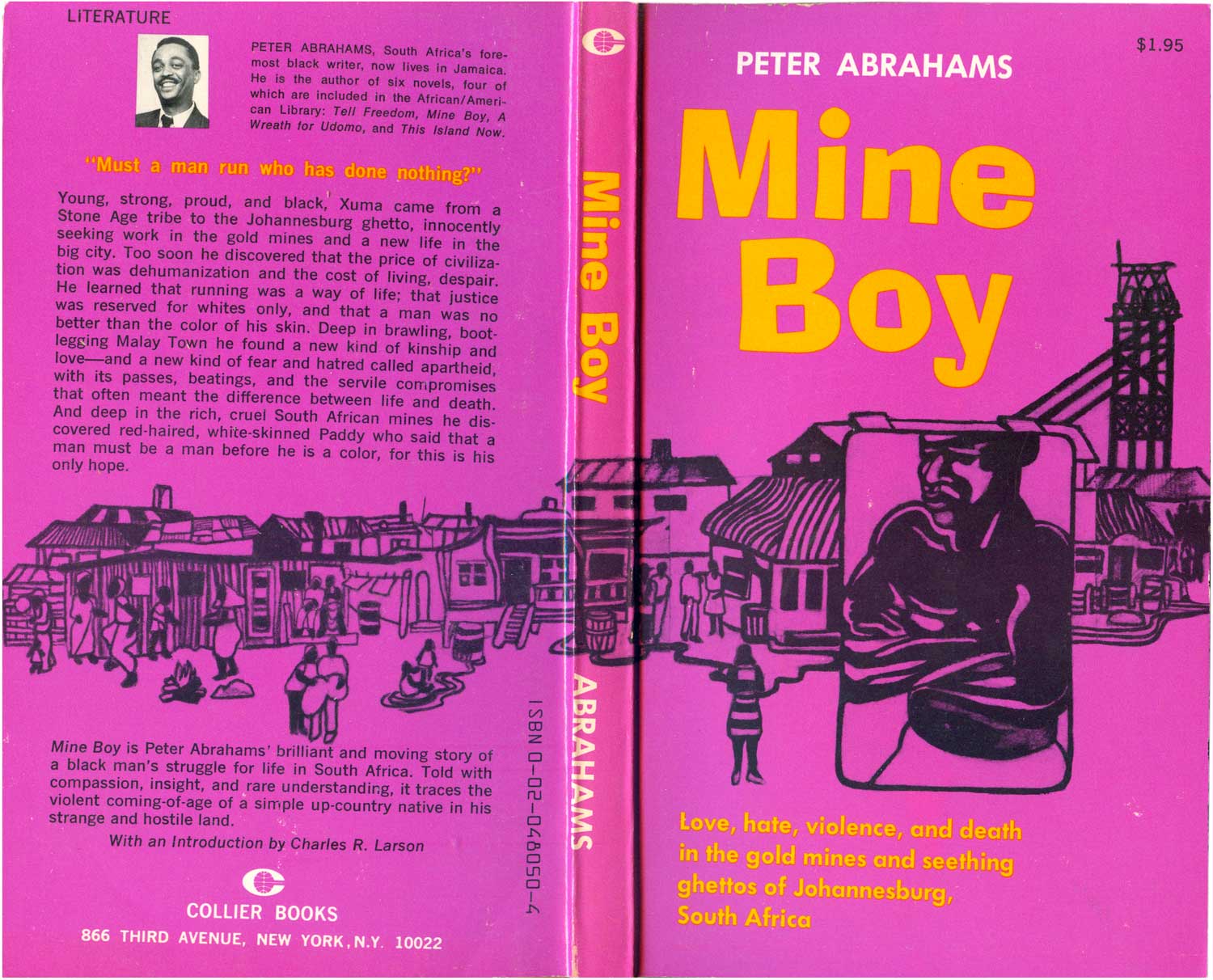
Mine Boy
New York: Collier Books, 1970
Book #04805 [South Africa]
So let’s jump into the books and their covers. I’m going to run them alphabetically, since it’s the easiest way to keep track of them. So we’ll start out with one of the early greats of English-language African literature, and one of the anchors of the collection, Peter Abrahams. Abrahams had four books published by Colliers, the breadth of which illuminate Larson’s editorial ability to tie-together many complicated aspects of the African diaspora. Abrahams was born and raised in Johannesburg, South Africa, but lived for years in England, and eventually settled in Jamaica. Mine Boy, his most well-known novel, is the story of Black workers in the gold mines and ghettos of Johannesburg.
The book’s cover is paradigmatic for the Af/Am Library, with its bold pink and yellow color scheme and flowing, 60s-style core illustration. Like many other of the series’ titles, the cover is not amazing, but strong and functional. None of the cover designs or illustrations on any of the books are attributed, which makes me believe they were either done by in-house illustrators at the publisher, or freelance people that did bulk work for Collier/Macmillan. The illustration is stylish, and has a nice wrap-around to the back cover. The central, muscular African figure with his arms crossed expresses a combination of defensiveness and power appropriate for the story, and the shanty town that sprawls out behind him gives us context to understand the setting for the novel. The type is unfortunately not as compelling, with the title in a font both awkward and a little childish, and the tag line heavy at the bottom, neither large enough to fill the space it is holding nor small enough to be out of the way.
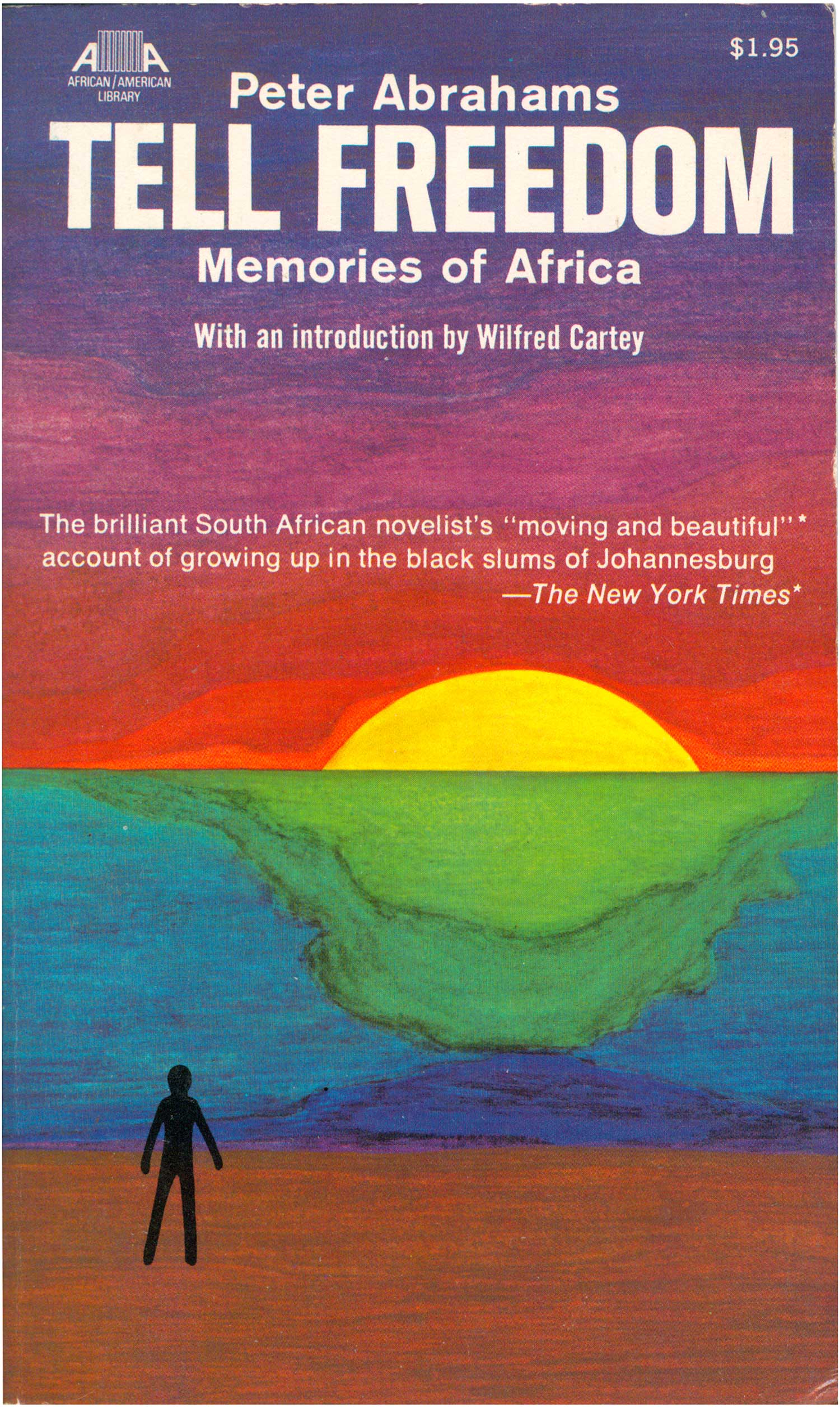
Peter Abrahams
Tell Freedom
New York: Collier Books, 1970
Book #04803 [South Africa]
All the above said, Mine Boy looks downright brilliant compared to the naive and strange cover to Tell Freedom, Abrahams’ novelistic autobiography. A black stick figure looks on (or out from) a sun setting beyond what may be the ocean, or green continent, or submerged iceberg. Possibly this rudimentary imagery is supposed to be transcendent, or inspire contemplation, but instead it provokes feelings of elementary school drawings tacked up on the refrigerator by overly proud parents. As a book cover designer, I can’t even imagine turning in a cover draft that looked anything like this. It works for the Frigidaire, but a book cover?
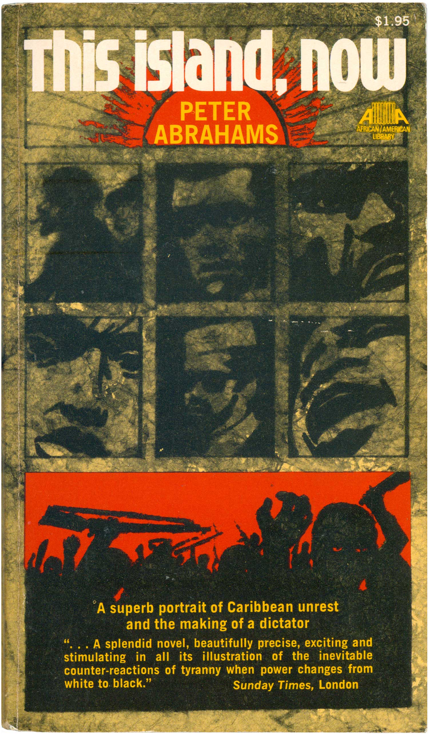
Peter Abrahams
This Island, Now
New York: Collier Books, 1971
Book #04804 [South Africa]
The covers to Abraham’s next two novels are much more accomplished. Both use grids of hazy portraits to imply a level of complexity and interlocking parts, a simple and effective graphic tool. The novels themselves tie together some of Abrahams complexity, and the cauldron of interchange between Africa, the Caribbean, and the West in the 1950s and 60s. This Island, Now tells the story of violent, black-led revolution on a colonial Caribbean island. The cover does the same. Unlike on Tell Freedom, this sun on the cover below speaks to heat and power, locking the matrix of people between the title and the red-rimmed action of the uprising below. The title is in tight block lowercase, giving it a slightly claustrophobic feel, and adding to the tension on the cover. My only complaint here is that the canvas of a mass market book is so small, it’s hard to have this many elements functioning and still be legible. This is a great cover, but would work much better at a larger size where each piece could be read better.
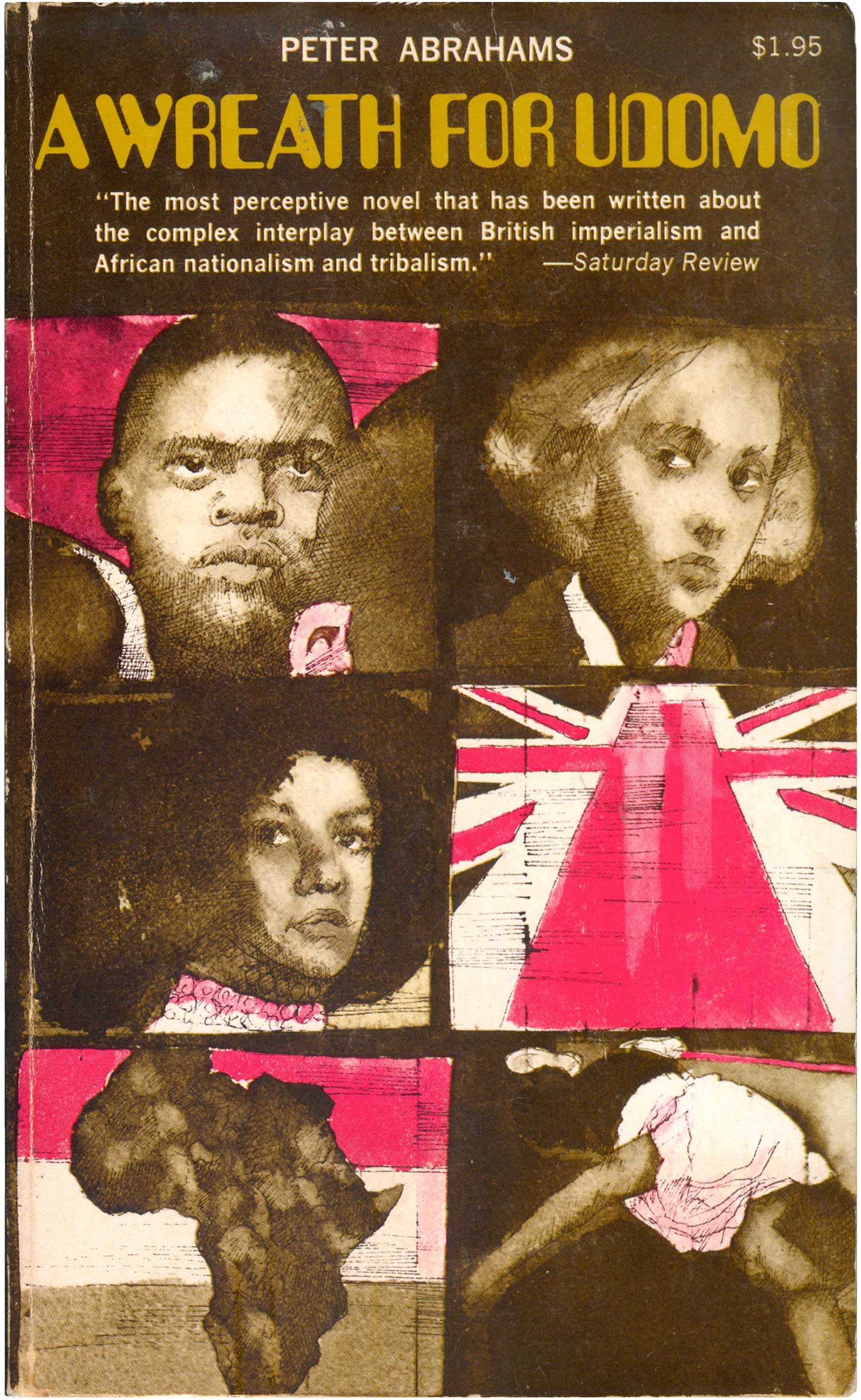
Peter Abrahams
A Wreath for Udomo
New York: Collier Books, 1971
Book #04806 [South Africa]
A Wreath for Udomo is a novel of African revolutionaries in exile in the UK, and the knotty realities and conflicts between duty to nation and ideals, the comfort that comes from living in the colonial seat, and the space between high liberation ideology and real politic. Once again we get a grid of images, or vignettes, which if we read from left to right, lead us from strong African male to white woman to African woman. The Union Jack as a road forward (or back) to an African flag to death, a man down. The illustrations are rendered in sharp line and pink and grey wash, making the cover look both historical and etched, as well as up-to-date and hip, merging styles in the way Push Pin Graphics was famed for. The design is pretty post-modern, mixing old and new, right down to the modified EAN barcode/computer font used for the title.
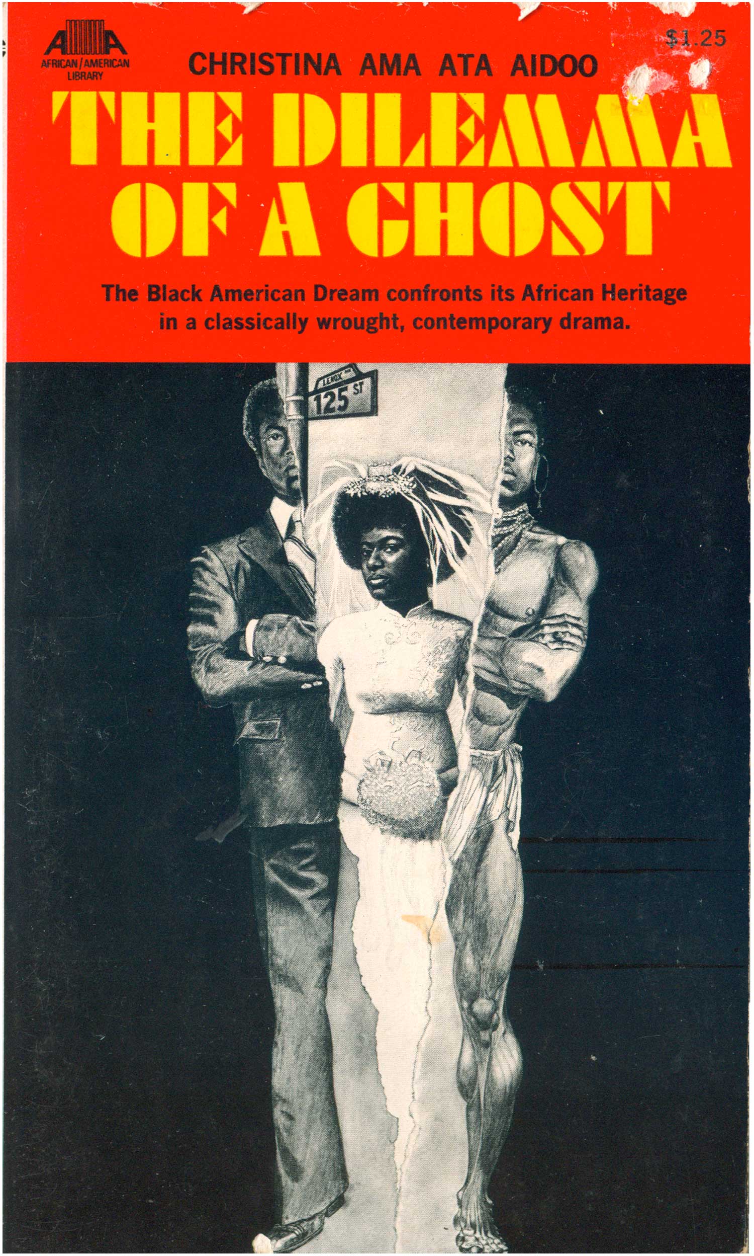
Christina Ama Ata Aidoo
Dilemma of a Ghost
New York: Collier Books, 1971
Book #01202. [Ghana]
Ama Ata Aidoo has become a big name in the world of Third World feminism and post-colonial literature, but in 1971 when The Dilemma of a Ghost was published she was still using the first name Christina. Dilemma is a play, the only one in the series, and the cover is quite dramatic. A solid black field is torn in half, splitting a central male figure down the middle, one half in Western suit, the other in “tribal” African garb. The tear reveals a woman in a wedding dress. The implications seem clear, a woman stuck between the traditional and modern aspects of her man. The illustration is strong, if a bit literal, but it feels diminished by the overall design. The large red box holding the titles doesn’t interact with the image, and since the split doesn’t run top to bottom through the entire cover, it feels less remarkable.
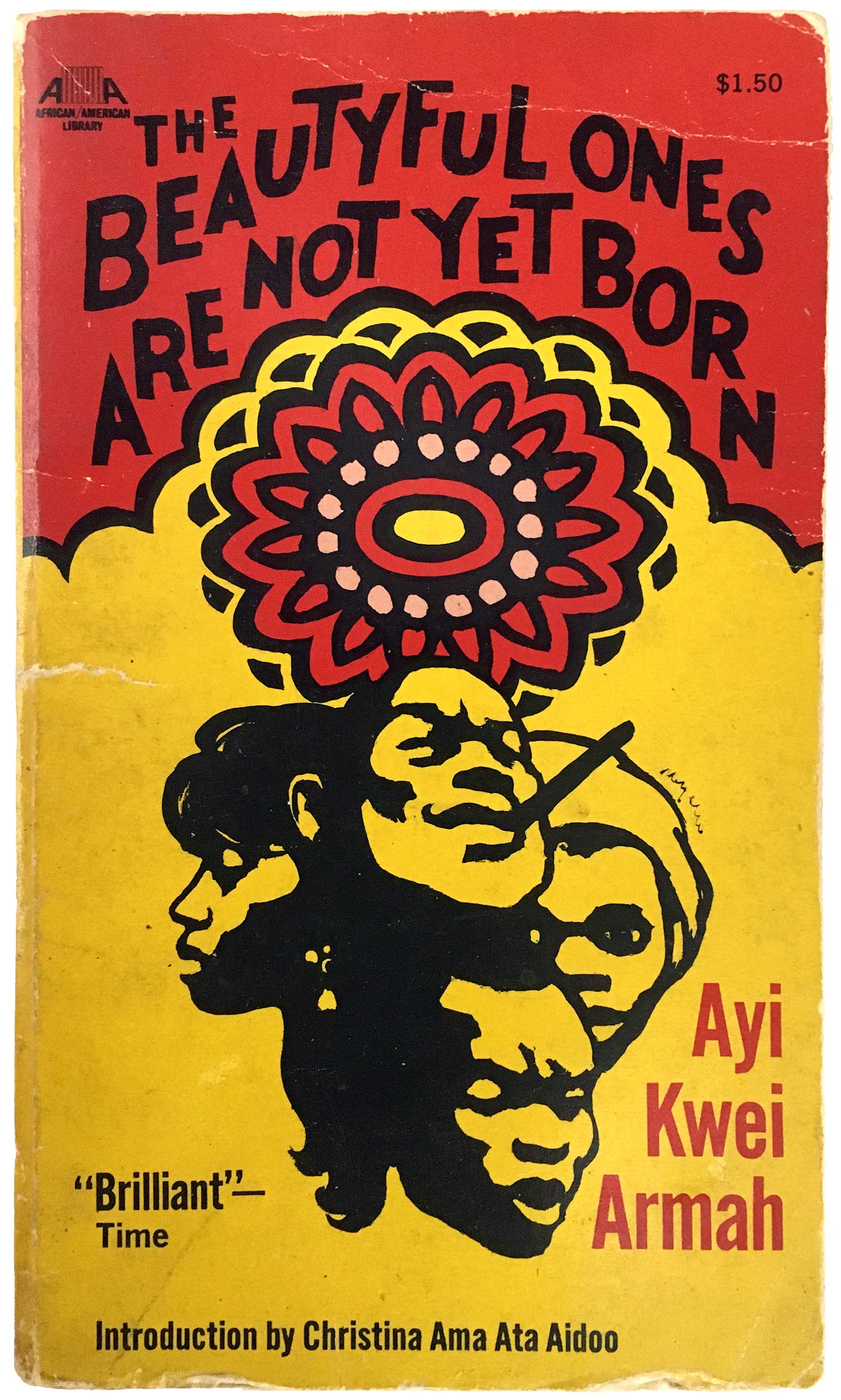
Ayi Kwei Armah
The Beautyful Ones are Not Yet Born
New York: Collier Books, 1969
Book #04825 [Ghana]
Collier published two novels by Ayi Kwei Armah, another Ghanian (like Ama Ata Aidoo). The Beautyful Ones are Not Yet Born is his most well known book, and this cover does it some justice. The color scheme is great, and the central flower simultaneously makes for a nice pattern, gives the book an “African” feel, and references the central floral image on the dust jacket of the original cover hardback edition. The title is hand-drawn, a huge improvement from the very rudimentary and machined type-work on most of the titles in the series. And the pile of faces in the center are really evocative, pulling out a wide range of emotions and seeming character types. A really well done cover.
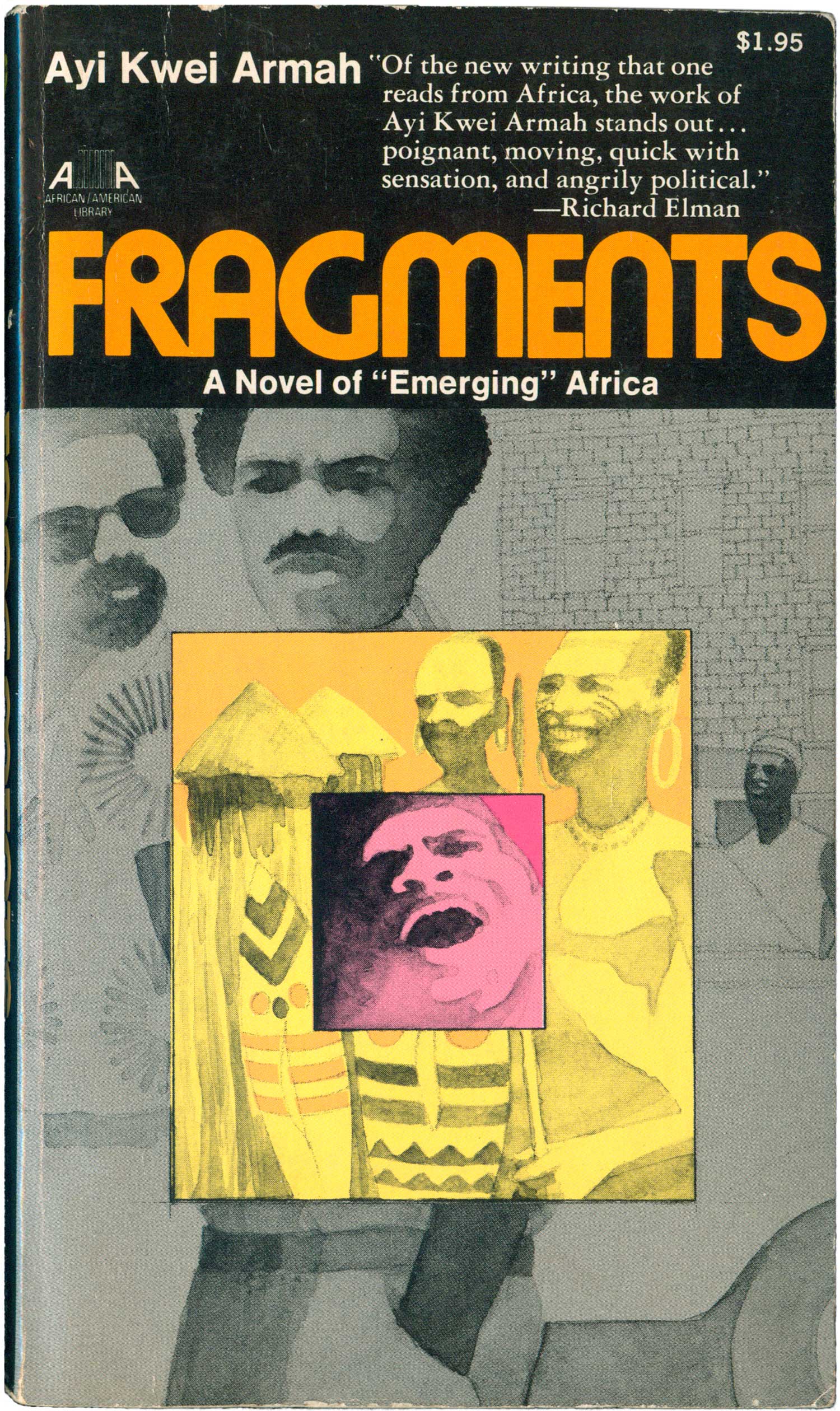
Ayi Kwei Armah
Fragments
New York: Collier Books, 1971
Book #04826 [Ghana]
The cover of Fragments has a really different feel. It’s much less bold and immediately powerful, and seems likely done by the same artist who created the cover for A Wreath for Udomo above. The title at the top is once again completely separated from the central image, doing it no favors, while Armah’s name is squeezed into the top left, barely noticeable. The image part of the design is a different story. The muted colors are kind of cool, and the image within and image within an image puzzle-box quality of the illustration has really grown on me. Up close the images are less washed out, and the boxes within a box capture a sense of the anguish of being caught between the rural, traditional culture of Ghana (shining gold in the sun), and the new, urban, independent Ghana of Kwame Nkrumah. But overall the book has a real ’70s feel, which makes sense since it’s when it was published, but doesn’t articulate the fact that the novel itself is set much earlier.
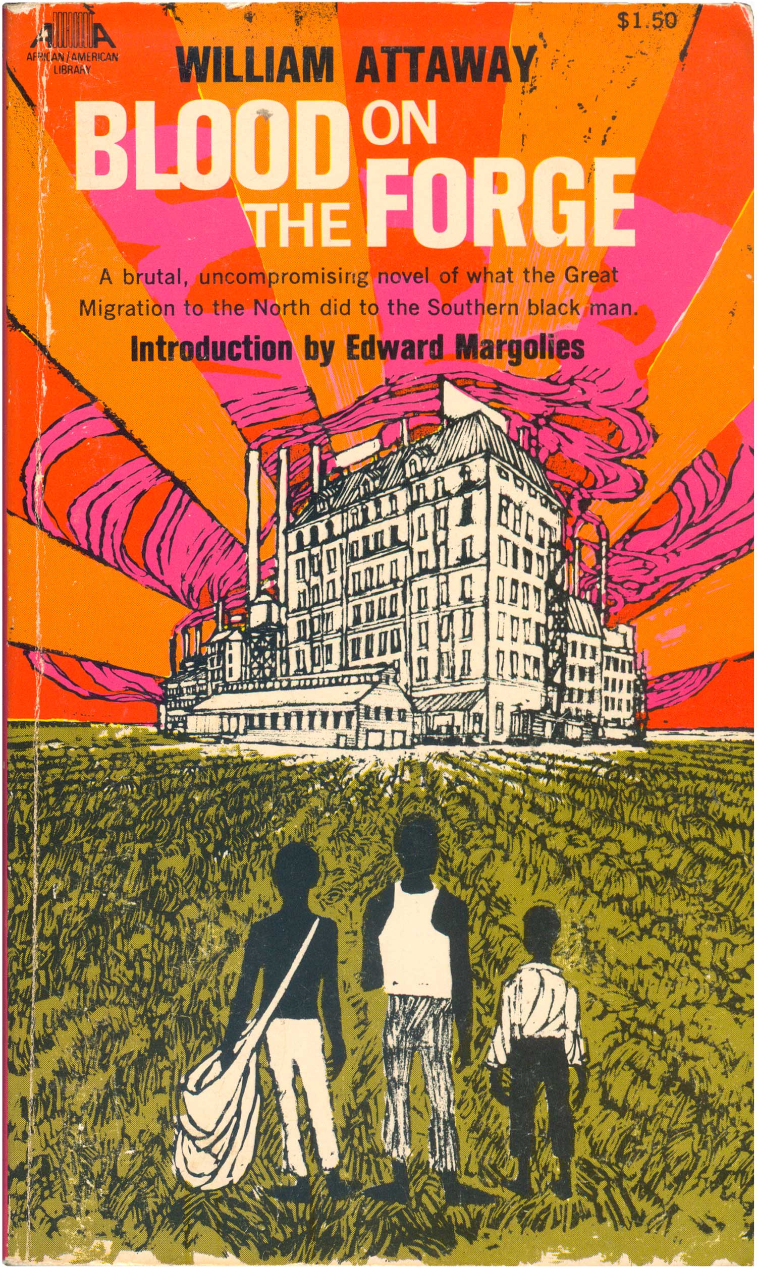
William Attaway
Blood on the Forge
New York: Collier Books, 1970
Book #04828 [United States]
Unlike the African novels in the series, most of those by African-Americans and Caribbean authors are not contemporary, but “classics” from the Harlem Renaissance or older. Case in point is William Attaway’s Blood on the Forge, a book about the Great Migration North, originally published in 1941. The cover does a good job bringing the book up to date with 1970, with it’s proto-post modernism. The orange and pink deification lines around the factory in the background simultaneously reference psychedelia and Emory Douglas’ illustrations for the Black Panther paper, while the rough-hewn block-printed figures in the foreground evoke Robert Gwathmey with a touch of Jacob Lawrence. While both aspects seem dated today, I suspect at the time the factory projected a modern feel, while the figures and field were rooted in the past. Blood on the Forge was recently republished by the New York Review of Books Press, which has given it a well-deserved new life.
John Bayliss, ed.
Black Slave Narratives
New York: Collier Books, 1970
Book #04850 [United States]
John F. Bayliss’ edited collection of slave narratives has a fairly uneventful cover, but there are a couple curious things about it. For one, the central figure is repeated in the background, once to the left, and once to the right. On the one hand this create the sense of slavery being social, and evokes the plural of the “narratives,” yet at the same time implies not just a commonality between the texts enclosed, but an actual repetition. This may just be laziness on the part of the illustrator (who is unattributed), or an interesting commentary on the nature of either slavery or the kind of writing that came out of it and attempted to articulate the experience. In addition, although less important, the designer choose to backdrop the entire cover with a strange painted wood grain pattern. I’m at a bit of a loss as to what that was intended to do.

Mongo Beti
King Lazarus
New York: Collier Books, 1971
Book #04860 [Cameroon]
Mongo Beti is an exceptional novelist from Cameroon known for his satirical stories. King Lazarus is the first of his books published by Collier, and has an unfortunately unimpressive cover. It is bright and colorful, but neither specific enough to be compelling nor decorative enough to engage with powerful shapes or patterns. My guess it was done by the same artists as Tell Freedom above, and is successful in comparison, but still a poor design. The title is also simply plopped on top, in basic sans serif, and gets lost in the swirl behind it and the large white space below. The novel itself is full of interesting ideas and plotting, yet none of this is captured here. I have a hard time understanding how covers like this make it to press. It seems unlikely that something like this would be printed today, since marketing departments are so much more involved in all aspects of book production—for better and for worse.


Mongo Beti
Mission to Kala
New York: Collier Books, 1971
Book #04861 [Cameroon]
The cover to Mission to Kala fairs better. A montage of scribbly drawn scenes surround the edges of the front and slip onto the back. None themselves accomplish much, but as a whole they make a nice fabric, bringing the eye from one set of characters and actions to another. It would have been more interesting to stock the entire cover, side to side and top to bottom, with these little bits, and drop the titles in a small box on top, but that would have demanded a level of coordination between illustrator and designer that likely didn’t exist.
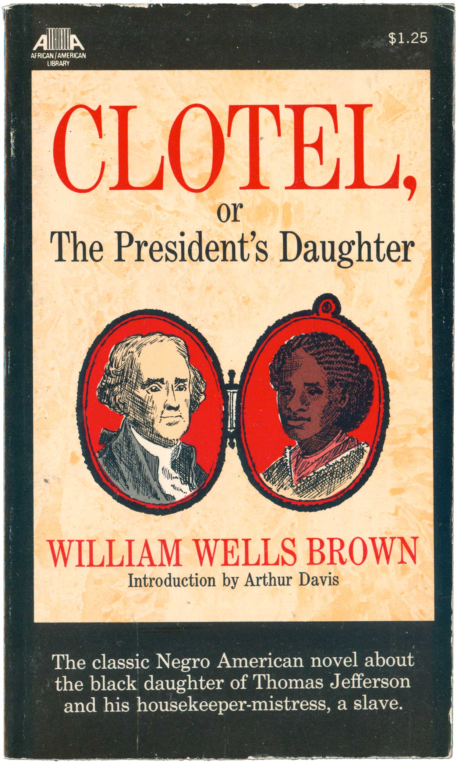
William W. Brown
Clotel, or the President’s Daughter
New York: Collier Books, 1970
Book #04913 [United States]
William Wells Brown’s novel about Thomas Jefferson’s black daughter, Clotel, or The President’s Daughter, was first published in 1853 and is considered the first novel by an African American. The cover is restrained, and rather playing to the possible sensationalism of the subject, it more interestingly attaches Jefferson to the black side of his family through a simple illustration of a locket. Crisp serif-ed type in both red and black, all capitals and lowercase, and multiple sizes creates the aura of an old-school letter-pressed broadside. The clean illustration of a two-faced locket also carries with it a Victorian feel. These visual devices work on multiple levels, both conveying the actual age of the novel—originally published in 1853—and jarring the viewer by framing Thomas Jefferson having a Black daughter with the trappings of tradition. It’s a solid set of design ideas, and the concept could easily be updated into a contemporary cover.
Charles W. Chesnutt
The House Behind the Cedars
New York: Collier Books, 1969
Book #04938 [United States]
The House Behind the Cedars is a post-Civil War novel, originally published in 1905. Pink and yellow seem like bold choices for a cover about interracial conflicts in the South, but the illustration is so staid, and seems so dated, that overall the book has a conservative feel. I do like how the foliage of the trees are constructed of simple tight scribbles, which make an effective backdrop for the title. Because of this simple element, the integration between image and type is much more effective than on many of the Af/Am books.

Paul Laurence Dunbar
Sport of the Gods
New York: Collier Books, 1970
Cover illustration by E. Stephen Perry
Book #05053 [United States]
Paul Laurence Dunbar’s The Sport of the Gods is from a similar period, 1902, but was a much better received novel, and the cover Collier put on it is much more dynamic. A striking blue and brown tight-cropped portrait confronts us, an arrogance implied by the toothpick in the mouth and a gold tooth, but the face is largely impenetrable because of a giant pair of sunglasses reflecting black rural and urban life back at us. The painting/illustration appears to be by E. Stephen Perry, and is really compelling, as it both repels and attracts. The grittiness is refreshing, not something common on covers these days.


Langston Hughes
Not Without Laughter
New York: Collier Books, 1969
Book #04802 [United States]
The cover of Langston Hughes’ Not Without Laughter reads as more traditional and conservative than many of the other covers in the series. A flat brown background lays torn around the edges, framed in black. A quick illustration imaging rural poverty sits at the bottom, quiet but evocative. The majority of the cover is dominated by the title and author name, obviously seen as the major selling points for the book. The illustration is simple yet strong, and it is a nice touch to have it wrap around the spine and onto the back cover.
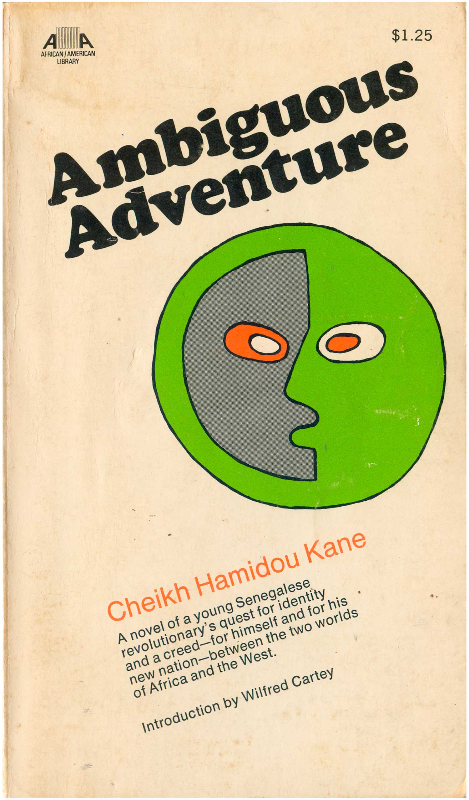
Cheikh Hamidou Kane
Ambiguous Adventure
New York: Collier Books, 1969
Book #05241 [Senegal]
The cover to Ambiguous Adventure is a bit of a throw-away. Although the green/grey face featured attempts to represent the complexity of the novel’s engagement with the hybrid African/European reality of post-colonial Africa, it’s too simple and awkward to be convincing. In theory I should like all the elements of this cover: its simplicity, the angle of the type, the use of Cooper Black for the title (which was only beginning to come back into style in the early ’70s), the off-centeredness of the central image, the willingness to let the majority of the cover ride as plain white background. But it just doesn’t come together for me.
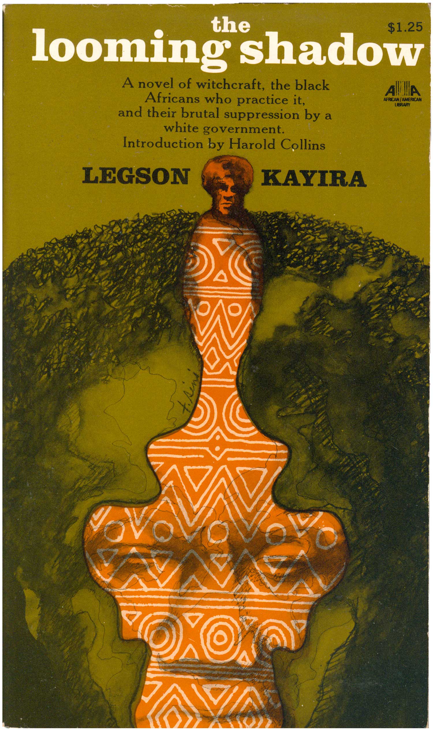
Legson Kayira
The Looming Shadow
New York: Collier Books, 1970
Cover illustration by T. Simi
Book #03401 [Nyasaland]
The cover design of The Looming Shadow has taken a surrealist turn. A green globe–which triples as Earth, Africa, and a man’s face–splits down the center, revealing an orange figure—which itself triples as a trophy, an African-patterned sculpture, and a central man emerging from the center of the Earth. Taken as a whole the image feels somewhat like those visual games, where an image of a young woman turns into an old crone, yet here the options are so varied it’s hard to focus in on such a simple binary. The image is dark for a book cover, pushing the orange figure forward as the central element, balancing out the white title at the top. The image has a small signature on it, “T. Simi,” likely the illustrator.
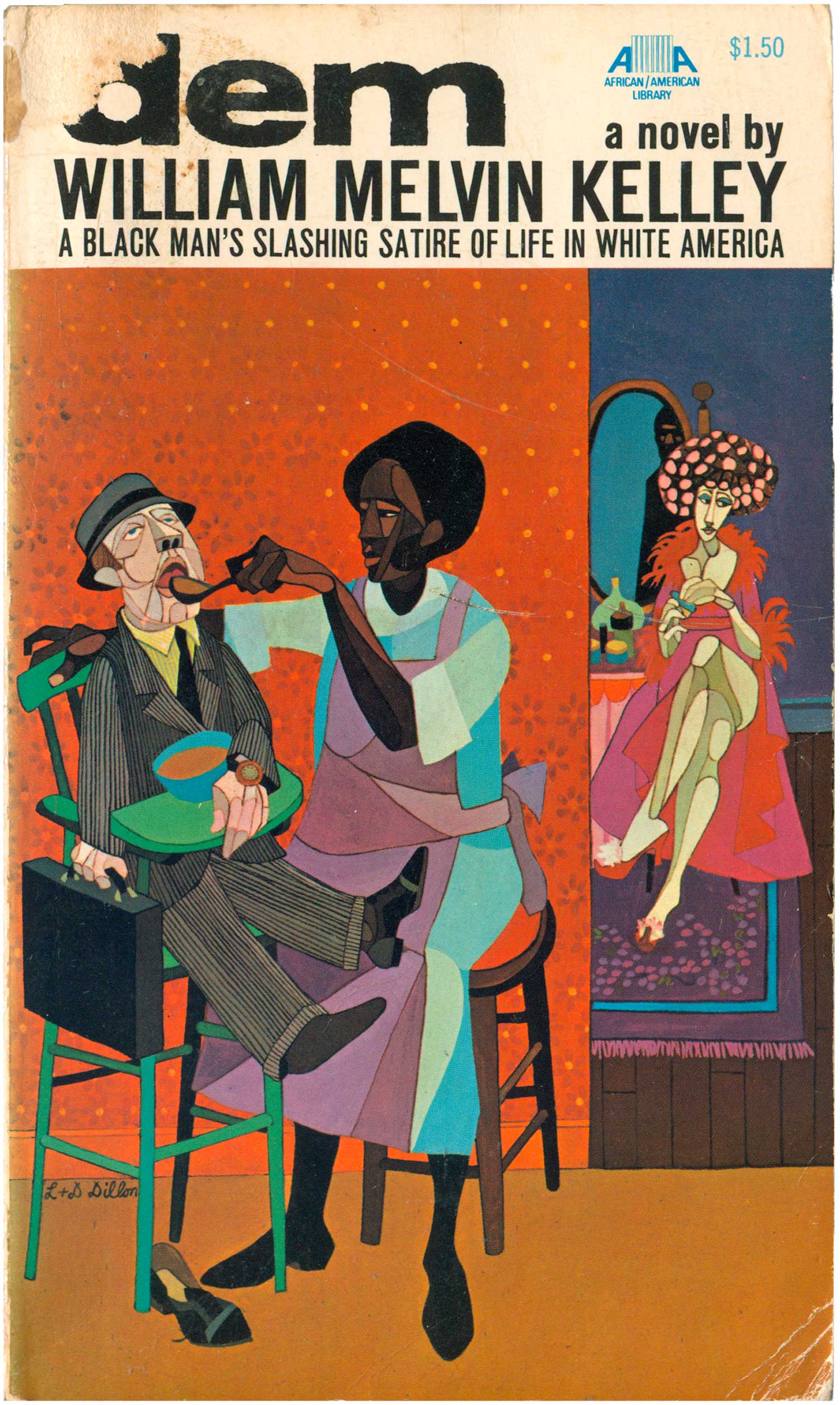
William Melvin Kelley
dem
New York: Collier Books, 1969
Cover illustration by Leo and Diane Dillon
Book #05243 [United States]
The cover of Melvin Kelley’s dem reads as a ’70s black reinterpretation of cubism, filtered through the Harlem Renaissance. The image is by Leo and Diane Dillon, the sci-fi book cover super-couple (see post 224, specifically on their work here). They designed thousands of covers from the 60s through the 90s, the vast majority for science fiction paperbacks. They boldly wear their influences—a dash of Jacob Lawrence, early Faith Ringgold, a bit of surrealism. The image is also reminiscent of the Corky McCoy’s illustrations for Miles Davis’ 1970s On the Corner/Water Babies period LP covers, and a pop black vernacular heavily referencing comic books.
George Lamming
In the Castle of My Skin
New York: Collier Books, 1970
Book #05270 [Barbados]
In the Castle of My Skin is one of the classic Caribbean novels of the first half of the twentieth century. The cover of this edition of George Lamming’s novel is way creepy. The illustration is a direct attempt at enacting the title, but it ends up terrifying, the castle/skull image looking a bit like Jason from Friday the 13th, the gate over the mouth reading as a hockey mask. From this cover it’s clear that Lamming’s head is not a nice place to be. Once again the type treatment isn’t ideal, and makes for a clunkier design than necessary.

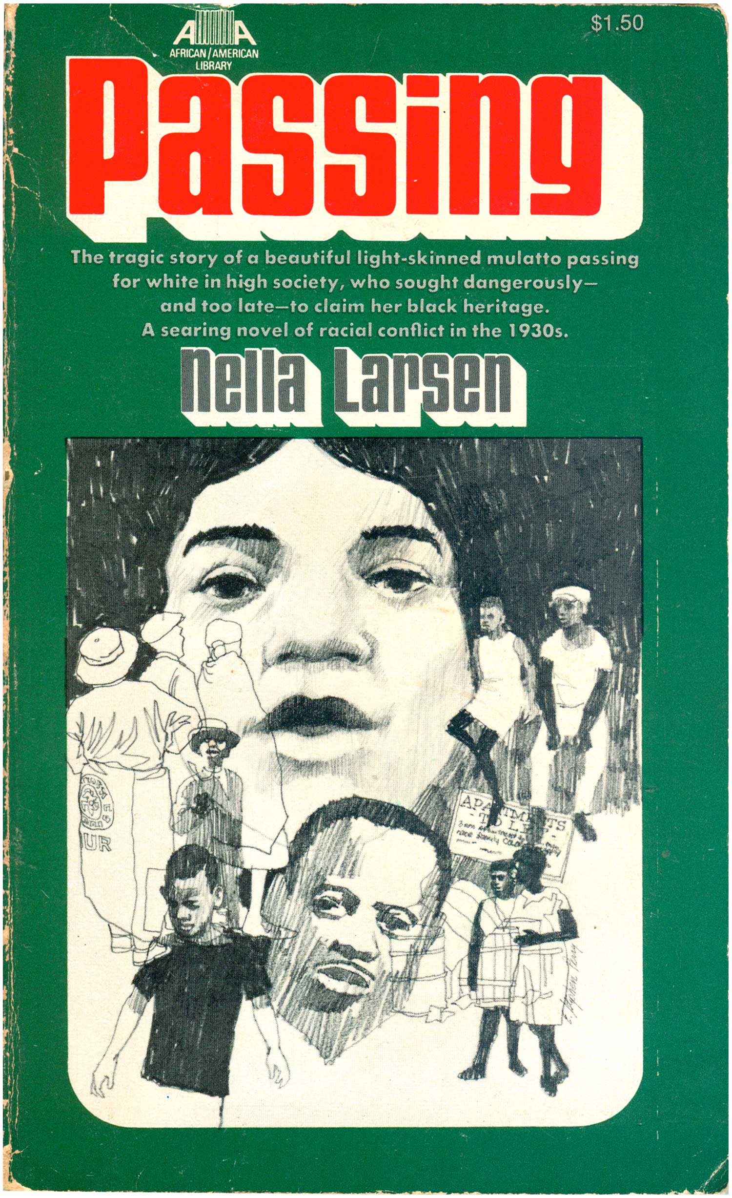
Nella Larsen
Passing
New York: Collier Books, 1971
Cover illustration by E. Stephen Perry
Book #05268. [United States]
Nella Larsen was a bi-racial author of the Harlem Renaissance, who wrote two novels, Quicksand and Passing. Although she was not recognized during her lifetime, both books have since been republished in multiple editions (including Modern Library and Penguin Classics) and lauded as important articulations of the racial complexities and complications of the 1930s. Both books were reprinted in the Af/Am Library in 1971, and both feature the same basic design with illustrations by E. Stephen Perry. The consistency of the design is nice, and the drop shadow on the titles makes them seem almost up-to-date and somewhat timeless. The graphic here on Passing is a collage of line drawings, rough renderings of Black street life.
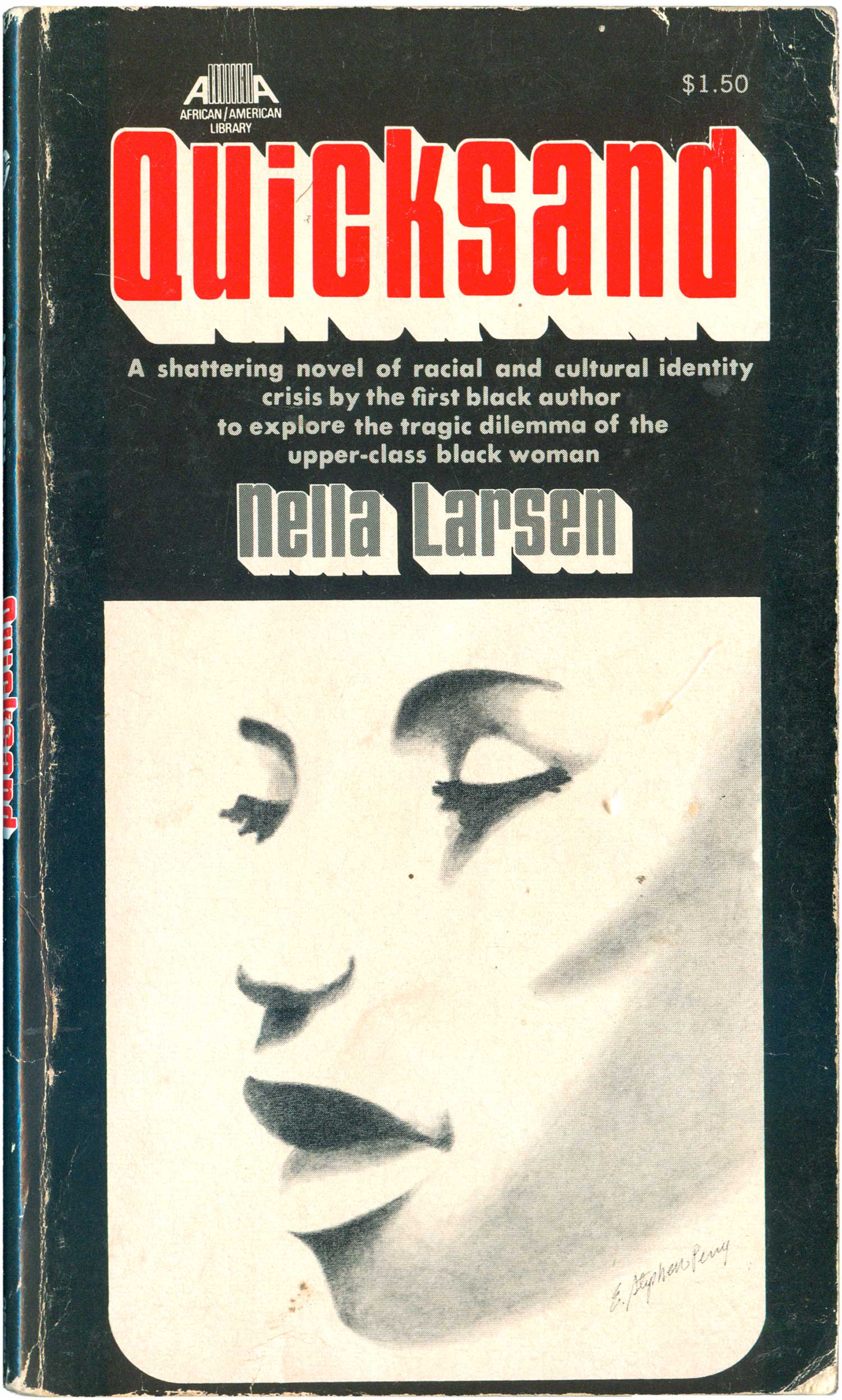
Nella Larsen
Quicksand
New York: Collier Books, 1971
Cover illustration by E. Stephen Perry
Book #05269 [United States]
There is little interesting about this cover of Quicksand, which is a disappointment since it is such an important novel, and one of the first books by an African American woman (or anyone, for that matter) to deal with the intersections of race, class, skin color, bi-racialism, and regionalism. You would have no idea of how brutal and powerful the content is with this cover as your guide. The simple portrait of a beautiful black woman conveys little of what’s actually inside, nor is it compelling enough to sell the book well on its own merits. While the cover of Passing above placed the central figure in a context, there’s none of that here.
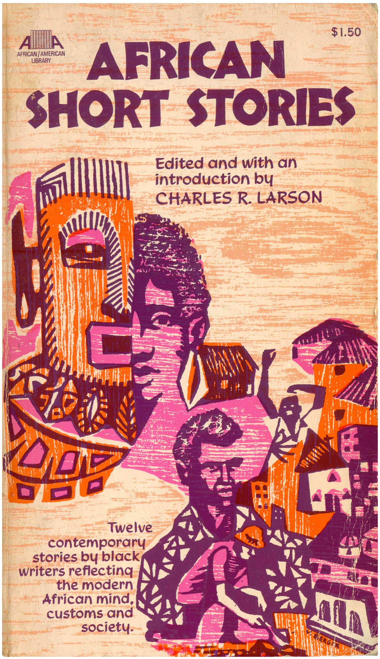
Charles R. Larson, ed.
African Short Stories
New York: Collier Books, 1970
Cover illustration by V. Berger
Book #05271 [United States]
I compliment the bold color combination of purple, pink, and orange on the cover of African Short Stories, and in particular the foregoing of any black. The illustration itself, by V. Berger, contains a powerful combination of woodblock feel and patterning, and has some echoes of the simple figures and landscapes of Rini Templeton. The montage of images has some cool elements—in particular the man with his arms in the air and the man whose chest turns into a gardener—but the boy’s face/African mask element is the weakest, yet largest part. It would have been more effective to either cut that element and just enlarge the bottom right quadrant to fill the entire cover, or to add even more parts, sinking the mask/face into a much larger and complicated collage. The modified Nueland typeface and the mask both function as cheap shorthand for “tribal African,” giving the cover a borderline colonial vibe. Included in the volume are strong pieces by Sembene Ousamane, Ngugi, Alex La Guma, and Ezekial Mphahlele—none of whom are effectively represented by this simplified image of Africa.
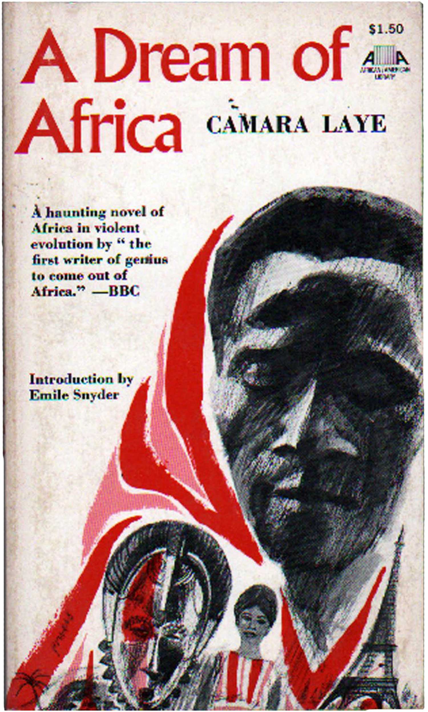
Camara Laye
A Dream of Africa
New York: Collier Books, 1971
Book #05274 [Guinea]
Like Chinua Achebe and Ngũgĩ wa Thiong’o, Camera Laye was one of the early African authors picked up and popularized in the West, except that being from Guinea, his base of popularity has always been in the Francophone world. The cover for A Dream of Africa bluntly illustrates the tensions between Africa and Europe. The central figure is flanked by a traditional African mask on one side and the Eiffel Tower on the other. The images all tilt to the right, which gives the cover some movement, and then the pink and red are used to both wrap the face and spice up the other pieces as a background color. Not stunning, but not bad either.
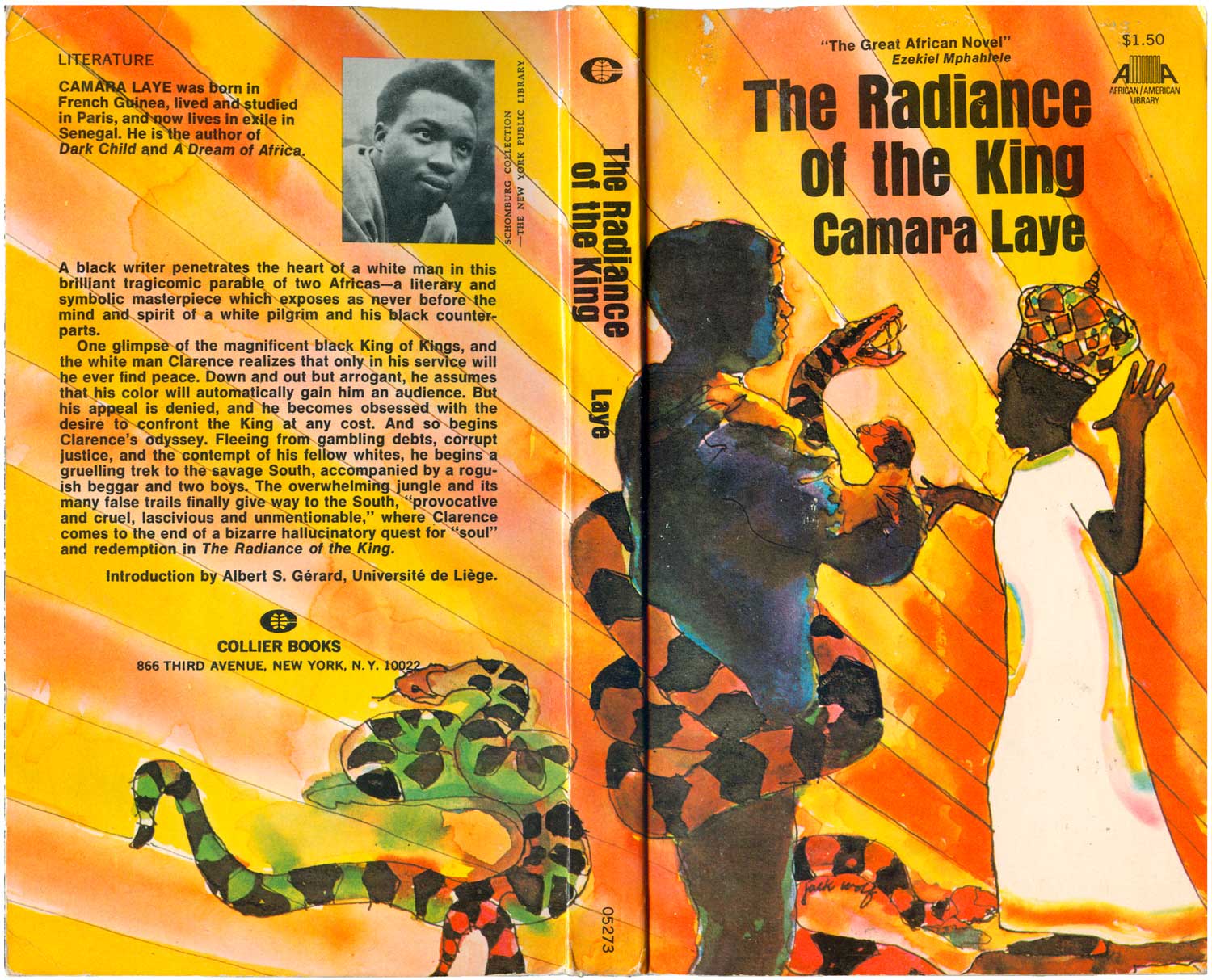
Camara Laye
The Radiance of the King
New York: Collier Books, 1971
Cover illustration by Jack Wolf
Book #05273 [Guinea]
The cover of The Radiance of the King is also carried by the strength of the illustration, but the overall execution isn’t quite strong enough. The pen and ink and watercolor style is cool, as are the deification lines in the background. The darkening of the white figure mirroring the white frock on the Black one is a smart reversal and complication. At the same time these two Laye covers are a good representation of the overall problems with many of the Af/Am Library designs. Both images are interesting and appropriate, but they function too much like editorial illustrations. They aren’t effectively integrated into an overall cover design, they don’t necessarily interact with the type (as in this case here) and often conflict with it (as in in the design of In the Castle of My Skin above.
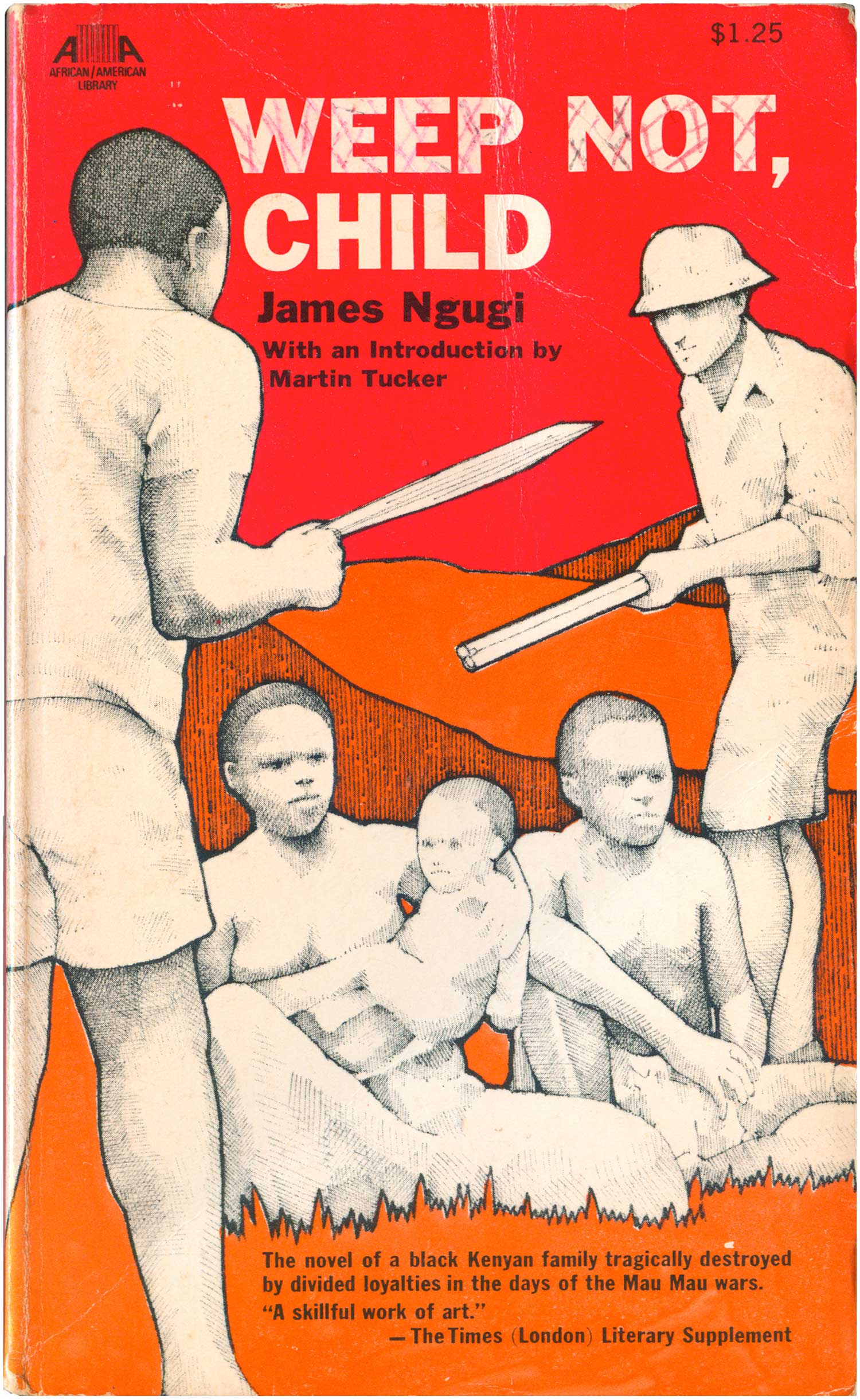
James Ngugi
Weep Not, Child
New York: Collier Books, 1969
Book #05308 [Kenya]
Like with Ama Ata Aidoo above, this series published Ngũgĩ very early in his writing career, when he was still known as James Ngugi. Weep Not, Child was his first novel, and they’ve given it pretty a hip cover. A fine, fine line drawing (almost pointillist) of a Mau Mau fighter and a British colonist squaring off over a Kenyan family on a background of rich orange and red. Leaving the drawings black and white was a solid decision, allowing them to pop to the foreground, and giving a sense of action or motion that is otherwise lacking (as the figures themselves are so stiff).
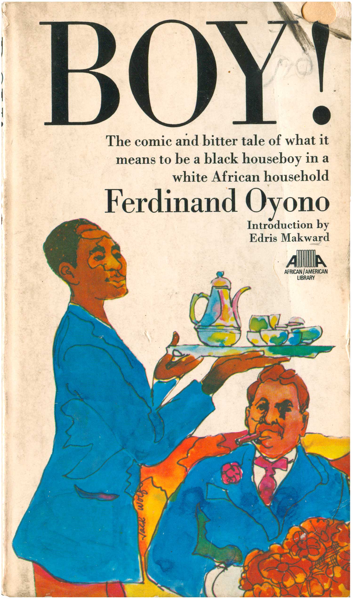
Ferdinand Oyono
Boy!
New York: Collier Books, 1970
Cover illustration by Jack Wolf
Book #05320 [Cameroon]
The two covers for Ferdinand Oyono’s books fair a bit better. Boy! (published as Houseboy in Heinemann’s African Writers Series) has another Jack Wolf cover illustration, done in a similar style to Laye’s The Radiance of the King above. But this time the designer chose a much more appropriate font, and the tall and classy Didot complements the image, adding to the sense of farce of colonialism disguised under an upper class veneer.
Ferdinand Oyono
The Old Man and the Metal
New York: Collier Books, 1971
Book #05319 [Cameroon]
The illustration on The Old Man and the Medal is so self-contained that the titling font doesn’t much matter. The spot color in the medal identifies it as French and colonial, and the old man on the one hand appears as an autonomous figure in the foreground, he is also being absorbed into and onto the medal.

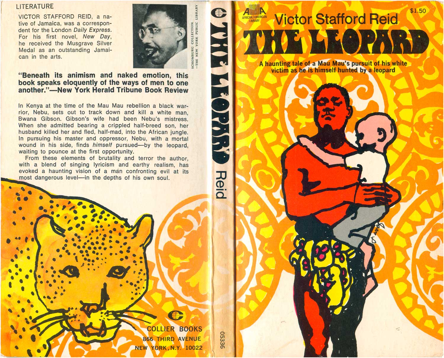
Richard Stafford Reid
The Leopard
New York: Collier Books, 1971
Cover illustration by Jack Wolf
Book #05336 [Jamaica]
A great example of diasporic cross-fertilization, this is a book by a Jamaican about the Mau Mau in Kenya. It also has one of my favorite covers in the series. The central illustration is once again by Jack Wolf, and is a nice quick drawing of a Mau Mau fighter carrying a white child. The red of the figure sets it apart from the ornamental background, which is echoed in the man’s loin cloth (and on the pattern of a leopard’s coat). The title is hand drawn, and compliments the line quality of the main figure. The cover also wraps around, and while the leopard drawn on the back is kinda cool in a scrappy way, thankfully someone was smart enough to know that it wasn’t a strong enough image to carry the front of the cover.
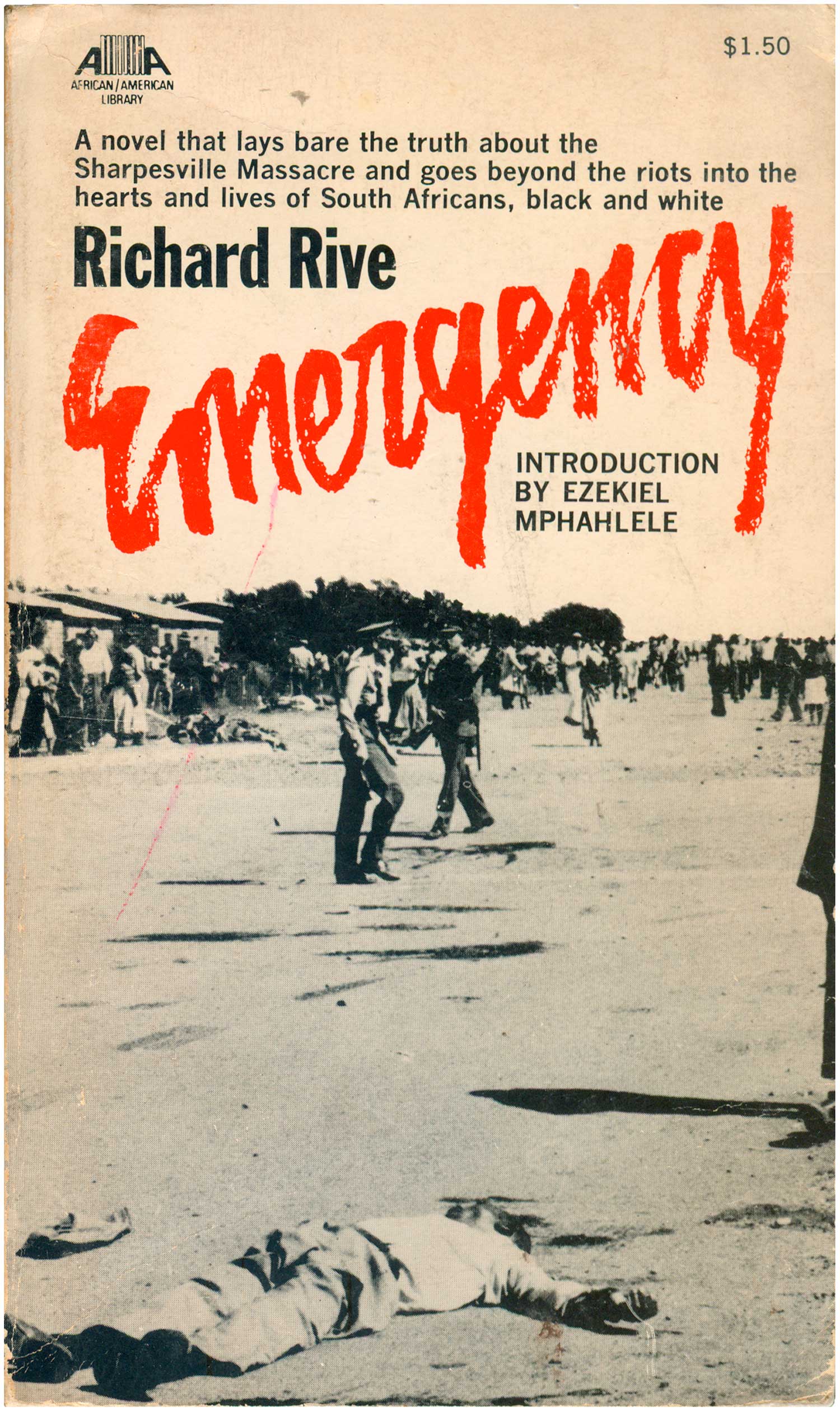
Richard Rive
Emergency
New York: Collier Books, 1970
Cover photo by Wide World Photos
Book #05340 [South Africa]
Richard Rive’s novel about the Sharpesville Massacre in South Africa is the only book in this series with a photographic cover. It is almost as if the horror of the real event was too much to illustrate, that there was nothing that could capture it better than the actual evidence of bodies in the streets. The lack of color adds to the documentary feel of the image, and the bright red title jumps off the page, scrawled and bloody—a call to arms. It’s interesting to see that this novel got mass market treatment and distribution, long before apartheid of Mandela were household words in the U.S.
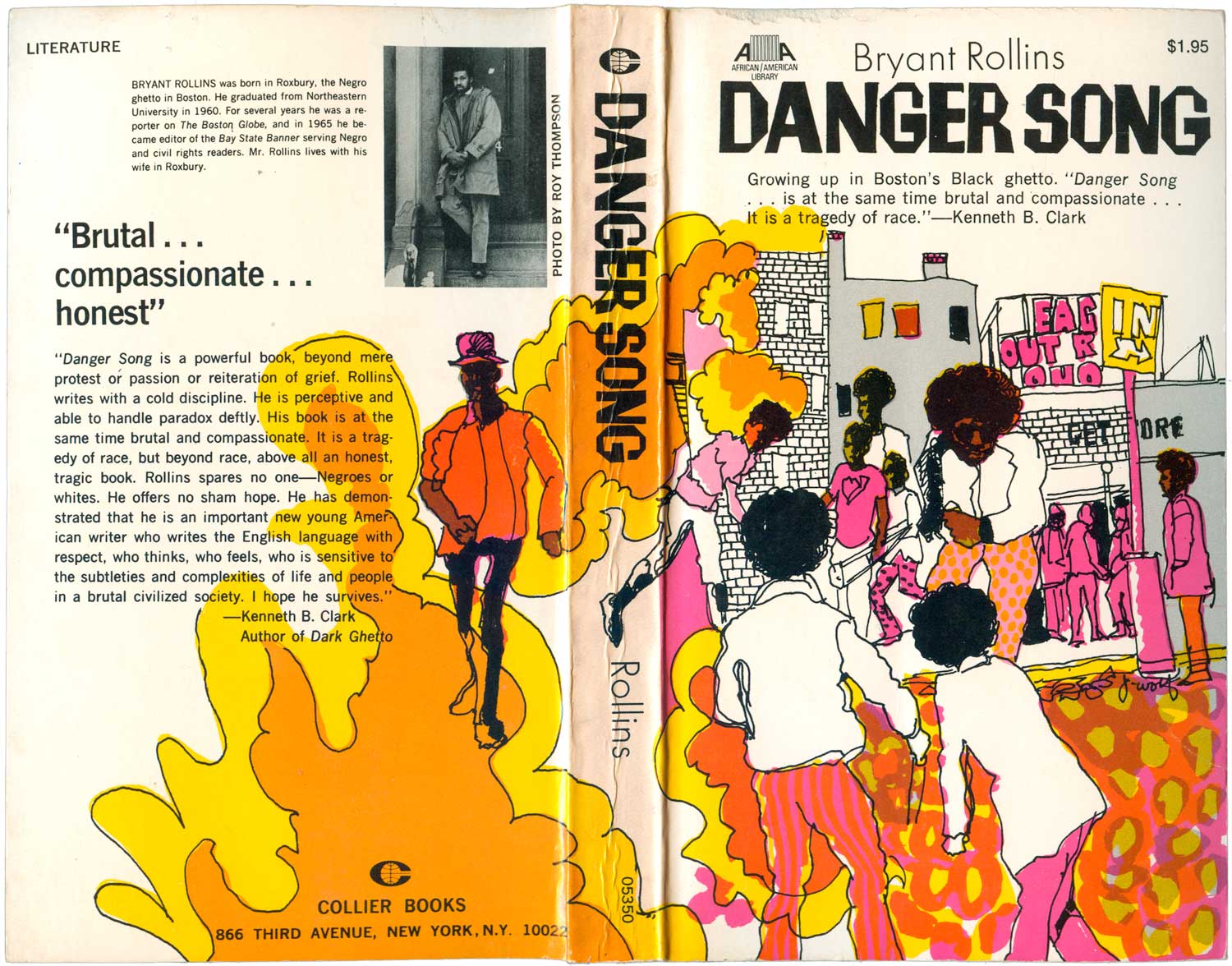
Bryant Rollins
Danger Song
New York: Collier Books, 1971
Cover illustration by Jack Wolf
Book #05350 [United States]
One of the nicest surprises here is this wrap-around cover Jack Wolf did for Bryant Rollins’ Danger Song. The loose, pop illustration is a celebration for the eyes, with yellow, orange and pink figures strolling, hanging out, fighting, and throwing tear gas. A riot is evoked, but also contained, as everyday life appears to go on around it. Bell-bottoms, disco, big afros, and happy trees and store signs mingle here, collapsing in on themselves the reemerging to evoke happening street life, slightly off-kilter. It’s possibly a coincidence, but this book and Kelley’s dem are the only contemporary African American novels in the series, and they have two of the strongest covers.
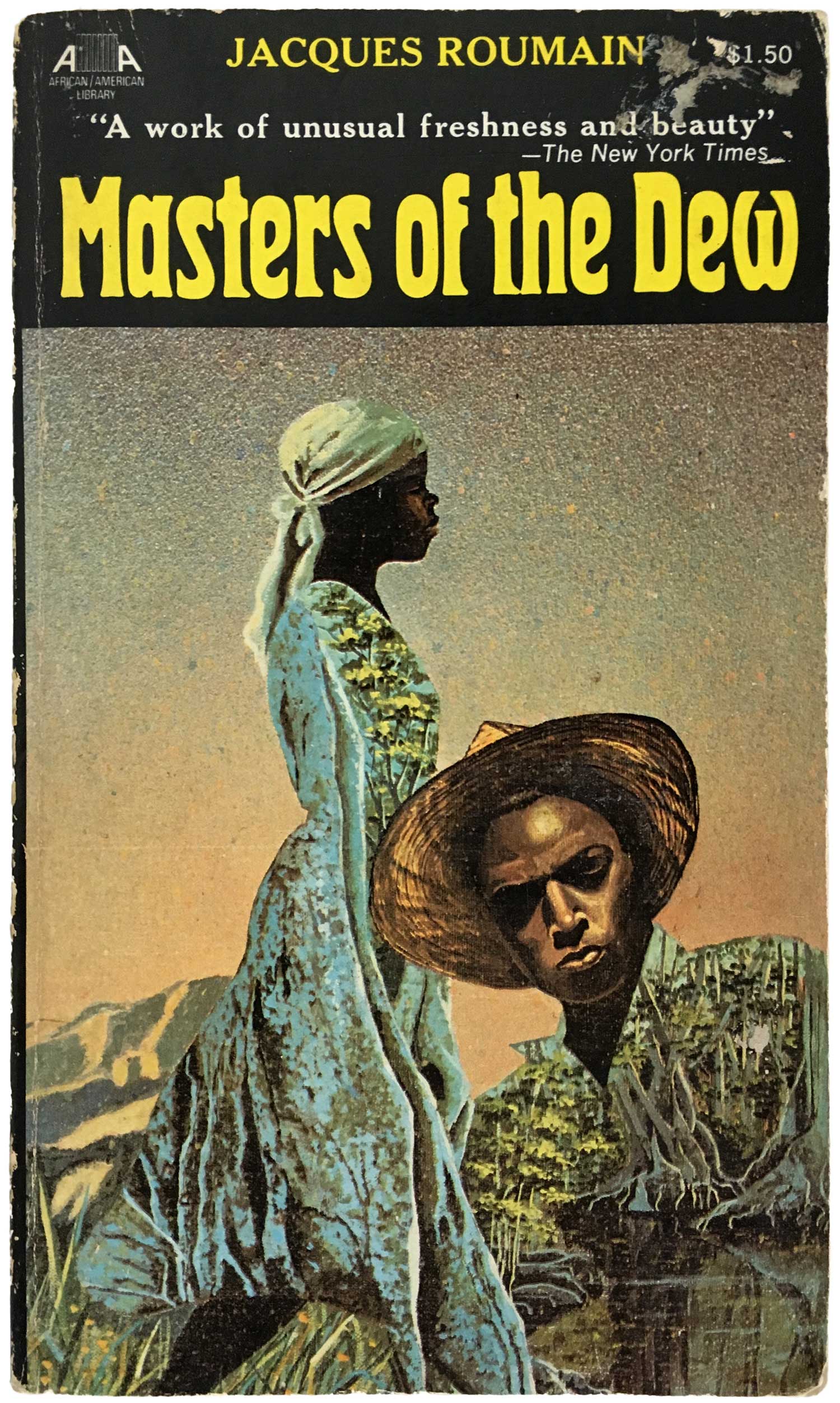
Jacques Roumain
Masters of the Dew
New York: Collier Books, 1971
Book #03555 [Haiti]
This has been the hardest title in the series to find, I just picked up a copy after keeping an eye out for it for the past three years! The cover is strong for the series, a detailed painting set on a black background, which contains the image (although it might have been stronger if the painting was allowed to bleed to the top, and the titling set on top of the painting background). The background and foreground are playfully engaged here by the filling of the figures with detailed imagery of swamps and forests. It’s a strong statement about the characters literally carrying within themselves the landscapes they came from.
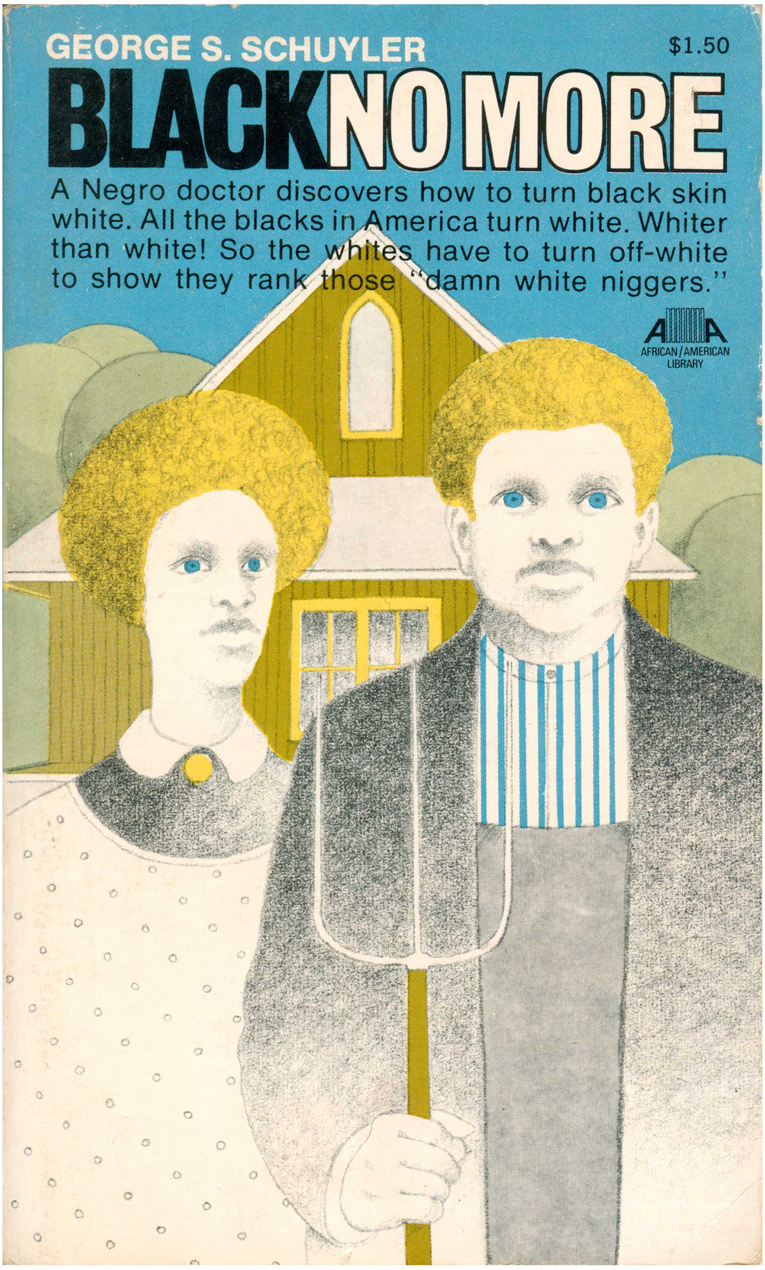
George Schuyler
Black No More
New York: Collier Books, 1971
Book #05365 [United States]
Shocking blue eyes look out from the cover of George Schuyler’s Black No More. A couple repeats the motif of American Gothic, they are still white, but they have Black features this time around. This twist is a bit shocking, and definitely catches attention, as I assume the novel did in 1931. (The image also reminds me of David Hammon’s 1988 portrait of a blond, blue-eyed Jesse Jackson entitled How Ya Like Me Now?) The basic plot is imaged by the cover: a future world where a Black doctor discovers a way to turn black skin white, and all that ensues from that conceit. The style of the image dates it, with the round trees in the background paralleling the afros but also evoking a neo-psychedelic, art deco vibe.
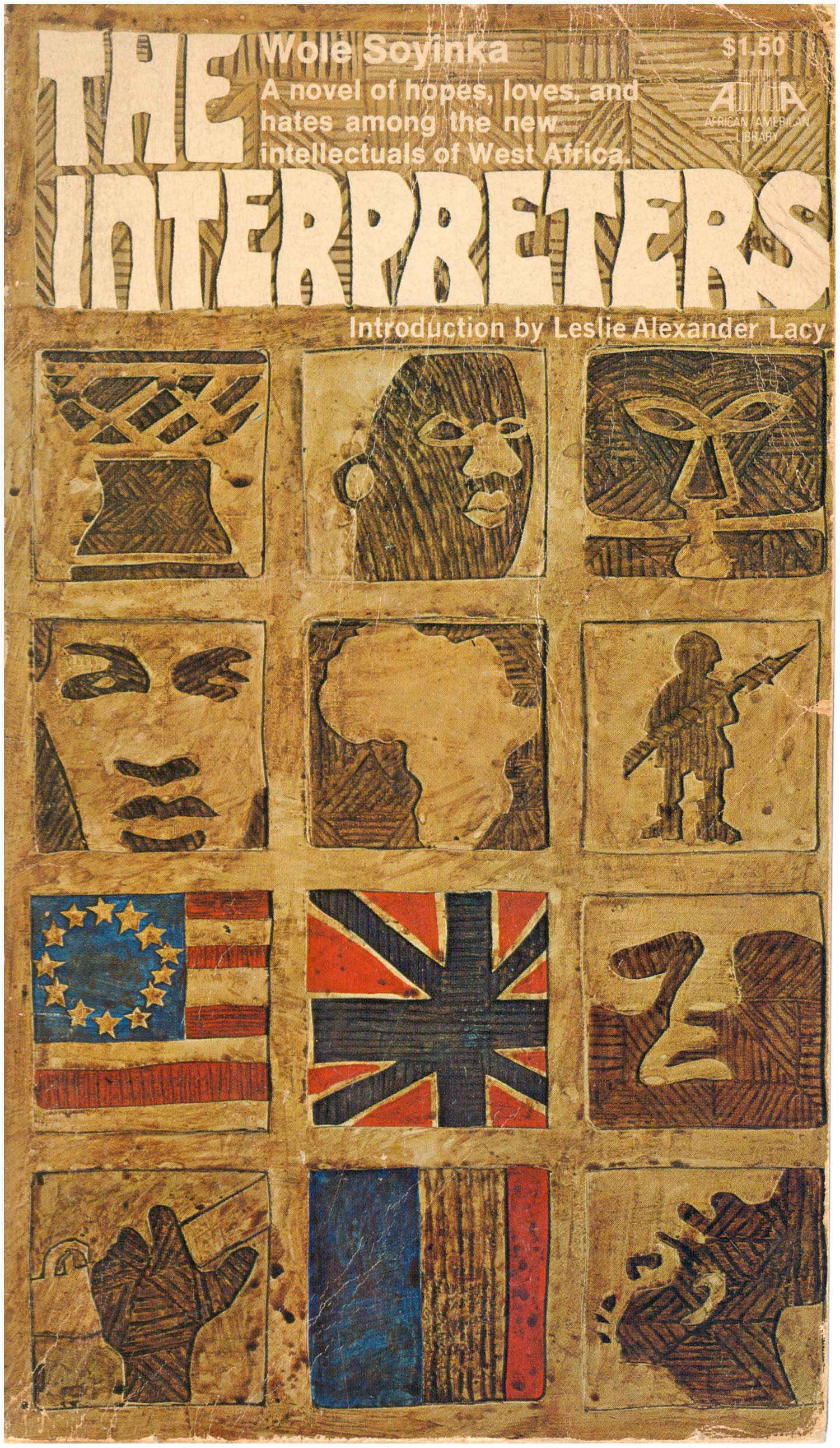
Wole Soyinka
The Interpreters
New York: Collier Books, 1970
Book #05390 [Nigeria]
Wole Soyinka’s The Interpreters carries a cover composed of a grid of “carved” images, similar to a couple of the Peter Abrahams covers above. The design works well, building an image of the content with a dozen small icons, and integrating the title at the top. Blocks fluctuate from representations of individuals to masks to flags.
Wallace Thurman
The Blacker the Berry . . .
New York: Collier Books, 1970
Cover art by Mozelle
[United States]
Wallace Thurman’s The Blacker the Berry. . . cover is powered by the illustration, the black silhouette feels lush on the deep purple background. There is too much text (per usual for so many covers) but it mostly stays out of the way, letting the strong face carry the design. The red oval glows on the side of the face, playing earring, berry, and blood spot. This is the only Af/Am Library book I have which is actually more recent, the edition I have must be from the 1980s or early 1990s. The Af/Am logo has been removed from the cover, and I believe it’s the only book that Collier kept in print after discontinuing the series.

Melvin B. Tolson
Harlem Gallery
New York: Collier Books, 1969
Book #07091 [United States]
Collier republished two titles by Melvin Tolson, Harlem Gallery and Libretto for the Republic of Liberia. Harlem Gallery’s cover is a raucous compilation of illustrated figures—cops and flappers, workers and bosses. The image is unfortunately overly caged by the type above and below. I usually like a tall sans serif, but here it deadens the otherwise highly energetic design. Overall the illustration would have been much better served blown up and out, bleeding off the edges, maybe with the marquee in the image turned into the actual book titling.

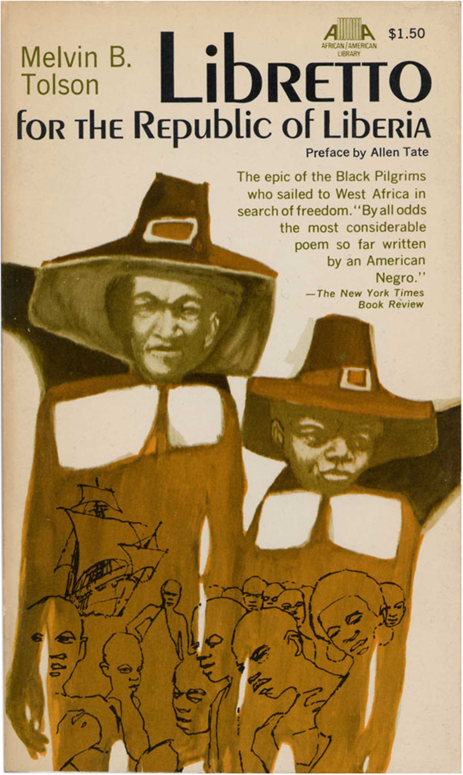
Melvin B. Tolson
Libretto for the Republic of Liberia
New York: Collier Books, 1970
[United States]
This cover is witty, re-imagining Black American immigrants to Liberia as pilgrims. At the same time a line drawing within the figures evokes slavery, confusing and complicating the image. I like the idea a lot, but overall the color could be stronger and more distinct, and would have helped the pilgrim deceit work better.

Eric Walrond
Tropic Death
New York: Collier Books, 1972
Book #05525 [Guyana]
And finally, Eric Walrond’s Tropic Death, with another great wrap around cover. The riotous and clashing collage of imagery is similar to the styles found on other Af/Am books like Peter Abraham’s A Wreath for Udomo and Wole Soyinka’s The Interpreters. The figure with a knife on the back cover is cribbed from Jacob Lawrence, while the one on the spine evokes classic images of Sandino from Nicaragua. African statuary and Haitian voodoo mix with palm trees, rainbows, and the Union Jack. Eyes morph into stars and flags, rainbows cut across the scalp, cheeks are obscured by trees and other faces, and the chin dips behind a voodoo doll. Somehow this kaleidoscope comes together as a whole, and sits comfortably under the bold title font, simple sans serif with a strong drop shadow. It grabs attention while balancing the power of the image.
* * *
I love mass market paperbacks. They are small, fit in your pocket, and were usually printed cheaply and in such volume that they hold little monetary value these days. Most of these African/American Library books I’ve been able to find on dollar racks, or for $2-$3. It’s pretty great to have this collection of literature still circulating for super cheap, that itself speaks to the value of this project.
This is an impressive collection of titles, but it’s unfortunate that overall it appears as if their design was an afterthought. The illustrators of very few of these covers were appropriately attributed, many I’m guessing based on reading signatures buried in the artwork. And even when I powerful illustration was used, the design is more often than not so slapdash as to undermine the imagery. Many of the covers seem hurried or low-quality, but in all fairness, others are smart and well-down, especially for what was likely a quick turn around and low budget. It is impressive that a major publishing house was able to roll out almost forty African and African-American literary works in accessible editions in a three year period.
It speaks the the late 1960s and early ’70s being a very different time than today, one where the Civil Rights and Black Power Movements carried over into a thirst for the literary history of the African diaspora, where relatively unknown African novelists were having their novels published in editions of tens of thousands.
There is one book in the series I have yet to find. W.E.B. DuBois’ The Quest of the Silver Fleece is listed inside a number of the later books as part of the Af/Am Library, but I can’t find any evidence that it was ever actually published by Collier. If you’ve seen a copy of it, please let me know, or better yet, send me a photo!
W.E.B. DuBois, The Quest of the Silver Fleece (New York: Collier Books, ???). [United States]


[…] First published in 1946, Peter Abrahams’ Mine Boy exposed the condition of black South Africans under a white regime. It presents a portrait of labour discrimination, appalling housing conditions and one man’s humanitarian act of defiance. (Image: Justseeds website) […]
[…] [From: https://justseeds.org/240-colliers-afam-library/%5D […]