Following last post’s foray into genre fiction, I’ve now hopped from sci-fi to crime. I’m a huge fan of detective novels and crime fiction, and in some might say that in the same way Philip K. Dick is the master of SF, Georges Simenon is the master of crime. Simenon was a Belgian author who wrote in French, and some claim (mainly his publishers) that he is the world’s best selling author. At first that might seem a little hard to believe, but consider that he published almost 500 novels, and hundreds of them are available in a dozen languages. This guy moves a lot of product, even now, over thirty years since his death. For the U.S. market, both Penguin and the New York Review of Books Press have been buying up rights to republish his work, and Penguin is in the process of releasing the entire run of 75 Maigret novels (Jules Amédée François Maigret is Simenon’s famous detective) in new English translations.
My first couple Maigret novels were random paperbacks I picked up here and there, but once turned on to Simenon, I started running across nice hardback editions that his original American publishers, Harcourt, Brace & World (which became Harcourt Brace Jovanovich in the early 1970s, and eventually Houghton Mifflin Harcourt, which it is now), began releasing in the mid to late 1960s and continued into the mod-1980s. I don’t know the numbers, but I suspect they released upwards of three to four dozen of his titles, and used well over a dozen different designers. I’ve collected thirteen dust jackets here, released between 1968 and 1985, and I’ve assembled them roughly in order of release. All the designs of these covers have to do with illusion, of one sort or another.
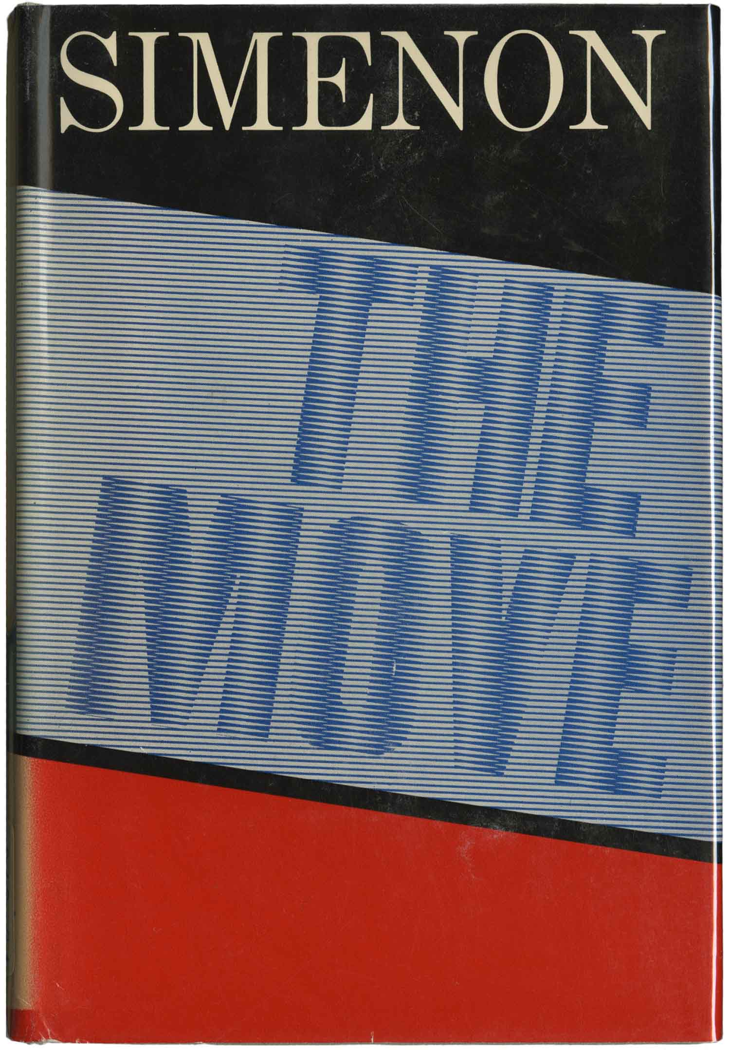
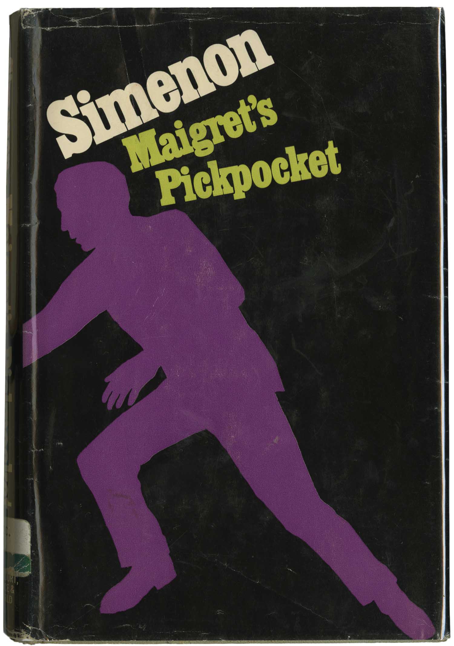
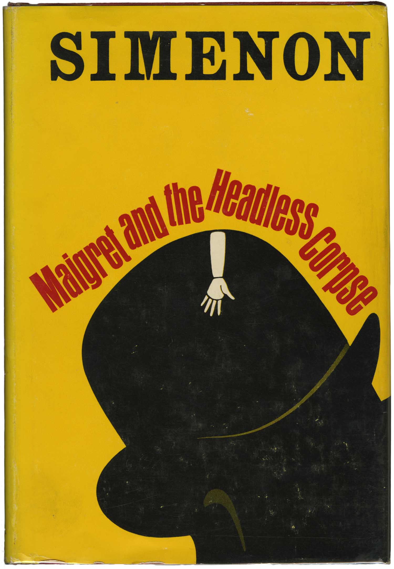
Above is The Move, the earliest of these hardbacks I have. Although it came out the same year (1968) as Maigret’s Pickpocket below, it’s unique in that rather than seeming hip and forward looking, it has a very dated sense, like a 1940s or 50s vibe. The simple color palate; the tall, thin, classical serif author name; the slant of the design; and the fact there is nothing pictorial on the cover all add up to a real “Modern” feel. Here the illusion is rooted in the optical, with two different sets of straight lines being used to generate the books title. The two covers below appear much more contemporary, with staggered typography and slab serifs (look at the difference the thicker type makes on your impression of the name Simenon at the top of The Move vs. Maigret and the Headless Corpse), and the visual trick is rooted in the playful interaction of hyper-flat surfaces to generate the perception of a depth that isn’t there. Maigret and the Headless Corpse also features a bowler cap, which along with a traditional pipe, are ever-present accoutrements of Maigret.
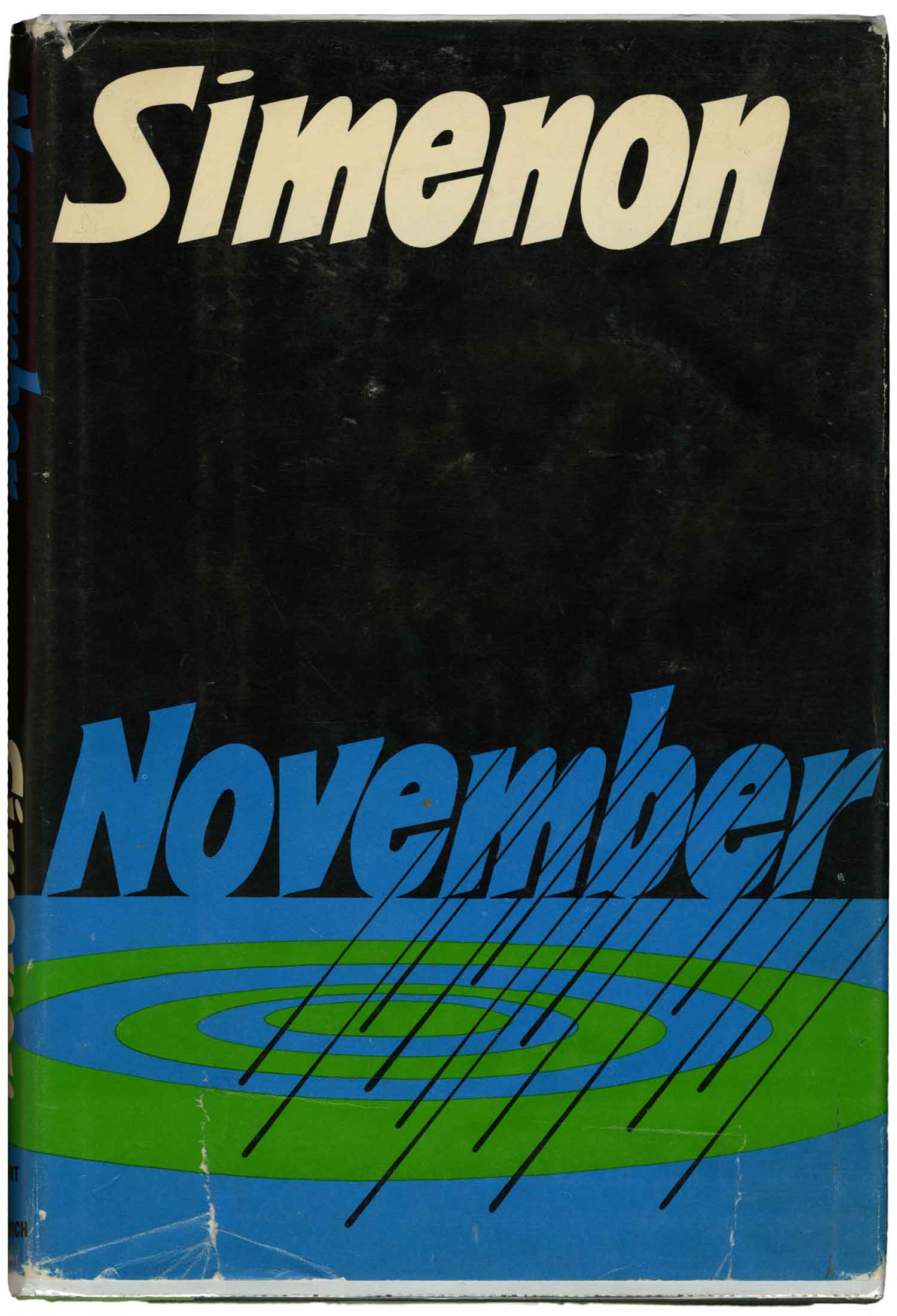
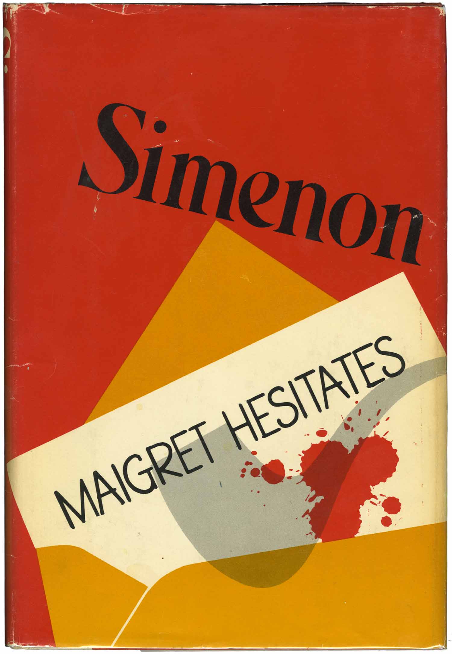
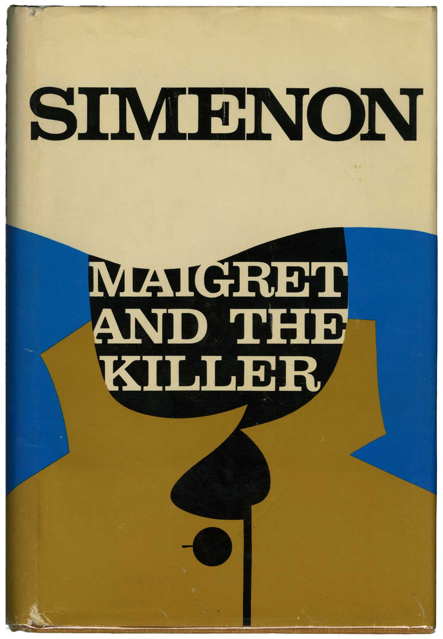
All three of the covers below were designed by Anita Walker Scott, who was really active in the book cover field in the 1960s and 70s. Like the two covers above, all of these play with the illusion of movement or depth on flat surfaces made up of very simple shapes and objects. On November the target in extreme perspective creates a depth of field, but the rain which is angled the same over the target and throughout the letters of the title challenges that perspective. On Maigret Hesitates the top half of the cover seems like a purely formal composition, Simenon’s name balanced on top of two pointy shapes, but the shapes resolved into an envelope and letter, splattered with blood and shadowed by Maigret’s famous pipe. And with Maigret and the Killer we have Simenon’s name rendered at the top in an almost identical bold serif as on Maigret and the Headless Corpse above, but the bottom half of the design uses minimal shapes and color to sketch out a figure in a trench coat and hat.
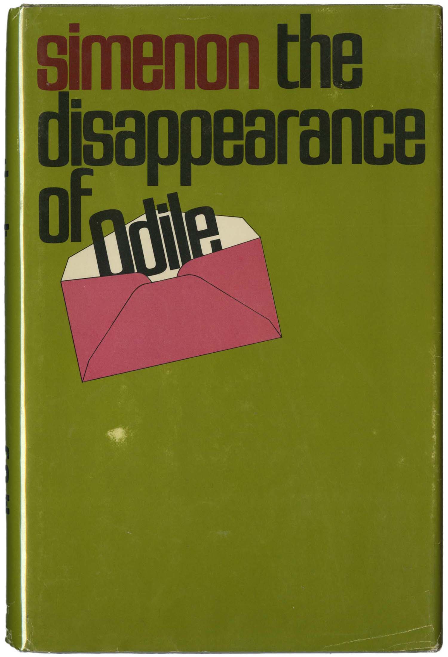
Both of the covers below are bold in their simplicity, composed almost entirely of the author’s name and title, with only the smallest flourishes of imagery. I really love how both covers allow for so much negative space, and The Disappearance of Odile in particular evokes a real sense of disappearance by leaving the entire bottom half of the cover empty.

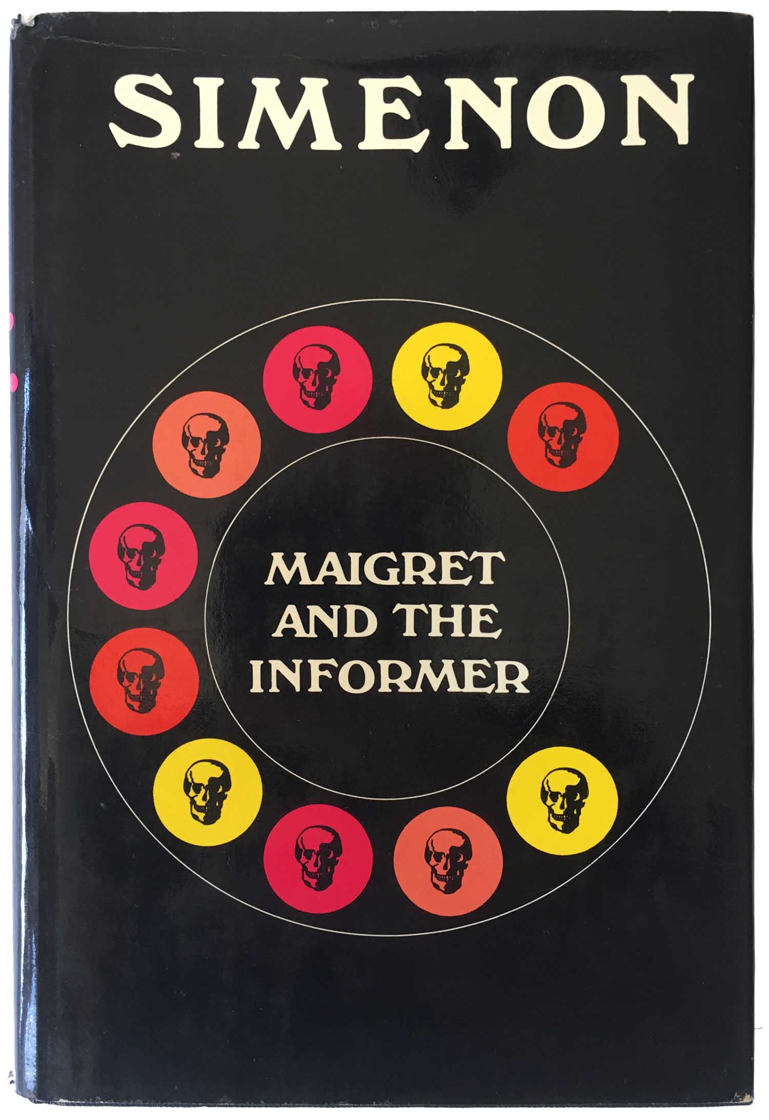
The visual gag on the Maigret Trio is simple but fun, with the 3-ringed key turning into a gun. The design of Maigret and the Informer is genius, using 12 circles to construct the illusion of an old rotary phone, with each number replaced with a skull. The use of bright color in the circles really makes them pop against the black background.

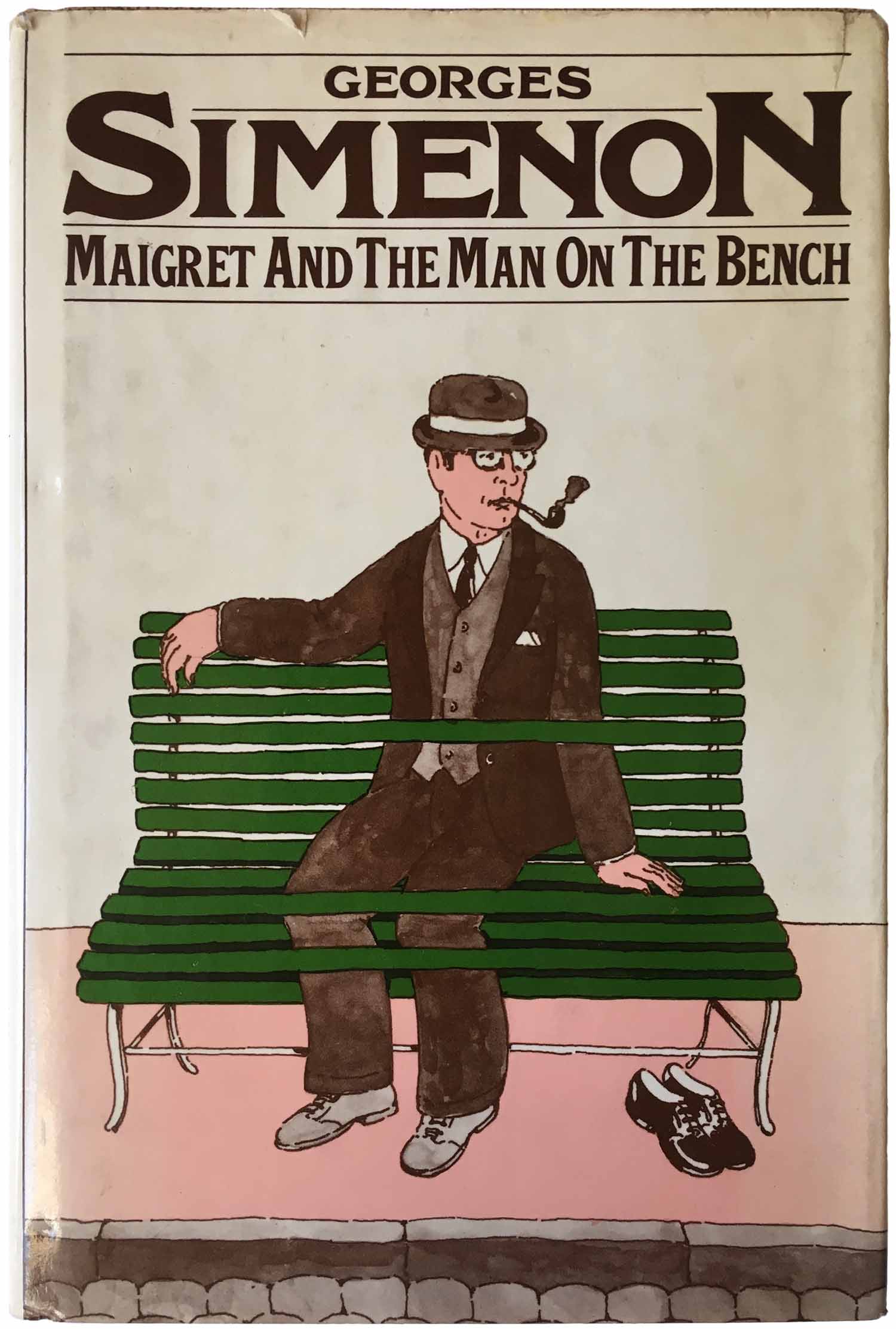
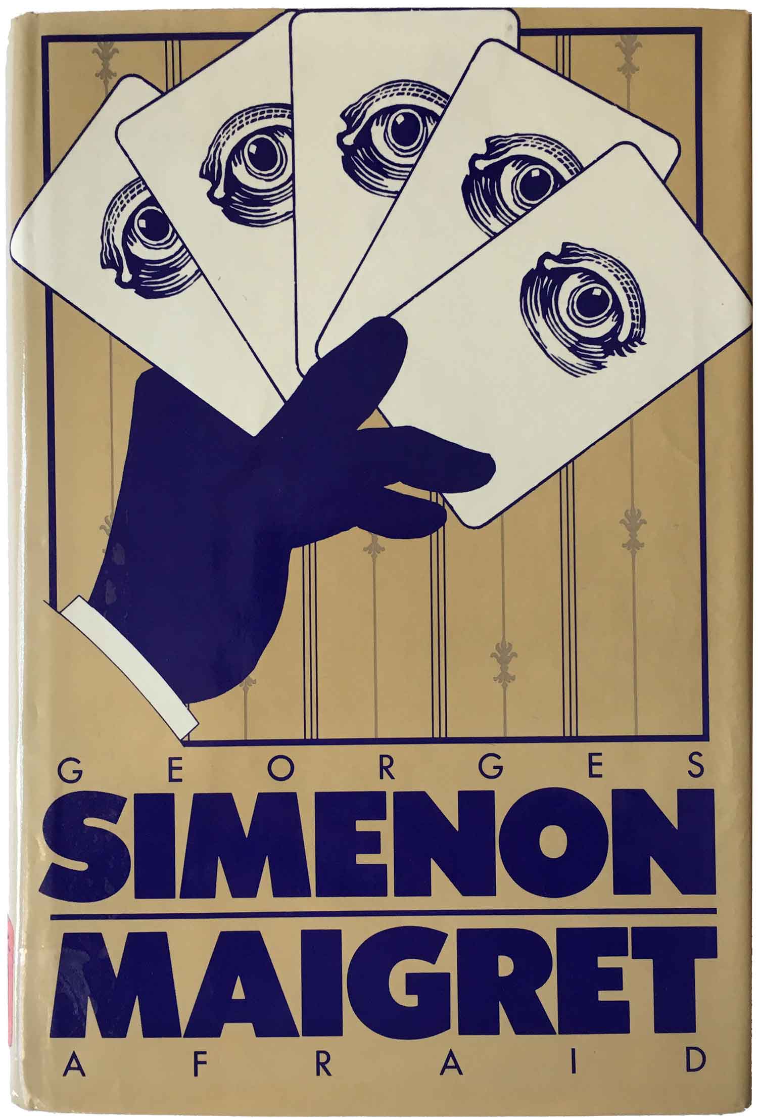
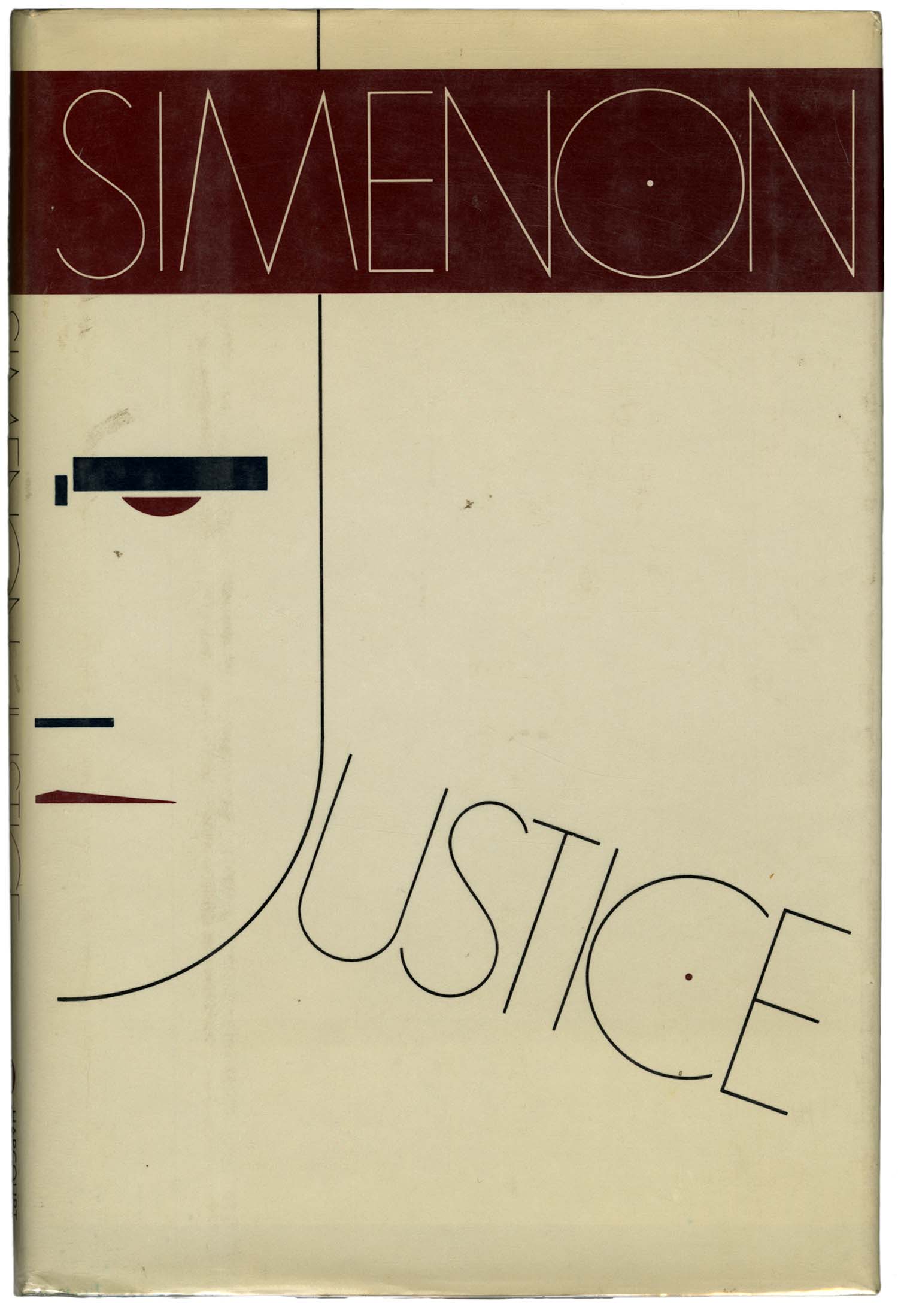
These last three covers are from 1975, 1983, and 1985 respectively. Although I don’t dislike them, I feel like by this point in the series the designers had abandoned the flatness that makes so many of the covers feel so successful. Maigret and the Man of the Bench was designed by Seymour Chwast, and it feels as much a Chwast cover as a Simenon one. I suppose this is a fine thing, but the playfulness of the figure on the bench carries none of the edge or unease that exists in many of the previous covers. Maigret Afraid gets a little of that back, but also feels both too polished and has too many visual elements competing for attention. And finally, the cover of Justice is a bit of a mess. The J of the title makes up the shape of the face, which I suppose fulfills the “illusion” requirement, but lazily. And the face itself has a Bauhaus-logo vibe, but to what end? I’m confused what this cover is supposed to be communicating to me.
Most of the other later covers that I have seen are like these last three in many ways, and didn’t even seem worth me picking up. Many feature garish, surrealist-style paintings (sadly popular in the 80s), which claim to be about illusion yet leave nothing to the imagination.
Bibliography: