EPIC Bee was inspired by the logo for Upton Sinclair’s EPIC movement (End Poverty In California) from the 1930s. Sinclair’s plan called for a massive public works program, sweeping tax reform, guaranteed pensions, and state seizure of idle factories and farm land where the owner had failed to pay property taxes. The farms and factories would operate as self-sufficient, worker-run co-ops. EPIC also called for the implementation of California’s first state income tax, with the wealthiest being taxed at 30%.
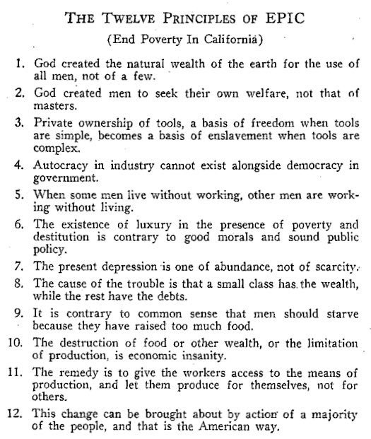
Having run twice before as a Socialist, Sinclair ran as a Democrat in 1934. Thousands joined EPIC Leagues, and by mid-1934 there were more than 800 clubs across the state.
The Socialist party refused to allow its members to be active in any other party and expelled Sinclair, along with socialists who supported his campaign. Internal opposition from corporate Democrats (sound familiar?), FDR’s lack of endorsement, and a more moderate candidate from the Commonwealth/ Progressive Party, split the Left vote, allowing the well-funded Republican campaign to win with 49% of the vote.
Sinclair’s 37.8% represented a vote total that was twice as large as any Democratic candidate in California history. While EPIC did not win the gubernatorial election, the movement influenced many New Deal programs, and went on to shape California politics and spread up the West Coast with even greater success in Washington State. More on the EPIC campaign can be found here.
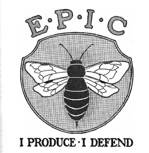
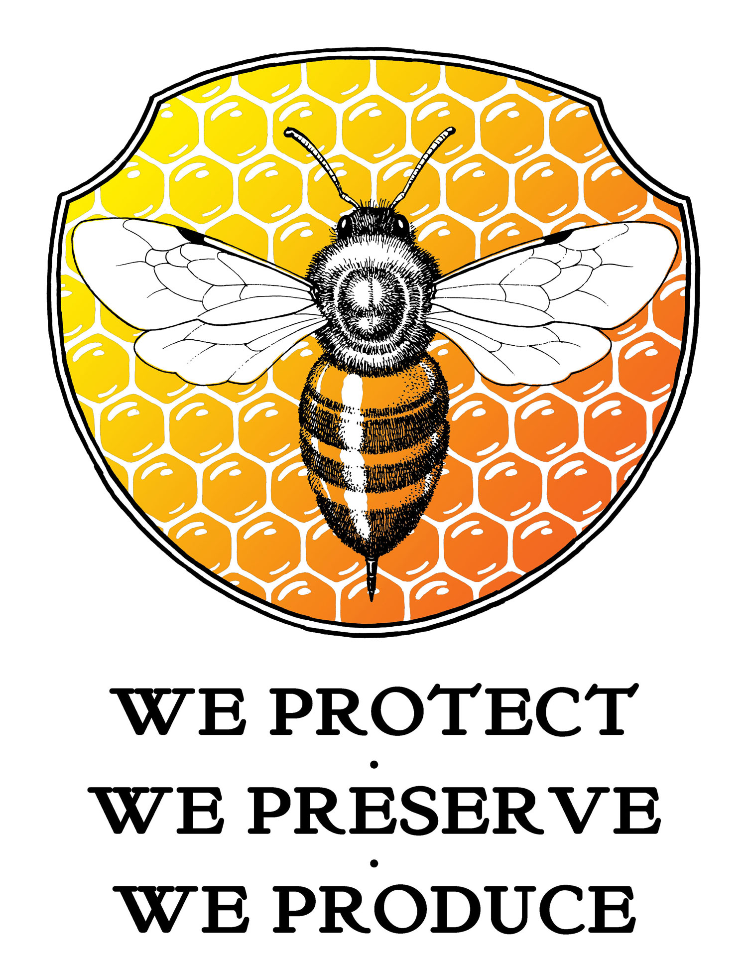
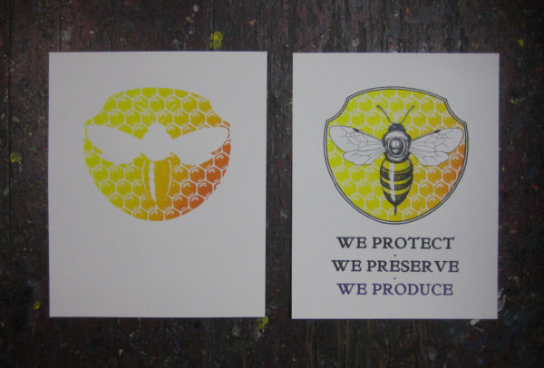
The original EPIC bee logo had the words “I Produce. I Defend.” In my work as a housing activist in San Francisco, I’ve found it important to ground our work in three aspects of how we relate to housing: Protection for low-income renters and tenants, Preservation of the existing housing stock in our gentrifying communities, and Production of new permanently affordable housing. The collective work of bee colonies to protect the hive, produce honey and preserve for future generations seemed a perfect fit for illustrating the “Three P’s.”
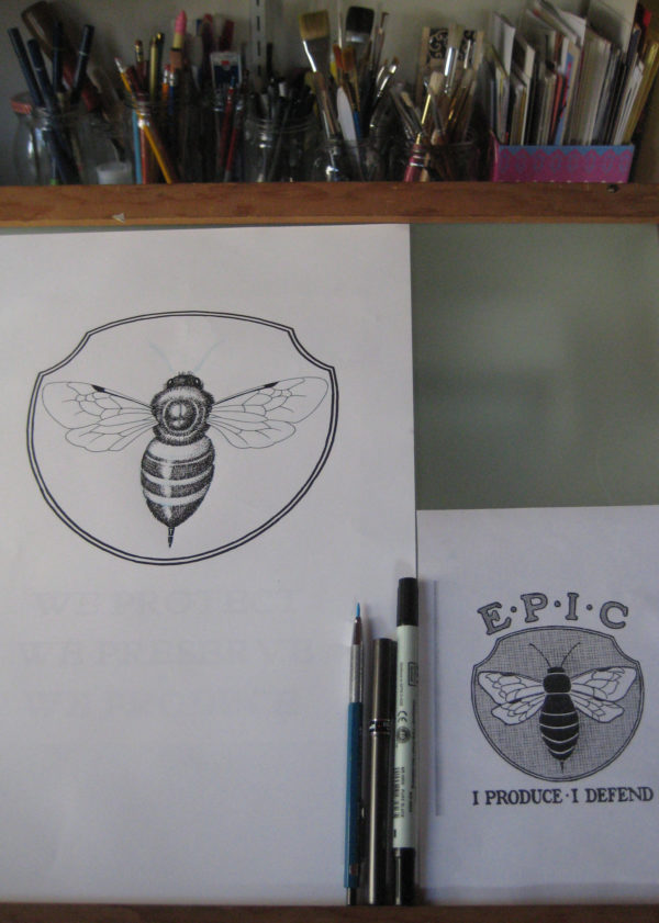
Rather than copy the delicious Art Deco bee of the logo, I studied bee anatomy to draw my own, though I exaggerated the stinger to match the original. Did you know bees have three extra eyes on top of their heads called ocelli? I drew them in, but they’re pretty small and you can’t really tell in the print…
You can get a print from the first edition here!

I forwarded this great updating of the EPIC logo to the Yellow Vests with one small addition: a red star where the red hourglass of a black widow would go: both EPIC and the red star came from California, and both emphasise that the Yellow Jackets are a workers’ movement. Kudos!