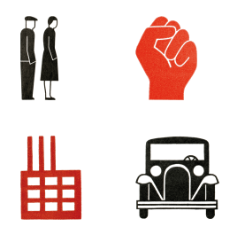
Pictograms are a type of visual language that is ubiquitous today. They are regularly used along highways and streets, in the olympics, or on bathroom doors. These symbols (often called ‘peds’) originally came from the same utopian dream as esperanto, to create a language that was simple, clear, and international.
One of the progenitors of this movement was Gerd Arntz. He was born in 1900, and associated with left (anarchist, socialist, communist) movements in his native Germany. In the late 1920s he moved to “Red” Vienna, then under a socialist government. There, along with Otto and Marie Neurath, he began developing the visual language of Isotype.

I first saw Anrtz’ work on the Institute for Social History’s website, and was hooked when I saw a block print of communist peds cutting phone lines and re-appropriating money from a bank. Beyond the obvious propagandistic images like this, I think there is something valuable in his and the Neuraths’ work that tried to convey complex modern information in a graphic format. These type of info-graphics and pictograms are so commonplace today that it’s shocking to think they were created with the radical intention of making geography, economics, and politics understandable across language or literacy barriers.

The images on this post are mostly from a new website devoted to Arntz’ work (the Gerd Arntz Web Archive), it’s lovingly assembled and rich with images, especially the work he did with Isotype. In contrast to a book of his work I have (from the 1980s) the website downplays (or excludes) much of his work with radical content. Aside from that, I’m excited for this new book, the new interest in his work, and I love the web archive.
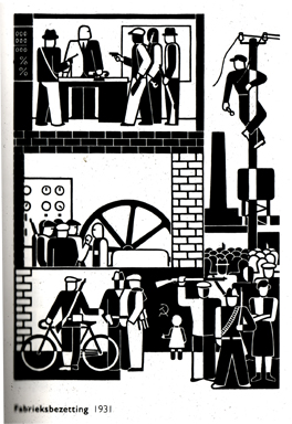
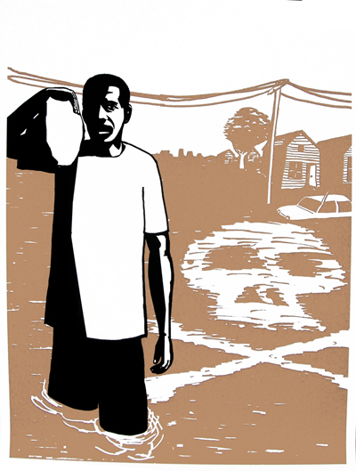
Some of these are mysterious. Like what is the person with a loaf of bread supposed to mean? A baker? The person is hungry?
http://www.gerdarntz.org/node/204/
I think it means agricultural worker.
If you look on the Isotype page you’ll find 10+ of these with the same shape but with a different symbol inside, each one representing a different industry.
I’d like to read more about the development of Isotype and the development of data visualization more generally. I can definitely see the utopian impulse, but I wonder if some of the liberatory potential backfired? It seems that we now regularly see large numbers of people represented by abstract images and numbers, and in a way this dehumanizes them. The numbers of people killed in wars, or die from malnutrition, are so huge that they are actually beyond our ability to truly visualize. I wonder if the conversion of these people into simple graphic data ends up erasing the severity of what happens to them as much as it helps us “see” them?
That said, I do love Arntz’ work. It reminds me a lot of the work of Anton Van Dalen in NYC in the 1980s and 90s, who used a similar simplified graphic language to attempt to explain the way gentrification, violence, drugs, and real estate were changing his neighborhood, the Lower East Side. This kind of imagery clearly still has contemporary resonance, and I would guess most logotype designers are familiar with Arntz’ (and possibly Van Dalen’s) work, their just using it to make new logos for oil companies and other things that obscure our understanding of the world rather than clarify it.
Word. In my original post I had a story about being lost in Poland and needing to take a crap, finding a MacDonalds and then finding a (free) men’s bathroom. I cut it out because I wasn’t really sure what I was trying to say, but I think it relates to your second point above, that this kind of work has just become part of the corporate landscape. Esperanto came from a radical notion, but what if esperanto became the lingua franca? What if every MacDonald’s employee had to speak esperanto? What if you could travel around the world ordering lattes in esperanto and ignore everything else? There’s two sides to internationalism…. corporatism and socialism and it’s not surprising they have the same tools.
I’m not sure if I agree with your first point. I think, if anything, isotype depoliticizes things (not truly… but aesthetically), and gives the veneer of objectivity that it is so effective that it becomes invisible. Maybe I’m not disagreeing at all!
Also you should read about Otto Neurath, founder of Isotype, kind of a wild man, Buckminster Fuller type.