I was over my friend Aaron’s house nine months ago or so, and stumbled upon a book on his shelf published by Seven Seas Books. The spine was clean and handsome, the title in a simple gothic and in English—but upside-down, like most French and German books. A bold black bar runs across a half inch of the bottom, and a bold Bodoni poster-style number 7 sits atop the bar. Aaron explained that it was a Seven Seas book, an English-language publisher in the 60s and 70s in the GDR, or East Germany.
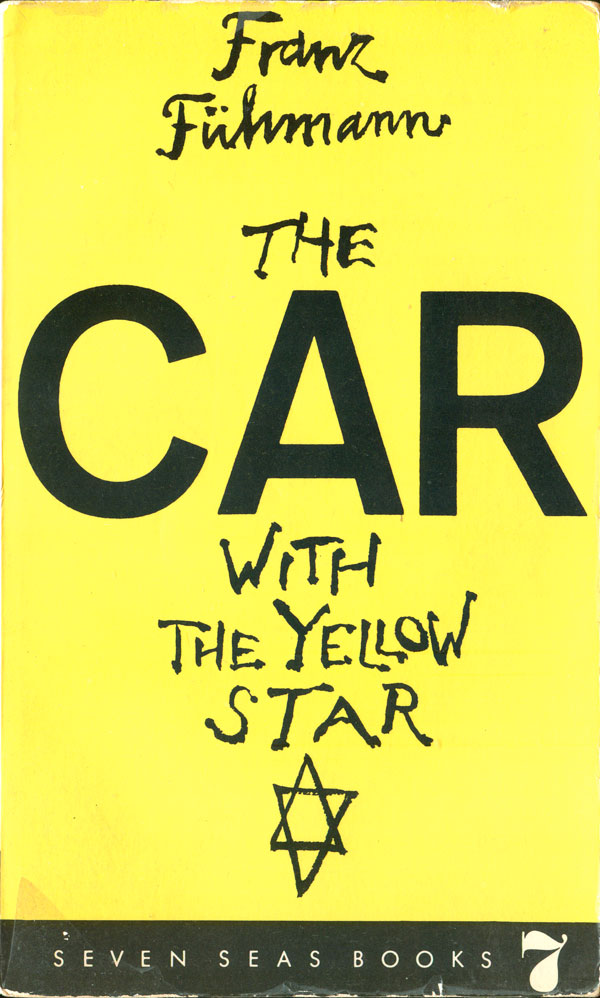
I filed it away, and started looking for these while scanning the shelves at bookshops. In Milwaukee I found my first Seven Seas title, Franz Fühmann’s The Car with the Yellow Star (1968). It turns out that the book is good example of what Seven Seas was publishing. Fühmann was a popular East German poet, and this is his only novel, the semi-autobiographical story of a boy growing up in Germany in the 1930 who is taken in by fascist ideology and becomes a faithful soldier of the Nazis until coming to a new consciousness in a prisoner of war camp.
The cover is also a strong example of the work that typically graces Seven Seas titles. All their book covers, as far as I know, were created by the accomplished East German designer Lothar Reher. Reher worked for a number of German and Eastern Bloc publishers, but there is little about him in English. I found a decent German piece about his book design, which you can haltingly read in google-translated English HERE.
The Car with the Yellow Star is an almost entirely text design, with black hand scrawled type floating on a bright yellow field. The word CAR jumps out, both because of its size and distinction of being in a bold sans serif face. These traits call attention to the oddness of the word in the title: why Car, and not Man? What is a Jewish car? The only non-text element is the Star of David at the bottom, after, but part of, the title. The use of the star makes it clear that the yellow star is a direct reference to the emblem the Nazi’s forced Jews to wear on their clothes during the Third Reich. That simple symbol makes it clear when and wear the novel takes place, and largely what it is about.
Herbert Aptheker’s And Why Not Every Man? (1961) is an interesting contrast to the Fühmann cover. It is also completely type-based, but uses two texts in tension with one another, overlapping and overprinted, to convey the contents. The title’s question, in bright pink, sits on top of the most well-known piece of the Declaration of Independence, “We hold these truths…all men are created equal….” The promise of the Declaration is squarely challenged, and the deep historical roots of the books subtitle, “The Story of the Fight Against Negro Slavery,” are illuminated. The back cover is also packed with wall-to-wall text, giving the entire book a sense of bursting at the seems.
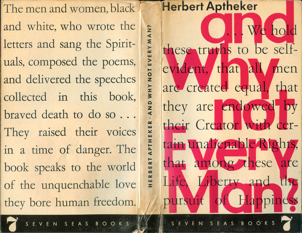
It is also no coincidence that Seven Seas is publishing Aptheker, a Marxist historian who was both a member of the Communist Party and deeply critical of the United States. Much of the Seven Seas list is filled with two types of books: political novels by writers from Communist countries a la Fühmann, or texts by American or British writers that are either Communists themselves, or can be seen as critical of US and UK policy when placed in the rest of the Seven Seas stable. But to be clear, most of the titles seem to have significant literary merit, this was not simply a propaganda press. This was a solid attempt to produce meaningful English-language texts in the Eastern Bloc. A question is who was the intended audience of these books? Internationals behind the Iron Curtain?
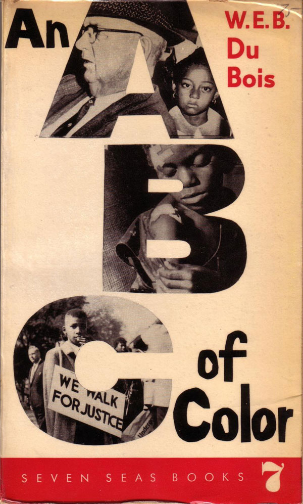
The struggle of Black people in the US is heavily represented in the list. Below are books by W.E.B. DuBois and an edited collection by Ernest Kaiser. They both have effective, but very different, covers. The cover for DuBois’ An ABC of Color has many of the hallmarks of Reher’s design. The bold and dominant use of negative space highlights the elements that are present. The type is a combination of hand designed and industrial, with the continued preference for a strong sans serif (modified Helvetica) for the font. The handwritten title elements compliment the collaged ABCs, giving the book a children’s vibe, which heightens the tension with the serious content.
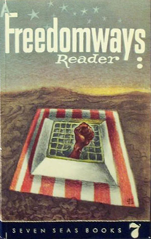
The Freedomways Reader goes for an entirely different tack. Although cohesive and interesting, the cover illustration is quite strange when you really look at it. A black fist bursts out of a barred window, I think we can figure out what that represents, but then the window sits of a striped field recalling the American flag, embedded at an awkward, horizontal angle into a brown, earthy landscape with rolling hills in the background. Huh? Is the United States a subterranean cage hidden under a beach blanket?
The always great 50 Watts book aficionado site has a short write-up on Seven Seas, but surprisingly only a couple cover images. Their piece can be seen HERE, and as far as I can tell it’s the only English language synopsis of the press online. They’ve also got a pretty solid bibliography of titles published—many more than I’ve been able to hunt down, but also missing a couple that I have.
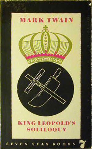
Like the two books above, these two Mark Twain covers show the diversity in Reher’s work. King Leopold’s Soliloquey (1961) reads as antiquated and staid (with its black border all around and discreet and kitschy symbolism) , while Your Personal Mark Twain (1960) is boomingly modern—almost Constructivist, the giant M and T making up the architecture for the rest of the cover.
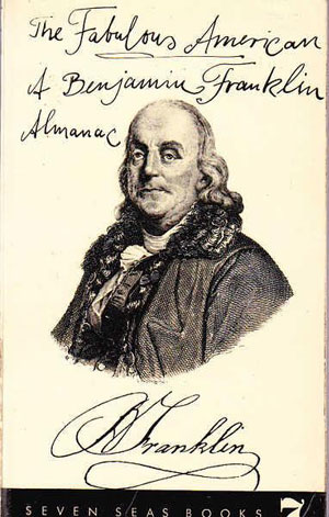
Twain is a radical figure in the history of the U.S., although so central to U.S. literature it is easy to forget that, and lose track of why an East German publisher would be reprinting his work. The recuperation of Benjamin Franklin as a figure of the Left is even more intrepid. Reher comes up with another bold and efficient design, maximizing the negative space, centralizing Franklin, and scrawling the title around him in a style that reads as off the cuff but is also clearly intentional. Like The Car with the Yellow Star above, the playful hand script gives the cover an almost zine-like quality, making very serious subject matter seem both approachable and more human. The inclusion of Franklin’s signature on the cover seems unnecessary at first, but it anchors the image, balances the title lettering, and reminds us that Franklin was a signer of the Declaration of Independence, and at the bedrock of the history of the United States.

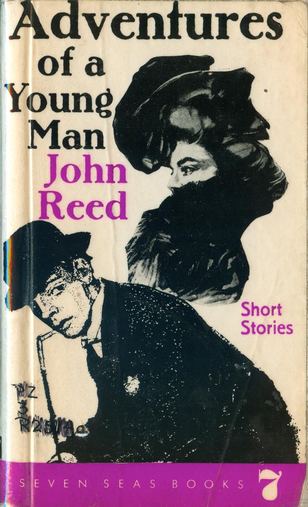
American-born Communist journalist John Reed is not surprisingly part of the Seven Seas list. And again the covers of the two books I’ve found could not be more different. The covers diverge around a certain ornate craftiness on the one hand (Adventures of a Young Man, 1963), and a very austere modernism on the other (Insurgent Mexico, 1974).

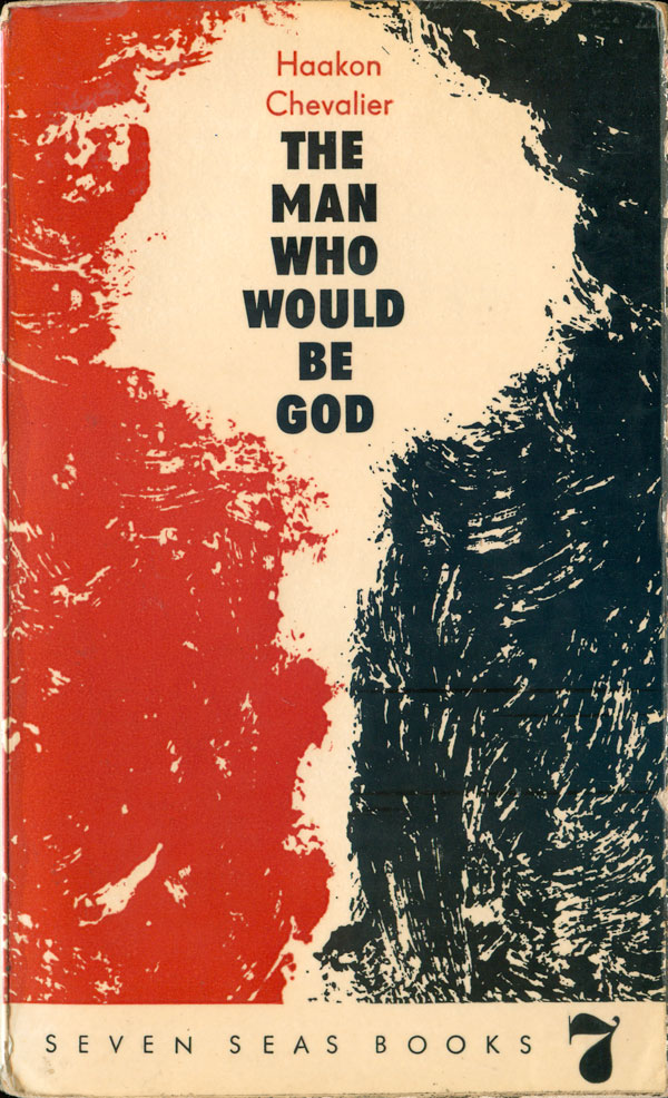
To close out this first installment of Seven Seas, below are Haakan Chevalier’s The Man who Would be God (1963) and Louis Fürnberg’s Conversations in the Night (1969). The Chevalier cover is straight forward, scratchy black and red shapes converge the leave a mushroom cloud-shaped negative space. The two facing sides also bring to mind those children’s games where two profiles make another shape or face in-between them, but the profiles here are blank, no matter how hard you look, the man of the title doesn’t appear, all that is made out of the shapes is nuclear disaster.
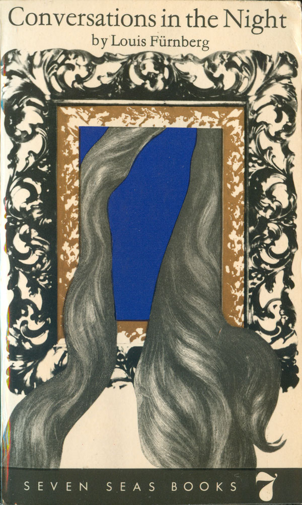
Conversations in the Night is much more playful. Reher returns to using montage, this time women’s hair pouring out of an ornate picture frame. On the one hand surreal, this approach is also reminiscent of Polish poster design. The deep blue that sits in the frame makes the image feel even stranger, as we try to plug a face into the space between the flowing locks of hair. The overall effect is pretty disturbing, as I want to both turn away and understand something that seems impossible to make sense of.