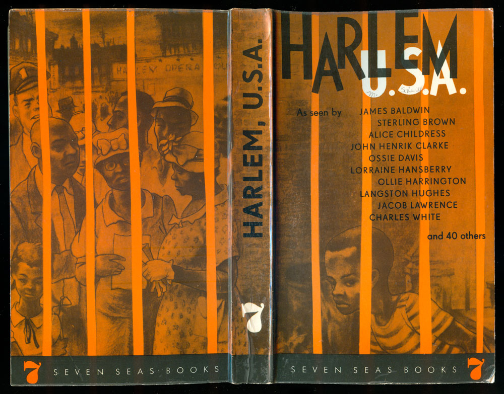
For this third entry into the books put out by East German publisher Seven Seas in the 1960s and 70s, I want to look in-depth at a single title. By far the coolest Seven Seas book I’ve picked up is Harlem, U.S.A., a huge collection of writings and art by Black cultural icons, most from the Harlem Renaissance period. The book was edited by John Henrik Clarke, and published in 1964 (and largely drawn from work originally published in the Civil Rights Movement-aligned journal Freedomways).
This is the only Seven Seas title I’ve seen with a cover designed by someone other than their house design Lothar Reher. The cover design is attributed to Oliver (Ollie) Harrington, an African-American cartoonist with an interesting political history. Popular with other Black artists in the 1940s and 50s, Harrington produced editorial cartoons for newspapers, became head of public relations for the NAACP, and eventually fell on the radar of the House Un-American Activities Committee. Fearing for his life, he fled to East Germany in 1961, and lived out the rest of his life in East Berlin.
So the cover is a wrap-around, featuring one of Harrington’s comics of a crowd of Black people, looking pensive and closed, largely because of the bars that lock them into the image frame. There is no doubt that Harrington sees Harlem and the US as a prison. While the figures on the back appear to be going about their business, if sullenly, the child on the front seems hunted and penned. The bright bars of orange push the duo-toned image to the back, with the title, in particular the white U.S.A., dominating the cover. The cover is strong, but clearly the work of Harrington alone, a communist in exile in the Eastern Bloc, and likely out of touch with what was going on in the US. It is dark and oppressive, with none of the ascendancy, power, and light brewing in the Civil Rights Movement back home.
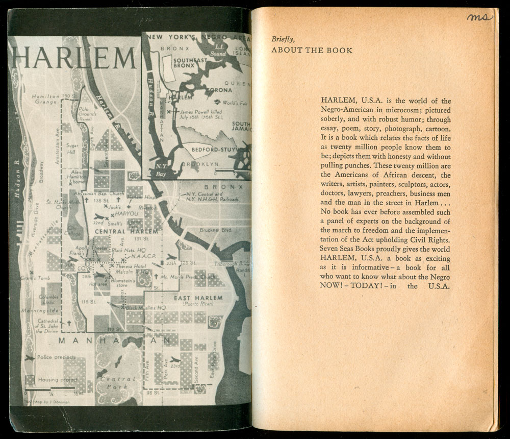
The book opens to a great old map of Harlem (originally from Time magazine), with hot spots marked, including Malcolm X’s HQ, NAACP HQ, and the Apollo Theater, and a scattering of hypodermic needles (but no key to explain them).
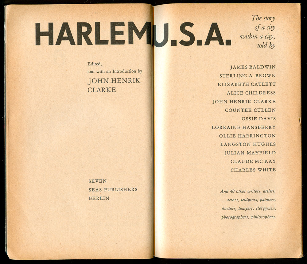
The full title page is clean and expansive, with the title stretching across both pages, and a large amount of content and credit information comfortably listed. The full right justification on the recto, and the mid-page left justify on the verso really work.
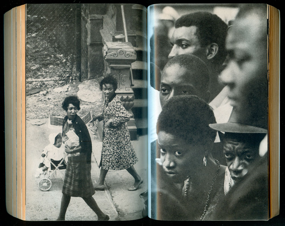
Tucked into the book are five sections of images, including cartoons by Ollie Harrington, a survey of Harlem artists, and photographs of Harlem street scenes and the March on Washington. Below is a spread of images of Elizabeth Catlett’s sculpture, and below that a spread of John Taylor’s photographs of Harlem streets. The photos are so tightly packed into the book they almost function like montages.

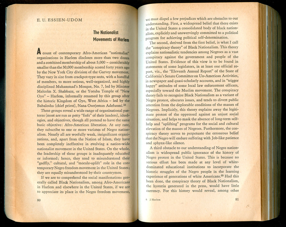
And below is a typical spread of the beginning of a written piece, with the author’s name in all caps at the top left, the title in a tall gothic to the left, and the text cleanly and evenly spread across the pages. It’s simple, but extremely comfortable and easy to read.
Next week I’ll finish up the Seven Seas books with a collection of all the rest I’ve found over the past year.
