The last handful of years have seen an explosion in student organizing, here in the States, but also across the world, with hot spots in the UK, Austria, Sudan, and a slew of other countries. But here in the U.S. most people associate “student revolt” with the 1960s, and that is in large part due to the media representing and re-representing 60s and 70s student movements. One small part of that media apparatus is the publishing industry. During this pre-internet time, books played a much larger role in many people’s lives, and what were called “Mass Market” paperbacks (smaller, pocket-sized books, usually around 4″ wide and 7″ tall) were regularly sold in the tens, if not hundreds, of thousands of copies, and were available not just in book stores, but drug stores, five and dimes, newsstands, and supermarkets.
Partly these books were competing with other print media like tabloids, newspapers, and magazines, there was a need to make them seem sexy, and create exciting and often somewhat exploitational covers. This was most obvious in the realm of sex, with racy, titilating covers for novels with sexual content, but spread out into politics when publishers were trying to figure out how to sell books about race, gender, and sexuality. This in turn spread across other political realms, including the broader Left, and student movements, generating a small genre of covers I call student-sploitation books.
Roger Rapoport and Laurence J. Kirshbaum’s exposé Is the Library Burning? is a classic of this genre, with it’s inflammatory title and red and black duotoned cover image of a gas-masked soldier staked out in front of an ivory-covered university building. Not exactly subtle.
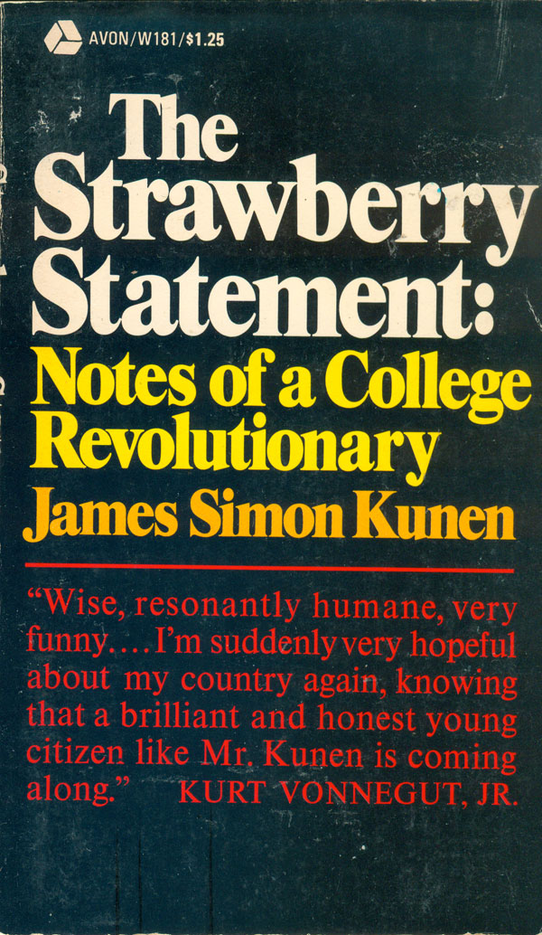
Two of the most circulated books that their respective publishers tried to capitalize on were the “tell-all” manifestos The Strawberry Statement: Notes of a College Revolutionary by James Simon Kunen and The Student as Nigger by Jerry Farber. The Strawberry Statement is surprisingly restrained, with a type-only design, the only visual reference to the discord of the time is the type slowing intensifying from flame red at the bottom to white hot at the top. The cover of Farber’s book is much more exploitational. The title, of course, carries serious weight and implications, but the visual also is constructed to communicate a set of powerful ideas. The gasmask is now on the face of a student, not the police, which turns the tables—making the student not only the one under threat of being gassed, but also conferring a level of power by obscuring individual identity and making the figure of the student a self-organized actor that is able to protect himself against the police. The pop-art background places the student in the context of “hip”, the graphically cool landscape both contains the student and frames him, the sun behind the head conferring ascendancy.

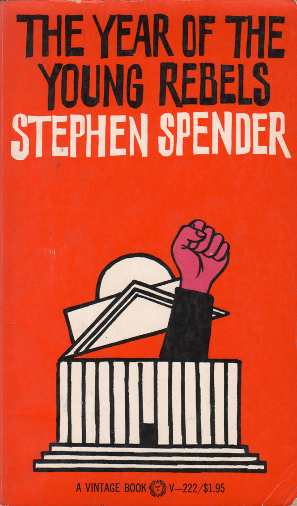
Stephen Spender’s The Year of the Young Rebels uses the then-ubiquitous fist as it’s primary symbolic punch. The fist both emerges and knocks the roof off the university building. At this point the fist is also largely perceived of as a sign of the Black Power movement, so this particular fist is pink, implying that student rebels are white, and although aligned with, very different than the Black liberation movement. While the conversion of student revolt into a simple pictograph of fist and school building is very efficient and “good” design, it raises intersting questions about whether the demands of good design are antagonistic to the complexities of movement realities. The boiling down of hundreds of thousands of students and their myriad demands and needs into a single fist might not convey the true weight of what was happening on campuses across the US.
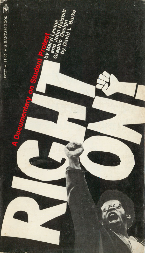
Right On!: A Documentary on Student Protest compounds the questions above even further. The cover draws much more on movement culture and graphics themselves than on contemporary design, the type style and exclamation point fist drawn straight from student placards, overlaid with a photograph of a black student with real fist raised high in the air. A connection between Black Power and Student Power is made more evident, the cover clearly illustrating that not all rebel students were white. The knocking of the titling almost vertical also reads as a protest against conventional book design and readability. Both fists on the cover point to the only colored part of the cover, the subtitle in bright red. It’s hard to tell by the cover, but this book is not only about the student movement, but also a foray into a meta-discussion about mass-market book design and visual studies happening at that time. The insides of the book are a complete collage of text, photographs, and graphics, and it reads very similar to the influential Marshall Mcluhan book The Medium if the Massage? Why Mcluhan’s book raises questions about how we receive and interpret information, Right On! seems to just take the visual style and use it to create a graphic romp through the student protest movement.
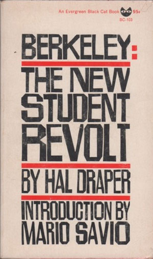
The earliest student protests of the era were in the early and mid-60s at the University of California–Berkeley. Likely because they were part of what initiated the onrush of what would be later simply called “the Sixties,” the book about them are of a style that pre-dates 60s cool. The Berkeley Student Revolt cover is both straightforward and square, the lined paper implying student, the bold sans-serif type being cracked or torn. Overall the cover is didactic and dull. Hal Draper’s Berkeley: The New Student Revolt is more hip, but in a Beat 50s way, not forward looking. The type style is similar to most Black Cat/Evergreen/Grove Press books of the era, nicely hand rendered, but referencing Kerouac more than Cleaver.

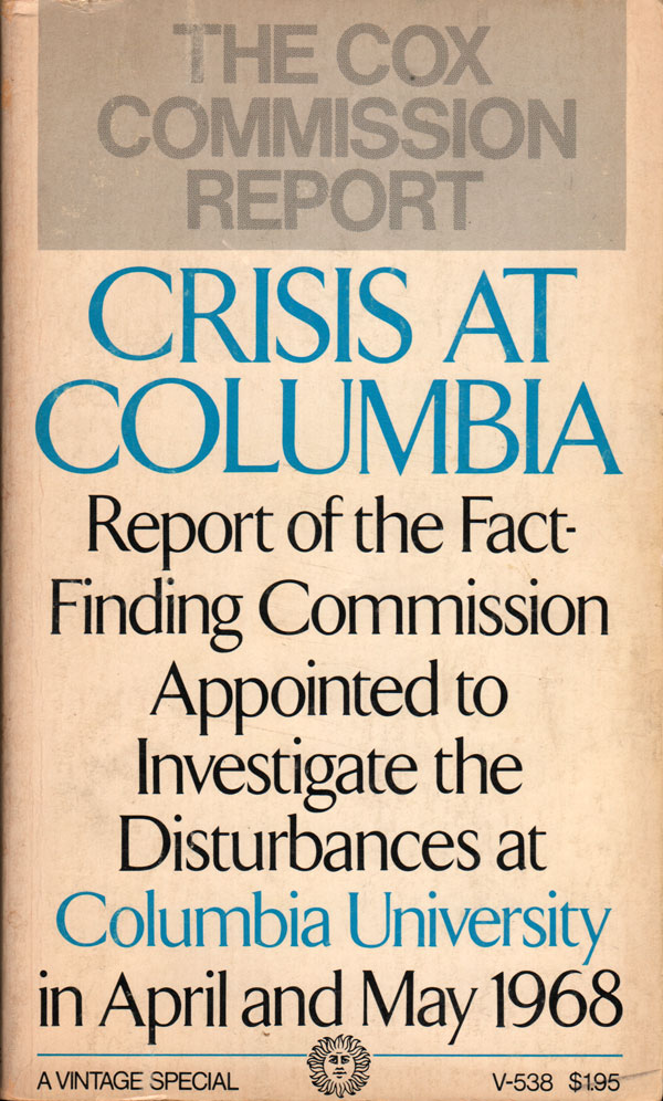
While the 1968 protests and building occupations at Columbia University were much more spectacular, violent, and exploitation-worthy than Berkeley’s earlier, and relatively tame, Free Speech Movement, the only mass market paperback I’ve found about them is the Cox Commission government report below. Rather than designing it to reflect the turmoil of the time, it is presented in a staid, direct manner fitting of a report, where the words riot, occupation, and brutal police repression have been replaced by “crisis” and “disturbance.”
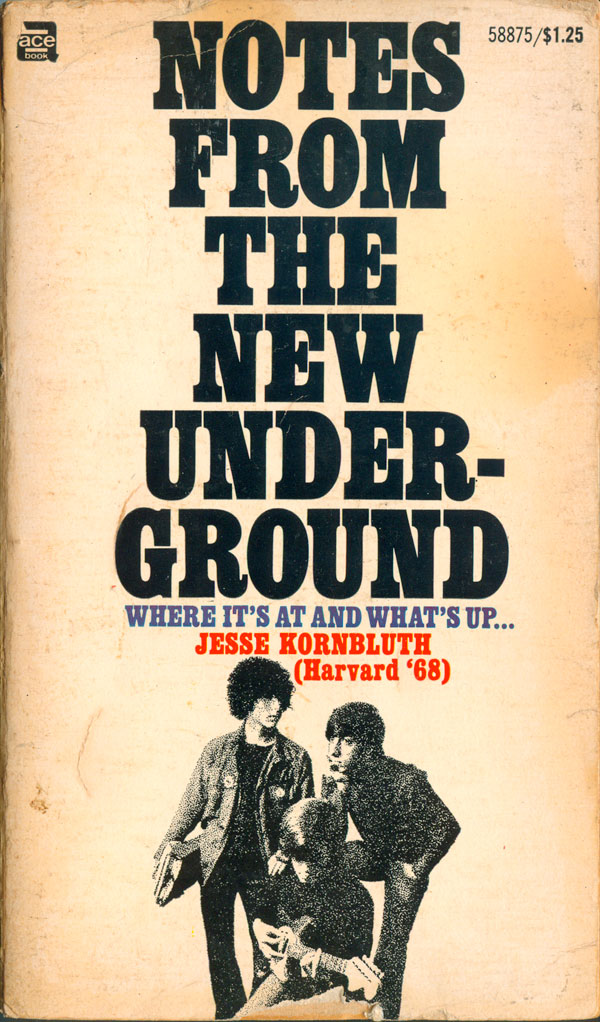
An adjunct set of books from the era took on the role of underground publishing and newspapers. One of these books, Notes from the Underground, specifically focuses in on college and high school newspapers, and their relationship to the larger protest movement. The cover is strange, the title—a play off of Dostoevsky but also appropriate to the subject matter—takes the majority of the real estate, which an clip-art looking image of hip students thinking and playing guitar anchor the design.
I’ve found two 1960’s British mass markets about student movements, both books by Penguin, the dominant mass market publisher in the UK. Student Power was Alexander Cockburn’s first book, a collaboration between Penguin and the New Left Review crowd. Because it is a Penguin Special, it follows the design of that series at the time—all covers being red, black, and white. Not particularly exciting for a book about protest, or for a Penguin, which even then was well known for its innovative design. I’m not sure who to pin the blame of this on, Penguin or the NLR, not exactly known for its visual flair.
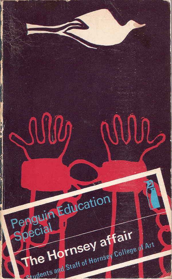
On the other hand, The Hornsey Affair has a stupendous cover, I think my favorite of this entire week’s lot. The field is a deep purple, not black, made from the overprint of the red and blue on the cover. The raw, shackled hands and the dove they are reaching for are very roughly drawn, taken directly from a protest poster of the movement. In order to not interfere with the power of this initial design, the title and series are directly “stamped” onto the image, simultaneously implying the kind of official stamps schools put on student postings on campuses, and official dossiers, as if this book is some sort of secret report. The boldness of skewing the box and cropping the edges and the text adds to the ad-hoc feel. Well done!

Next week I’ll be looking at non-mass market student movement books, and I’ll provide a bibliography for those and all this week’s books. Come back and read next week!


