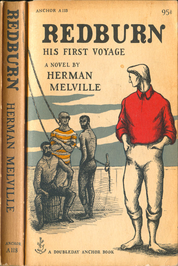
One of the great things about working at a bookstore is you start to notice more and more quirky little things about books, stuff that only the week before passed you by. In the Spring I started noticing similar covers on a wide array of mass market paperbacks from the 1950s and 60s, mostly on classic literature, but also on philosophy, poetry, sociology, and essays. There was something familiar about the artwork, but also strange and unknown. Cracking open the books led to discovering that all of them had been designed by Edward Gorey. I’ve never been a huge Gorey fan—although I always found “A is for Amy, who fell down the stairs; B is for Basil, assaulted by bears” somewhat charming, in a gothic kind of way—I’ve never been remotely driven to the kind of Gorey worship that seems popular today, with the onslaught of little gift books and tote bags, t-shirts and nick-knacks.


But it turns out I was looking at the wrong Gorey. His skills as a book cover designer and typographer are far superior. While whole graphic narratives built around his lone and lonely characters read like jokey Edgar Allan Poe for the pre-teen set, the same characters placed within a sweeping vista on a book cover take on a much deeper power. These scenes operate on multiple registers, which gives them great range and appeal: to some they are Edward Gorey art, and that is enough; to others they are fine examples of illustration work integrated with superior typography and design; to even more, they create a snapshot of a world that reading the book promises to flesh out and make whole.
The size of the figures change, and the constellations of them, but in every single cover the dominant relationship is one person being left out. I find myself having an almost schizo response to this, on the one hand identifying with the pathos, on the other finding the political implications of this sweeping generalization of the quality of human exchange abhorrent. In a funny way these Gorey covers read like a inverted Ayn Rand, where the individual is clearly paramount, but instead of being heroic, he is pathetic, lonely, miniscule.
On the cover of Kafka’s Amerika, two men stand on the deck of a ship, but each is wholly separate. Even though they both are looking at the exact same thing—the New World on the horizon—they are each on their own deck, or level, literally and emotionally. This sense of the complete separation of the individual is even true in the fantastic cover for Thomas Szasz’ Ceremonial Chemistry, where a group of three men are literally under the thumb, but rather than a sense of solidarity in their common predicament, each seems utterly apart, each one feeling the crush alone and uniquely.


Until finding this pile of covers, I had no idea that Gorey had done this level of commercial work. In the 1950s he lived in New York City and worked for Doubleday Anchor. All of the covers here are from early Anchor mass markets, I don’t know how many total books he had his hand in, but it was a lot. On top of the ones where he did the illustration and typography, he also did just typography for a large number of titles (I’ll look at those next week), as well as interior illustrations for some. A quick web search finds dozens of covers I don’t have here. I suspect some are rare, but many are easy to find at used book shops and thrift stores.


I’ve forgone my usual attempt at completeness here because one of the things I think is so cool about book covers is that they are mass produced objects that at their best put high quality art and design front and center. So many well known cultural figures have designed covers, so anyone can own a piece of their work for almost nothing. All of the Gorey covers featured here and over the next couple weeks were found at Book Thug Nation in Brooklyn, and almost all of them were priced around $3. For $50, anyone could have quite a cool Edward Gorey book cover collection.
There are plenty of cool Gorey book cover image collections online (definitely search around, there are some great covers I don’t have), but as far as I know, they have never been collected in print, and appear to be popular with fans, but not treated particularly seriously by those that have written about him and his work.


