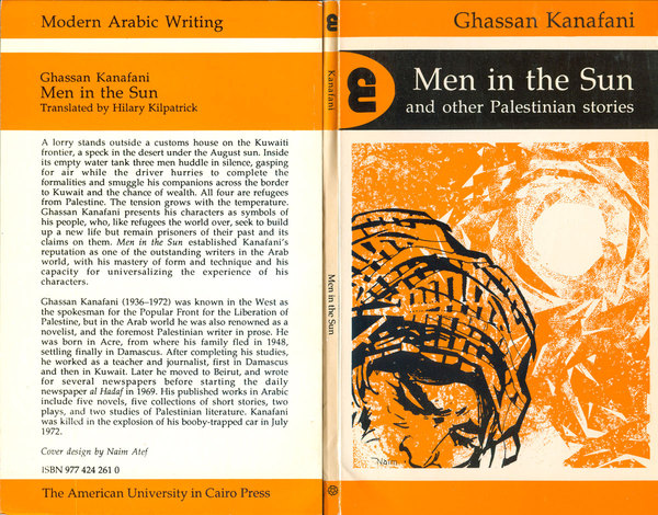
In the late 2000s, in the basement of the Caliban Bookshop in Pittsburgh, I found a handsome paperback edition of Ghassan Kanafani’s Men in the Sun. It was the first Palestinian novel I ever read, but I didn’t have a copy anymore, so I picked this one up. The cover design by Naiem Atef is striking, all black and orange, a keffiyeh-ed man’s head being pushed down by a bright and throbbing sun. The man’s face is rendered in an almost comic book style, but that doesn’t do anything to diminish the sense of anguish the illustration communicates. The image is settled into a larger series-design framing, black and colored bars alternate, titling a classic serifed font, and the series acknowledged by a black graphic logo in an orange oval. I don’t know Arabic, but the logo reads as a letter or series of letters, possibly the letter ‘ain. Or in English, an E, or an ampersand, or an M and A turned on their side, counterclockwise.
The logo is for the American University in Cairo Press’s “Modern Arabic Writing” series, one of the premier collections of Arabic writing translated into English. Although the series has been around for a long time, and is still published, it seems as if they only used this series design for about five years, from 1990 to 94. Over the past handful of years I’ve found a half dozen books with covers in this style, all of them published in the that half decade, and five of the six with covers designed by Naim Atef. I’ve found another four covers online, all by Atef with the same design. Atef has no English language profile on the web at all, so I haven’t been able to find out anything about him.
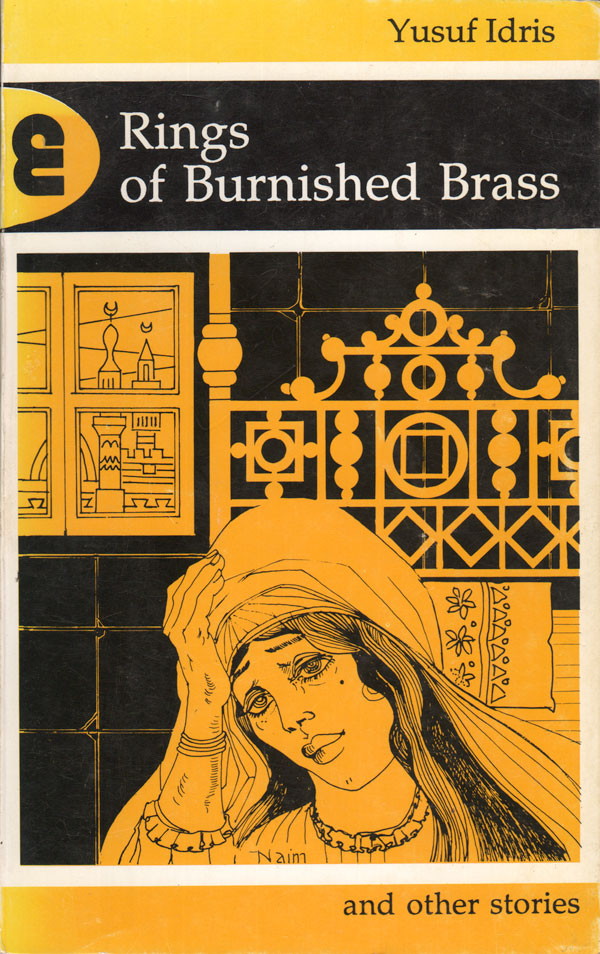
The design of the Modern Arabic Writing series has evolved and changed since the mid-90s, but it has never been as clean, coherent, and sharp. A couple different broader series designs were attempted at different points, but by the mid-2000s the design of the series largely descended into a random collection of covers, mostly garish paintings with poor type-treatment laid on top. By contrast, Atef’s designs bring the series together, giving a set of disparate titles a strong identity. At the same time, the diversity of color, and Atef’s varied illustration styles allow for real difference in the covers, giving each book it’s own affective register.
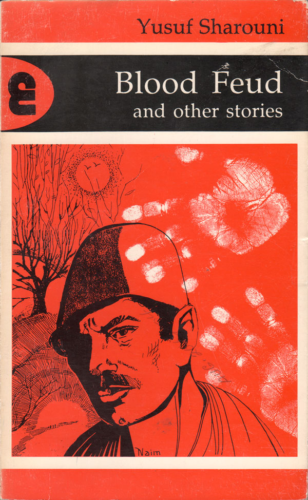
Although it is possible I’m a little too enamored. While it’s true that all three of the above covers are distinct, they do all feature a single, central face—and the overall emotion in each face is one of anguish. But this might say as much about the character of this wing of Arabic literature as it does about the designer.
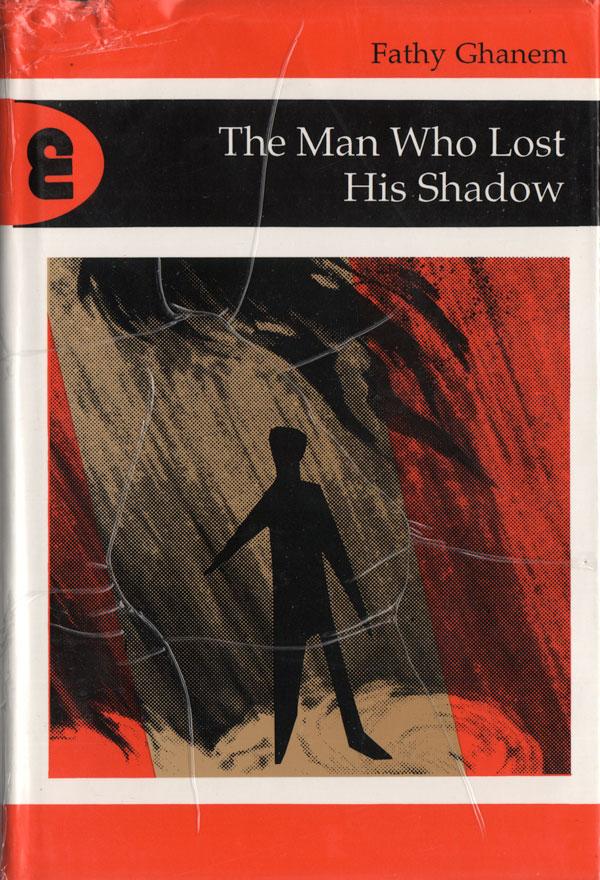
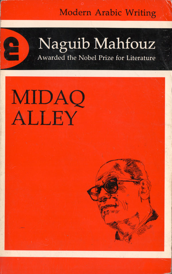
American University in Cairo was the initial English language publisher of Naguib Mahfouz, Egypt’s most heralded modern author, and have published over a dozen of his books. Midaq Alley is the only one I’ve found with this particular series design on the cover. I suspect there might be more, but likely they would be almost identical, with Mahfouz illustrated by Wagih Moner. This same illustration has shown up on later editions of his books I’ve seen, but the rest of the series design has been stripped away.
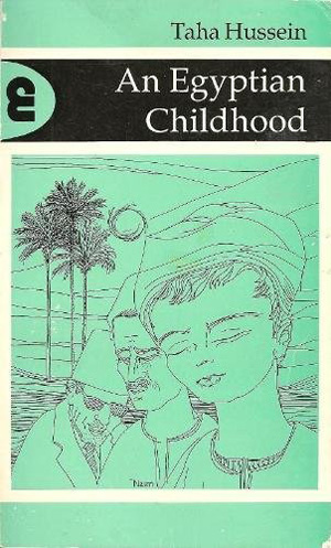
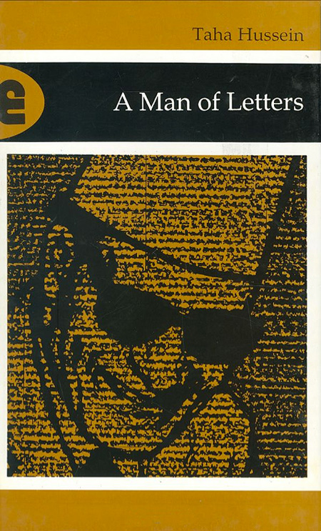
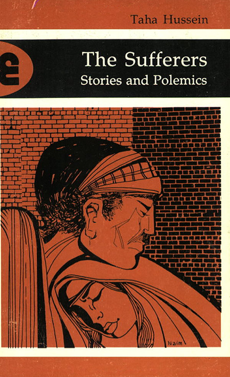
Three books published by another Egyptian great, Taha Hussein, show much greater diversity and flair. An Egyptian Childhood feels light, with the bright green color and thin lined illustration. A Man Of Letters is much heavier, the portrait of Hussein overlaid with heavy lines of Arabic text which both reinforce the title and give the image a sense of being a copy of a copy, an old xerox or even fax. The Sufferers also carries weight, the brick red echoed in the heavy brick background, each piece individually drawn. The faces are once again filled with pathos and pain, which seems appropriate given the title.
The last two titles have photographic designs, which are a nice addition to the broader series design, but individually I find them less compelling than the illustrated covers.
I think it was smart to give Atef a long leash, and he did a effective job creating a design flexible enough to be inclusive of—and do justice to—a really broad array of literary voices. It is surprising that the project unfolded in the 1990s, as it clearly harks back to the 1970s in influence, and I suspect seemed seriously out of touch with other 90s cover design. Out of step then, but still interesting today.