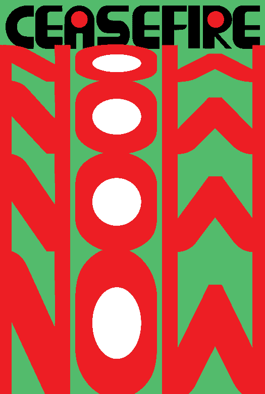
This weeks book is the second in a series of mini-poster publication produced in the DDR, or former East Germany. Last week we looked at a book about posters celebrating the Russian Revolution (see HERE). This week I’ve got another book that is the exact same size, and also comes in a nice little box (see to the right). The box implies the book is titled Politische Plakate de Arbeiterklasse (Political Poster of the Working Class), but the book itself is titled Politische Plakate: Eine Auswahl 1888-1978 (Political Posters: A Selection). The box cover is much funkier and more experimental than last week. At first it looks like a maroon and white spray can on a red background, but on second examination I see that the image is one of those large public pole/bulletin boards that are still popular in some European cities. The books title becomes just one of four posters visible on the pole, the others referencing Marx, the Soviet Union, and poster art in the DDR.
The actual cover of the book is much more traditional—dull—gold gilt on rubberized cardboard that feels and looks like leather. This “classic” aesthetic continues on the inside with bright red end papers and nice red binding and stitching. This book was produced by the same publisher as last weeks, Verlag für Agitations-und Anschauungsmittel Berlin (Publisher of Agitation and Visual Aids Berlin). It was released in 1979 for the thirty year anniversary of East Germany, or the Deutsche Demokratische Republik (German Democratic Republic).

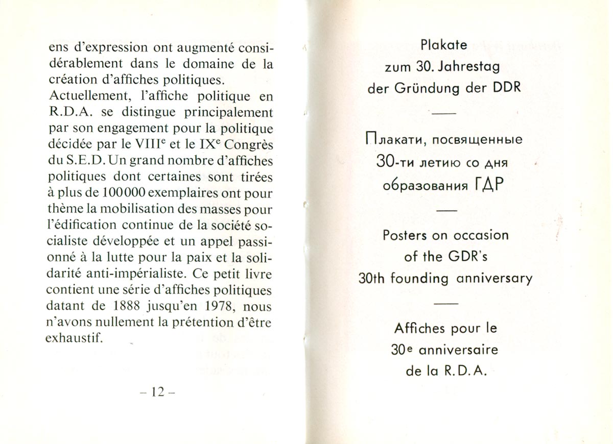
Like last week’s title, the text is quad-lingual, with German, Russian, English, and French. The book is also separated into sections: (a) posters produced specifically for the 30 year anniversary of the DDR, (b) early German labor movement posters, (c) posters produced in Germany in support of and after the Russian Revolution, and (d) posters produced after 1945 and the founding of the DDR. The deign of the book is also similar to last week’s, with the poster on the recto and the caption on the verso.
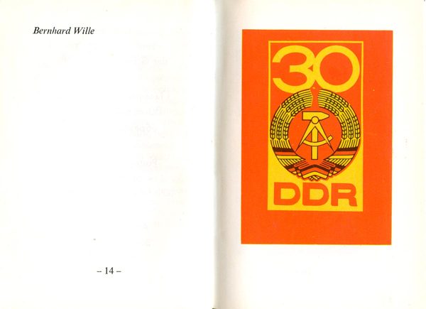
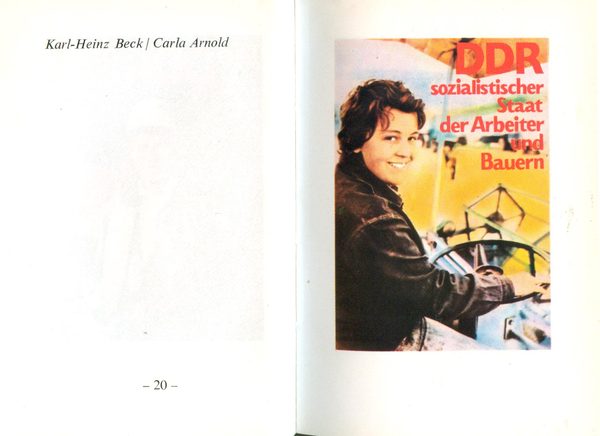
The anniversary posters which start the book are startlingly awful. All but a couple are over-saturated photos of happy workers staring directly of the page at the viewer. They look like late-Soviet socialist realist posters but without any of the remnants of constructivism or modernist design, it’s as if a low-budget department store was printing posters to convince people to work crappy jobs.


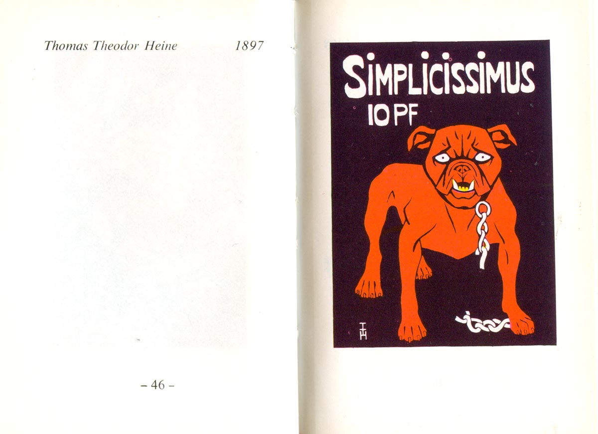
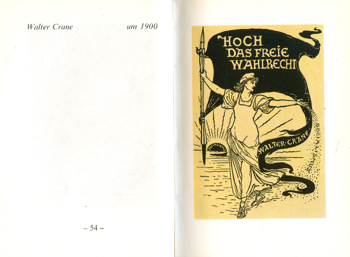
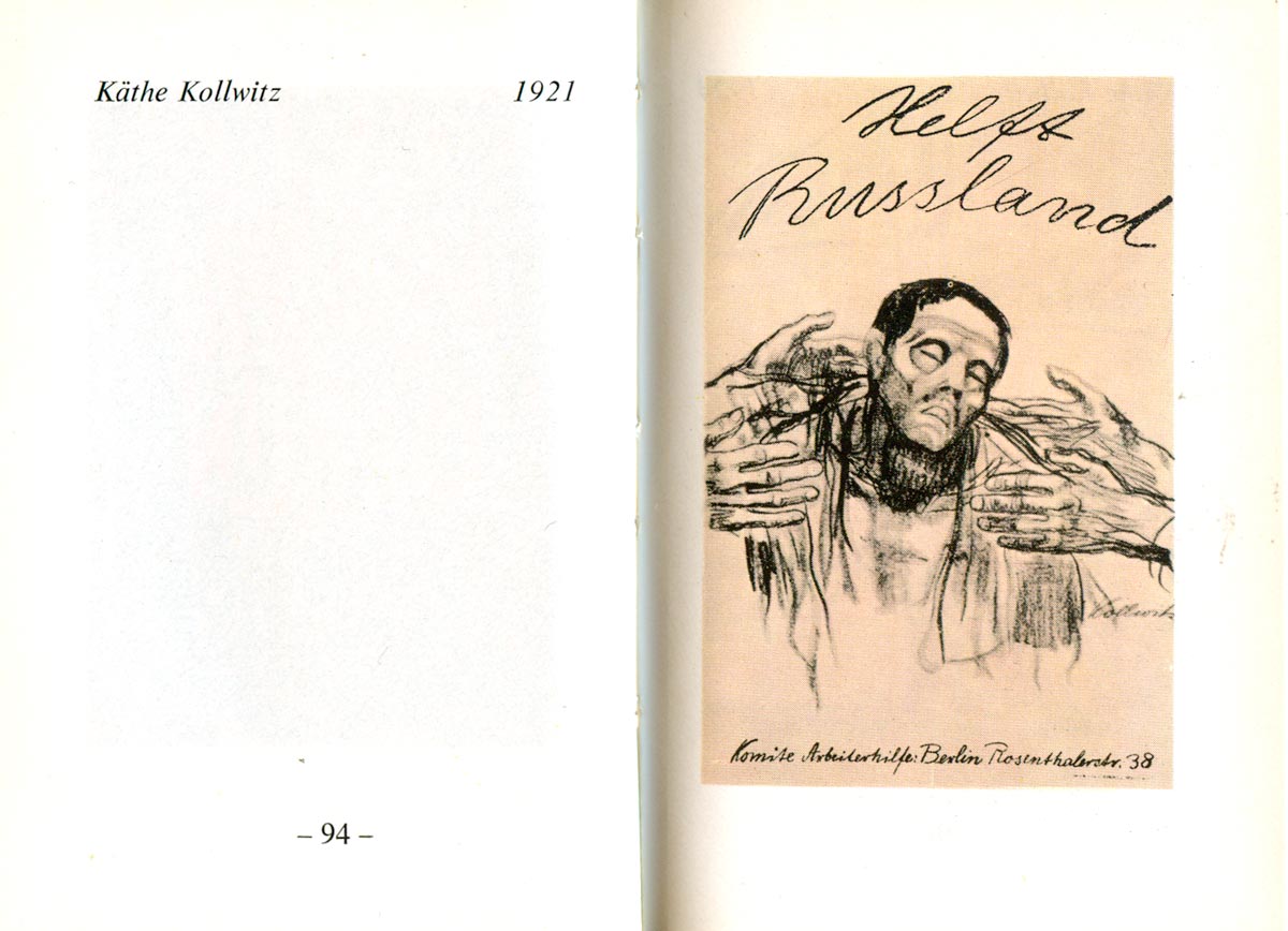
The section of early posters is much stronger, with great examples from Thomas Theodor Heine, Käthe Kollwitz, and Walter Crane.
Kollwitz shows up again in the pro-Soviet lot, along with John Heartfield, Alfred Stiller, Alex Keil, and a dozen others.
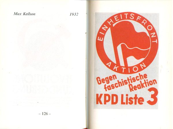
This 1932 poster by Max Keilson illuminated the origin of the contemporary dual-flag Anti-Fascist Action logo. Here it represents the Einheitsfront Aktion Gegen Faschistische Reaktion (United Front Action Against Fascist Reaction), but rather than a call to direct action, it’s a call to vote for the Communists, and an unsuccessful call at that. It might be that the logo has rallied more over the last twenty years than it did in it’s original form.
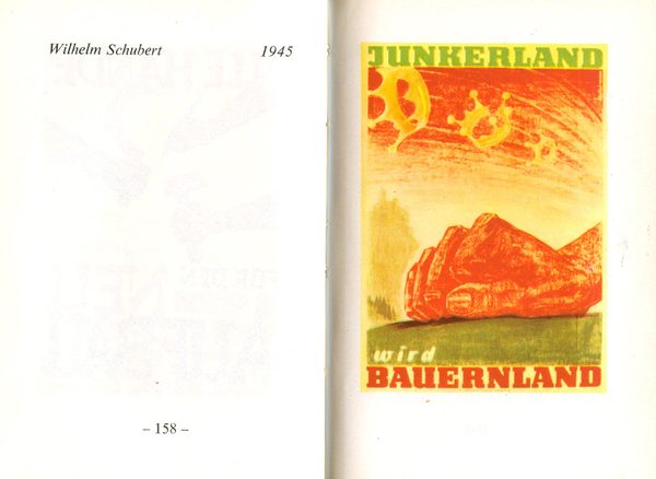
The post-WWII DDR poster set is by far the largest, and makes up for than half the book. I wanted to include the poster below because it jut seems strange and a bit out of joint. Junkerland is Farmland, and if you didn’t believe it, the giant red fist is there to convince you. Junkers were a group of landed aristocracy in what was Prussia (and part of Poland), expelled by the Soviets at the end of WWII.
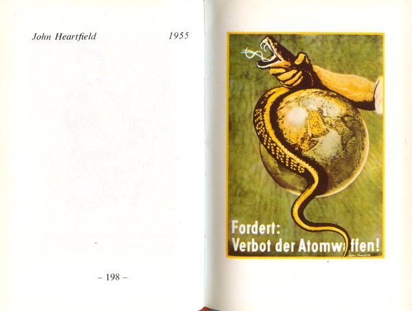
Here’s a less commonly reproduced John Heartfield. The snake of atomic war tries to wrap the globe, but is being squeezed by the burly arm of the working class, exposing it’s dollar-sign tongue, and thus capitalist nature. These representations of “capitalist” snakes encircling the globe were complicated in Europe by a long history of representations of Jews as snakes trying to encircle the world. It’s unclear if Heartfield was intending this message, but it seems likely many would have read it this way, regardless.
Stronger design work by Heartfield can be seen in my series of blog posts about his book covers, which you can read HERE.
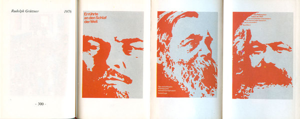
As a bonus within the book, there are a number of fold-out pages, allowing for a cool display of posters produced in series. Hello Vladmir, Fredreich, and Karl!
Check in next week for the third and final mini-poster book.
