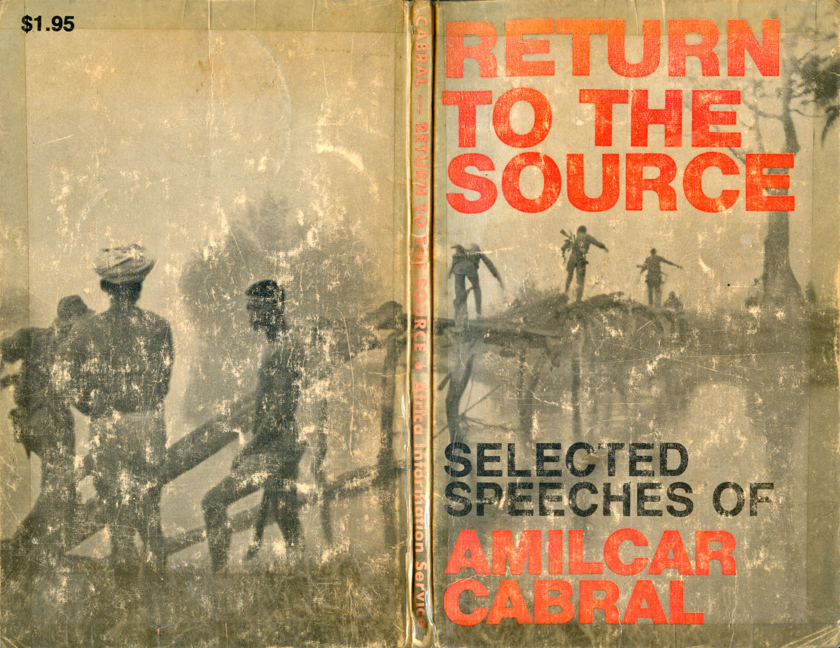
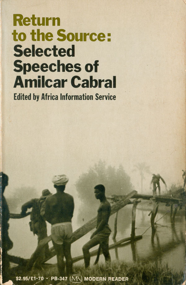
I was introduced to Amilcar Cabral when I was in college. His name popped up along with other African and Caribbean revolutionaries I was reading like Frantz Fanon, Walter Rodney, and Kwame Nkrumah. He was the leader of the PAIGC, the national liberation movement of Guinea Bissau and the Cape Verde Islands, or “Portuguese Guinea.” Like other African revolutionaries, he combined a sharp intellect with a knack for military strategy, but unlike many of his contemporaries, he was extremely attuned to culture as not simply a tool, but the heart of revolutionary struggle. His most accessible writing can be found in Return to the Source, which contains his important essay “Culture and National Liberation.” To the right is the first edition of the book (in English), published by Africa Information Service in 1973.
And below is the full cover, front and back. My copy is pretty beat up, but you can make out a series of guerrillas making their way across a wide river of an extremely thin, homemade bridge. They are aided by non-uniformed men in shorts and head wraps. The image places the book in a specific context, which was always important to Cabral. He joked about sending men to other parts of Africa for military training, where they learned how to blow up railroad tracks, only realizing upon return that Guinea had no railroads to sabotage!
To the left below is the Monthly Review re-issue of Return to the Source, put out a year later in 1974 to a much wider audience. The back cover image has become the front, and the type is much more purposefully placed in the top left corner, giving breathing room to the image. The green title also echoes the duotoning of the photo, giving the whole cover a more coherent and laid back look than the bold original.
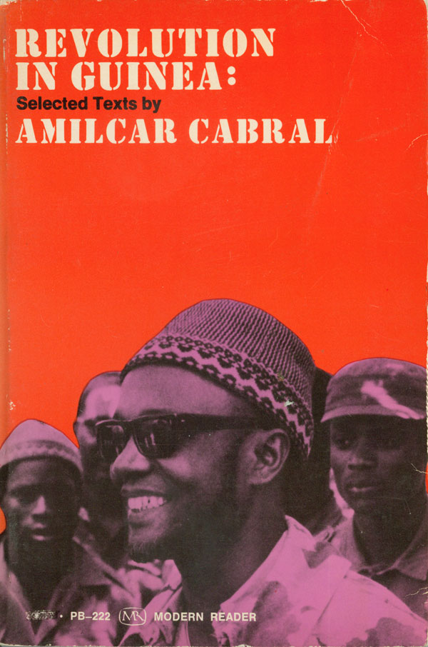
Next to it is The Revolution in Guinea, the first book by Cabral published in English (Monthly Review, 1969). The smiling face on the cover is Cabral’s, in the hat he is most famous for wearing, and has become completely interconnected with his image. The bright and strong red and pink colors with the black overprint gives the cover a look similar to a Cuban OSPAAAL poster. Clean and simple, and when you add in the militaristic stencil font, overall very Third World-ist.
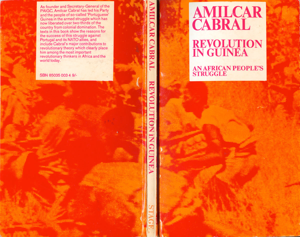
The British Marxist publisher stage1 republished Revolution in Guinea in the 1970s, and went with a similar color scheme and vibe. Their is no black trapping on the cover, only orange and pink and the red they make when overprinted, which gives the design a more ethereal quality. The struggling guerrillas in the image are hazy, large halftone dots, hard to pick out from their surroundings. Whether on purpose or not, the design mimics the role of the guerrilla, hiding in plain sight, mixing in with the environment. I like this cover a lot, especially the willingness to risk no dark overprinting to contain the image or make the title stand out. The matching white boxes on both the front and back are smart as well. (I have been collecting a number of titles from stage1, and will feature them in a future blog post soon.)
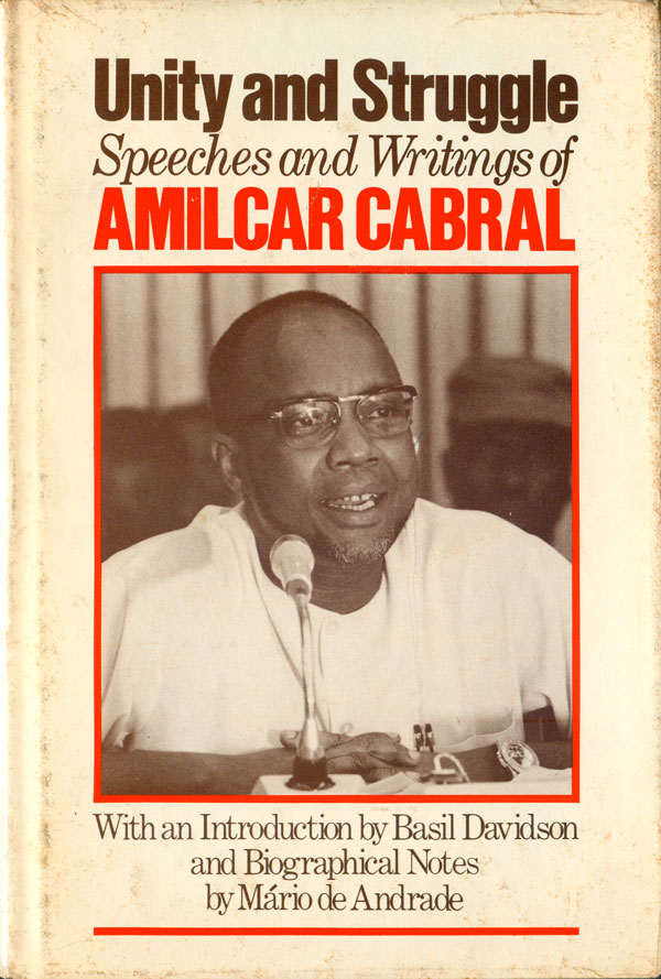
The last English-language Cabral book is Unity and Struggle, an omnibus of his writing published after he was killed (by a disgruntled former member of his own organization, just before independence—with help from the Portuguese secret police). The Monthly Review edition (from 1979) is appropriately reserved, with a simple sepia-toned photo of Cabral boxed in red on a white background. Cabral is shown speaking, not in the field or in military context.
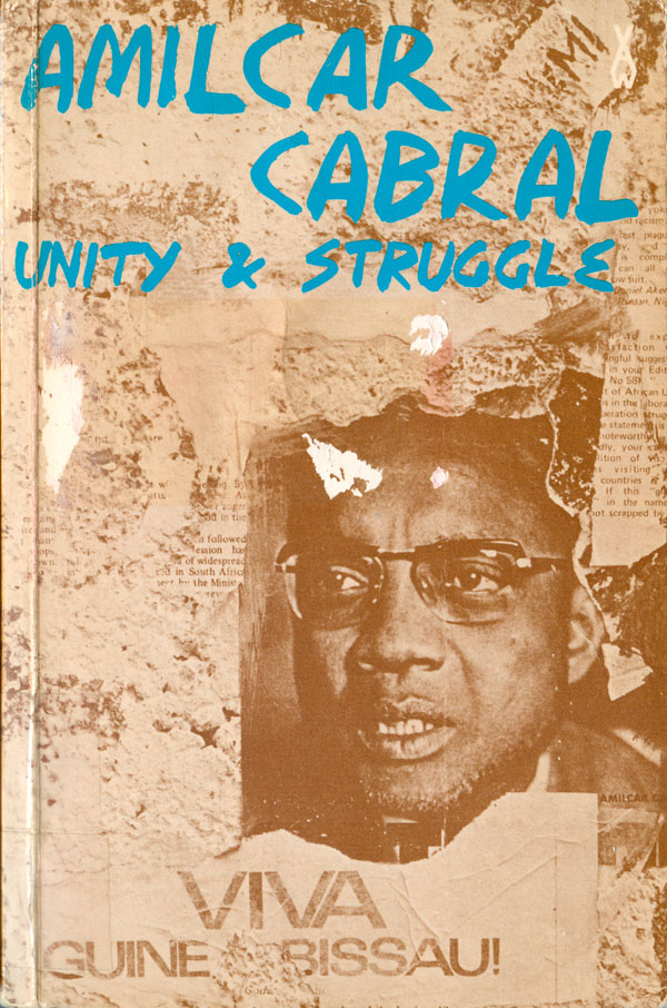
The Heinemann UK edition (a rare title in their African Writers Series) of Unity and Struggle has a more adventurous cover, a more serious looking Cabral stares out from a poster pasted on a wall. “viva Guinea Bissau” is pasted below him. The posters are torn and shredded, mimicking a wheat pasted wall, but also Cabral himself, torn from the struggle right before achieving his goal. His name and the title are scrawled in bright blue at the top, added to the sense of graffiti and immediacy. The cover is surprisingly punk feeling for the otherwise very sharply and cleanly designed African Writers Series.
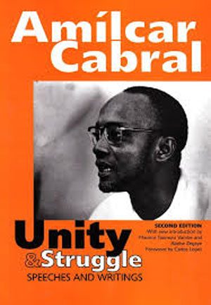
A new edition of Unity and Struggle (long hard to find) was released in 2008 by Unisa Press. I know nothing about Unisa, but I’ve never actually seen this book in person, and it doesn’t seem to have brought down the price of the original edition, which is still pretty pricey for an old book on Africa. The cover does the book no favors either. There’s nothing wrong with it, but there is also little to say for it. The orange is somewhat harsh, and feels random. The photo of Cabral is uncreatively placed, and the type is simple. The strongest design element is the second upswing of the U in “Unity” merging right into the photograph, but it looks more awkward that anything else, calling attention to how little else is happening on the cover. Wow, that sounds much more harsh than intended. I see the writing of this blog every week as an attempt to teach myself how to better describe images and design, but sometimes it’s really a struggle to learn how to represent mediocrity.
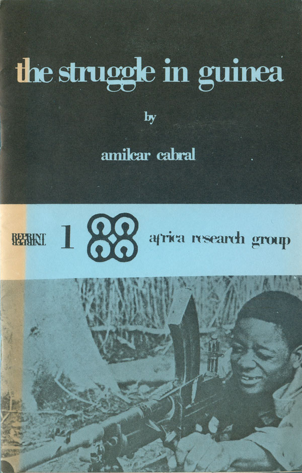
Often it is the simple and raw covers that are unexpectedly catchy and effective. This pamphlet The Struggle in Guinea is a good example. Just black ink on blue paper, the cover split into three strips, the title in negative space on a black field on top, with a photo of a guerrilla at the bottom to balance it out. A thinner blue stripe across the center, with information about the publisher and pamphlet series. Nothing fancy, but well done. It helps that the photograph is so great, the fighter smiling (or appearing to) as he aims this giant gun that takes up more of the visual plane than he does. It illustrates the determination that existed to rid Guinea-Bissau of the Portuguese.
Next week I’ll look at Cabral books in other languages, come on back!
