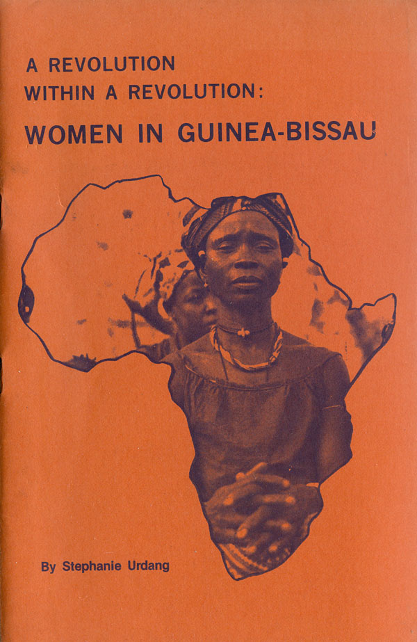
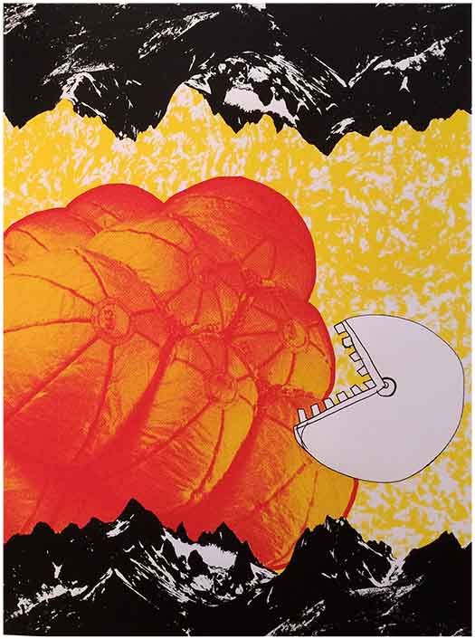
Although much respected, Amilcar Cabral didn’t actually write that much beyond speeches and lectures. But there is a large body of literature about Cabral, and the struggle in Portuguese Guinea. This week I’m going to take a look at the covers of this secondary material. It’s a combination of pamphlets, like the one above—published by the New England Free Press in the 1970s, to books about Cabral and the PAIGC (the liberation organization he led against the Portuguese).
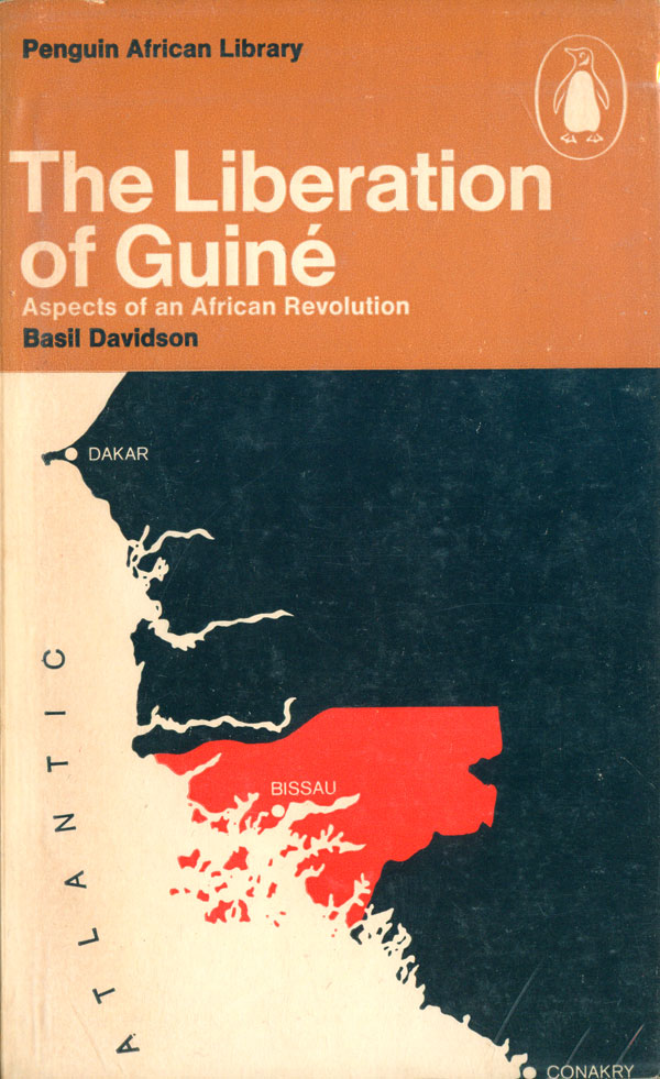
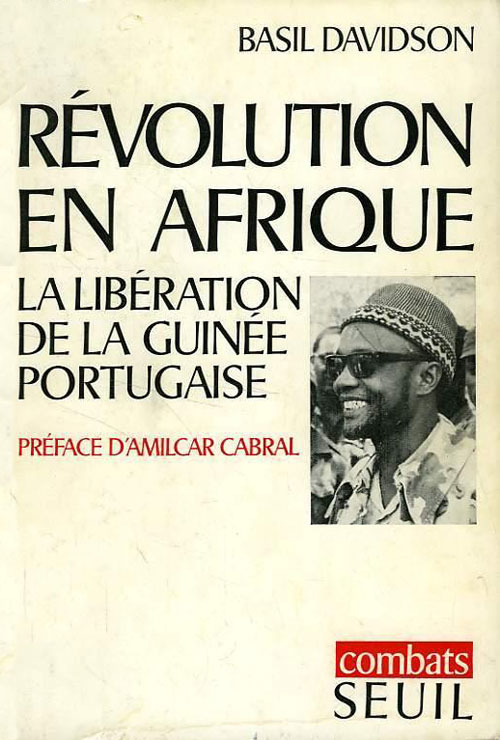
Many people in the West were likely introduced to Cabral and his writing through the Africanist Basil Davidson, who had Cabral write the introduction to his book The Liberation of Guiné. It was published in 1969 in English by Penguin, and in French by Editions Seuil. The Penguin cover is part of the Penguin African Library Series (which I featured on the blog a couple years back HERE), and caries the series style. The design is simple, titling in the top third, sectional map of Africa in the bottom two thirds, but still handsome. I find the red highlighting of Guinea-Bissau oddly compelling in contrast to the brown and black of the rest of the cover. The Seuil cover is clean and simple, with large titles and small inset photo of Cabral. It’s not related to the design, but one of the things that makes this book compelling to read is Cabral’s introduction, which calls out Davidson on some of his misconceptions and misunderstandings—a rare, rare thing in today’s age of 100% salutary intros that say little about the book or the author and are intended solely to put the name of someone else that might sell the book on the cover.
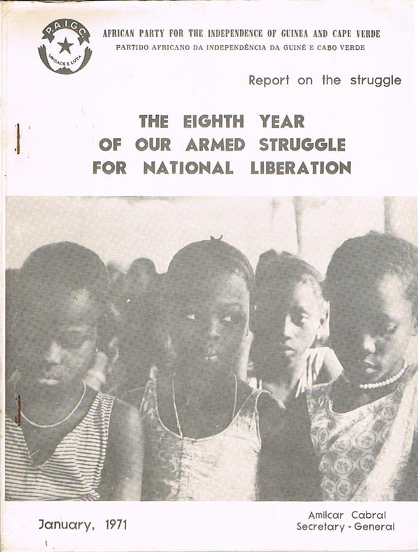
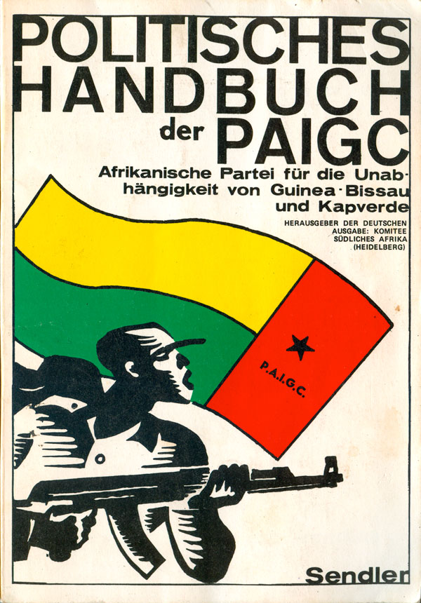
Over the last couple years I’ve tracked down a couple internal PAIGC documents, in English and German. The German “Political Handbook” (below right) has a nice cover, with the uniquely stylized guerrilla in motion against the backdrop of the PAIGC flag (which became the flag of Guinea-Bissau).
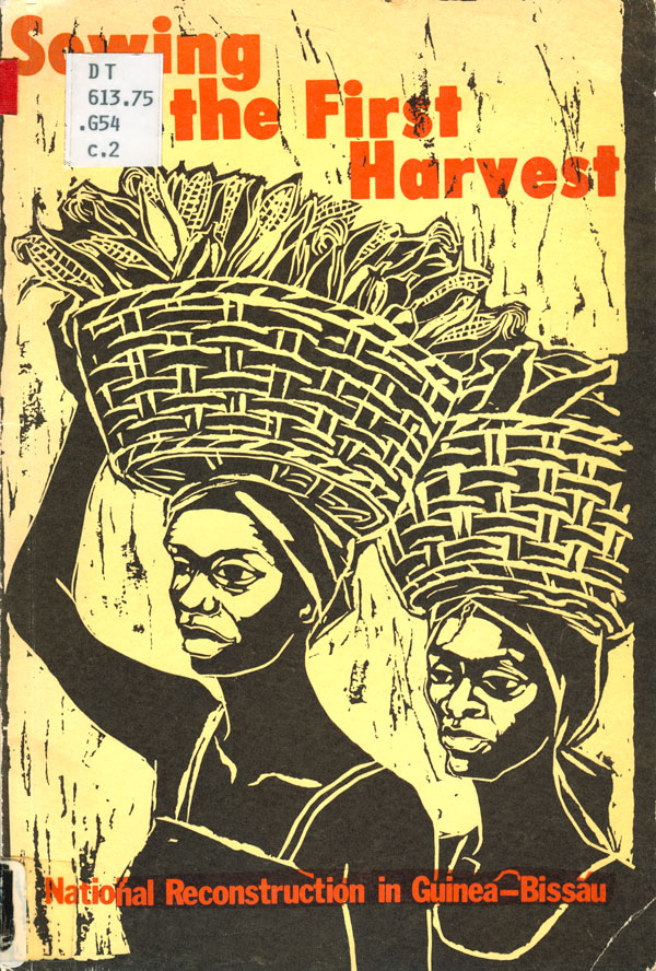
The Liberation Support Movement (LSM), which over its existence was based in both California and British Columbia, produced a couple books/pamphlets about Portuguese Guinea. (You can see a lot more LSM pamphlets in some of my earliest book cover blog posts HERE). To the left is a collection of party documents, with nice black titling over a red/orange duotone of lined up guerrillas which appear to be carrying some heavy weaponry. This is a paradigmatic example of 1970s solidarity movement design/publishing, with raw but manipulated photos, simple type, and a maximal use of limited materials (for instance the printing on yellow stock here in order to get a richer image). To the right is another book published on yellow stock, Sowing the First Harvest. The accomplished block print is by Japanese/Danish artist Yukari Ochiai, who was also a member of the communist art and music collective Røde Mor (see Signal:02 for more on them, HERE)

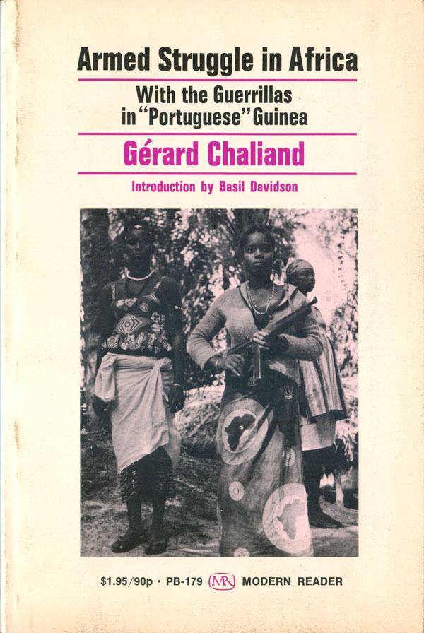
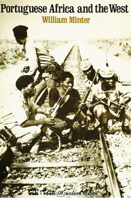
Socialist publishers Monthly Review put out all of Cabral’s books in the US, and in addition in the late 60s and 1970s they published a number of books about Guinea-Bissau and the other Portuguese colonies in Africa. Design-wise these titles fall under the standard conventions of many of Monthly Review’s covers at the time, with relatively simple type work and then a single, prominent, documentary photograph. Both of the books below follow these conventions, with Mintor’s Portuguese Africa and the West looking better, with it’s tinted, full-bleed photo and bold serifed titles.
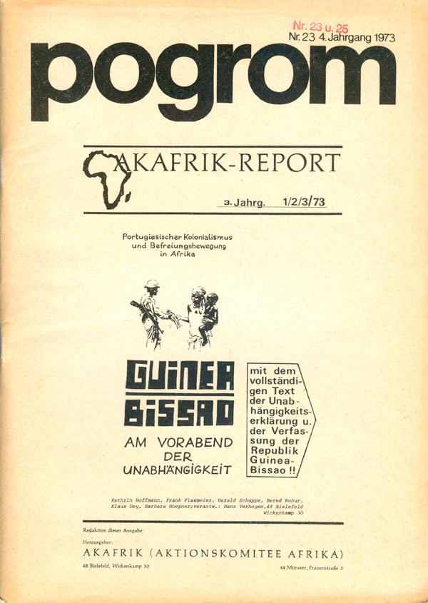
Below are a French book on Cabral and Guinea-Bissau and a German journal with a focus on Guinea. The photo of the cover of the French book is really strong, all of the hands on a pipe really capture a sense of solidarity and collectively.

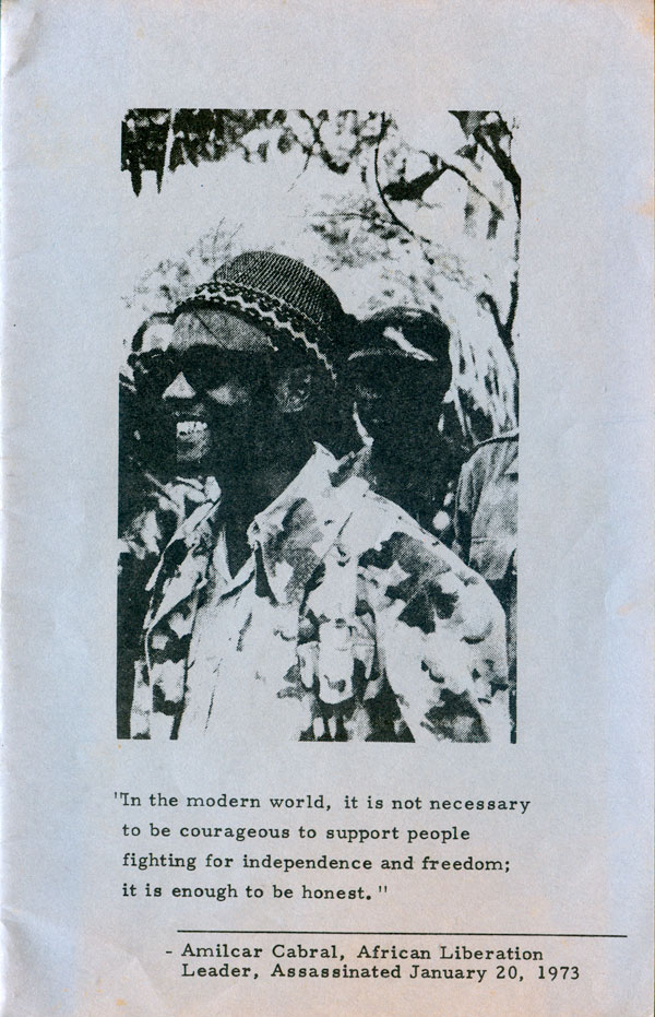
I stumbled upon this scrappy photocopied Memorium pamphlet, nothing fancy but a nice attempt to acknowledge Cabral’s life and work. The photo on the cover is the same one used on the cover of Basil Davidson’s book on Editions de Seuil.
There has been a recent spate of interest in Cabral, with three biographies or collections reflecting on his life and work released in the past decade. The most recent is Firoze Manji and Bill Fletcher, Jr.’s Claim No Easy Victories: The Legacy of Amilcar Cabral published in 2013 by CODESRIA (Conseil pour le Developpement de la Recherche Economique et Sociale en Afrique, talk about a mouthful…). The cover is basic but strong, African colors in blocks making a flag. Cocked at an angle, one field filled with a photograph, another with a star. Nothing ingenious, but very bright, bold, and presentable.
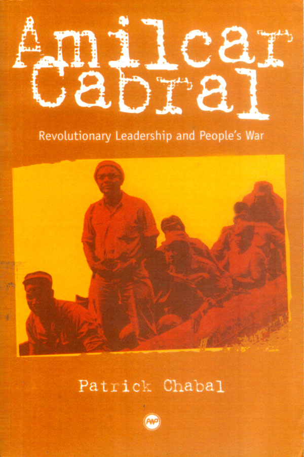
Patrick Chabal’s biography Amilcar Cabral: Revolutionary Leadership and People’s War was published in 2003 by Africa World Press. My copy is a sadly produced print-on-demand copy so the colors feel dead, the image blurry and lifeless. The design itself feels fine: the posterized and fading photo captures the graphic sense of the 70s, the enlarged typewriter font titles, although not my favorite, do a decent job capturing the eye. “Cabral” tilting slightly down to right, with the photo then tilting slightly down to the left is very subtle, but effectively moves the eyes around the visual plane of the cover.


It is extremely difficult to capture the meaning of an important—yet little known—figure like Cabral on a book cover. His image introduces people to him, but doesn’t tell them much, while his legacy is not particularly easy to sum up in simple graphic form. Thankfully the over use of knee jerk shorthand design solutions like African masks (see my ten posts on Fanon covers HERE) is absent here, but little else has been developed in their place. Photos of people at work or struggle in Guinea-Bissau seem like the best solution found (the Monthly Review covers this week, or the stage1 cover two weeks back), but these designs still leave me somewhat unsatisfied. I’ve been working on a Cabral Celebrate People’s History poster for a couple years now, and part of why it isn’t done is for these questions of representation.
