I’m slightly embarrassed that I only read Yevgeny Zamyatin’s (Eugene Zamiatin) We for the first time about two months ago. Not embarrassed because it’s something everyone should read, but embarrassed at myself for having first got a copy in high school, and taking over twenty years to finally read it. And it is well worth reading. It is the original blueprint for the dystopian novel, written in the Soviet Union in 1921—as the reality of Bolshevik authoritarianism was sinking in. Through the narrator, an engineer known only as D-503, and his journal, we learn about a future world known as the One State. Everyone lives and works in transparent cubes, and all individuality is suppressed in the name of collective Freedom. Orwell clearly read We before penning 1984, and Huxley’s Brave New World also owes Zamyatin a debt. Probably the crudest rewriting of We is Ayn Rand’s Anthem, an impoverished attempt to turn a nuanced and satirical challenge to central authority of all types into a vulgar equation of individual freedom and free market capitalism.
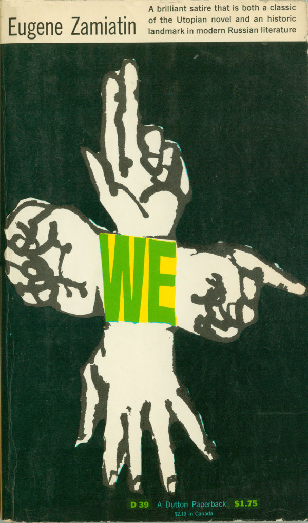
Because We is now outside of copyright, there have been many editions and many different translations. The first copy I found was at a school yard sale when I was 16, and it was the 1952 Dutton mass market paperback version to the right. It’s got a powerful Seymour Chwast cover, the four hands featured making up a collective “we,” which is part message conductor, part monster. The image is bold and, would be even more striking without the white bar and text at the top. In 1952 the book likely needed to be explained, now it speaks for itself, and the hand logo could carry the entire cover.
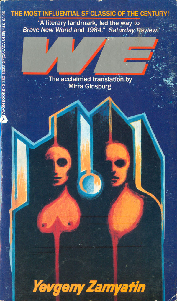
For most of the 70s, 80s, and 90s, the only copies of We readily available were cheap mass market paperbacks pitching the book as a standard Sci-Fi novel. The most common is the Avon edition, first published in 1987, with multiple variations following into the 90s and even 2000s. Two different versions are below, the one on the left bring the earliest. All feature a painting/illustration by Harold Seigel. I must admit, I don’t see the appeal, and don’t understand the commitment to it as the primary cover image over decades.
Two other U.S. mass market editions are below, the one on the left is the current mass market edition, published by Eos, one of HarperCollins’ Sci-Fi imprints. The cover looks like a still from the credits of a bad SiFy TV movie. It obliquely references Russian modernism, but is also messy and nondescript. In it’s own way it follows the disjointed narrative and sense of reality slipping into other realities that the book captures so well, but it does it in such an unattractive way. The title is also awful, the font being so dated as a ’90s cyper-y distressed typeface.
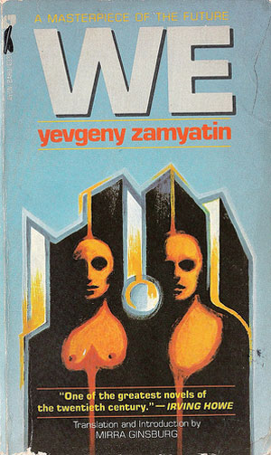
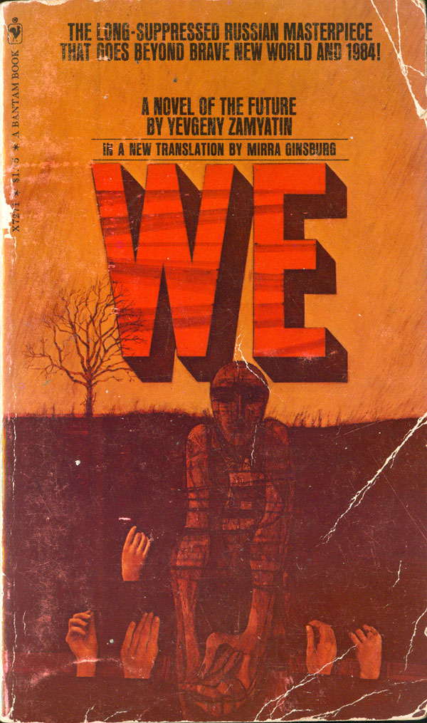
The 1972 Bantam edition has a cover with a very different tact. The color scheme is completely different, being red and earthy, and their is nothing stereotypically futuristic here. The design is plagued by being printed so dark, but this also adds to the general mystery. This cover doesn’t at all resonate with my reading of the book, but it is still really intriguing because it is so different. Chwast’s hands show up again, as does a masked or blank figure, but gleaming towers and glass cubes have been replaced by dirt and a dead tree.

Below to the left is supposedly the cover of the first English language edition, published in 1924. I found the image, but haven’t been able to track down the publisher’s information. The cover is fascinating, recreating a pattern that could have been cribbed right out of Stepanova’s notebook for fabric designs. “We” are all shapes floating in space, contained in our own right but unable to find social cohesion.
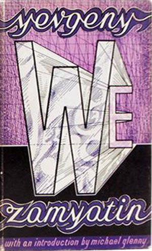
British publisher Jonathan Cape published a new hardback edition in 1970. The dust jacket is rendered in purples and blacks, with the title being the main visual element. We becomes a geometric shape, and the “W” echoes the clear glass cubes everyone lives within in the novel.

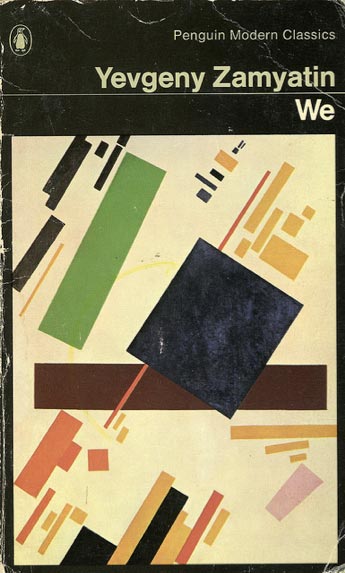
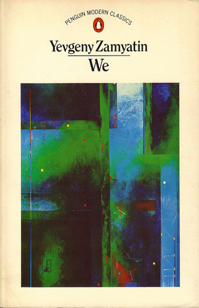
By far the most English editions produced have been by Penguin. The sheer volume of books that Penguin used to sell allowed for hundreds of editions of many books, often each one with a distinct cover. I’ve found seven different covers for Penguin-published copies of We, but I suspect there are probably even a couple more floating around. The cover to the right is the first Penguin Classics edition (1972), featuring the 1916 Malevich painting Suprematist Composition. I’m often not a fan of simply sticking unrelated modern art on book covers, but in this case it feels like some of the Constructivist classics do a better job of conveying the feeling of Zamyatan’s writing than newer cover designs.
In 1980 it appears as if We was moved from the Modern Classics collection into Sci-Fi, with a commensurate change in cover styles. Adrian Chesterman’s painting feels more like a cross between Metropolis and Tron (which actually didn’t come out until 1982) than anything in We. 1983 sees another Modern Classics edition, but the Constructivist painting has been replaced by a contemporary image created by Russell Mills. I feel this is one of the weakest moments for the Classics series in overall design, but the painting itself is alright, and might have even shined in a better design frame.

In the 90s Penguin did a full redesign of the Modern Classics, and two new We covers came out of that in 1993. The one on the left was designed but not used, the one on the right is the actual cover as published. They smartly returned to the Constructivist toolbox, this time pulling out Georgii Petrusov’s photograph/photogram of Alexander Rodchenko. And it works. The simultaneous front and back portraits make for that same feeling of split identity/reality so well drafted by Zamyatan in the novel.


2007 saw another redesign, with two more covers, but in this case both versions found there way onto printed books. The US edition is a simple reworking of the 1993 cover, with the same art repurposed into the new series design. The UK edition uses completely new art—a painting by Anton Brzezinski. While a cool piece of work, it feels a bit too specific for the book itself. Zamyatin’s actual descriptions of the One State are slippery, you can never quite grasp what anything really looks like as it morphs into other things and other descriptions. The world of We is richly described, but hard to fully grasp, as basements open up onto even lower levels, and elevators lift to nowhere, underground passageways connect everything, yet at the same time all is uniform and simple, like the unifs (short for uniforms) worn by the citizens.


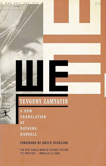
The Modern Library has been issuing some really handsome paperback editions of old classics over the past decade. They’ve done at least two versions of We since 2006, and I like both of them. The first (to the left below) is designed by Gabrielle Bordwin, and is one of the smartest uses of stock photography I’ve seen in awhile. Rather than splashing the cover with a saturated photo, she tightly crops the photo and uses it to prop up the title, rather than the other way around. All of the design elements have been converted into architectural forms, and the cover is built like a physical structure—the pull quote, foreword and translation information holds up an armature which contains the author’s name, and then the title is stacked on top of that. The photo and an echo of the title form background structures, pushing the entire composition forward.
The second cover is built around a painting by Constructivist Lyubov Popova. Far more than the feeble attempt on the mass market edition from Eos (see above), the Popova image really captures the sense of fracture in the novel, the human psyche being whole and split at the same time, one person breaking down and bleeding into others. The design around the image is smart too, the simple title placed quietly in a star, which although less common and literally sharp and pointy, is much less intrusive in this context than a box or circle would have been.

British classics publishers Hesperus and Vintage both have put out editions of We in the past decade. All Hesperus covers follow the same template, with a photograph (usually of a cropped solid or architectural form) with sans serif type overlaid. This one is no different. The strong shoulder and back of a statue ground the cover. The close crop makes it as much a design composition as a photograph, and it’s a powerful image. I’m not as convinced by the type treatment, both the no frills and the pink.
The Vintage cover returns to many of the same visual themes as many of the above covers. The letters of the title are once again architectural, building up a city of clear cubes and boxes. In this case it feels a little too easy, and the whole design leans too heavily on an idea which—based on it’s ubiquity—really isn’t that unique or clever.


And finally, a book on tape (I’m unsure of the publisher) and a nice eBook edition. Both of these formats are sort of the ugly step children of the book world, and rarely is much effort put into making particularly nice covers for either. Both these covers are better than the norm. The book on tape (below left) is less successful, but at least some effort was clearly put in. And I’m not sure if it was intentional, but the wavy lines on the face within the title distinctly remind me of the etching lines within the portraits on U.S. currency, which is a nice twist.
The cover of the Kindle was clearly made by someone with some design skills, but the designer isn’t listed (that I could find). Mazes, panopticons, eyes, faces, observatories, and Russian architecture are all blended into a smart design which manages to include a lot without being too much. Kudos.


Next week I’ll look at the non-English language editions of We. So come back and check them out!
Selected bibliography of English language editions:
Eugene Zamiatin, We, translated by Gregory Zilboorg (New York: E. P. Dutton & Co, 1959). Cover design by Seymour Chwast.
Yevgeny Zamyatin, We, translated by Mirra Ginsburg (London: Jonathan Cape, 1970).
Yevgeny Zamyatin, We, translated by Mirra Ginsburg (New York: Bantam, 1972). Cover design unattributed.
Yevgeny Zamyatin, We, translated by Mirra Ginsburg (New York: Avon Books, 1987). Cover design unattributed, cover illustration by Harold Seigel.
Yevgeny Zamyatin, We, translated by Mirra Ginsburg (New York: Avon Books, 1987 [5th printing]). Cover design unattributed, cover illustration by Harold Seigel.
Yevgeny Zamyatin, We, translated by Mirra Ginsburg (New York: Eos/HarperCollins, 1999). Cover design unattributed.
Yevgeny Zamyatin, We, translated by Clarence Brown (London: Penguin, 1993 [14th printing]). Cover design unattributed, cover photograph by Georgii Petrusov: Caricature of Aleksander Rodchenko, 1933-34.
Yevgeny Zamyatin, We, translated by Natasha Randall (New York: Modern Library, 2006). Cover design by Gabrielle Bordwin, cover photograph by Michael Pole/Corbis.
Yevgeny Zamyatin, We, translated by Natasha Randall (New York: Modern Library, 2006 [9th printing]). Cover design by Emily Mahon, cover painting by Lyubov Sergeyevna Popova: Man + Air + Space, 1915.