In honor of my upcoming trip to London, I thought I’d do a feature on a little known lefty publisher from the UK. For awhile now I’ve been running into some handsomely designed lefty books from England in the 1970s. It took picking up a couple to make the connection that they were all put out by by stage 1, a small London-based publisher which apparently ran for about a decade from the late 1960s until 1979 (the lowercase name appears to be intentional). In this internet age it often feels that information about just about anything is always at our fingertips, but stage 1 is a ghost online. I can find almost nothing about them. Politically they appear to fellow travelers of US independent socialist publishers Monthly Review. Like MR, their catalog is heavy with both Third World revolution and dense political economy. Rather than being particularly Trotskyist, Maoist, or Stalinist, they seem more ecumenical. They also have similarities to two other UK leftist publishers, Pluto and Zed, but appear to pre-date both.
While their design aesthetic is in someways as ecumenical as their politics, the core of their output does follow a simple convention, which is wrap-around covers which are largely graphic or photographic, with all of the titling bound within a small square box which sits top center on both the front and back. The Pesquet cover to the right is one of my favorites, with the May 68 factory repeated over and over to create wallpaper, nicely broken up by the boxed titling convention. One of the nice things about this format is that their are no limitations on font usage, so this cover features an ultra-thin Helvetica in all capitals, while other covers use wildly different type faces.
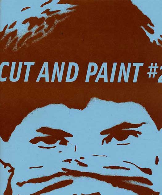
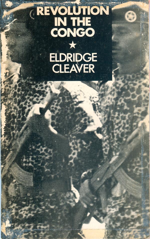
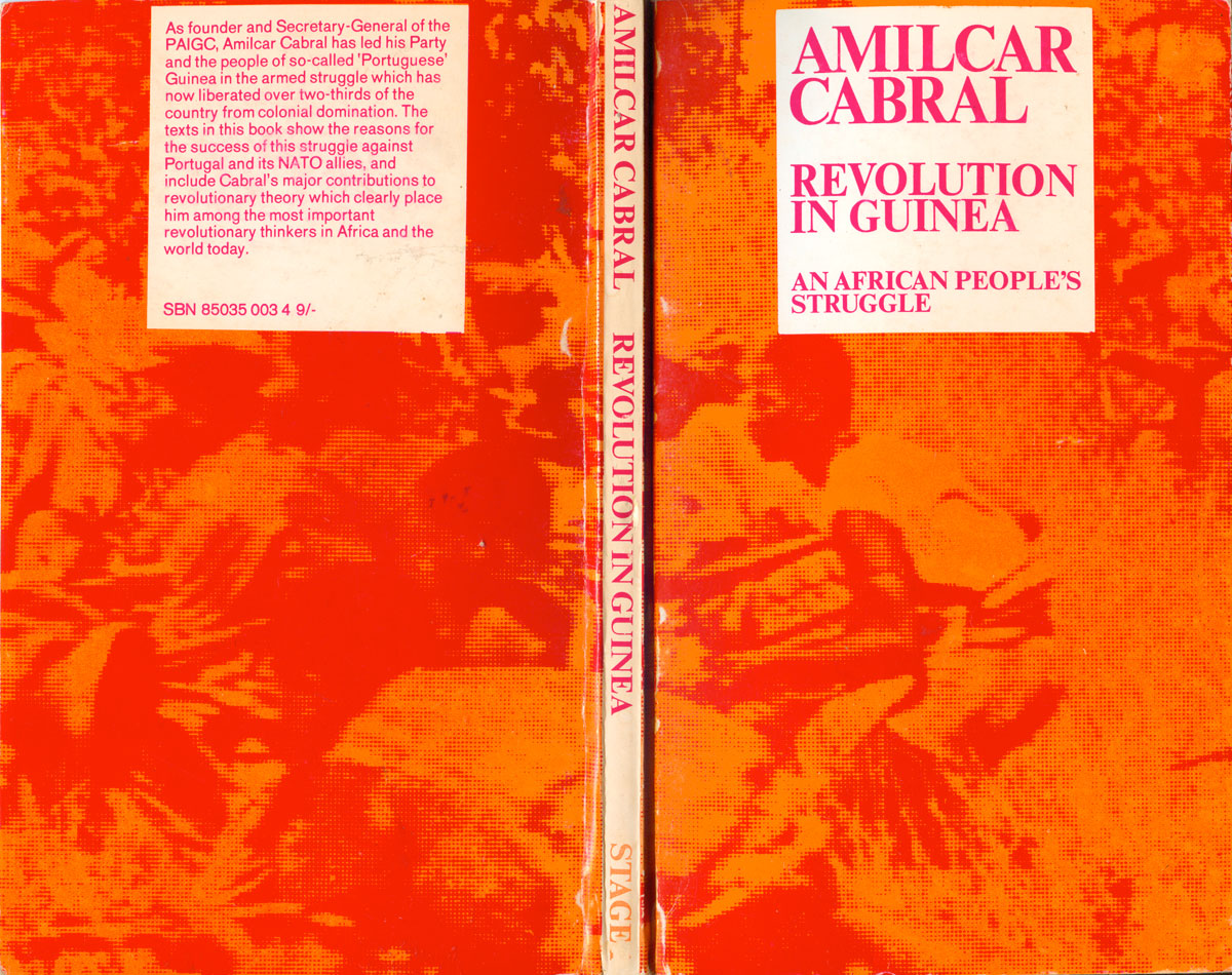
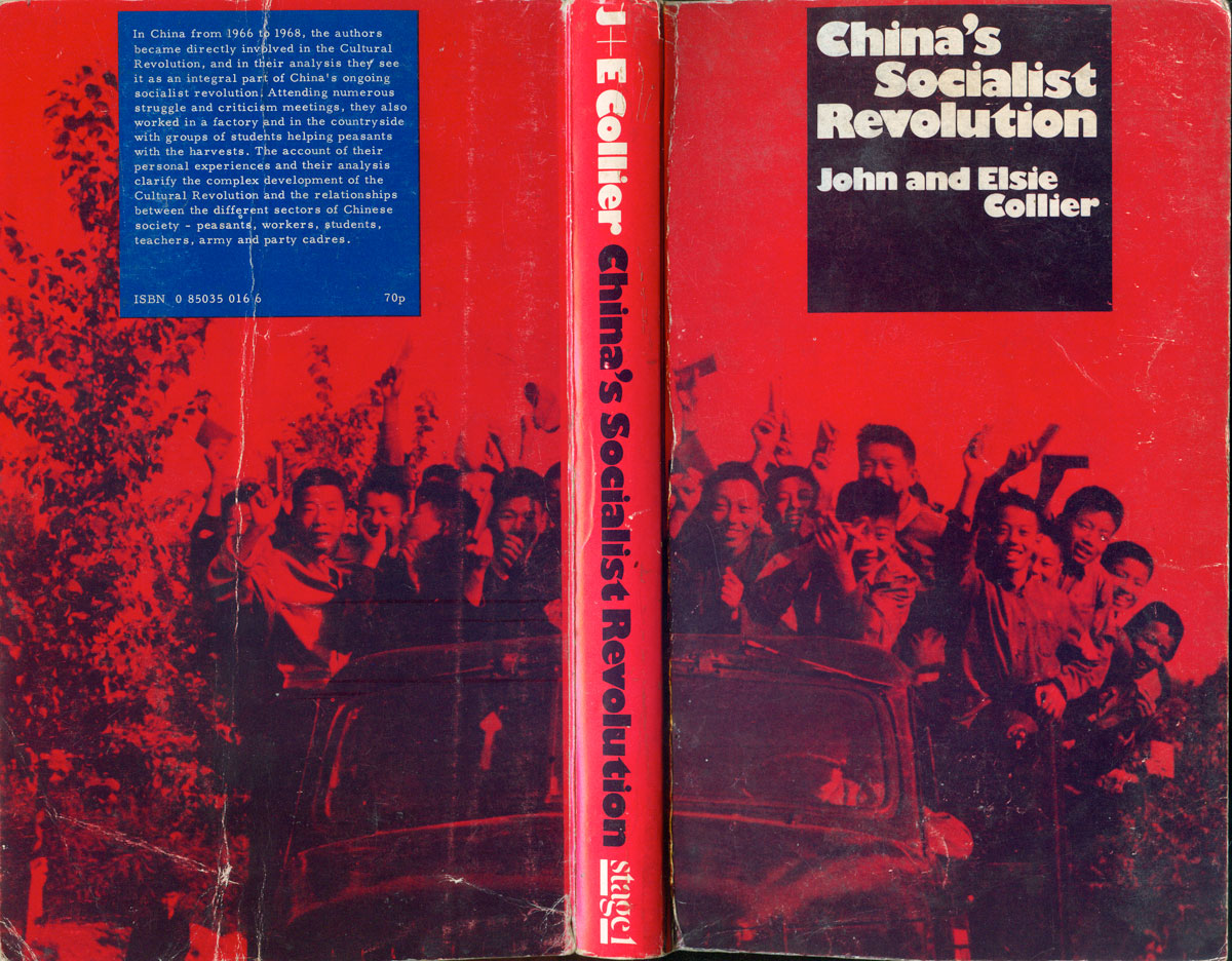
Below are six more covers using this basic convention of a small square box at the top center to hold the title and author’s name. The Cleaver, Cabral, and Collier covers in particular are really strong and effective. They were all designed by Ian Escott, who expect was the brainchild behind stage 1’s graphic sense. Escott is also a bit of a ghost online, but I do know that he did covers for Penguin in the late 1960s.

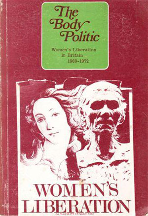
Housing for People or For Profit? and The Body Politic are the weakest of the covers that follow this general style. The former only nods to the convention, with the title in a box of sorts, but the overall graphic and design are much less compelling that the previous examples. The latter maintains the conventions, but the colors and font choice are terribly off-putting. It seems strange to have the cover of a book about 70s feminism seem so witch-y, and not in a good way.

I found this alternative cover for The Body Politic online, but I believe it’s the cover for the revised 1978 edition. It’s interesting that the designer kept the same graphic, but dumped the title in the box for a much more bold, big, drop-shadowed type. While I prefer the typeface and larger graphic, I think both of these elements could have been used to good effect within the existing conventions.
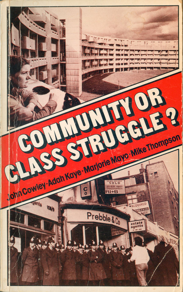
Community or Class Struggle? is also a later title (1977), and uses a bold drop-shadow type face and drops the box for a diagonal banner across the cover. The design is strong (if dated feeling) and attributed to Fiona Macintosh.

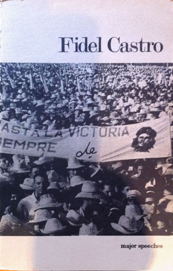
The earliest publications I can find are a set of two pamphlets about Cuba from 1968, one by Castro, the other Guevara. Both are once again simply and relatively elegantly designed, in one color, with right justified, classical, serifed titles and large central graphics.

stage 1 published two pamphlets by the Conference of Socialist Economists. The first is completely no-frills, with a generic and largely undesigned cover. The second is much improved, but still relatively clean and simple. It also features a nicely designed stage 1 colophon.


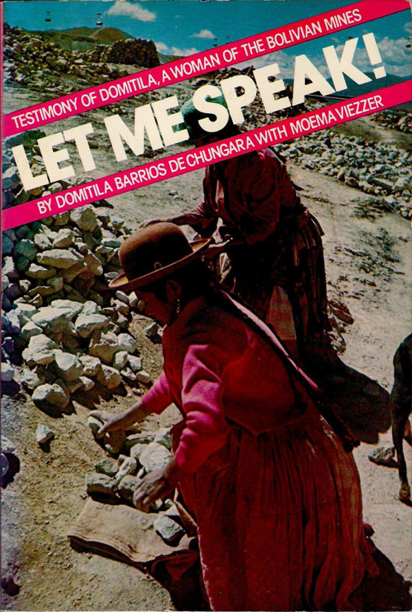
The Little Red Schoolbook is an early title (1971), and has a really nice, simple cover. The title in ultra thin, super rounded sans serif lowercase, and that’s it. The Barrios book seems like the last title stage 1 published, and the only one with a full color cover. Here’s another banner for the title, the pink is a nice highlight for the clothing in the photo, but overall it feels a little flat. It also strikes me as a precursor to all the highly saturated full color photo with sans serif type across the front covers that have been all the rage on lefty non-fiction titles for the past 5 years. Maybe ahead of its time, but still a bit boring.

If anyone out there knows more about stage 1, I’d love to hear about!
Domatila Barrios De Chungara, Let Me Speak!: Testimony of Domatila, a Women of the Bolivian Mines (London: stage1, 1979).
Tony Beck, The Fine Tubes Strike (London: stage1, 1974). Cover design by Ian Escott
Amilcar Cabral, Revolution in Guinea: An African People’s Struggle (London: stage1, 1969). Cover design by Ian Escott.
Fidel Castro, Major Speeches (London: stage1, 1968).
Eldridge Cleaver, Revolution in the Congo (London: stage1, 1971).
John and Elsie Collier, China’s Socialist Revolution (London: stage1, 1973). Cover design by Ian Escott.
The Conference of Socialist Economists, The Labour Process & Class Strategies: CSE Pamphlet no.1 (London: stage1, 1976). Cover design unattributed.
The Conference of Socialist Economists, On the Political Economy of Women: CSE Pamphlet no.2 (London: stage1, 1977). Cover design unattributed.
John Cowley, Adah Kaye, Marjorie Mayo, and Mike Thompson, Community or Class Struggle? (London: stage1, 1977). Cover design by Fiona Macintosh, cover photographs by John Sturrock (Report) and Michael Sheridan.
John Cowley, Housing for People or for Profit? (London: stage1, 1979). Cover design by Ian Escott, cover illustration by Paul F. Downton.
Soren Hansen and Jesper Jensen, The Little Red Schoolbook (London: stage1, 1971).
Jacques Pesquet, Soviets at Saclay? (London: stage1, 1976). Cover design by Ian Escott.
Michelene Wandor, ed., Body Politic: Writings from the Women’s Liberation Movement in Britain (London: stage1, 1972).