About 3 or 4 years after I first got involved in the then-tiny prison activist movement, the movement began quickly growing on college campuses, and a new round of activist, academics, and journalists began writing and publishing on prisons again. Many of these authors were friends or people I had organized around prison issues (Eli Rosenblatt, then director of the Bay Area Prison Activist Resource Center and Daniel Burton-Rose are two of these) or writers that had some experience working within the growing movement (Eric Cummins and Christian Parenti are two of this variety). By the year 2000 there was an entirely new literature about prisons published, with dozens and dozens of titles. There is no way I can look at them all, so I’m focusing on ones that I’ve read, have a copy of, or have interacted with in some way. The first book, to the right, is by Eric Cummins, and is a good example of the visual look of this new batch of books. The graphic tropes are slightly updated to seem modern, but they are the same old visual tropes: bars, bricks, barbed wire, and that damn stencil font!
The two covers below are good representations of this new activist publishing turn. The Burton-Rose book has a surprisingly modest Matt Wuerker illustration on the cover, but still falls within the general house style of the publisher, Common Courage. I’ve never been a fan of the Common Courage look, but this cover far more successful than a lot of the other books they’ve put out. The illustration attempts complexity with its evocation of a Metropolis-like prison with a conveyor-belt feeding prisoners into it’s glowing maw. The Rosenblatt cover also attempts to go beyond the usual graphic clichés, but ends up just piling them on top of each other, with the U.S. flag, the Statue of Liberty, a dollar bill and a policeman making up the bars holding a Black man in prison:


One of the better written and most read of these books is Christian Parenti’s Lockdown America. The cover of the first edition is nothing special, a blurry guard tower in the background, chain link fence in the fore. The second edition is much better, with the prison literally turned on its side. The hands protruding from the bars reach up to the sky, not in fists, but open palms, asking/pleading for help out of the system:


Here are two extremes of the “slightly updated” visual tropes. The Alexander book, which is brand new, has a cover that feels down-right old fashioned. The texture of the cement is nice behind her name, but beyond that that entire concept seems extremely exhausted, and wastes plenty of opportunity to play off the evocation of Jim Crow. The Morris book goes the other extreme. The large black wedge both cuts through the bars and creates a field to place the type, but shape feel inert, like it passively fell onto the prison bars, failing to live up to the activist zeal of the abolition in the title:


The Friedman cover below to the left is a classic example of the kind of post-modern cover design large publishing houses started churning out in the 80s and 90s. The bottom illustration calls from the late 19th century, the guard tower from the 40s or 50s, and the electric chair from the 70s. The fonts are just as dissonant, the wide title and thin author fonts feeling both historical and contemporary, just out of place with any specific time period. And the bars both reference prisons, but also modernist design and constructivism. The cover to the right is a different story all together, with a very raw drawing of a prison that evokes a somewhat timeless prison art style (especially the nod to it being on a torn sheet of notebook paper), but then the stencil font again, and a sans serif font with awkward transitions from thin to thick within the letters. It’s an OK cover, but tells us very little about the book:


Vikki Law’s book uses ALL the tropes: bars, bricks, barbed wire, and prison art. The cell floating on the black background is somewhat interesting, and I like the distressed title font, but the author’s name shouldn’t have been placed on such a busy background. The book is great, the cover fair, there has to be a way to better represent the vital struggles of women in prison that are discussed inside. The Critical Resistance book to the right has one of my favorite covers of the recent books, the type is striking, and the bird out of the cage, while not that conceptually inventive in the long view, is a leaps and bounds beyond all the rehash of same old prison visual language. On top of that, the transparency of the both the bird and the type, as well as the aged corners, create a nice depth of field:


Like the 60s and 70s, recent times have created a new crop of prisoner confessionals. Abbott’s I Cried happens to be one I worked on (I did the interior design of the recent AK edition, I had nothing to do with the covers). The first edition to the left has a terrible cover. The image of the kid is creepy, the staggered type is awkward, and the blue duotone seems largely wasted beyond giving the feeling that you are underwater. It feels like a reject surfer memoir. The new edition to the right is much, much more successful. The photo is still creepy, but purposefully creepy. The scratching out and handwriting clearly echo the title—”You Didn’t Listen”:


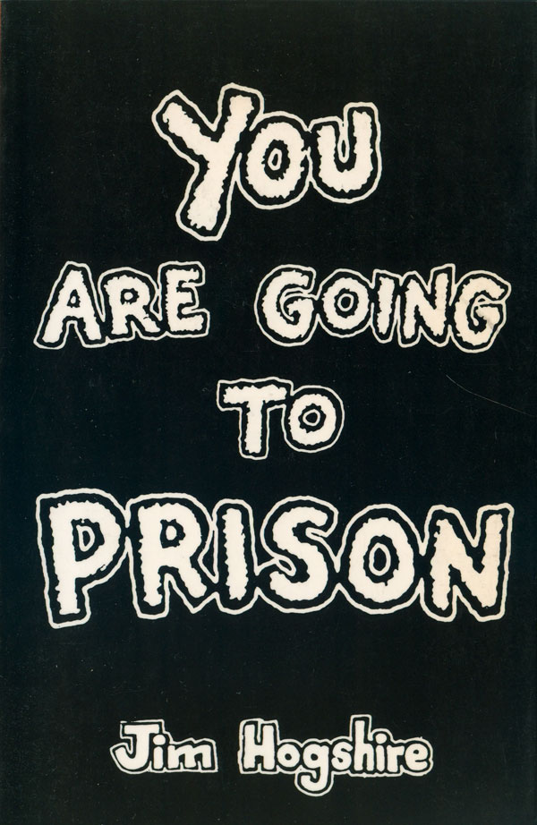
Not much to say about the book to the left, a classic self-produced memoir-type cover with requisite self-portrait. The one to the right cracks me up: no-frills, like a generic prison book, black & white with shitty letters, just like your experience will be in the joint:


Next week I’ll start on the political prisoner books. Here is the full bibliography of the prison books discussed over the past three weeks:
Dwight E. Abbot, I Cried, You Didn’t Listen: A Survivor’s Exposé of the California Youth Authority (Port Townsend, Wash.: Feral House, 1991).
Dwight E. Abbot, I Cried, You Didn’t Listen: A Survivor’s Exposé of the California Youth Authority (Oakland: AK Press, 2006). Cover design by Herb Thornby.
Jack Henry Abbott, In the Belly of the Beast: Letters from Prison (New York: Vintage, 1982).
Michelle Alexander, The New Jim Crow: Mass Incarceration in the Age of Colorblindness (New York: The New Press, 2010).
American Friends Service Committee, Struggle for Justice: A Report on Crime and Punishment in America (New York: Hill & Wang, 1971). Cover photograph by Mark Feinstein/Liberation News Service.
Burton Atkins and Henry Glick, Prisons,Protest, and Politics (New York: Prentice Hall, 1972).
Jamie Bissonette, When the Prisoners Ran Walpole: A True Story in the Movement for Prison Abolition (Boston: South End Press, 2008). Cover design by Asha Tall, cover illustration by Darrell Gane-McCalla.
Malcolm Braly, False Starts: A Memoir of San Quentin and Other Prisons (London: Penguin, 1977). Cover design by Overlook.
Daniel Burton-Rose, ed., The Celling of America: An Inside Look at the U.S. Prison Industry (Monroe, Maine: Common Courage Press, 1998). Cover design by Matt Wuerker.
G. T. Cartier, Deadlock at Walla Walla (Somerton, Ariz.: Somerton Press, 1986).
The CR10 Publications Collective, ed., Abolition Now!: Ten Years of Strategy and Struggle Against the Prison Industrial Complex (Oakland: AK Press, 2008). Design by Albert Ignacio & Marcelo Viana.
Eric Cummins, The Rise and Fall of California’s Radical Prison Movement (Stanford University Press, 1994).
Michel Foucault, Discipline & Punish: The Birth of the Prison (New York: Vintage, 1979).
Michel Foucault, Discipline & Punish: The Birth of the Prison (London: Penguin, 1979).
Lawrence M. Friedman, Crime and Punishment in American History (New York: Basic Books, 1993). Cover design by Tom McKeven.
Jim Hogshire, You Are Going to Prison (Port Townsend, Wash.: Loompanics, 1994). Cover design by Nick Bougas.
John Irwin, Prisons in Turmoil (Little, Brown, 1980).
James B. Jacobs, Stateville: The Penitentiary in Mass Society (Chicago: University of Chicago Press, 1977).
Hugh J. Klare, Anatomy of a Prison (London: Penguin, 1962). Cover photograph by Roger Mayne.
Victoria Law, Resistance Behind Bars: The Struggles of Incarcerated Women (Oakland: PM Press, 2009).
Robert J. Minton, Jr., ed., Inside: Prison American Style (New York: Random House, 1971). Cover design by Bob Giusti, photograph by Steve Salmieri.
Jessica Mitford, The American Prison Business (London: Penguin, 1977). Cover illustration by Roger Coleman.
Ruth Morris, Penal Abolition: The Practical Choice (Toronto: Canadian Scholar’s Press, 1995). Cover design by Brad Horning.
Eve Pell, ed., Maximum Security: Letters from Prison (New York: E. P. Dutton, 1972).
Eve Pell, ed., Maximum Security: Letters from Prison (New York: Bantam, 1973).
Elihu Rosenblatt, ed., Criminal Injustice: Confronting the Prison Crisis (Boston: South End Press, 1996). Cover design by David Gerratt, based on a concept by Olanzani Olatunji, photo by Craig Bailey/Ron Gill.
Bill Sands, My Shadow Ran Fast (New York: Signet, 1966).
Judith A. Scheffler, Wall Tappings: An Anthology of Writings by Women Prisoners (Boston: Northeastern University Press, 1986). Cover design by David Ford.
Leon “Whitey” Thompson, Alcatraz Merry-Go-Round (Fiddletown, Cali.: Winter Books, 1995).
Kathryn Watterson Burkhart, Women in Prison (Popular Library, 1976).
Words from the House of the Dead: Prison Writings from Soledad (Trumansburg, New York: The Crossing Press, 1974).
Min S. Yee, The Melancholy History of Soledad Prison (New York: Harper’s Magazine Press, 1973). Cover design by Stan Phillips.


Great set of covers and criticisms Josh.
This only scratches the surface of redundancy of prison related tropes. The lack of graphics led Justseeds to produce the Voices From Outside portfolio, two years ago.
http://justseeds.org/criticalresistance/
I do think the image on Parenti’s first edition is a quite effective use of chainlink and watchtowers. It’s incredibly descriptive of the content, allowing for little effort from the brain. The CR10 design is also my favorite of the covers chosen above. The second I Cried, You didn’t listen cover is also well done, I like the lettering. I also have to restrain my impulse to touch, even the computer screen, the scratches on the cover.
Josh, I really liked your survey here. For the “record,” i had really no say at all in the (indeed I think overly busy) cover of Criminal Injustice, but you prolly knew that. No offense to the designer, but I think it asks so much of the viewer. At the time (95-96) I was somewhat disappointed, but there was so much else happening and I was just *floored* about the reality of it going to print at all, that I just sort of let it go. Again, thanks for your insights here.
Thanks for your comment Eli. You bring up a good point, which is that book covers are most often all about compromise. The three principle actors in the process: the author/editor, the designer, and the publisher, rarely get full say in the final design. This can be a good thing, and act as a system of checks and balances which don’t let anyone’s perspective — and interests — get too dominant (i.e. the author has a strong idea that may not be at all effective in order to sell the book, or may turn off potential readers because of poor design sense, or a designer might have an amazing design, but it poorly represents the contents of the book, or the publisher may overburden a good design with commercial demands). But unfortunately it also can, and often does, create lowest-common-denominator covers, where the interests of each party are compromised, making a tepid soup…
As a designer I face this problem all the time, most often in the form of commercial demands from the publisher, for instance the expectation of hundreds of words of text to somehow fit on the cover and be balanced with an image.