Given the last 2 months of book covers relating to prisons, I thought it would be nice to take a little break and go off on some tangents. To start, I’ve been collecting a bunch of classic 60s and 70s anarchist book covers, and some of favorites have great illustrations of the old bearded protagonists of anarchy, so lets take a jaunt through some cool Kropotkin covers. Who doesn’t love a big white beard! This first week is my favorite Kropotkin beards, next week I’ll tour more Russian facial hair, and then some other non-bearded Kropotkin covers.
The above left is one of my all-time favorites, largely because the illustration is so unique. Anyone with a even a small shelf of anarchist classics at home knows that the same handful of images of Kropotkin, Bakunin, Proudhon, Goldman, etc. get recycled over and over. The source photo for this cover is actually a much used image of Kropotkin (check out next week for many more permutations), but the artist has used some creative license to fabricate a younger Peter, which is rare. The almost regal cross hatching on his balding head makes it look like this image was created to put on currency, but then the duotone black and red in the beard is totally trippy, a seeming product of the times (this edition was produced by Grove Press/Evergreen in 1970). Unfortunately the art and design are uncredited.
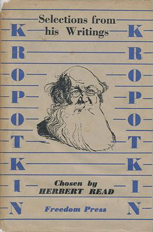
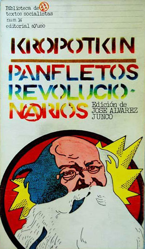
The 1942 Freedom Press edition below is nice, as it seems rare for Freedom to have an illustration on a cover during this time period (the war years were tight for money, and I would think the extra plate to print the image would have been expensive). I believe the portrait is original (based on not seeing it in any earlier sources), but unfortunately I don’t know the artist. Otherwise the cover seems a fair example of Freedom Press covers of the period, with the Bodini Poster font and 2 color printing. To the right is a 1977 Spanish rework of the same illustration on a cover of Kropotkin’s Revolutionary Pamphlets from Madrid. True to the times, the clean black and white image of a stern Kropotkin has been turned into a technicolor hippy punk exploding towards the reader. The raw and rainbow stencil typeface just seals the deal, they were sure excited about this old Russian!
The 1988 Freedom Press edition of Act For Yourselves is quite boring, but is of note because rather than a simple bust of Kropotkin, he is shown in context, which you almost never see. Once again I don’t know the origin of the image, but it looks almoist like a block print that would have been made by the Taller de Grafica Popular in the 40s, or a similarly politicized printmaker in China. To the right is another favorite, with a really great drawing by Clifford Harper (seemingly from the same photo-source as the Act or Yourselves cover). This book is one the Anarchist Pocketbook series put out by Elephant Editions in the 1980s and 90s, which all had covers designed and illustrated by Harper. So not only is the illustration cool, but the patterned boxes within boxes it and the titles are set in look great. I also usually have an allergic reaction to contemporary uses of Neuland (and similar) typefaces, but Harper really makes it work here.


Below to the left is the MIT Press edition of Selected Writings from 1970 (edited by Martin Miller, cover designed by Bernie LaCasse), and the over-saturated blue and green bleeding to the edges is a little overwhelming, but I have soft spot for this period’s design and use of large flat planes of color. The white Helvetica titles pop nicely, but the green subtitle lines at the bottom left, including the editors name, are totally lost. Interestingly (or strangely?) less than a decade later the editor released the biography to the right on University of Chicago Press (1979), which uses the same exact photo of Kropotkin in an almost identical pose/bleed with a similar blue. I don’t have the actual book, so I don’t know if the design was also done by LaCasse, or is a straight rip-off.


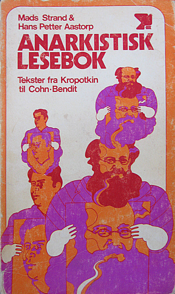
I’m a big fan of the Norwegian Kropotkin: purple, red, and orange, and seemingly holding a portrait of himself why he dreams of himself holding a portrait of himself, huh?!? The white gloves are a nice touch too! And I’m generally flabbergasted by the cover to the right. Kropotkin as a creepy Santa Claus on his way to scare children at the circus in the background? WTF!?!? I’m pretty sure this cover is actually on a Print-On-Demand edition (more on that in a couple weeks), and the image was created completely independently from the book, and chosen to represent Conquest of Bread simply because the guy in the image has a beard.






That spanish version is sick!
I like the graphic on the MIT Press version, a much better design choice than the actual photo. The below text is way too muddy though.
That last on looks like the cover of a choose-your-own adventure book, incredibly hilarious, yet terrible.