No more beards, but this week I’ve found cool old-school Kropotkin covers, 19th Century to early 20th. The one above is a great Czech modernist cover for Anarchist Morality, designed by Josef Capek and published in 1919. There is little to the design other than the text, yet it explodes off the page.
Next a couple of old non-pictoral Freedom Press covers. Selections is likely from the 50s, I’m not sure about the The State, I would guess the early 40s based on the price and the use of Bodini as a titling font. The blue-ish black ink on the red paper is really striking, and the box with Kropotkin’s name laid in at the top is very clean and efficient, lovely!


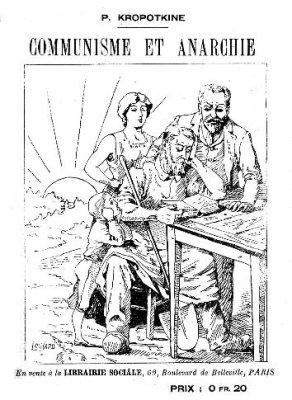
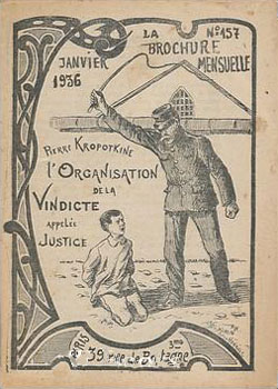
Here are a couple French editions with illustrated covers. Anarchist Communism (to the left) is turn of the century, published by Librairie Sociale. Ahhh, the sun rises behind the family that reads Kropotkin! To the right is L’Organisation De La Vindicte: Appelee Justice (The Organization Of Retribution: Called Justice), published in 1936 by Brochure Mensuelle. It’s quite an odd cover, with the heavy ornamentation on the left side, the flowery yet awkward hand-written type, and the stiff illustration. It somehow feels “in-between,” but I’m not sure in-between what…
Here are two British pamphlets published by William Reeves. They both seem to be from the early 20th Century. The typeface used for War! is great, and strangely Peter Kropotkin has become “Pierre.” Maybe because one of the volumes is from a speech in Paris?


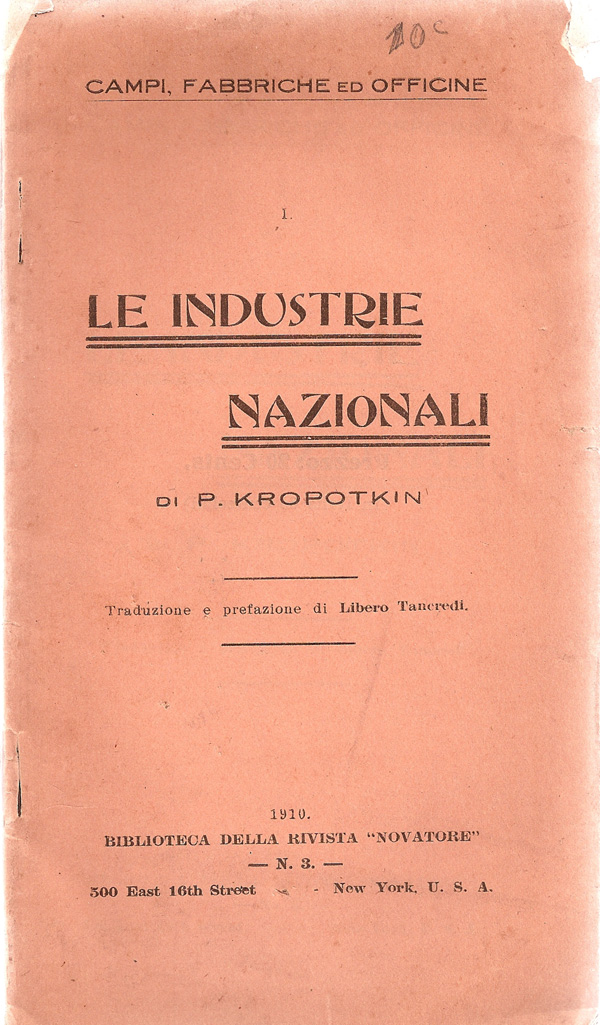
More type-based modernist covers: To the left is an Italian edition from 1910, published in the U.S., and to the right a Spanish edition from 1922 published in Barcelona. The border is beautiful, but I can’t quite make out what the symbol in the center is.

This edition of Fields, Factories and Workshops was published sometime in the 1910s by Thomas Nelson, & Sons in London. The slope of the title echoes the smoke coming out of the stacks, really tying the etching into the cover, regardless of whether the industrial scene shown (which now looks a bit like a nightmare) was really Kropotkin’s vision. And last but not least, the first Penguin edition of Mutual Aid from the 30s. Pelican Books was an imprint of original or more scholarly paperbacks put out by Penguin. At the time all Penguin books followed this same 3 part grid, and the blue indicated that this was non-fiction. Almost 80 years later there is something still so powerful about the grid design on these covers, the simplicity of the color schemes, the clean Gill Sans type face…but maybe that’s my desire to see the mainstreaming of anarchist ideas talking. Kropotkin as a public intellectual worthy of a general audience, mass distribution, reading on the subway!







I love the Capek cover. We’ve just returned from Prague and saw a great deal of his work in the Cubist Museum. It all has that fierce economy and dynamism. He’s a cubist without any kind of doctrinal purity. He died in Bergen-Belsen; couldn’t keep his mouth shut. Well worth exploring his stuff