Dove-tailing off of last weeks post on the UK publisher Shortfuse, this week I’m going to start a series of posts on the UK/Italian anarchist publisher Elephant Editions. I believe Elephant Editions was begun in the UK in the early to mid-80s by insurrectionary anarchist Jean Weir. I’m not an expert in insurrectionary anarchist history, but in 1982 Weir began producing an anarchist magazine/broadsheet called Insurrection, which ran for seven issues throughout the 1980s (I will be featuring the covers of this magazine in a future post). Within the pages of Insurrection their is a melange of anti-militarism, critiques of the organizational forms of politics, records of state violence, and a defense of illegalism (for lack of a better description, individualist armed struggle). In addition, Weir translated and published some of the first writings by the Italian anarchist Alfredo Bonnano into English. Elephant Editions as a publisher seems to have begun in the mid-80s as an extension of Insurrection.
Like the magazine, Elephant is a diverse and interesting brew. Their publications fall into roughly three groupings, the early Anarchist Pocketbook series, the Bratach Dubh pamphlet series, and a small collection of other pamphlets and publications. This week we’ll start with the Anarchist Pocketbooks.
Published in a quick burst between 1985-1988, the Anarchist Pocketbooks series is a collection of eight small (~4.5″ x 6.5″) perfect-bound anarchist texts. These books are eclectic. They range from old-school anarchist classics like Conquest of Bread by Kropotkin, to the now-classic Sabate by Antonio Tellez, from the communiques of the UK guerrilla group The Angry Brigade to the Marxist collective Midnight Notes critique of the U.S. anti-nuclear movement in the 1970s and 80s. The thing that really holds them together is their unique size, as well as the fact that all eight were designed by UK anarchist illustrator/designer Clifford Harper (who also designed a number of the issues of Insurrection).
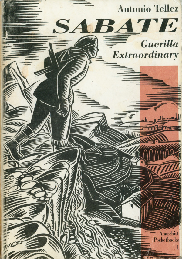
The mid to late 80s was one of Harper’s most aesthetically wide-ranging periods, he had broken out of his early pointillist-realist style, but had yet to entirely solidify into his hard-edged post-Masereel graphic forms. The Pocketbook covers are an amazing jumble of graphic styles, and very exciting because of this. The first in the series, Sabate (above right), is one of Harper’s most dynamic “post-Masereel” graphics. The lines are relatively soft and lay out a complex system of clouds, mountains, and small Spanish towns that the guerrilla Sabate is determinedly walking across. He is alone, but also is the surveyor (and “master”?) of all that is below him. The black and white illustration is set off nicely by a rust colored bar that runs vertically along the right side, a small but nice modernist touch which makes the cover feel both contemporary and balanced.
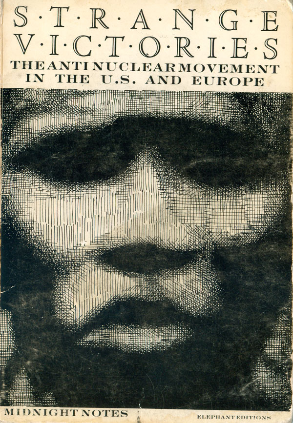
The covers for the 2nd and 3rd books, Strange Victories and The Angry Brigade respectively (below), are both very different from each other and Sabate. I first picked up a copy of Strange Victories at Housmans’ bookstore in London back in 1993. Both Midnight Notes’ critique inside, and the style of writing of Bonanno’s introduction were very influencial to me in my 20s. I can only image I was brought to the book by the cover, which is dominated by a ghostlike cross-hatched face, the only illustration like this I’ve ever seen Harper do, and completely unexpected. It is a powerful cover, but strange, as after 20 years I’m still not sure what bearing it has on the insides of the book!
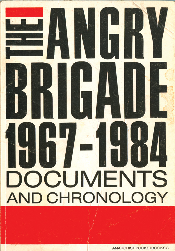
The Angry Brigade is much more straight forward, as an effective riff on modernist design. It features the first use of sans-serif type in the series, and forgoes any illustration of bombs, guns, or other tools of the Brigade in favor of solid black type-treatment and horizontal red bars. These first three books are a nice study in the diversity a designer can get out of largely black and white covers with the simple use of spot color.
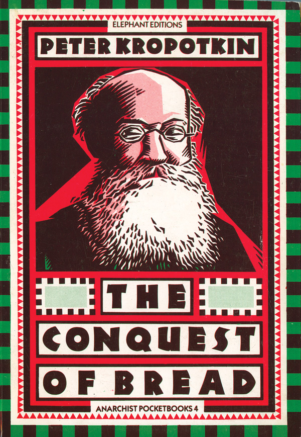
The fourth and fifth covers break further out of a mold, and prove Harper’s design prowess. Conquest of Bread takes a nice and relatively simple portrait of Kropotkin (done in the “post-Masereel” style Harper is best known for which he used to illustrate his book Anarchism: A Graphic Guide) and makes it the centerpiece of a great book cover. The simple illustration is perfectly balanced and housed within a series of concentric patterns, all of which are constructed out of extremely simple squares and triangles. The real stroke of genius is that this cover, like all the others, is printed in only two colors, it just happens that those colors are green and red, and overprint to make a rich brown. In addition he uses percentages of the red and green to add shading and additional depth to the cover. This is also one of the rare used of a Neuland-type font that I actually like, sticking with the extrabold makes it operate almost like a graphic element within the cover’s patterns, but the slightly un-square edges allow the titles to be distinct from the rest of the cover design.
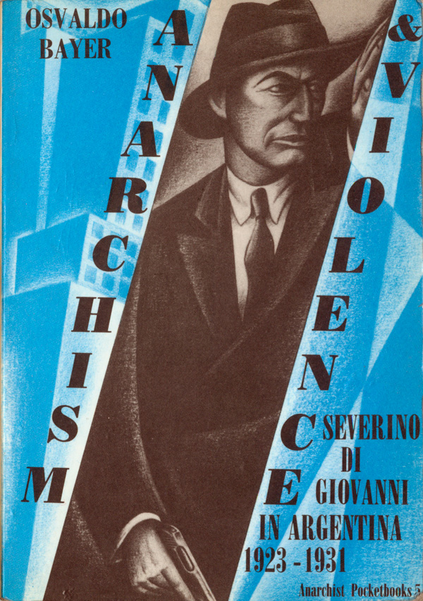
Anarchism & Violence is another striking cover, but in a completely different way. Once again we get a Harper we rarely see, with foreground and background illustrations that are shaded and stylized to read as modernist graphics. As a whole the cover could function as a poster for an anarchist film noir, but what really impresses me is that somehow Harper was able to create a design that simultaneously and convincingly reads as both high-modernism from between the wars and a distinctly Clifford Harper production.
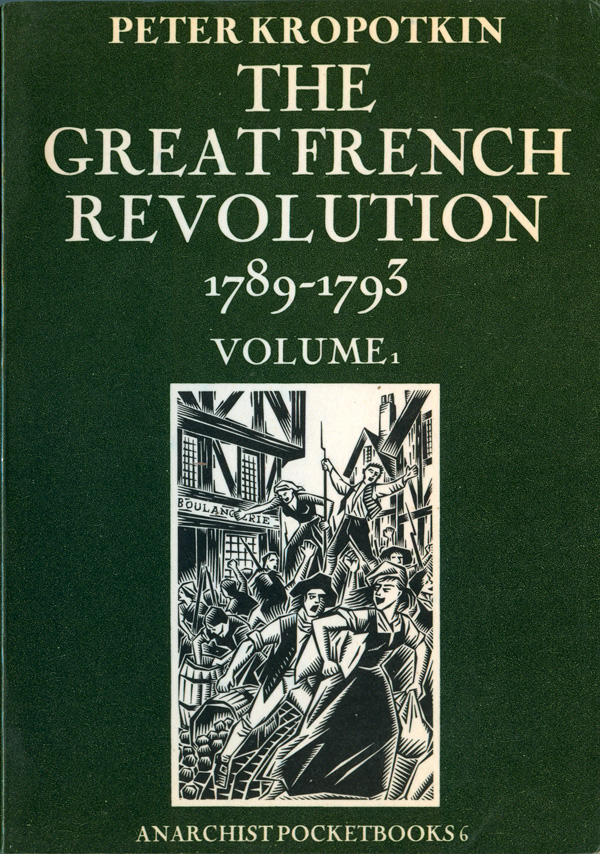
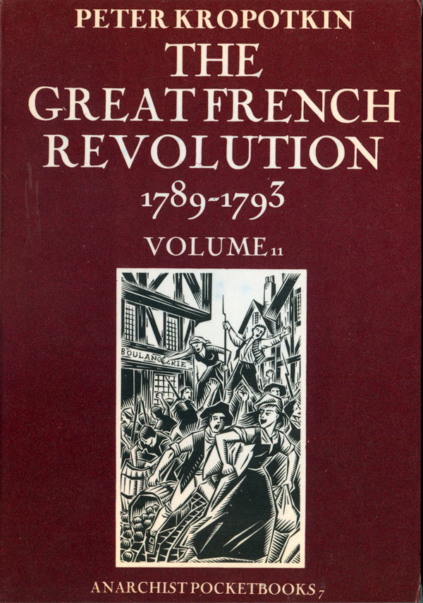
The 6th and 7th books in the series are a bit of a toss-off, and the weakest of the covers. They are both relatively generic, solid dark colored covers with classical serifed type and a small inset illustration. The illustration is the same on both, and is of one of his illustrations of the French Revolution taken from his book, Anarchy: A Graphic Guide.
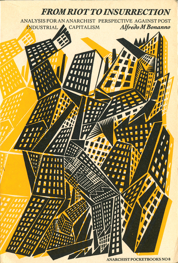
The eighth and final book in the series is a Bonnano text, From Riot to Insurrection, and the cover is one of my favorites. Harper takes his standard illustration of a cityscape, deconstructs it, and rebuilds it into a living, breathing anthropomorphized giant city in revolt. With factories as feet, housing estates as arms, and a smoke stack being swung as a club, the city is both on the attack and at war with itself. The simple but severe yellow drop shadow adds the necessary depth to the otherwise flat city creature, and the book’s title sits quietly at the top, but is italicized and in motion with the image. There are a number of historical examples of this sort of attempt to build a man out of a city and vice versa, I’ve seen some in Art Young’s style re: the Masses and New Masses, as well as Masereel, and even a Peter Kuper version from a cover of an old issue of the Baffler that riffs off of Art Young, but there is something distinct about Harper’s vision. His city risen is not sentimental or specific, it is both generic and blank of emotion, and maybe more harrowing because of that.
I’m going to dig deeper into Elephant Editions in the following weeks, but in the meantime, you can read more about the press, including many of the texts they’ve published, HERE and HERE.
