I had intended to follow-up last weeks post about Elephant Editions Anarchist Pocketbook series (check it out HERE) with the covers of another of their popular book/pamphlet series, the eight publications printed under the label Bratach Dubh (Black Flag in Gaelic). But, I still feel unhappy with my research, and keep turning up new info and new covers (i.e. it appears that Bratach Dubh was originally it’s own publisher, and was folded into Elephant Editions in 1990 when Weir reprinted all of the original pamphlets from the 70s and 80s), so I’m going to wait on that for a couple weeks (If you’ve got any info on the origins and history of Elephant Editions beyond the basics (see last week’s post) please drop me a line!
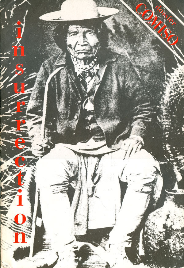
Instead I’m going to look at the covers of the seven issues of Insurrection magazine, published by Jean Weir concurrently to running Elephant Editions press. To the left is the first issue, which is technically issue #0 (the pilot). The cover is generally unremarkable design-wise, other than the designer was smart enough to not obscure the striking photograph of a Native American (possibly Sitting Bull, but I don’t know for sure?).
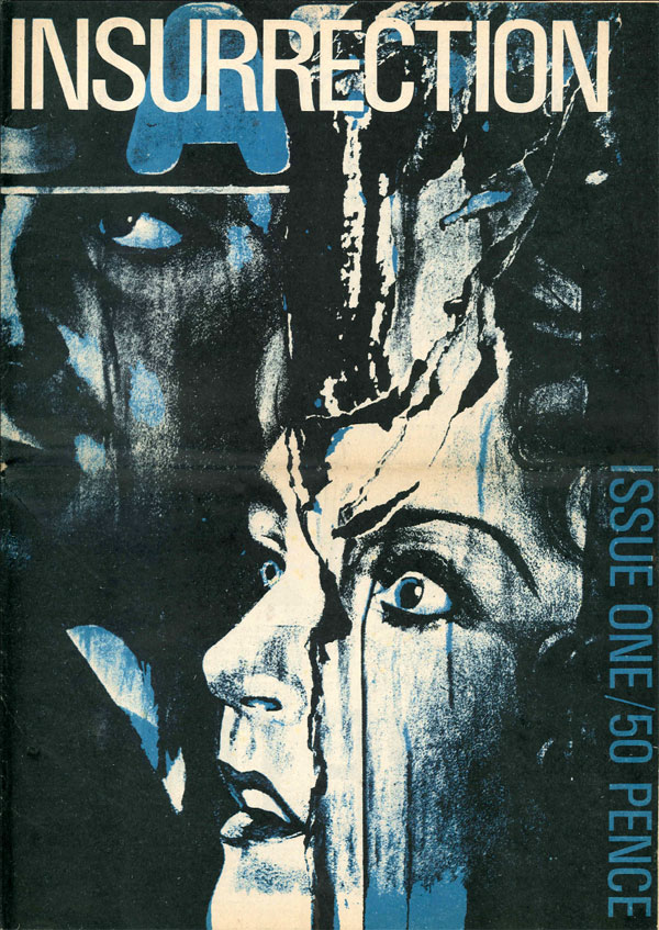
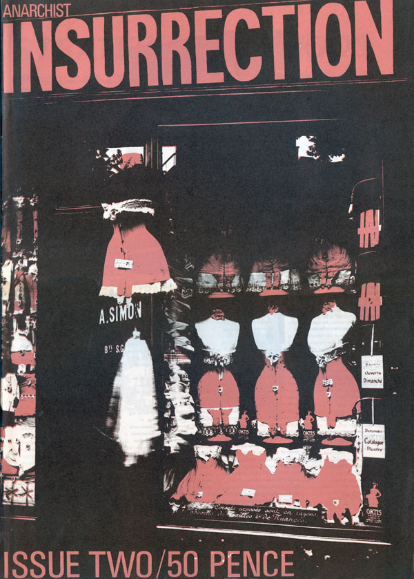
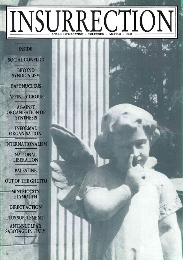
On the first two numbered issues below (both newspaper format), Clifford Harper is attributed as the art director, but never specifically labeled as the cover designer. These covers seem like they definitely could be Harper’s, but they are also a bit of a break from his normal range of styles.
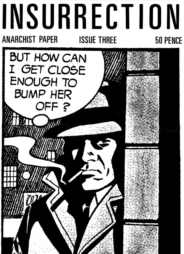
After the strong covers above, the series goes adrift graphically. The cover for #3 below in some ways references the comic book elements in the cover for issue #1, but in a much less dynamic way. It features a single frame from some sort of detective/noir comic, or at least is intended to look that way. This could also be Harper, but it seems a step backwards in design from issues #1 & #2.
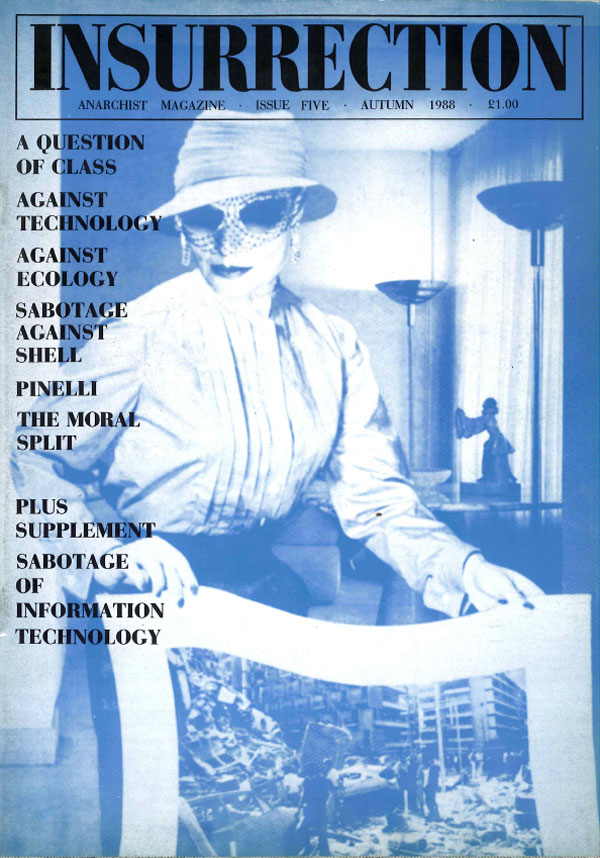
With issues #4 and#5, it appears as if the publication was trying to settle in to a new magazine format, with these issues being a much more traditional A4 size. In addition, they both feature a mono-toned photograph with a top centered masthead and contents printed in black. Strangely the masthead type treatment changes, and the two photos are very different in feel and style.
Issue #6 returns to a newspaper-size format, and also a more traditional newspaper style, with a masthead and a largely textual cover. Nothing too interesting here, mostly a bit weird and post-punk feeling.

You can download and read all the issues of Insurrection HERE (scroll about halfway down the page).


I did everything, from ideas to paste-up, on issues 1-3, while Jean and myself were tangled up together.
Jean has a natural talent for design and imagery and I took her direction on many pictures. Often I would initially think her choice of images had no relevancy to the texts, but once they were on the page I saw they took things to unthought of places. In this way Jean really put the boot into logic and rationality.
On issue 4 she handed the design over to some first year student and I got into other stuff, although I continued to produce Jean’s book and pamphlet covers. Clifford H.
Thanks for the info Clifford!
Another note, I was just at my friend Sean’s house and noticed a poster of a Walker Evans photo, the photo used on the cover of issue #1! The spot color printing of the blue really pulls out the fear and creepiness that already existed in the original photo, but makes it more graphic. Also, Clifford must have cheekily removed the rest of the word that is in the top left corner of the image, leaving only the giant “A”!!