
A couple months back I was browsing the shelves at the awesome Book Thug Nation bookstore in Brooklyn and I came across a nice paperback copy of Julius Fuchik’s Spanish Civil War book Notes From the Gallows (to the left). The cover is fabulous, a three-color print job used to strong effect with yellow overlapping red to make orange, and black outlines pulling everything together where necessary. Aaron at Book Thug told me he had seen other nice looking books from New Century Publishers (who put out the Fuchik book in 1948), and that sent me on the hunt.
There is very little information about New Century online, but I can deduce from what they have published (William Z. Foster, Elizabeth Gurley Flynn) that they were a post-war Communist Party, USA front publisher. I tracked down another dozen books that appear to have been put out by the same New Century between 1946-1963 (there are a number of other non-commie NCP’s out there), none have as nice a cover as the Fuchik, but there are some other nice ones. Like most CP books, as far as I can tell none of these give info for the cover designers, but the Fuchik cover has the signature “Nydorf” in the top right corner. This may be Roy Nydorf, a painter that I think was associated with the CP. If anyone has any more info on New Century or Nydorf, make a comment below, or send me an email.
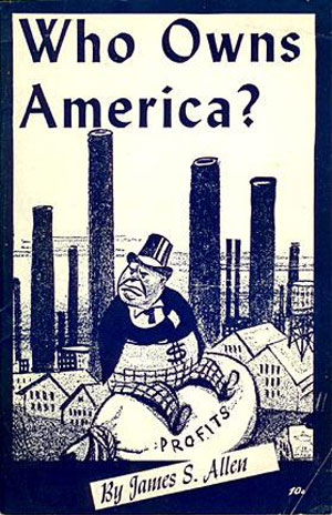
I’m going to go through the rest of these roughly in chronological order, for lack of a better organizational system. Below are James S. Allen’s Who Owns America (1946) and A. B. Magil’s Socialism: What’s In It for You (1947). Allen’s cover has a great New Masses style illustration, with the necessary fat, evil, capitalist boss and amazing giant smokestacks looming over the houses. The titling font isn’t my favorite, but I like how the author tag seems tossed at that angle at the bottom, it gives the whole thing some motion and breaks the illustration out of the straight clean box. The Magil cover is more conservative, and seemingly standard for the older NCP books. Straight single color, with a mix of fonts, standard tall sans on the top and a nice drop outlined serif in the center. Both of these fonts are classic looking, and I’ve seen a number of newer fonts with similar styles.
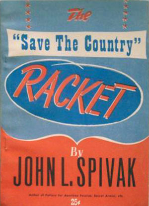
Spivak’s The “Save The Country” Racket (1948) is quite interesting, very graphic but contained to mostly type and basic elements. The Save The Country sign is hung with small stars and is in a “Western”-style font, and the curly bracket on it’s side that points to the author’s name gives the whole cover the appearance of being a close-up or detail of one of those fancy western-type button-up shirts. This cover seems to be taking on the 1970s Republican cooptation of country music and Southern white culture 25 years early!

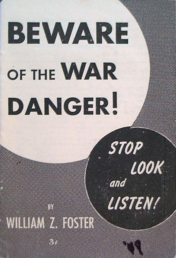
Here are two books by William Z. Foster, then head of the Communist Party, USA: Reaction Beats Its War Drum (1946) and Beware of the War Danger (1948). These both must be arguments against the building Cold War, and are fairly conservative in design, maybe to add a sense of the mainstream to the arguments. The subtitle of Beware of the War Danger is a crack-up, “Stop, Look, and Listen!”
Starobin’s Should American’s Back the Marshall Plan? (1948) is back to the more conservative single color cover designs, and is even a bit more dry because of the total lack of color or pattern.


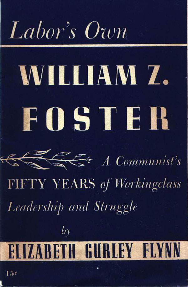
Below are Elizabeth Gurly Flynn’s glowing portrait of Labor’s Own William Z. Foster (1949). It’s a bit hard to stomach both of their falls from a height of radicalism in the Industrial Workers of the World to post-war hack Stalinism. This cover is nothing to write home about either.
On the other hand, Carl Hirsch’s Public Enemies in Public Office (1951) has an exceptional cover. A giant spider, rendered in all its hairy detail and glory, crawls out of the shadows with the Capital in its sights! In terms of understanding politics visually, this is also fascinating. At first glance this appears to be a red scare pamphlet, given that the spider is descending from a giant smudge of red and that the 50s were full of fear that communists were going to try to highjack our highest levels of government. But it is actually a tract that takes aim at politicians that supported the Korean war and Jim Crow laws in the south. I can’t help but wonder if this communist publisher didn’t wrap itself temporarily in a graphic cloak of anti-communism in order to get its ideas across?
Liu Shao-Chi’s On Inner-Party Struggle (1952) and Pettis Perry’s The Party of Negro and White (1953) are pretty uneventful. The graphic balance on the Perry cover is nice, with the title in white spread out vertically on the black half, with a small box of black text at the bottom of the white half.


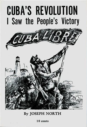
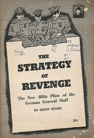
You wanna give them props for putting an illustration on Joseph North’s Cuba’s Revolution (1959), but the image is somehow simultaneously mundane and terribly ugly. Ernst Henri’s The Strategy of Revenge (1961) seems to be turn out of time. Published in 1961, there is almost nothing here that gives any indication it isn’t 1941. The illustration is interesting, and worked into the cover well (although the heavy title treatment on the white slab of the soldier’s “desk” is a wasted opportunity). The “blitz” written on the map is nice touch, as is the caricature of Hitler in the top right.
The cover of Mike Newberry’s The Fascist Revival (1961), also seems a bit retro for 1961, but is also completely inspired. The stark tall sans in white and black on red really works, and the mixed use of caps and lowercase, and different widths and kerning really gives the cover some tension. It seems almost American Bauhaus, like if Tschichold was a Beat, designing cheap commie paperbacks while criss crossing the country on a motorcycle!
Scott Nearing’s Cuba and Latin America (1963) is more typical throwback, i.e. likely the same designer that was doing covers for them fifteen to twenty years earlier. It’s not a total loss, though. The two color spot printing and off-registration has real character, as does the blocky layout.


Hi, I came across your site as I was preparing to list another publication from New Century Publishers. It is “Who pays for the Cold War – How the Marshall Plan affects your living standards.” by George Blake, who is listed as the chairman of the New York County Committee of the Communist Party.
It is an unabashed attack on the Marshall Plan and American foreign policy, and lists other publications with a communist slant on the back cover. Very bland cover, but fits in with the other publications by this publisher.
Roy Nydorf is an award-winning painter, printmaker, draftsman and carver. He has exhibited nationally and internationally, and is represented in numerous public collections, including the Smithsonian American Art Museum, the Hirshhorn Museum and Sculpture Garden, and the Nelson-Atkins Museum of Art. The son of artist parents, he was born and raised in Port Washington, New York. He earned a Master of Fine Arts with honors from Yale University, received his Bachelor of Arts from State University of New York at Brockport and also attended the Art Students League of New York, and State University of New York at Albany. Roy is a drummer who loves blues and jazz, a year-round organic gardener, and he, and his wife Terry, are painstakingly restoring a mid-19th century farmhouse. He is professor of art at Guilford College, Greensboro, NC where he has taught since 1978. Email – rnydorf@earthlink.net.
Thanks Michael! Great additional info.
As far as I know, Fucik’s book was notes he wrote while awaiting execution under the Nazi occupation of Czechoslovakia. He was a Communist writer in the resistance. A national hero during the country’s failed experiment with socialism.