I recently got the word from PM Press that I’m designing two covers for reprints of C.L.R. James books. It’s quite an honor, as James is one of those interesting figures of the 20th century Left that has both contributed significantly to the theory of revolution and liberation, but has also been present and involved during many political upheavals, including Detroit in the 40s and 50s as the foundation for the Black workers’ struggles to come in the 60s and 70s was being laid, and again in West Africa during decolonization in the late 50s and early 60s. Although much of his political thought evolved from Trotskyism, he split with most of its doctrinaire tenants and mined it for deeper liberatory potential, particularly for the Global South and African diaspora.
Although I’ll be doing covers for State Capitalism & World Revolution and
A History Of Pan-African Revolt (both co-publications betweeen PM Press and Charles H. Kerr), my eyes were first opened to James through reading his seminal study of the Haitian Revolution, The Black Jacobins. James articulates that one of his reason for writing this book was deeply partisan, to show that Black people could carry out a successful revolution. His book and his reasons for writing it have been deeply influential to my understanding of history and how it can be written.
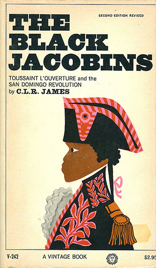
In addition, the copy of The Black Jacobins I first read was the 1963 Vintage pocket paperback edition with the fabulous cover design by Loren Eutemy. Clearly taking a cue from Jacob Lawrence (to be generous!—others would maybe call it a rip-off), the portrait of Toussaint L’Ouverture is ultra-flat yet colorful and filled with different patterns and textures. The bold serifed title highlights the “Blackness” of the Jacobins, yet overall the cover is a bit subdued, published on the cusp of an earthquake of change in US racial politics and prefiguring the rise of Black Power. Although I’m not designing a cover for this book, I feel this particular edition is the standard for comparison of all C.L.R. James covers.
I have pulled out of my collection—as well as tracked down on the web—a small pile of other Black Jacobin covers. None fully rise to challenge of Eutomy’s cover, but some are successful in other ways.
Below to the left is the dust jacket for the Dial Press first edition from 1938 (I believe, I don’t have this book, but found the image on the web). It has that old school classic look, with a strong etching of L’Ouverture. It’s interesting that this edition came out around the time Jacob Lawrence’s paintings of L’Ouverture were first being shown in Harlem, but it took the publishing industry almost 30 years to catch up to his forward looking aesthetics. To the right is the most common cover seen for the book these days, the 1989 Vintage paperback edition with a distinctive cover designed by Janet Odgis & Company. It is distinctive, but I’m not sure I like it. Primary colored shapes leave a black figure with its arm raised in the negative space. It’s a strong idea, but the figure is neither detailed or very efficient, instead it reads a bit inarticulate and clumpy—especially the feet turned at 90 degrees at the bottom. The text also feels like a compromise. It is more a much more clean and modern titling serif than the wood block inspired type on the 1963 edition, but it doesn’t really make update the design, instead it seems to squarely place it in the 1980s.


Below to the left is the 2001 Penguin UK edition, which attempts to frame the book as a classic by covering it with a 1797 portrait by Anne-Louis Girodet Trioson. The painting is actually not of L’Ouverture, but of Jean-Baptiste Belley, a Captain of the Infantry during the Haitian Revolution. Next to that is the 1980 Allison & Busby edition also uses “classic” imagery, covering the book with a colored engraving of a scene from the revolution.


I’m not sure why, but Spanish and Portuguese books seem to have their own cover design sense, too illustrative to be truly “continental,” but not pop, self-aware, or commercial enough for the US book trade. The Cuban 2010 Casa de Las Americas edition to the left below is case in point. It is truly graphic in nature, but not unique or particularly intelligent. Instead it appears that the designer threw together a handful of cheap clip art elements in Illustrator. This cover has none of the creativity of a Cuban poster, or even what I have seen of Cuban book design from the 60s and 70s. Instead it has the dull fonts, generic images, and hairline framing box that plaques so many Spanish books from the 80s on. The Portuguese volume below that one is similar, although it fairs better. The illustration is fitting for the subject, if generic, and the black and white boxes that make up the cover and nicely engaged by the orange title. And once again we have that hairline box.
Next to the Cuban edition is a Mexican one from 2004, published by Fondo de Cultura Económica. From the few I have seen, this publisher has some of the nicer looking Spanish language books, including this one. The cover is extremely simple, all the titling in a black box that takes up the top 2/3 of the cover, and the bottom 1/3 is filled with wide vertical stripes in red, white, and blue—the tricolors of both the Haitian and French Flags. An elegant and simple design solution, which makes for a much more successful European-looking cover.


