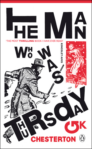
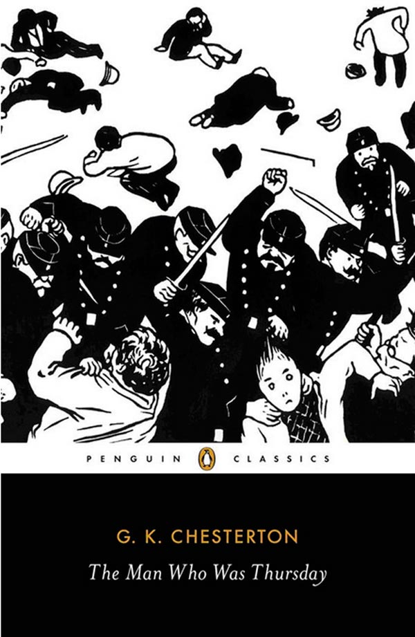
A couple months ago I was looking around a great local Brooklyn new/used bookshop, Unnameable, and I stumbled on a book cover featuring an cool looking illustration of a riot scene, an illustration that looked really familiar. It was an image by Félix Vallotton, a late 19th century Swiss avant-garde print maker with deep sympathies towards anarchism. It turns out that the book was a new Penguin edition of GK Chesterton’s 1908 thriller The Man Who Was Thursday: A Nightmare (see above).
On the one hand, the image is quite fitting, it is from the period of the book, and could be illustrating a scene straight from its pages. On the other hand, Vallotton fell far on the other side of the political fence from Chesterton. While anarchists and police are the subject of the novel, Chesterton shows no sympathies to the rebels. Vallotton did quite the opposite, regularly satirizing the police. The placing of the two texts literally on top of each other is a fascinating rewriting of history, both humorous, but also in a way stripping both historical figures/artists of their beliefs, and flattening them out into a period “style.”
Thursday is one of the earliest and most enduring representations of anarchists in Western literature, and as such, I wanted to start digging up all the covers I could to see how designers were imaging anarchism. This week I’m going to look at 16 different covers, and next week I’ll look at 17 more.
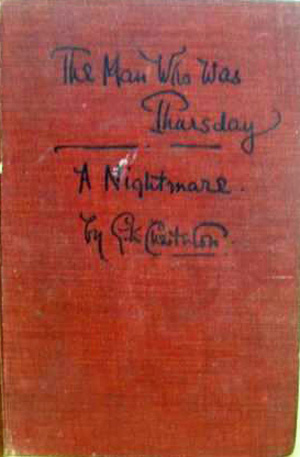
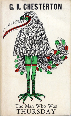
Below on the left is the first edition of the book, published in London by J.W. Arrowsmith in 1908. It was pre-dustjacket era, and the cloth cover is simple, with the title embossed in it in a gothic script. Next to it is likely the most well-known or celebrated edition, the 1960 version, published by Capricorn Books and graced with an illustration and design by Milton Glaser. As you’ll see below, while most designers have framed the book with simple references to Edwardian/Victorian period top hats and canes, Glaser to the less traveled route, and illustrated a scene from the proto-psychedelic dream sequence at the end of the book.
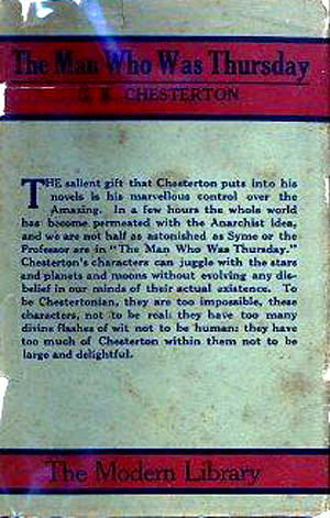
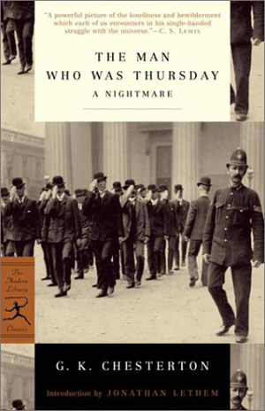
As a “classic,” the book has had a number of Modern Library editions, below are two, the left from 1920, the right from 2001. The 2001 version is largely filled with a photograph that captures the style of the time, but the multiple reproductions of the image next to and on top of each other send the design a little off-kilter, which echoes a certain strangeness is the book itself. I’m unclear if the image on the right is an actual wrap-around cover for a 1946 wartime printing intended for American troops, or an advertisement for that edition. Either way, not much going on on this no-frills edition.
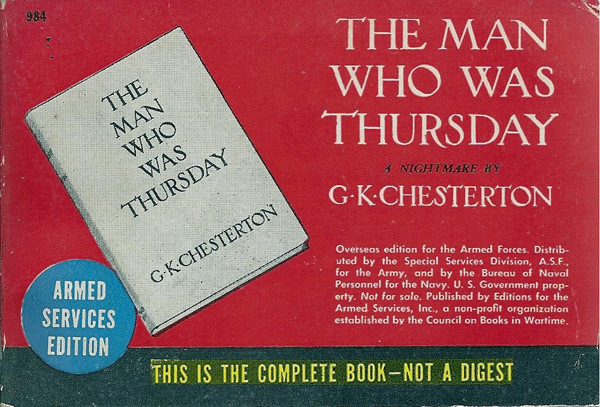
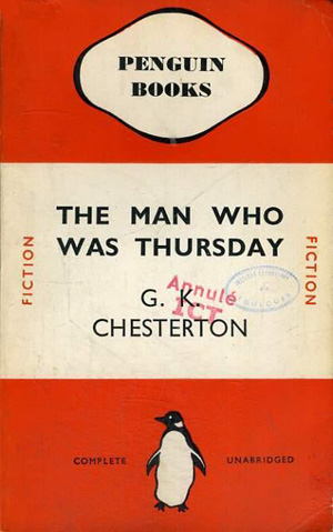
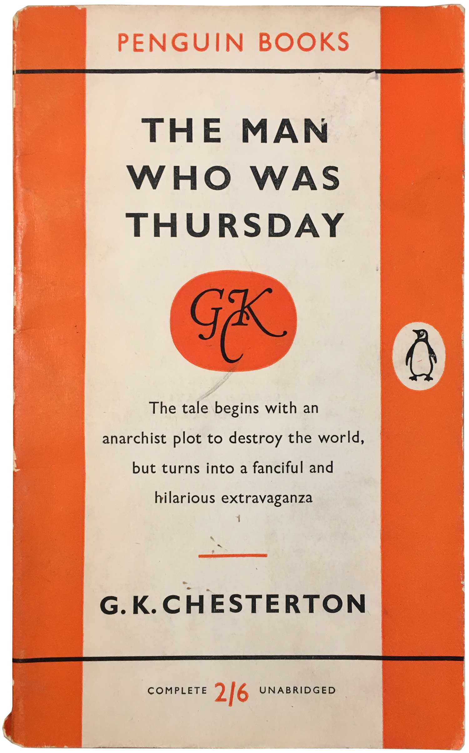
As is often the case with more popular books with a mass audience, Penguin in the UK has created some of the most interesting covers. I’ve only been able to unearth seven different ones (six below and the one up top), but I would imagine that since the book has been in print for 103 years, there are a couple other Penguin editions kicking around that I just haven’t tracked down yet. The earliest one I’ve seen so far is on the below left, from 1937, with the classic early Penguin grid design and orange coloring. The 1958 edition is similar, but by this time they must have been publishing over a dozen of Chesterton’s novels (he was quite prolific), so this version has his own unique monogram emblazened on it. They must not have considered the book a crime title at the time, or the cover would have been printed in the requisite green of the crime fiction line.
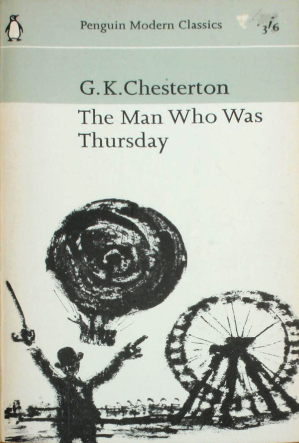
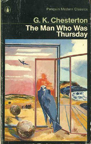
Next we jump to 1967, where Thursday has already become a “Modern Classic.” This is the early grid style cover for the Classic series, with an expressionistic charcoal illustration in the bottom section. Not the most challenging, but a nice cover nonetheless. Next is the 1972 edition, the Modern Classics are now in their familiar black period, and the watercolor illustration is even more expressionistic, leaving direct representation of the books content for much more conceptual representation of the ending chapter (as earlier represented more graphically by Glaser). I have to wonder if the central bird in the mirror image is not an attempt to reiterate the Glaser cover, and connect this edition to the one he designed.
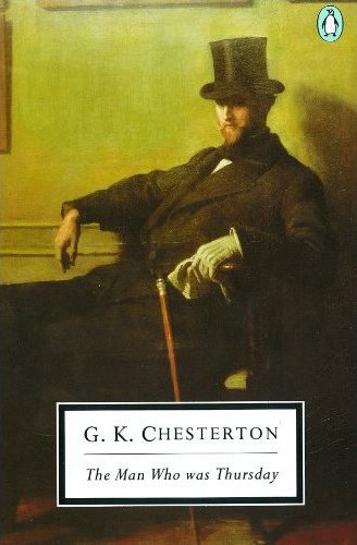
By the 1980s the covers and general design of the Classics had become much more conservative, and the 1986 cover below is representative of the larger series, a late 19th century painting of a man in Edwardian men’s wear, with the title box laid on top. The painting is somewhat haunting, but not the comic anarchist that Chesterton describes in the book, or the terrible embodiment of anarchism he elucidates. The 2008 cover next to it hits Penguin in its more recent stride, with an engaging and self-aware cover of a chase scene between two period representations of cops and robbers, with strong type treatment that is literally pushing the images and author’s name off the page. The black and red also is a nice referential touch to anarchism.
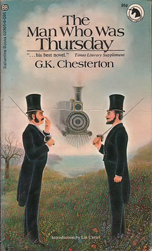
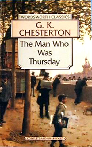
A number of other reputable paperback companies have on and off been publishing their own editions of Thursday, below are a Ballantine Books version and a 1995 edition by Wordsworth Classics. The Ballantine one is nice in it’s almost surrealist representation of the dual scene which is a turning point in the book, The Wordsworth seems a failed attempt to capture the same spirit of the 86 Penguin copy with a period painting, but it is too busy and the text boxes too ornate and awkward.
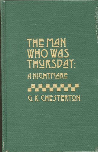
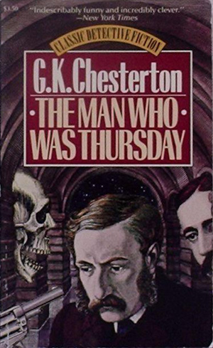
I don’t know much about the publisher Amereon, but I would guess they do nice hardcover library editions of books in the public domain. The cloth cover for their 1984 copy below is tasteful if a bit dull. The 1986 Carroll and Graf edition next to it has an interesting cover, with the Edwardian detective not only facing a gun, but a screaming (or laughing?) skull, all within the underground maze/anarchist headquarters described in the second section of the book. This is the only attempt on a cover to represent the more conspiratorial aspects of the story, which is cool. I suspect few of the cover designers had much sympathy for far left ideas, otherwise I find it quite striking how few took the opportunity to play up and explore the more entertaining “anarchist adventure” aspects to the book.

Who made the charcoal drawing?