Here is part two of my series on the early American paperback experiment known as Boni Paper Book. To read the back story, and see the first four books I looked at, check out last week’s post HERE. I love the Sun Way cover above, so I started off with that, but I’m going to go through the books just like last week, from first published to last, with the back covers included and as much info as I have.
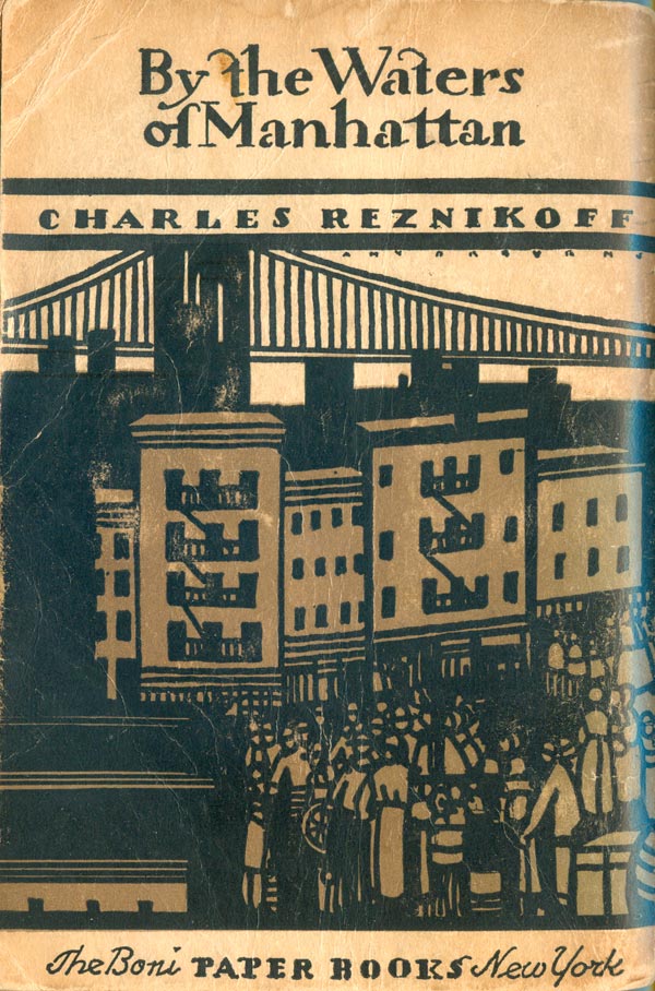
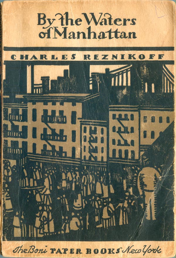
First is Charles Reznikoff’s By the Waters of Manhattan (June 25, 1930), and what an amazing wrap-around cover. The illustration is by Amy Drevenstedt, a great, chunky, black and brown Manhattan cityscape backed by the Brooklyn Bridge. The type is a cool hand-drawn serif, very understated, and the Boni series tagline at the bottom, usually in Stempel Garamond, is replaced by a hand-drawn version, a very nice touch.
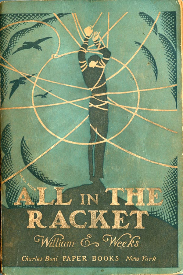
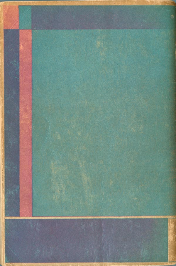
Next is William Weeks’s All In the Racket (July 25th, 1930). Unfortunately one of the owners of this book (during it’s eighty year life—impressive for a paperback!) decided to pencil in the illustration on the cover, done to great effect by Vera Bock, A Russian-born American book illustrator. The front cover has a real modernist European feel, and the back captures the same atmospheric qualities of many of the Rockwell Kent back covers from earlier in the series (and shown here last week).
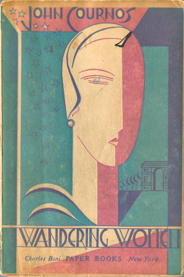
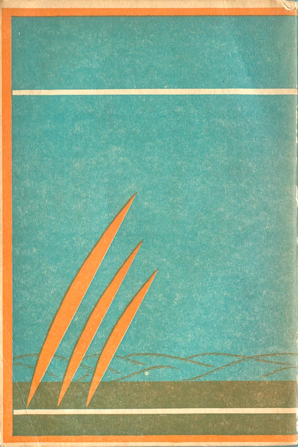
John Cournos’s Wandering Women (September 25, 1930) is the most traditionally Art Deco of the covers, with an illustration by John Barbour. The woman on the cover is styled high fashion, the type is unique and very Deco, and the overall cover has the benefit of a third printed color, giving it some depth and complexity the others lacked (but made up for in strong graphic imagery and effective 2 color overlays). The back cover is a bit more stiff, the color lines creating a frame around the main square, which looks empty, a problem none of the other back covers suffered from.
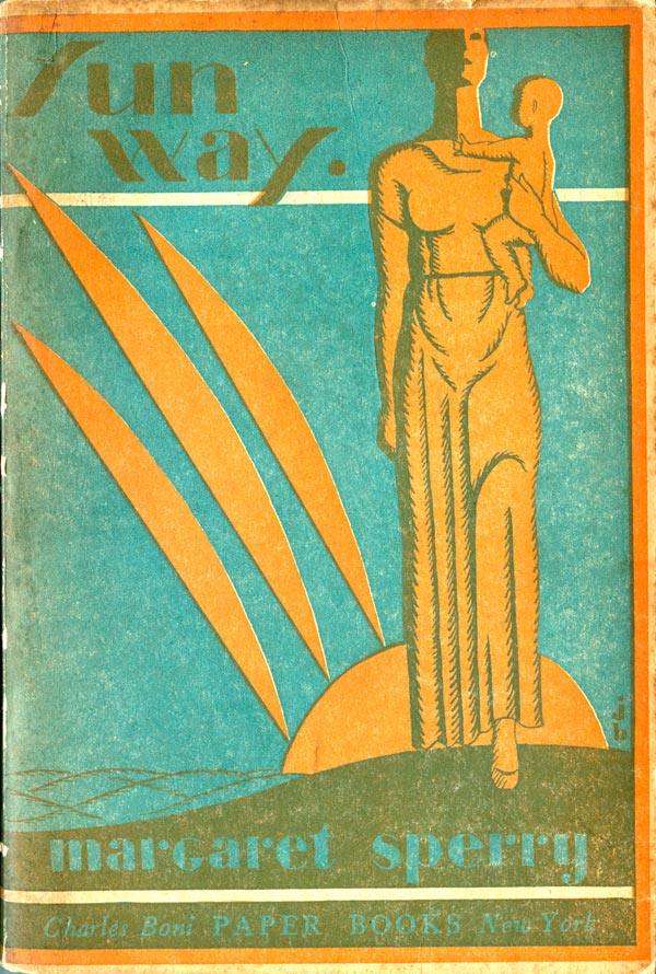
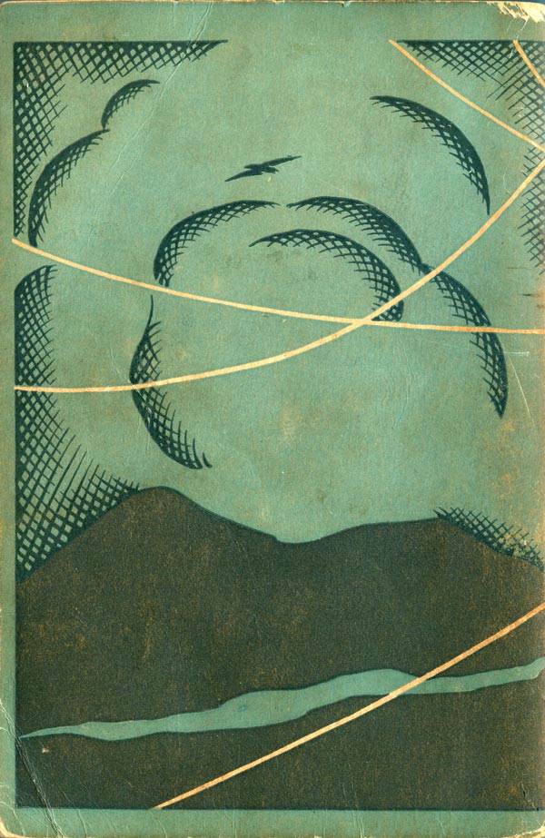
Now back to Margaret Sperry’s Sun Way (October 25, 1930), one of my favorites of this set. The style is once again Art Deco, the color choice of blue and orange is bold and powerful, and the overprint of the two creates such a rich earthy brown. The illustrator, John Barbour again, makes a smart decision to fill the cover with color, but also use the white of the paper stock as the thin horizontal bands that underline the title and the author. The back is successful too, with the orange rays echoing those on the front.

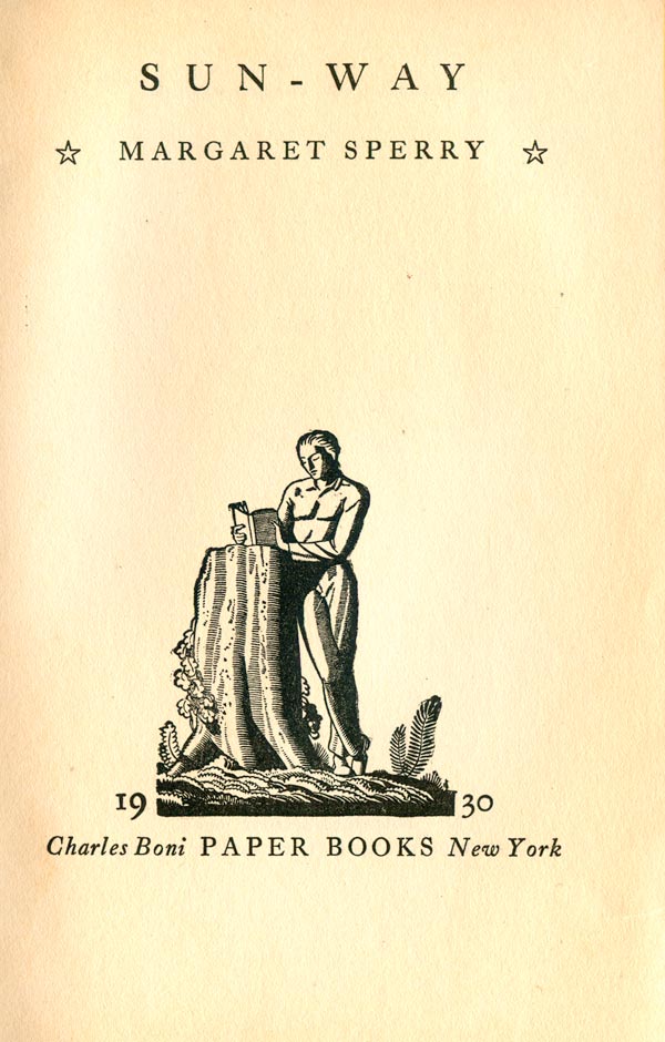
To the above right is the frontspiece of Sun Way, which is the same basic design as all the rest of the Boni Paper Books. It is clean and well-designed, but the real treat is the graphic by Rockwell Kent.
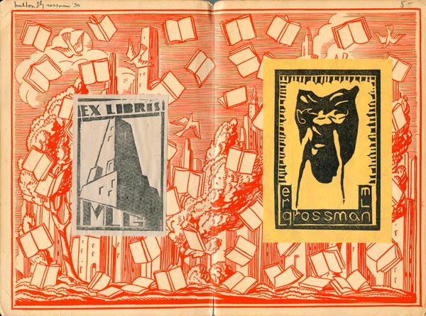
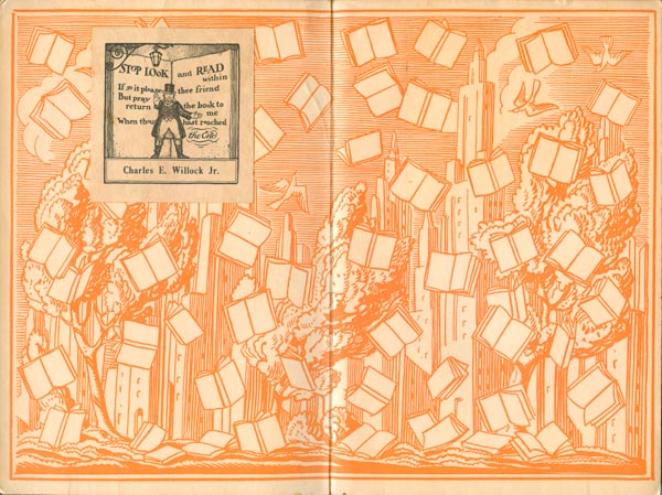
Although all four of these books had the standard Boni endpapers (designed by Rockwell Kent) that I showed and discussed last week, some of the copies I picked up also had cool ex libris stickers on the inside front covers. Below are the endpapers with the ex libris’.


The cover for Cournos’s Wandering Women is listed by booksellers as by Rockwell Kent. You identify John Barbour.
I’m curious!
Hi Marilyn-
I believe a lot of booksellers drop the name “Rockwell Kent” in association with all the Boni Books because it is recognizable (and might help sell the books!), and he did do the overall design of the series. But each book has a specific named cover illustrator, some Kent did, but many he didn’t. The cover of Wandering Women is listed in the book as by John Barbour.