
One of the most compelling political symbols of the 20th century is the hammer and sickle. Although it was created during the Russian Revolution, and became the official symbol of the Soviet Union as a nation, it has taken on a much broader array of meanings. The hammer and sickle have come to mean any form of communism, not simply the Soviet variety, and as such, they get thrown around by all kinds of people. Youth who want to look rebellious pin button-versions on their graffitied backpacks, sectarian Communist relics dutifully keep them in the masthead of their musty newspapers, and right-wing nutters photoshop them as tattoos onto Obama’s forehead.
More than a fair share of books are graced with the iconography, and I’ve been picking these up over the past couple years. I present the first part of my collection here. I’m also really hoping some you out there have some other great examples and will send them in to me. Email images to: josh at justseeds.org.
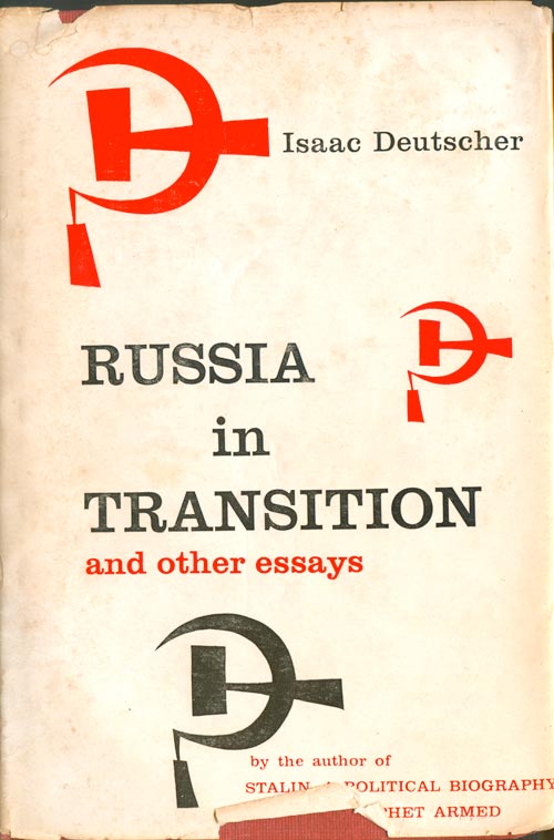
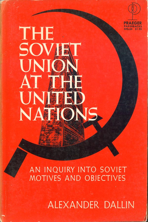
Top right is Mary McAuley’s Politics and the Soviet Union (Penguin, 1977; cover design by David King), from the Penguin Education series. A regal hammer and sickle, in all their Soviet pomp and circumstance. A nice move for the cover, using the symbol to evoke the larger frame of communism, and the garlands and such the actual Soviet state. Below are two more books specifically about the Soviet Union. Isaac Deutscher’s Russia in Transition (Coward, 1957; cover unattributed) has stylized hammer and sickles dotting the cover, but they don’t do much other than evoke the obvious. I do like the stylization and tilt, which for some reason makes me think of both paint rollers and the Islamic crescent. Alexander Dallin’s The Soviet Union at the United Nations: An Inquiry into Soviet Motives and Objectives (Praeger, 1962; cover unattributed) literally wears its politics on its sleeve, the giant sickle both framing the UN, and cutting it off at the base. I wonder what Dallin thinks those Soviet motives are? Hummm….
The two Pelican editions of R.N. Carew Hunt’s The Theory and Practice of Communism (Penguin, 1963; cover design by Thomas Simmonds/Penguin, 1973) are bit more neutral. The ’63 edition is pretty striking, the hammer and sickle enlarged and flowing off the page while illuminating the portrait of Karl Marx, in particular his eyes (and beard, although I suspect that was less intentional!). It fits solidly within the grid and style of ’60s Pelican book designs, and is a strong design in it’s own right. the ’73 edition is even more striking, the “theory” of communism filling the bright red hammer, the “practice” filling the sickle as a mass of people. There is a strong balance here, with the hammer in color, but placed below the gray-scale sickle.


John C. Caldwell’s Communism in Our World (John Day, 1962) still anchors the logo within Soviet iconography, taking a Soviet-style montage of people in a globe and “branding” them with a red hammer and sickle.
It is no surprise that a number of different editions of Marx and Engels’ Communist Manifesto (the one below was published by Washington Square Press in 1964) have covers graced by the hammer and sickle, it is a bit of an anachronism, with the writing of the book (1848) pre-dating the symbol by almost 70 years. Here is a clear example of the Soviet Union’s existing Communism over-shadowing all other conceptions of communism.


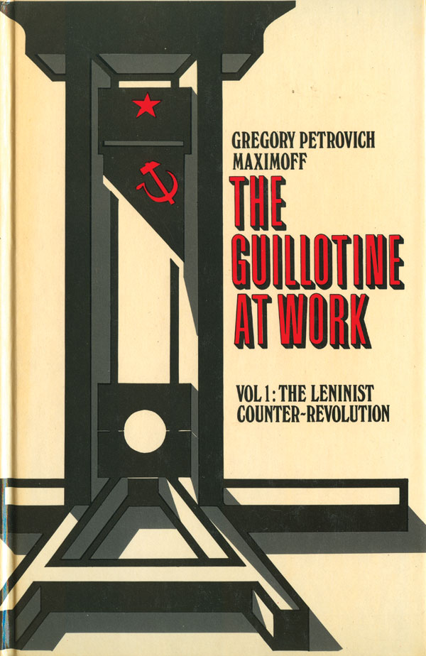
The UK anarchist publisher Cienfuegos Press published a number of critiques of Soviet Communism from a left, antiauthoritarian perspective. Two of those books are below, Alexander Berkman’s The Russian Tragedy (Cienfuegos Press, 1976; cover design by Flavio Costantini) and Gregori Petrovich Maximoff’s The Guillotine at Work (Cienfuegos Press, 1979; cover design by Flavio Costantini). On The Russian Tragedy the hammer and sickle hang above and behind the sailor, like the skull representing the Kronstadt sailors, a marker of death. On The Guillotine at Work, the icon sits comfortably on the guillotine blade, prepped and ready to remove heads. Costantini has slyly built a big “A” into the base of the death machine, commenting on who it was that was dying at the hands of the Soviets—anarchists and other far left activists.

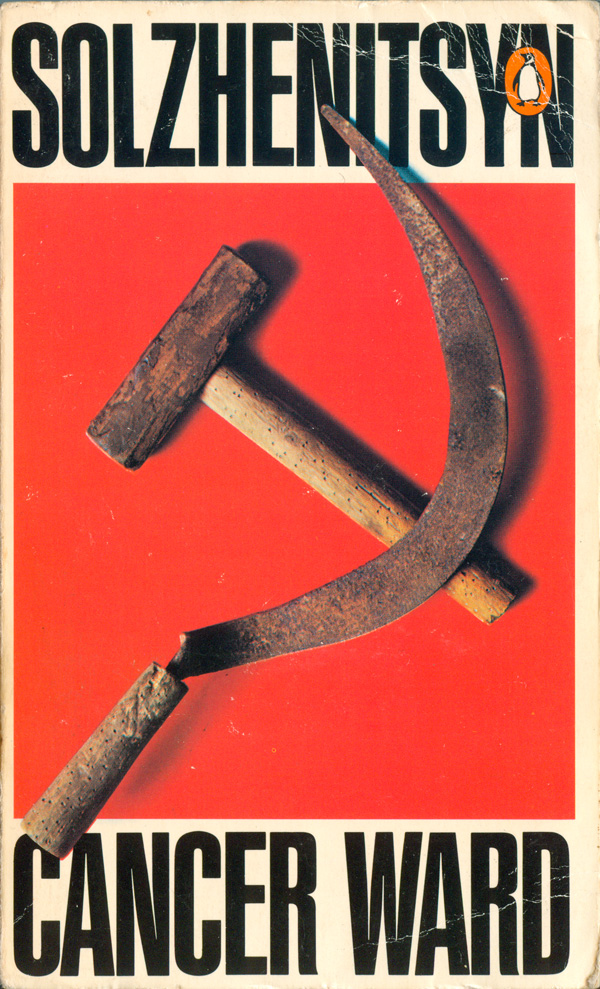
Another source of criticism of the Soviet Union, and popular location for hammers and sickles, are the books of Aleksandr Solzhenitsyn. Best known in the West for writing the Gulag Archipelago about his time in Stalinist prison camps, he has written a number of other novels, most of which revolve around his experiences as a dissident in the USSR. I haven’t read enough of his work to have a very educated opinion, but he is definitely a controversial figure, both because of accusations of deep anti-semitism, and because his critiques of Marxism and communism made him a darling of the far Right in the U.S.
The Cancer Ward is about his time in exile at a cancer ward in Tashkent. Below are two different Penguin editions, 1971 on the left, 1973 on the right, both designed by David King. On these covers, the icon is stripped back down its composite earthy tools, these ones in particular well used by workers and farmers. Yet the field of red they lay upon still gives them a sense of the mythic. At the same time, in the context of the title and its references to health and medicine, the rusty tools take on a very different—critical—feel, as you imagine these not as workers tools, but as those of doctors.

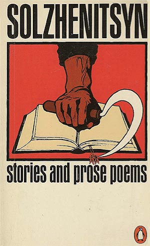
Stories and Prose Poems (Penguin, 1973) has another nice David King cover. This time only the sickle is present. Along with the fist holding it, the sickle is holding open a book, yet their is something violent, or ambivalent in the gesture. A few shafts of wheat act also as a bookmark, which reframes the sickle as an enemy of reading, books, and knowledge. For the Good of the Cause is an earlier Solzhenitsyn novella (1964, although this edition is from Sphere Books, 1971). The cover is not by King, and is more direct, with the hammer and sickle a weight around the neck of the phoenix. Although single-headed, the bird does also resemble the Russian imperial eagle.
A quick note on David King. Penguin was smart to hire this UK designer for these books. A life-long leftist (and a fan of Trotsky) his more nuanced perspective on communism and the Soviet Union allowed him to give the measured ambivalence to the Solzhenitsyn covers that make them so successful. I’ve been a big fan of King’s work for years, both his design work (including much for grassroots activist campaigns like the Anti-Nazi League) and his authored/edited works, especially the excellent Commissar Vanishes and the more recent Red Star Over Russia. There is an interview with King HERE, and I hope to feature a wider array of his covers I’ve collected here in the future.

If Solzhenitsyn’s political perspectives are a bit ambivalent, there are plenty of books with extremely direct anti-communist sentiments that feature hammers and sickles. Richard Crossman’s edited collection of disgruntled Marxists turned pro-U.S. democracy stooges entitled The God that Failed (originally published in 1949, the below edition published by Bantam, 1965; cover design unattributed) . While sympathetic with the writer’s anti-Stalinism, their willingness to be used as a Cold War propaganda tool by the U.S. seems dubious. Although unexceptional at first glance, I’ve come to like the below cover, with its hazy hammer and sickle, forcing all of us to lose our ability to focus in on Communism. This is also one of the few examples where creative lowercasing of the title actually works, and matches the content.
The cover of Wes Andrews and Clyde Dalton’s The Black Hammer (Desco, 1967) is much more direct with its messaging. There’s no doubt about it, for them Communism is going to brutally behead Black people! But the cover is a bit disingenuous, as Andrews and Dalton really could have cared less about Black people, they were much more concerned that the Civil Rights Movement was a Communist conspiracy to destroy the white race. But boy did these looney-toons commission a wild cover!


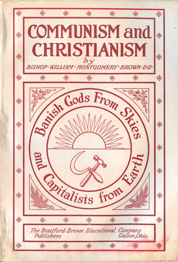
And send everyone off on a high note, I’ve got two great, extremely divergent examples of how religion has used the hammer and sickle. Bishop William Montgomery Brown is quite a fan, the cover of his Communism and Christianism (Bradford-Brown Educational Company, 1921; cover design unattributed) proudly sporting the newly minted logo shining under the rising sun and surrounded by the banner “Banish Gods From Skies and Capitalists from Earth.” Not a bad idea.
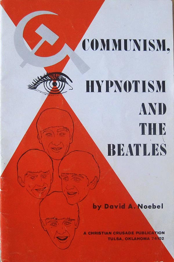
As a counterpoint, I’ve got the cover of David A. Noebel’s Communism, Hypnotism and the Beatles (Christian Crusade, 1965) with it’s instructive pictogram showing what only can be described as an obvious equation: Communism + Eyeball = hypnotized Beatles! Quick, hide your kids, those Beatles albums are actually Stalinist propaganda!! I knew there was something fishy about those haircuts…


I have to say of the above,
the anarchists did it best!!!
The hammer and sickle is a symbol of the unity of rural and industrial workers. The essence of Marxism remains true in its analysis of capitalism and in the need for working people to unite and create a more just system.