This is my print for This Is An Emergency!, a portfolio about Reproductive Rights and Gender Justice organized by Justseeds’ own Meredith Stern. The lineup of artists is impressive, and these graphics so urgently needed. In this blog post, I will discuss my process in designing and printing my piece.
Some info on the project from the Kickstarter:
“Reproductive Rights and gender justice are in a state of emergency right now. This past year we witnessed the near defunding of Planned Parenthood in Congress and from Komen, one of their largest private funders. In 2011 alone, a historic 80 new laws were passed which further prevent people from accessing abortions. Also this past year, over 200 transgendered people were murdered. And currently more than half the states in the US have passed amendments that prevent the recognition of same sex marriages.
In response to all the bullying, the legislative measures, and the horrifying statements filling the media, I feel that we need a collection of voices commenting on this situation through visual art. This project will bring together over a dozen voices from people most affected by these issues- women, queer identified, and transgendered artists.”
Please checkout the Kickstarter page for more information and updates on this project
I was stuck for a long time on what to do for my print; these issues are so close to home for me, and many great images and slogans have already been created…what could I contribute that would be new and fresh, and also call attention to the core of the recent attacks on reproductive rights, as well as the intersection of reproductive rights and social justice, reproductive justice?
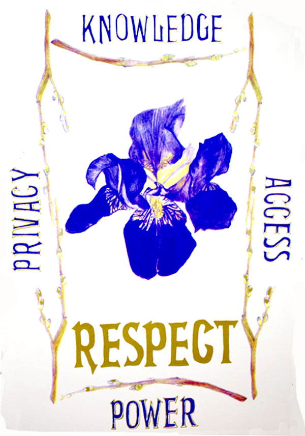
I was visiting Thea Gahr at her family’s nature reserve, when I finally got an idea for the print. Inspired by the natural beauty of the land, as well as many in-depth discussions that Thea and I were having. “At the core of the issue is respect. It’s a lack of respect for women and our bodies.” What if I just do a really brazen, beautiful drawing of a flower with the word “RESPECT”? Thea also pushed me to try something different in my practice, so I decided to go hard and do a CMYK silkscreen print of my drawing (a process I will explain in more depth in a bit)
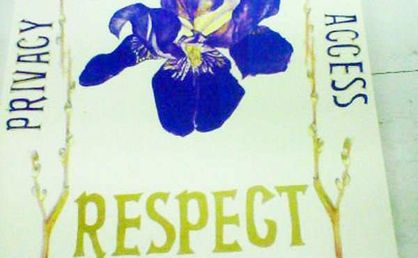
When it came to the text on the print, I wanted to add more information about the core demands of reproductive justice, which included knowledge, access, privacy, and the power that is a result of being equipped with these tools.
I made some drawings in colored pencil of an iris and some pussy willows (heh). I searched online for an Art Nouveau font that I liked, and printed out the font to trace the lettering, as I wanted the text to have a hand-drawn feel.
When I returned to Pittsburgh, I scanned in my drawings and laid out all the components, main flower, text, and the pussy willows to frame it. I spent some time adjusting the layout to my liking. This is what that finished layout looked like:
CMYK is the four-color print process that is used for print media, such as magainzes and newspapers. Images are broken up into their color components of Cyan (or blue), Magenta (red), Yellow, and Black. The image is half-toned, converted into a screen of dots, and when each color is printed on top of one another, they mix to create a full color image.
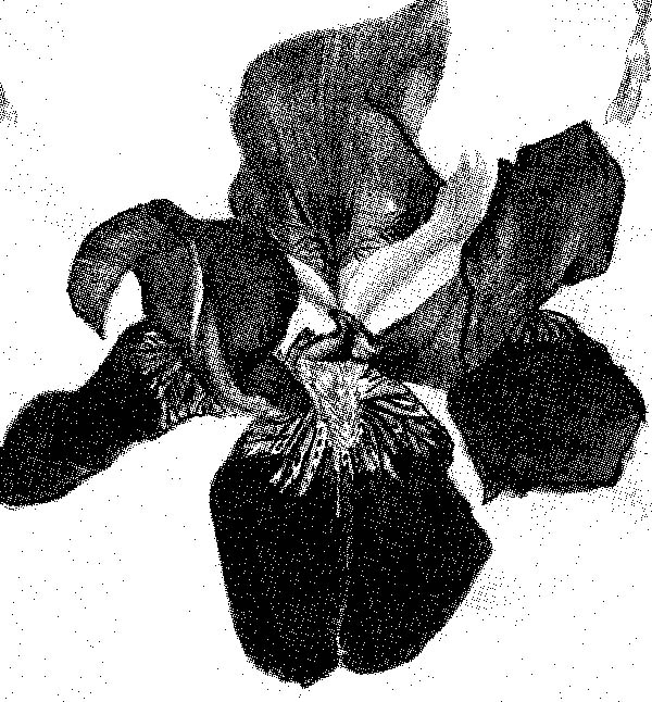
To convert my full-color design to CMYK layers for silkscreen printing, I first made sure my file mode was CMYK, and then clicked on “Channels,” a tab next to the “Layers” tab in Photoshop (I had to look it up online to remember how to do this) Without going into too much computer detail, I made each black and white channel a separate file, and bitmapped each one with a different angle of dots, so the layers wouldn’t create a moire pattern when printed over each other. Here is a closeup of the magenta bitmap:
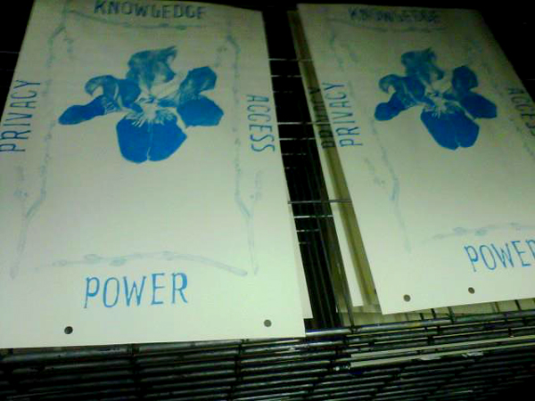
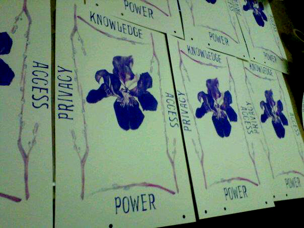
The black layer is simply an outline layer for text. I printed out transparencies for each layer, and exposed the screens. Four screens, one for each layer. An edition of 125, plus some extra in case I make mistakes, and to sell separately. That’s about 600 squeegee pulls altogether. Roll up your sleeves and do some stretches, Mary Mack! Thea was visiting Pittsburgh last week, and Bec had a print to make for the portfolio as well, so we had a Justseeds Ladies Print Party in the studio. Lots of chocolate and sweet jams.
I took some photos with my phone at each stage of the way, and they aren’t the best quality, but hopefully give you some idea of how the CMYK process works. You print the colors in order, so cyan comes first. Here is how it looked printed:
And with the magenta layer added (I love how the cyan and magenta mixed to make a rich purple):
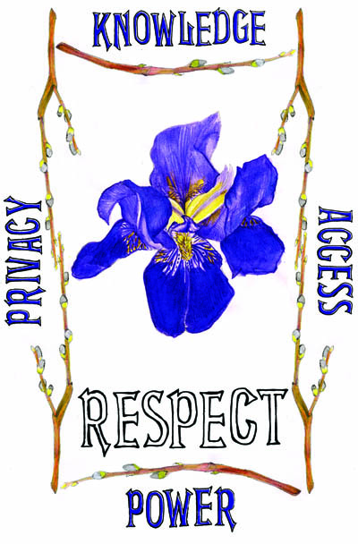
I didn’t get a good photo of the yellow layer printed, but after printing it, I had the idea to do a metallic gold layer instead of black, for the text, and to highlight the tips of the pussy willows. Here is the finished print:
The finished portfolios will be available in July here on Justseeds. This print will be available individually a bit later in the Summer. Hope this was educational! I am excited to do more CMYK prints.