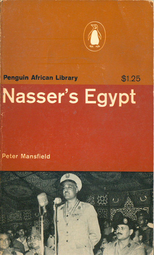
This week we’ll pick up with the fifteenth title in the Penguin African Library (PAL), Peter Mansfield’s Nasser’s Egypt (AP16: 1965). With this book the separation of the three sections of the cover is complete, there is no overlap, and they each fulfill a unique function. The brown top third signifies the series, and lists the PAL and features the Penguin logo. The middle third, in a solid red, holds the title and author’s name, and the bottom third illustrates the title, in this case with an image of Gamal Abdel Nasser. This is the first time in the series the three rectangles have been so disconnected, but it really works, and makes the cover feel almost like a brown, red, and black flag.
In 1969 a second edition of Nasser’s Egypt was published, playing with the grid in a different way. For the first time the central photo breaks into the top third, with Nasser’s hand pushing the overall trisected design into the background. Like the third edition of Which Way Africa (see HERE), the middle stripe is metallic, and printed in metallic ink, creating an interesting effect.
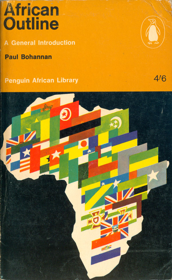
Paul Bohannan’s African Outline: A General Introduction (AP17: 1966) abandons the trisected cover for the first time (on a first edition), and features full color, also a first. The illustration is a bit odd, the flags of all the African countries piled up in the outline of Africa, but it also seems appropriate for this book.

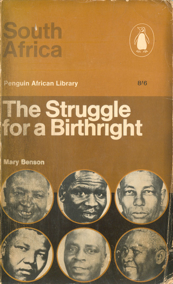
South Africa: The Struggle for a Birthright (AP18: 1966) by Mary Benson brings another innovation to the cover schema, with portraits in outlined circles filling the bottom third and overlapping into the middle zone. Like the second Nasser cover, this one sublimates the overall trisected design to the specifics of this book. Unlike on past cover, the title text is split between the top third and middle, with questionable effect. While the subtitle pops out in white, the darker “South Africa” is lost to the eye.
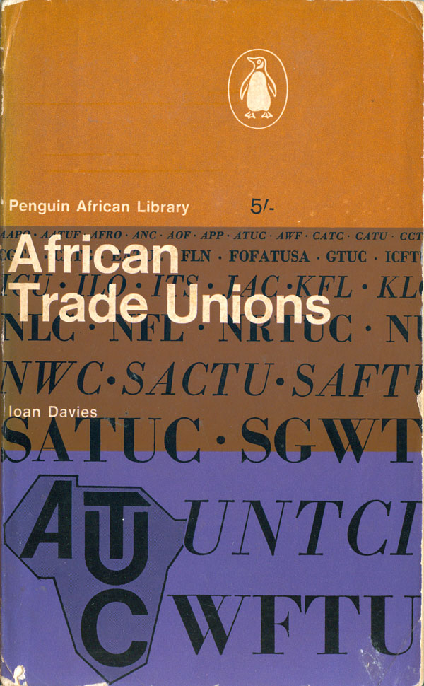
Ioan Davies’s African Trade Unions (AP19: 1966) has another of the lesser inspired covers of the series. The purple is a nice addition to the pallet, but the list of unions fails to convince graphically. If they were all represented by their respective logos, like the ATUC badge in the bottom left, it might have been a much effective design.
The nineteenth book is the second from Basil Davidson, The African Past: Chronicles from Antiquity to Modern Times (AP20: 1966). The three striped cover design is effectively employed here, with an inversion of the posterized central photos, being brown on black. Once again the open book functions like a flag, simple and graphic.

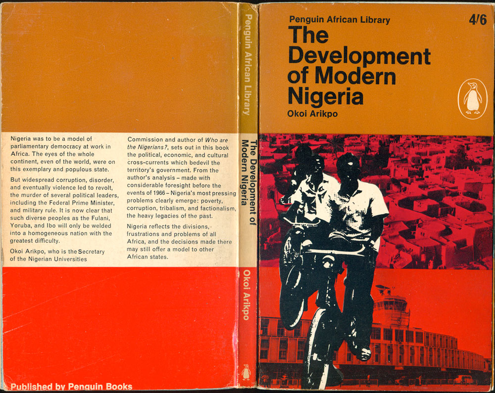
Okoi Arikpo’s The Development of Modern Nigeria (AP21: 1967) is the first volume in the PAL dedicated to a single country outside of Southern Africa. It also has one of my favorite designs in the library. The full and open cover is a joy to look at, holding to the conventions of the series design, but pushing hard against the boundaries. The brown and red stripes wrap around the top and bottom thirds, but the center, white on the back cover and spine, turns to pink on the front, with the white being channeled onto the kids on bikes, foregrounding them above the stock photos of Nigerian architecture. The design recognizes the dynamism of the kids, and lets them ride right off the cover into the reader’s world.
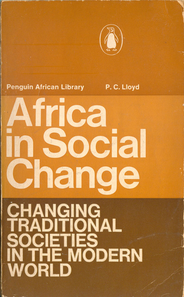
P.C. Lloyd’s Africa in Social Change: Changing Traditional Societies in the Modern World (AP22: 1969) is the first and only PAL cover to be entirely text based. In many ways it is the most quintessential of the Africa covers, as it embraces brown as the full color pallet, and squeezes the text into the grid of thirds. In 1975 a second edition was published, which switches to the style we’ll see in many of the later books, with the top third left the PAL brown, but the bottom two thirds combined into a single square, in this case also brown, and with no graphic to fill it. It’s almost as if the covers are telling us that Africa in change is impossible to visualize.
