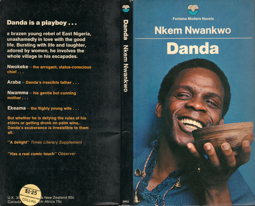
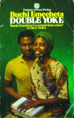
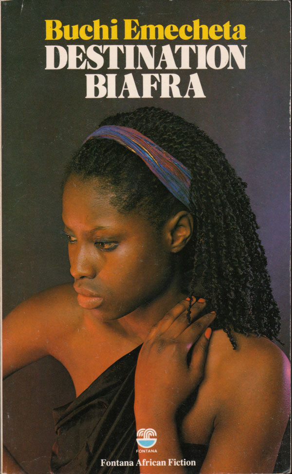
This week is a continuation of the covers from the Fontana African Fiction series. You can look at last weeks post and introduction to the books and their design HERE. What interests me about these covers is the desire to attempt to create a mass market interest in African fiction, rather than relegate it to more traditional sales avenues of academic contexts or specialty markets. This has definitely led to some quirky decisions for cover imagery. For the most part I’m going to just let these covers speak for themselves, as it’s really hard to know what to say about most them individually. They are most interesting as a whole, and give a window into a world of hip African socialites that might have looked like this, or might have largely been a creation of Fontana’s promotional staff.
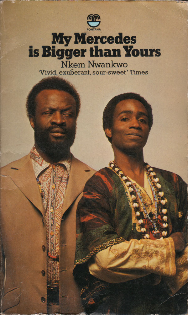
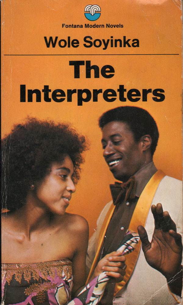
While the time period the narratives in the books take place ranges, some novels are set in a precolonial African past, while others focus on decolonization, and others on contemporary issues (of the time, the 1970s), most have covers that seem solidly set in the 1970s and 80s. The placing of the figures seems so staged as to feel awkward, and the lighting so intense that some of the Buchi Emecheta novels below look like romance novels. This is in striking distinction to how the very same books were designed and sold by other British publishers like Allison & Busby and Heinemann.
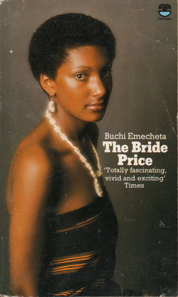
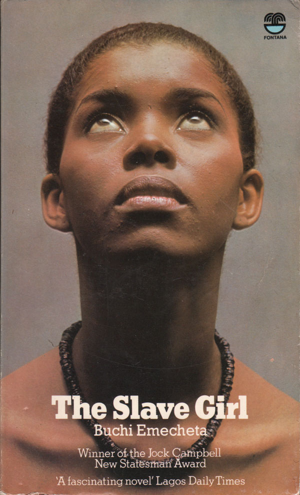
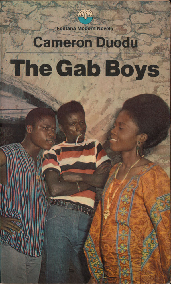
Cameron Doudu’s The Gab Boys, below, is one of my favorites of these covers. The people are so clearly shot in different places and pieced together—and the background is so flat and fake looking—that the entire composition feels as much an art montage as a piece of commercial design.
