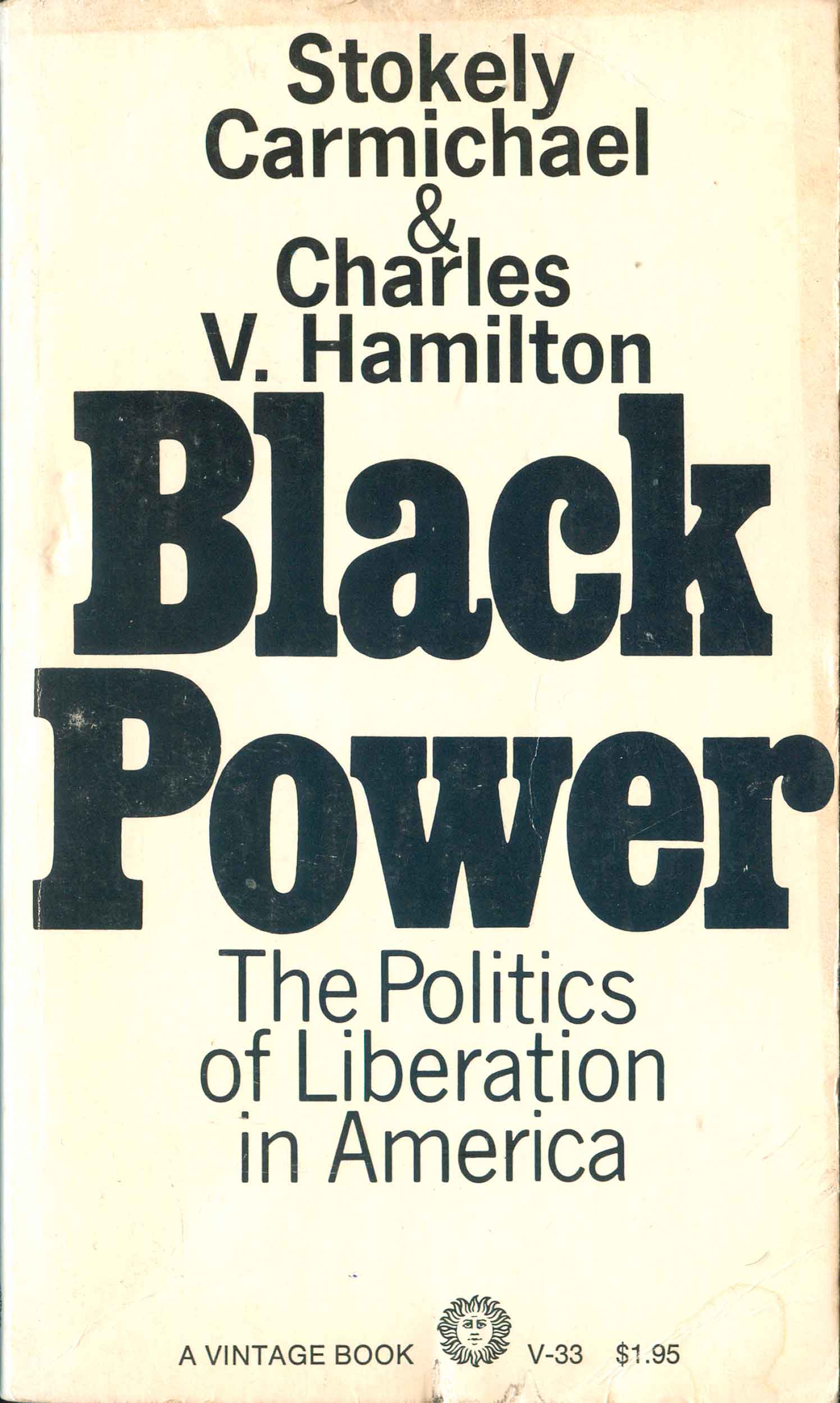
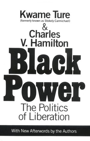
Working on the Angela Davis covers has got me thinking about representations of Black liberation. In particular, I’ve been trying to sort out and understand the surprisingly successful cover to Stokely Carmichael and Charles Hamilton’s Black Power, the 1967 text which defines the transition from the Civil Rights movement to the Black Power movement.
The original cover for the 1967 Random House first edition dust jacket was designed by Larry Ratzkin, a well-known graphic who created upwards of 1000 book covers. Ratzkin passed away last year, and in all of the writings about him and his work I could find online, including Flickr groups and other image collections, not a single one mentioned or included Black Power.
This seems a bit odd since all U.S. editions of Black Power in the 45 years since its initial publishing—including the Vintage paperback that following quickly on the heels of the hardback and the new Vintage edition published in 1992 (on which Carmichael’s name is changed to his taken name Kwame Ture)—have used almost exact recreations of Ratzkin’s original cover. My guess is that Black Power has sold copies in the multi-millions, and is still assigned to hundreds of high school and university classes as a textbook. This has to be the most seen and trafficked cover of Ratzkin’s long career, yet seems to not be at all associated with him.
But this lack of recognition gets to the crux of why this cover is so interesting to me. It is completely ubiquitous, yet simultaneously unremarkable. I’ve asked a dozen friends what they thought about it, and all of them could recall the design, but none had any particularly strong memory of or thoughts about it. It does exactly what design professionals argue “good design” should do: it communicates a simple message in an unassuming way, doing its work without drawing attention to itself. Yet at the same time, it has none of the individual and creative flair that designers secretly, and not so secretly, truly love.
The cover is a white field, the center filled—almost to exploding—with the giant words “Black Power” in a thick, slab-serifed type. The authors’ names and book subtitle stack above and below, in a more elegant, thin sans-serif. That’s it. No images, no frills. Somehow the ten big black letters of the title completely dominating the white background says all that needs to be said.
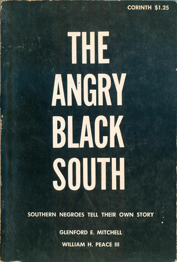
The efficiency of the cover seems so natural that any other cover is hard to imagine. This design has come to be an embodiment of the political moment in the late 60s when Black people en masse decided to take their struggle for liberation to the next level. But like the changes in the movement, the cover didn’t come out of nowhere. Designers of varying degrees of skill had been attempting to articulate the Civil Rights movement on book covers since the late 50s and the early 60s. The unattributed cover to The Angry Black South (Corinth, 1962) below is one attempt, almost an inverse of Ratzkin’s cover. The black background encloses in on the title, rendering it weak, and strangely making the Black South articulate itself in white. While the words “Black Power” are clearly the subject/actor on Ratzkin’s cover, here the title acts more as an object, adrift in the background. The cover to James Peck’s Freedom Ride (Grove, 1962), from the same year, does better, but the giant words “Freedom Ride” have to compete with the equally compelling photograph of the Civil Rights bus on fire. The image and text are incongruous in a way, detracting from both. Plus, no matter how big you make the words “Freedom Ride,” as a phrase it can’t compete with weight of the term Black Power.

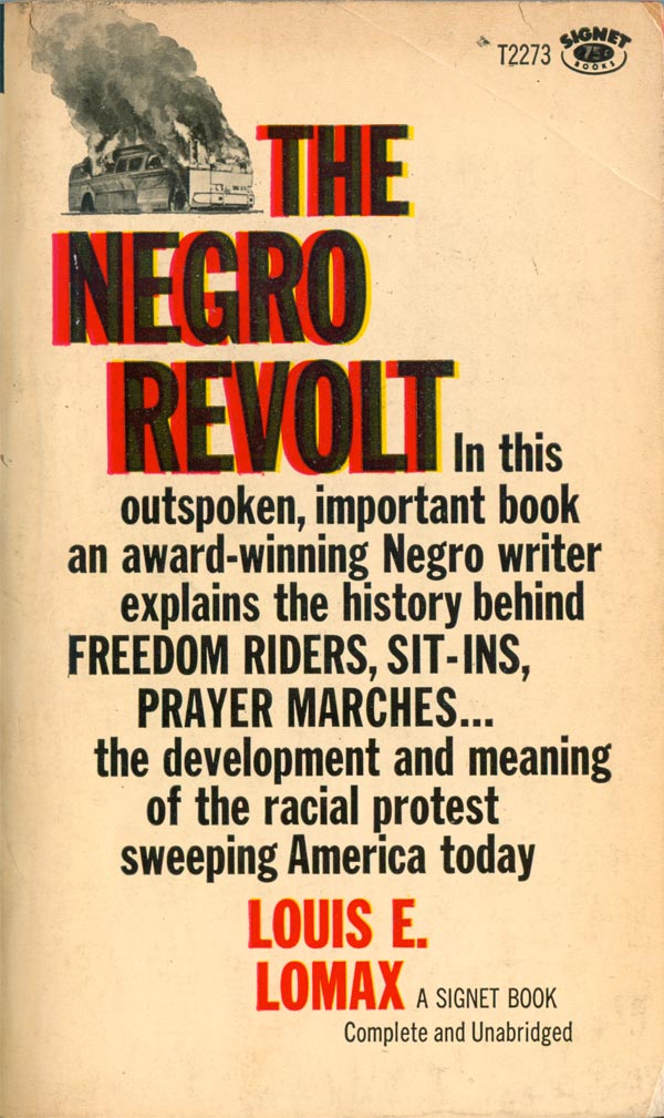
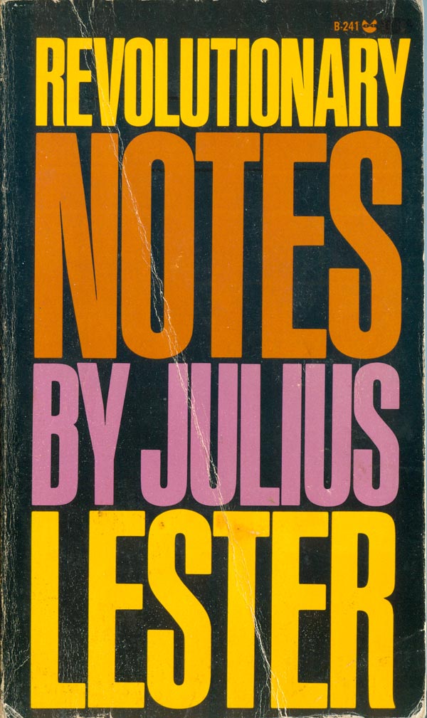
Louis E. Lomax’s The Negro Revolt (Signal, 1963) seems a bridge between Peck’s and Carmichael’s book covers. The same bus from the former cover has shrunk and rather than competing with title leads us into it. The title, on the other hand, has a similar problem as the title above, Lomax wants to say “Black Power,” but the words haven’t been created yet, the phrase has yet to rise to meaning. And maybe because of this, the words can’t simply be bold and black, they need the red and yellow underlays that make them pop, and stand out from the rest of the text on the cover. Julius Lester’s Revolutionary Notes (Grove, 1969) actually post-dates Black Power, and seems in its own way an attempt to take the design of Freedom Ride and bring it into a post-Black Power time. The overly tall and lanky sans serif type is the only design element, and while Blackness is present, it’s almost an afterthought. Rather than background, the black simply exists as the negative space, the other piece that makes the whole of the title Revolutionary Notes. It’s 1969 and the Black Liberation movement has grown and diversified, simple words in black can no longer contain it—Black is now orange, and yellow, and pink.
Neither of the Grove covers have a designer attributed, but it seems likely they were both designed by the same hand, and that hand might have belonged to Roy Kuhlman. Kuhlman designed a huge number of the covers for Grove and its sub-presses Evergreen and Black Cat.
Back to the main cover at hand, Ratzkin’s design was so strong it got used wholesale on the 1968 German edition published by Gunther. And as I said above, it was re-used on the updated U.S. addition, with hardly a change.

The UK editions of the book don’t have the same simplicity and power, possibly because the phrase Black Power meant something slightly divergent there, where the movement is different demographically and motivated by different social conditions. The Jonathon Cape first edition dust jacket uses the big, bold black letters, but rather than seeming to break off the page, by being trimmed on all sides they instead appear caged. The big red block on the bottom sits on-top of the title, again pushing it backwards, and the authors’ names float inert in the middle of the block.
The 1971 Penguin edition moves even further from the U.S. design. The title is still imposing and in black, but it floats on an American flag, something wholly unnecessary on the U.S. edition. While effective, it is much less efficient. The black on the rest of the cover also confounds. While it makes sense for the design in the abstract, in terms of content it undermines the power of the words on the flag. Rather than Black Power standing up to the overwhelming power of U.S. white society, It is now the U.S. that appears small, weak, and threatened by a sea of Black.


An early French edition published by Études et Documents Payot (1968) is simplt black text on a light background, but I suspect it owes more to the standards of continental book design than any specific affection for the Ratzkin cover. A new Payot reprint from 2009 takes a completely different tact, building the cover around a representation of a political button. This makes some sense in the contemporary context, because it evokes a nostalgia for the 60s that is absent from the other covers, but seems absolutely necessary to sell a book about a 45 year old moment in the U.S. Black Liberation movement to a French audience. As an interesting aside, the fist featured on the mock button was designed in 1968 by the California Bay Area artist Frank Cieciorka, so it actually post-dates the publication of the original book. For more information on the specific image, check out Lincoln Cushing’s great history of the fist in political imagery HERE.


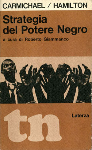
The cover of the Italian edition to the left below (Editori Laterza, 1967) can only be described as weird. The overall design is strong, and very solidly modernist, with the horizontal-striped-grid holding the authors’ names, title, image, and publisher info. But the image is strange, in the back left we have a shocked looking Carmichael, seemingly shocked, or even horrified by this mirrored cluster of reaching black hands in the foreground. Is there some sort of subtle critique going on here, is the cover design suggesting Black Power is a Frankenstein’s monster that Carmichael created but can’t control? The individual black fist is a symbol of power, but the cluster of fists instead evokes zombie hoards.
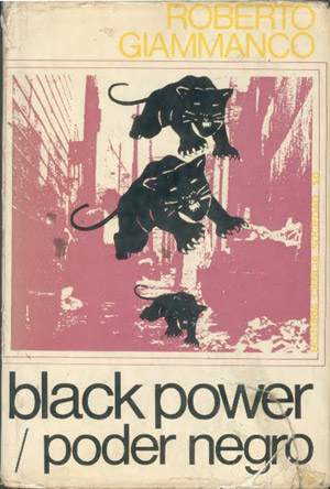
And the final cover I’ve found is from a copy by the Madrid-based publisher Ediciones Peninsula, put out in 1970. This is my favorite of the covers outside the original. The main element is a purple cityscape, which is dominated by a cascading series of Black Panther Party logos. The design strongly evokes the period, even if the specifics are a bit hazy—even thought Carmichael was briefly in the Black Panthers, this is hardly a book about them. As a side note, while Roberto Giammanco was the translator and editor of the Italian edition, for some reason he appears to be billed as the author of this Spanish version.
It is testament to the solidity of the initial Ratzkin design that I have only been able to dig up six alternative covers for a major international best-seller over which has been in print for almost five decades. In contrast, the similarly popular and related Autobiography of Malcolm X has had at least tens different covers on U.S. editions alone. If you’ve got a Black Power cover I’ve missed, I’d love to see it! Send any covers in to me: josh at justseeds dot org.
