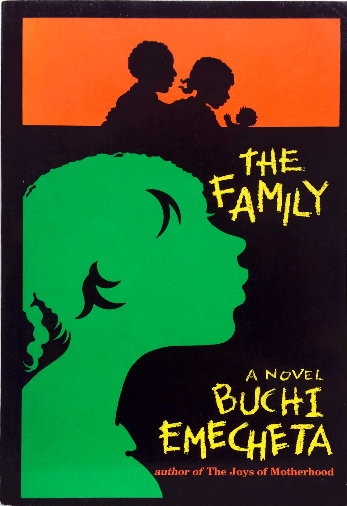
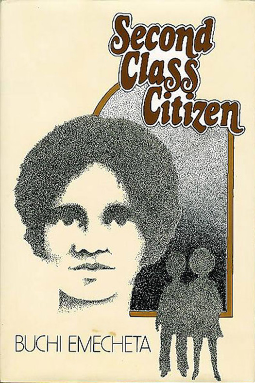
For this week’s post I thought we could stay in Africa, but focus on an author instead of a publisher. Or maybe a combination of the two. One of the more prolific—yet under appreciated—English-language authors from Africa over the past thirty years is the Nigerian Buchi Emecheta. Part of this under-appreciation likely stems from her books being more populist and less literary, but let’s be honest, it’s most likely because she is a woman, and her novels largely deal with the struggles of African women in our world—something our larger society and the literary establishment haven’t spent much time on (although the recent popularity of Chimamanda Ngozi Adichie is a good start). Emecheta’s over twenty novels have come out on a wide array of publishers, including Heinemann, Allison & Busby, and Fontana (you can see her Fontana covers HERE) her most coherent collection of covers has come out of her relationship with the U.S. publisher George Braziller.
Braziller has published (or re-published) most of her books for U.S. audiences (excluding her first autobiographical memoir—In the Ditch—and Destination Biafra, about the Nigerian civil war, both of which were only recently published in the U.S. as part of the Heinemann African Writers Series), starting in the late 1970s. I believe all nine titles were produced in hardback editions, with paperbacks following. Over the last couple of years they have re-issued Emecheta’s catalog with slick 21st century covers—all high saturated photos and sharp, clean fonts. I’m gonna focus on the set released over the fifteen years from 1976 through 1990. Although there has not been a single designer on her books, each cover resonates with similar attempts at balancing themes of gender, blackness, and African-origin. There isn’t one single stand-out design , and each have their own pros and cons (while some are clearly throw-aways), but they really do hold together as a series.
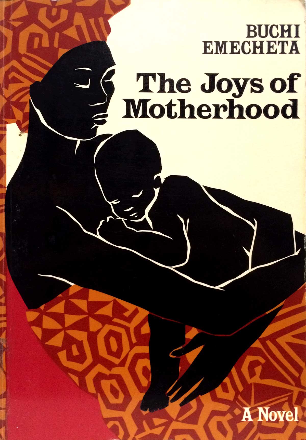
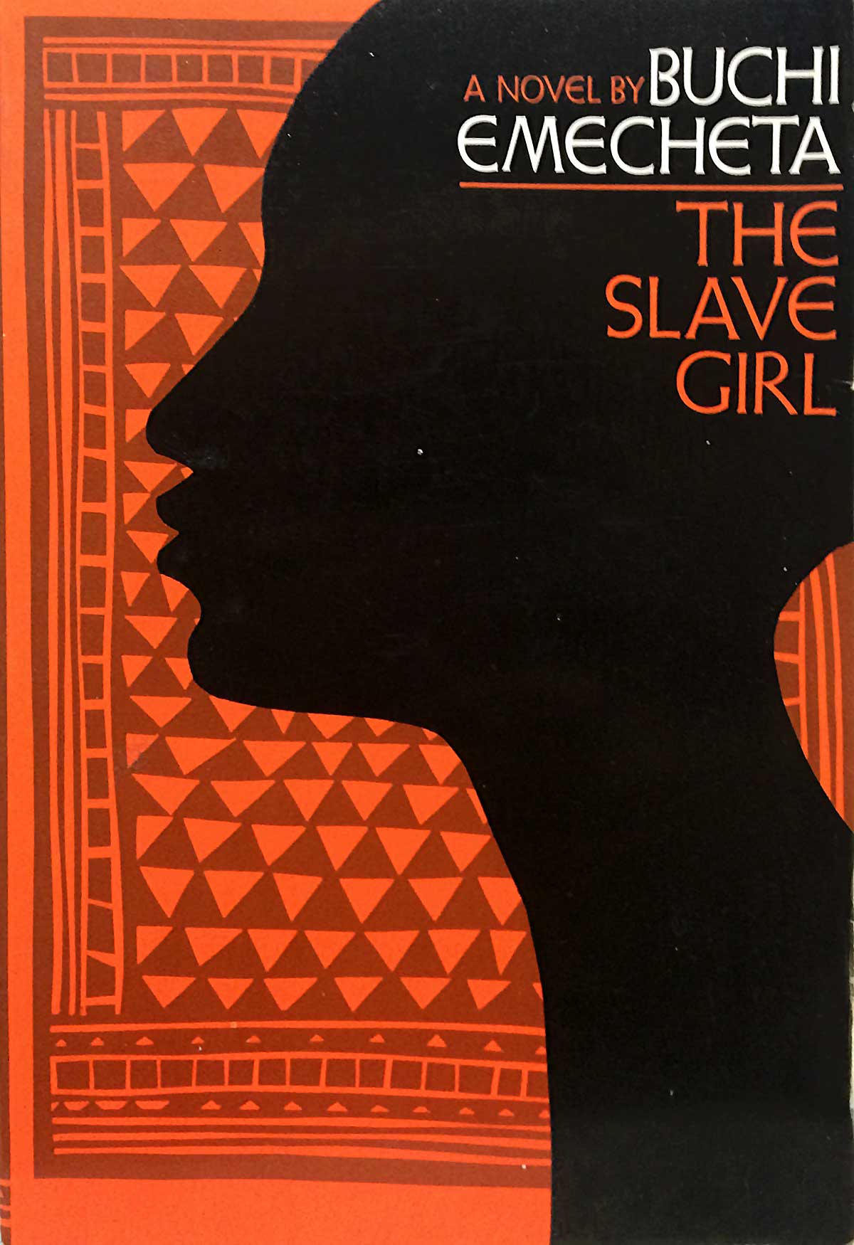
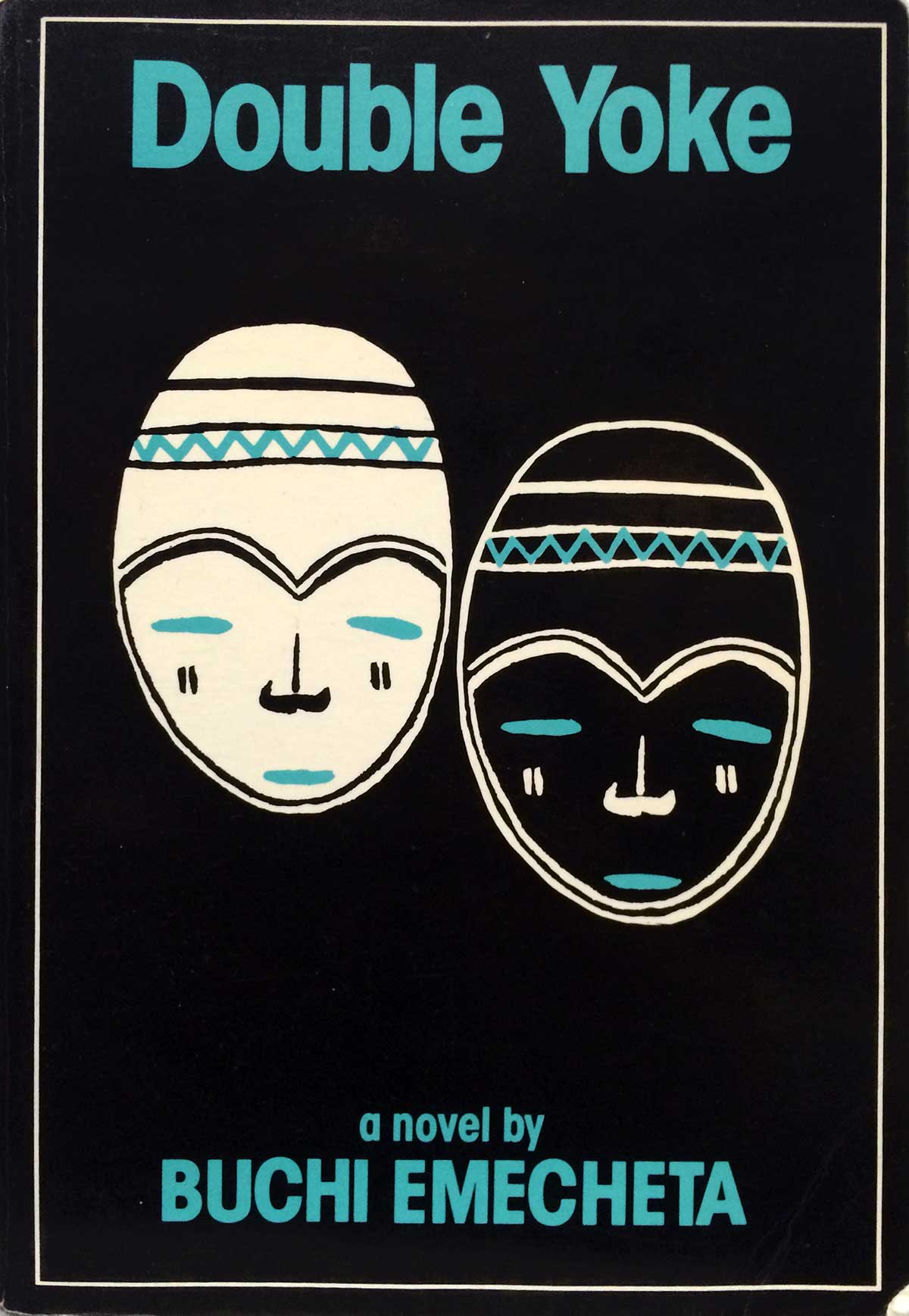
What I like about the whole set is the varied attempts at using less-directly representational imagery, from the masks on Double Yoke to the paper cut-outs on The Rape of Shiva, the psychedelic flourish on The Bride Price to the central use of patterning on The Joys of Motherhood and the paperback of The Slave Girl. The latter two covers, both by Catherine Stock, are the most accomplished of the set. The black figures are as much suggested and articulated, almost negative space the eye must fill in. They actively compete with hand rendered patterning, create dynamic designs that keep drawing the eye back in. The type treatments are tasteful and smart, filling the top right corner but not interfering with the overall design.
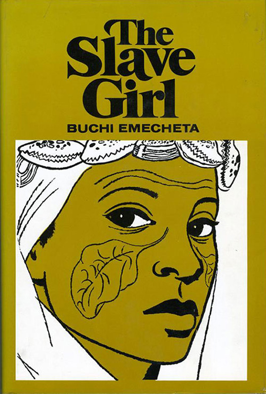
The hardback cover of The Slave Girl is also compelling, but in a completely different way. The eponymous girl is drawn in a powerful illustrative style that references comic art and almost presages the popular rendering of faces in contemporary street art, as if it was created in Adobe Illustrator before Illustrator even existed.
I’m gonna let ’em roll here, in alphabetical order, with a bibliography at the end.
