This week is a bit of a divergence from my usual book cover fare. Instead of focusing on a publisher, author, or designer, I want to look at likely the most popular visual symbol used on left-leaning books: the fist! There are literally thousands of books with fists on the cover, so there’s no question of complete-ism. Instead I’ve chosen fifty that I like, as the tip of the iceburg of fist-dom, so to speak.
Africa
Lets start in Africa—origin of the human being, so most definitely the origin of the fist! And we can start with one of my favorite novels, by one of my favorite authors. Gods Bits of Wood is Senegalese novelist and filmmaker Sembene Ousmane’s master work. One of the best novels about a strike ever written, never mind the complexities of gender, tradition, generation, and colonialism—it’s a fabulous book. And Guy Billout’s cover is great, too. A single black fist is thrust out of the ground, its heavy presence arresting both the viewer and the railroad.
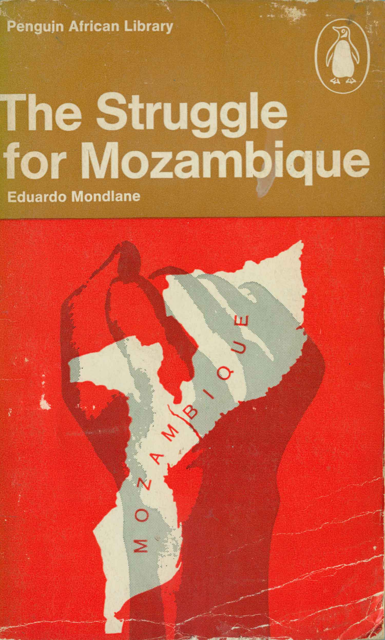
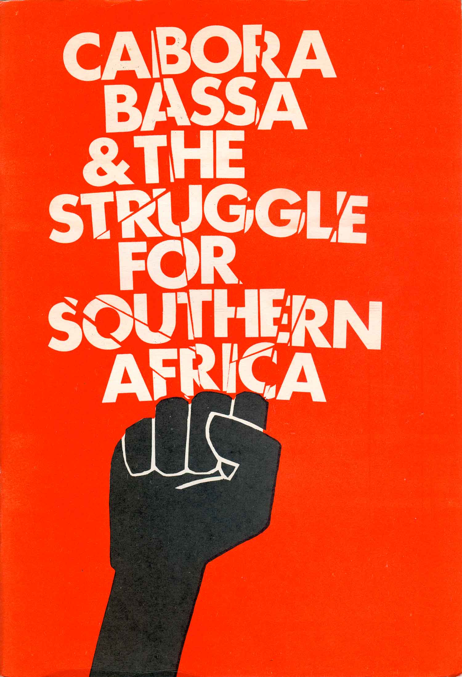
The Mondlane and Kesterloot covers below both overlay the fist on maps of Africa, making for parallel designs even though the fists and maps themselves are stylistically so different. Below those is a strangely rare edition of Fanon’s Wretched of the Earth. Originally released in mass market paperback on Grove Press, and reprinted dozens of times, this is a 1973 edition published by the much more mainstream Ballantine. I can only speculate that they bought the rights to publish this from Grove, thought it would sell out on the newsstands, and it just didn’t have that level of mass appeal. It’s a cool cover, even if a little over-the-top (but we are talking about fists here…)—a photorealistic painting of a fist swinging a broken manacle. Next to that is a political pamphlet produced by the World Council of Churches, of all places. The simple black fist smashes the title, creating a super dynamic cover composition.


South Africa
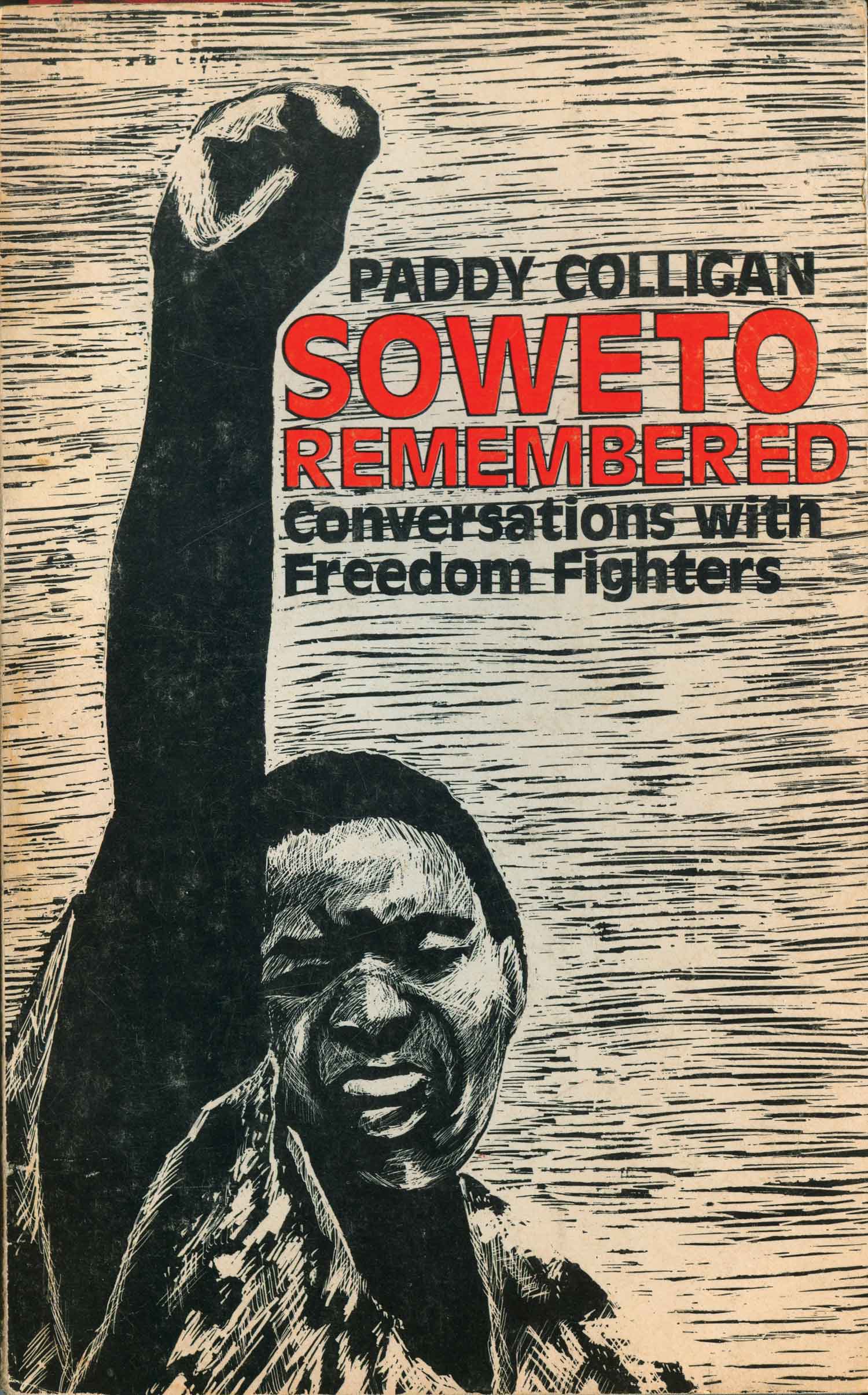
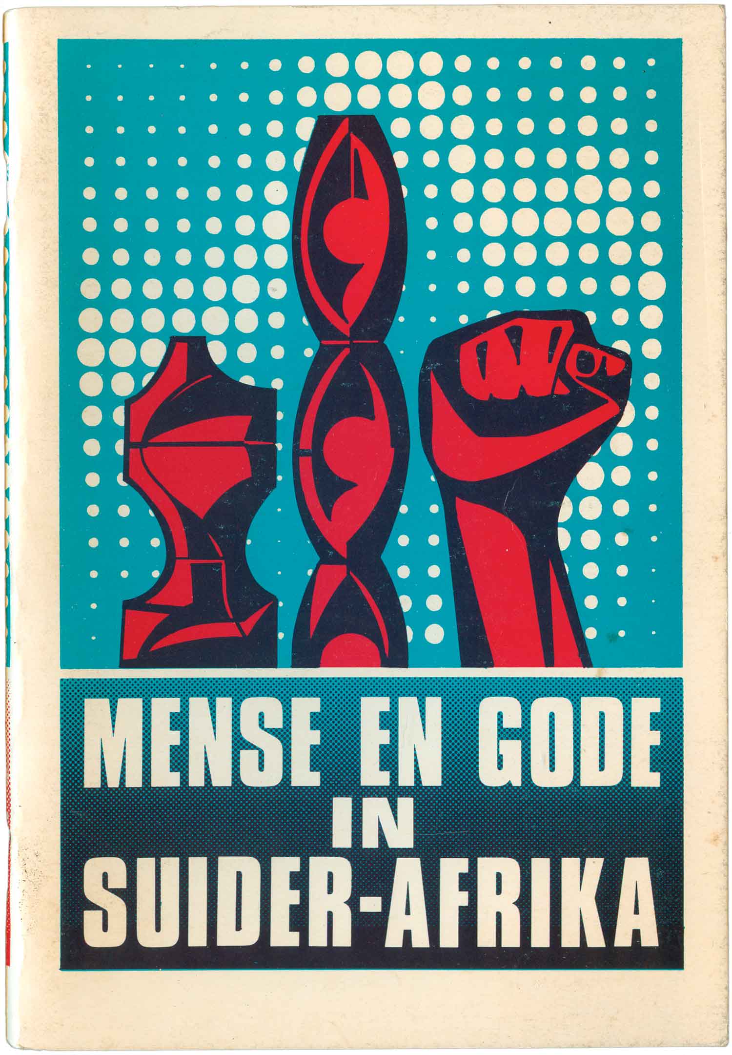
It only makes sense that the fist would take on an out-sized visual importance in the struggle against South African apartheid. While the fists on both of the books below are hand-done, the Colligan block print is rough, raw, and energetic, while the fist on the cover of Mense en Gode in Suider-Afrika is inert. Beautiful but static, stuck on a shelf next to pre-colonial African art. Below those are two covers featuring crowds of protestors, and crowds of fists. While the Harsch cover is interesting because the masses with their fists up somehow seem so contained (the framing of the design doesn’t help), while the insurgent thrust of the cover of Poets to the People is unmistakable. The design largely—and smartly—gets out of the way of the figures in motion.


Spanish Civil War
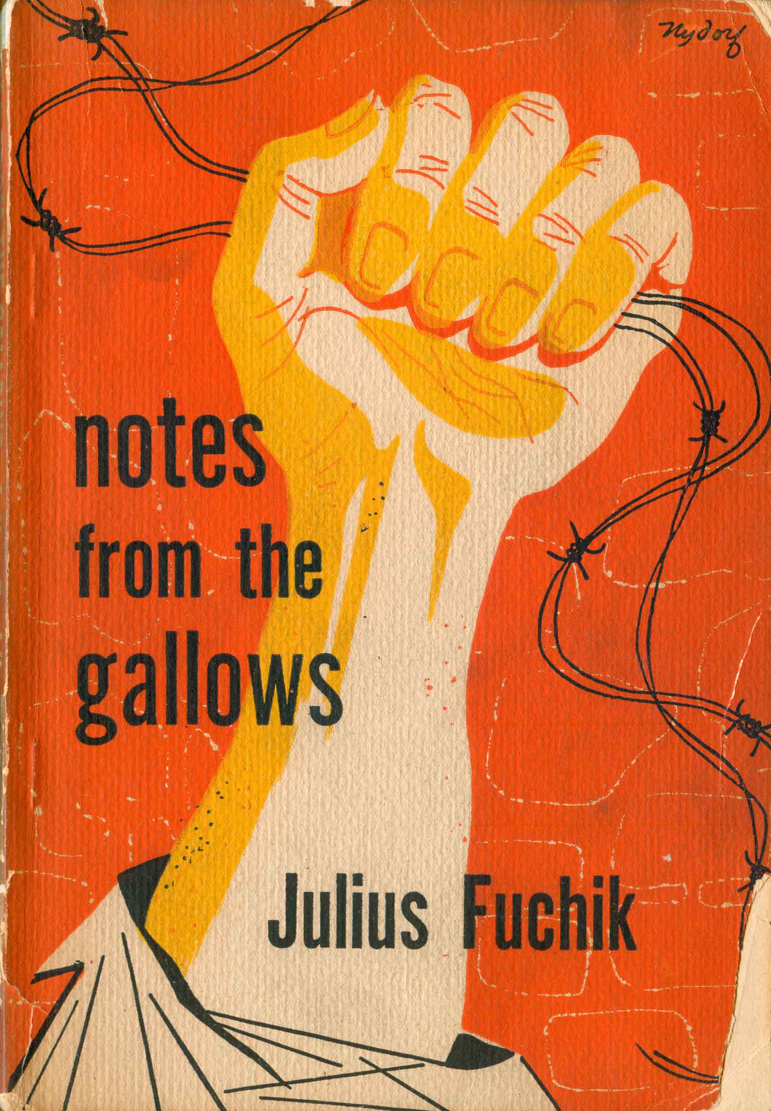
Now a leap from Africa to Spain. The struggle of the anarchists, communists, and anti-fascists in the Spanish Civil War is still the watermark for international heroism for many, so it only makes sense the fist would find a home amongst the representation of that conflict. First are two very different fist renditions: Fuchik’s is emotional, personal, evocative—it feels like a fist in torment—while the one on the cover of the Weinert book is calm and cool, nestled within a logo, in turn framed by the overall design. As an interesting aside, this cover was done by Lothar Reher, who did 90% of the design for the East German Seven Seas Books, which I’ve done seven different posts on over the years—you can read them HERE.
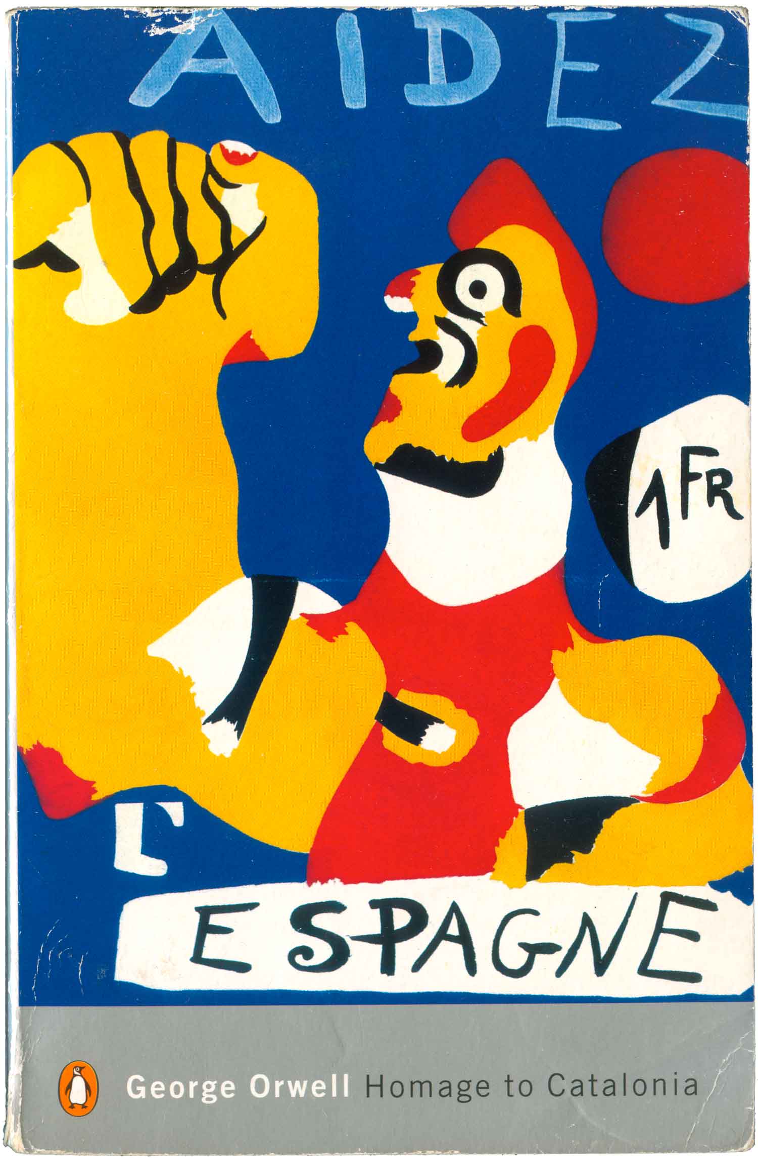
For me, the Spanish Civil War is intrinsically linked to George Orwell’s Homage to Catalonia. Although the book paints warfare, no matter how important the cause, as anything buy heroic, fists still turn up on many of the covers of the different editions. Here’s three of my favorites, from Miro’s expressionism to Robert Capa’s crisp documentary lens to the flat abstraction of this Catalan edition.



Black Liberation Movement
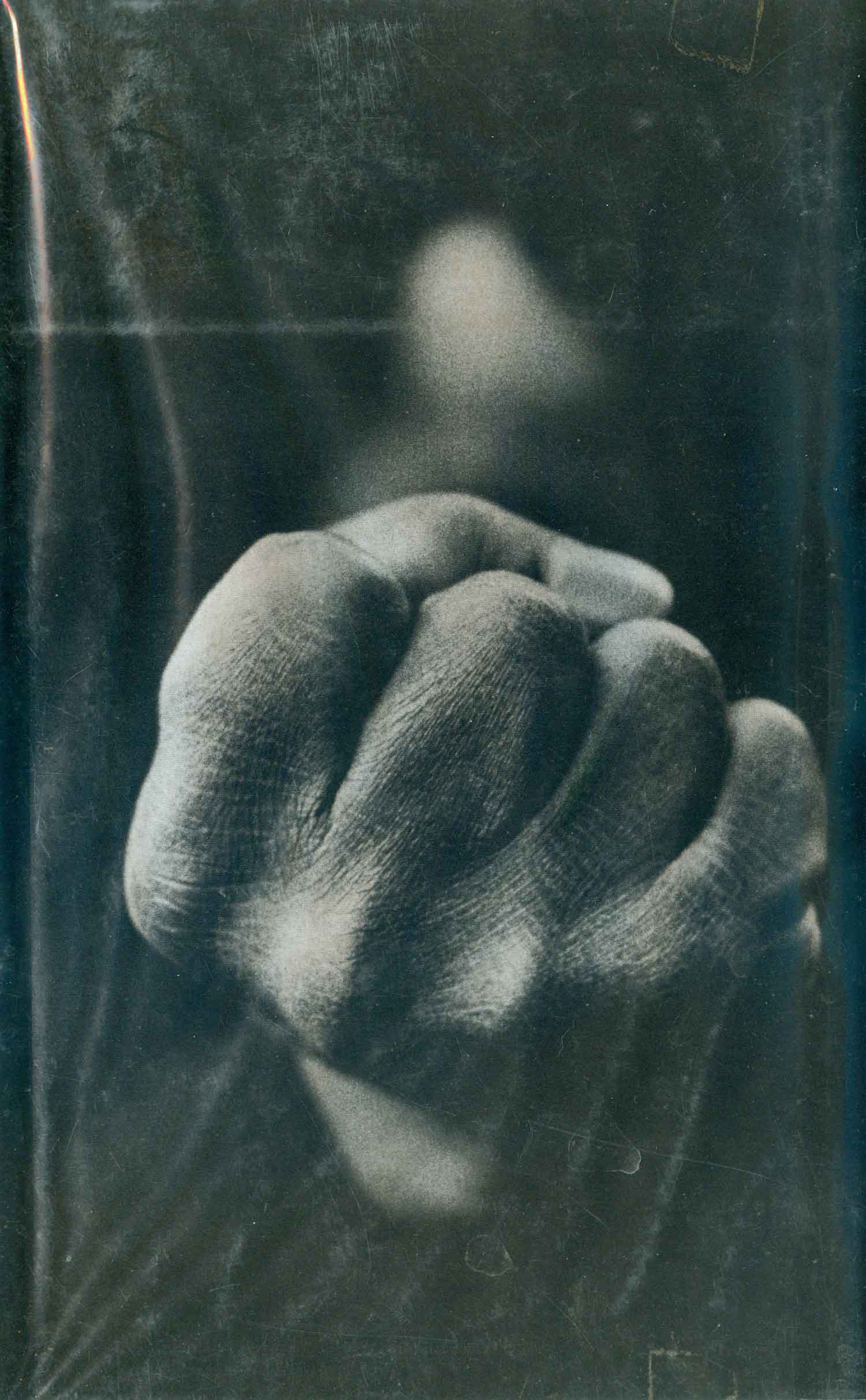
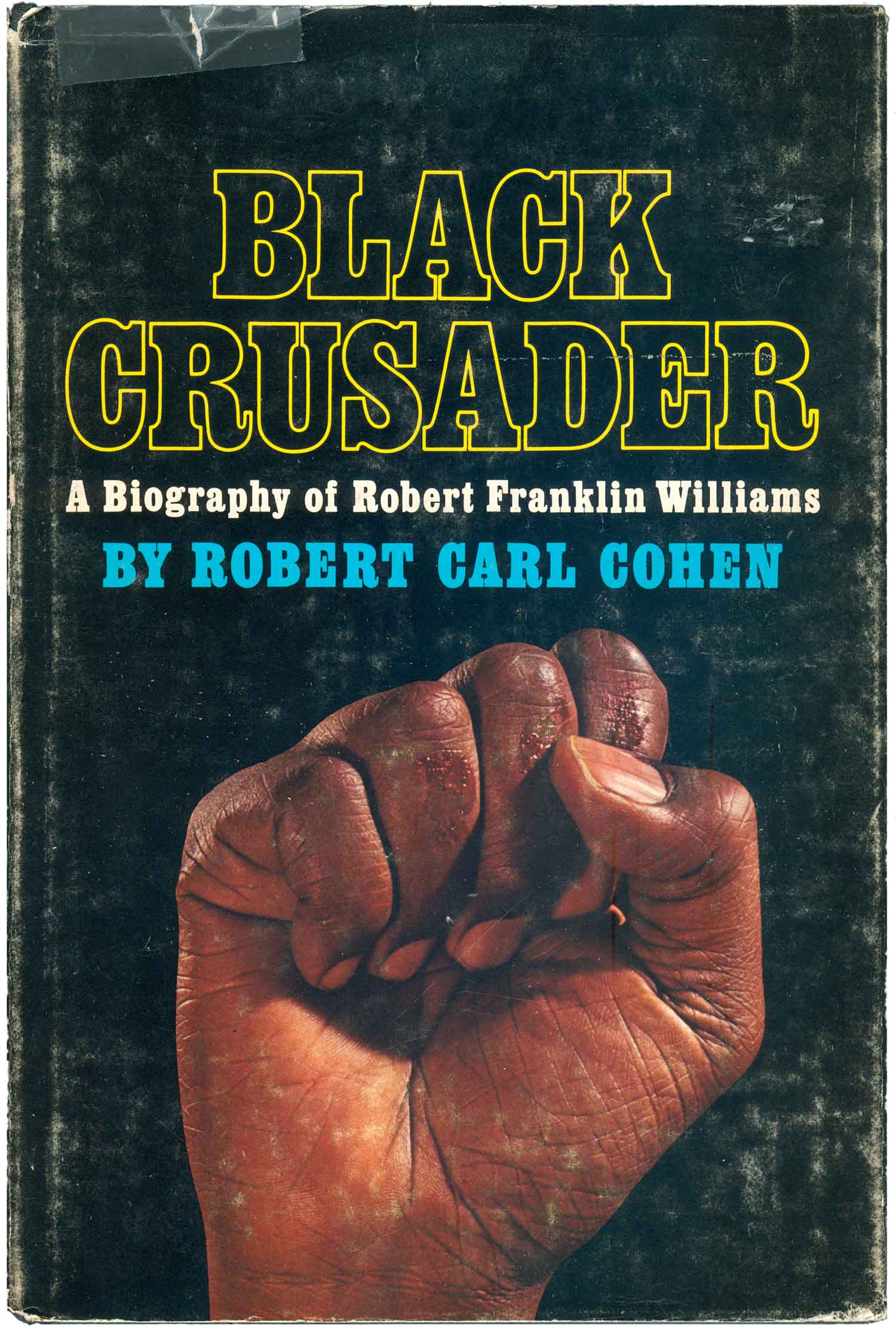
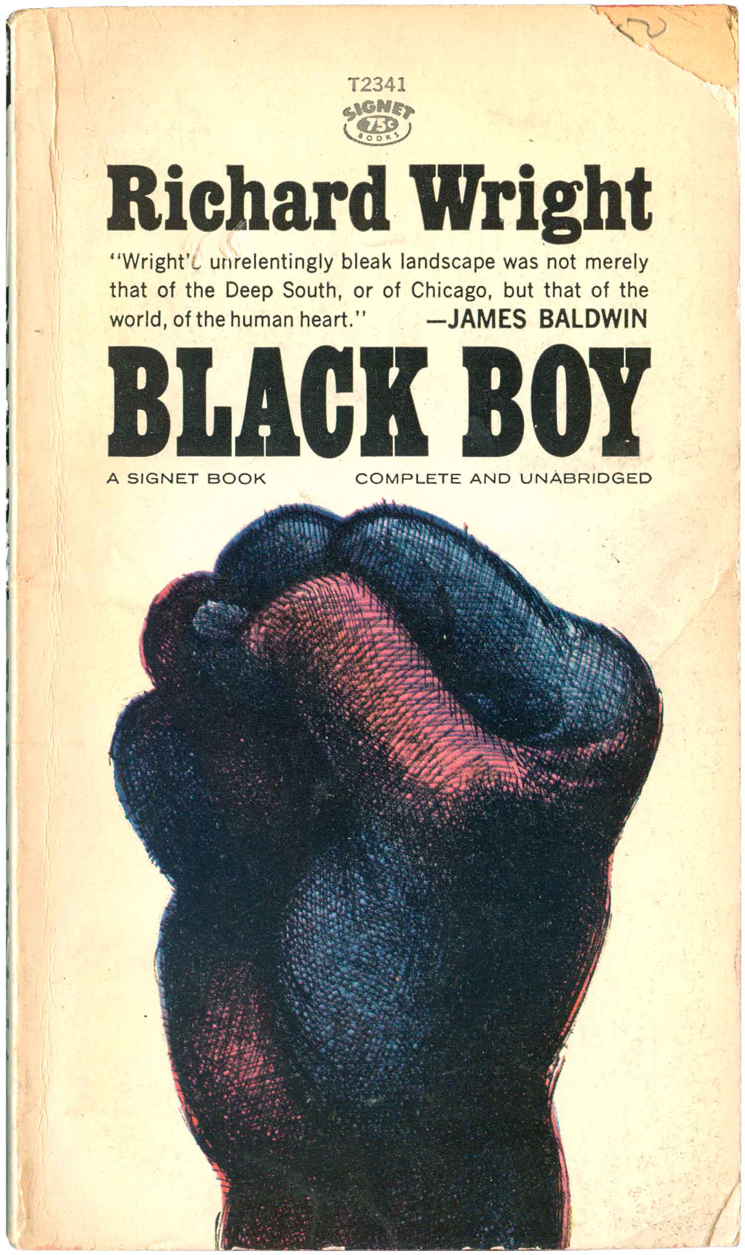
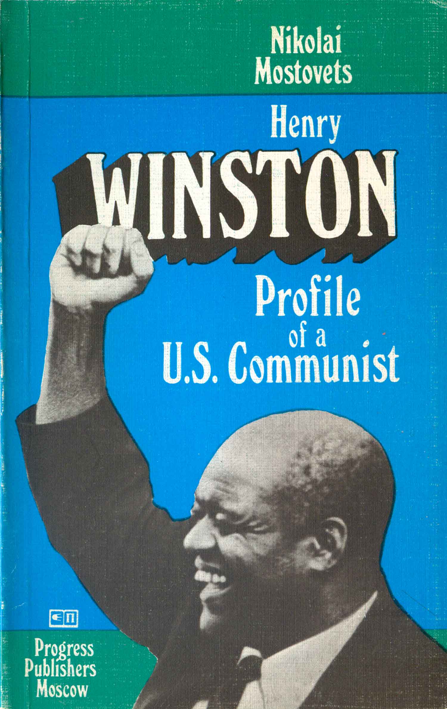
While the fist was a symbol used by groups like the Communist Party and the Industrial Workers of the World in the first half of the 20th century, it seemed to go underground in the 1940s and 50s, only to re-emerge in the 1960s as the go-to graphic for a range of new movements. I’m not 100% certain, but I suspect it first snuck back in to the visual lexicon via the Civil Rights Movement, and particularly the turn towards Black Power in the mid-60s. One of my favorite book covers of all time is Nathan Wright, Jr’s Ready to Riot, with it’s giant, in-you-face fist popping off the cover. No words, no clutter, just the fist. And there are dozen’s of variations of this basic image from the period. Given that all the rest also list the author and title on the cover along with fist makes them seem tame in comparison, but there are still some really great ones. I’m partial to this 1964 mass market paperback of Richard Wright’s Black Boy, and the hefty purplish black fist that dominates the cover.


Black Panthers
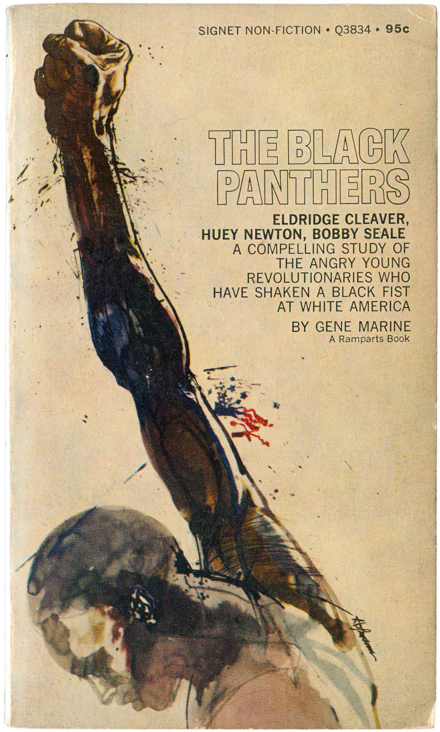
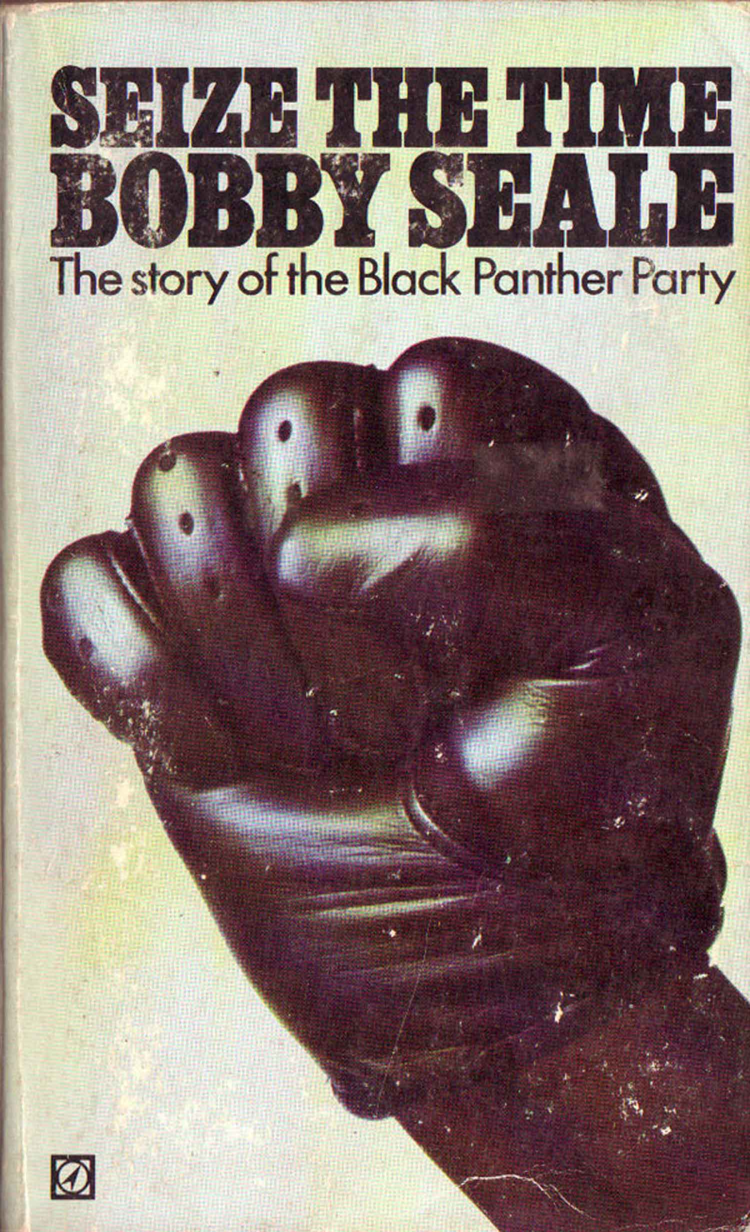
While the vast majority of books by and about the Black Panthers don’t feature fists, these four tell an interesting story. None of the covers of the U.S. editions of any of the major Panther leaders (Huey Newton, Bobby Seale, Eldridge Cleaver, George Jackson) feature fists. But one of the most popular mass market books about the Panthers does, Gene Marine’s book is covered by a black body in motion, a long, gangly arm thrusting forward, topped with a giant fist, almost as big as the man’s head. On a second look, the image is clearly modeled after the famous photo of athlete Tommie Smith giving the Black Power salute at the 1968 Olympics. The UK edition of Bobby Seale’s memoir features a gloved fist, pushing everything else out of the frame. It’s unique here as it’s the only fist in this post with a glove on. You have to wonder if the designer just couldn’t find a black man to make a fist, so he faked it with the glove….
Earl Anthony was an FBI snitch who infiltrated the Panthers, and his “tell-all” unabashedly uses a big black fist to try to take advantage of the popularity of Black resistance to sell this deeply reactionary book. This cover sits uncomfortably next to the attempt at a more refined, historic Black fist illustrating David Hilliard’s 1990s memoir of being a Panther leader. This fist is striking in that it is so clearly an attempt to make the fist “legitimate” and almost classy.


New Left
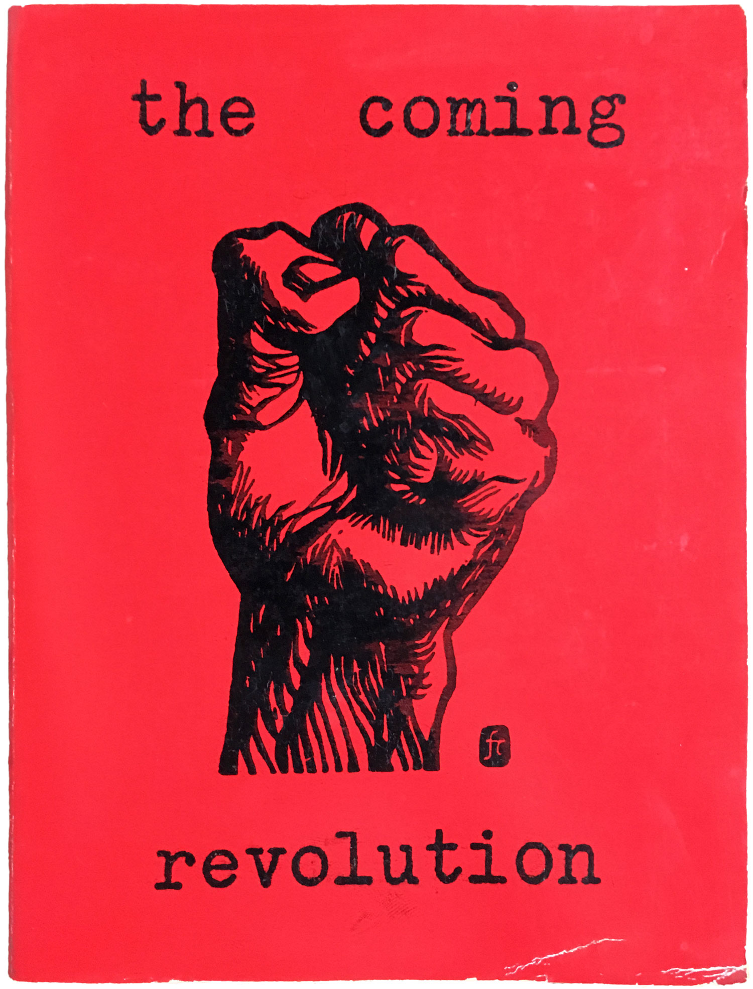
The broader New Left picked up the fist, and wrapped themselves in it, by the late 60s. One of the most famous fist designs of the period is a woodblock design by Frank Cieciorka, originally designed in 1965, which eventually ended up on the cover of Bill Callison’s early 1970s manifesto, The Coming Revolution. The fist on Seymour Krim’s literary criticism of the 1960s appears to be a fist made of trash—or tinfoil—thrust out and above the city. An interesting counter-point to the completely staid—and stock photo-looking—fist on the cover of U.S. News & World Report’s “exposé” on the New Left.


Feminism
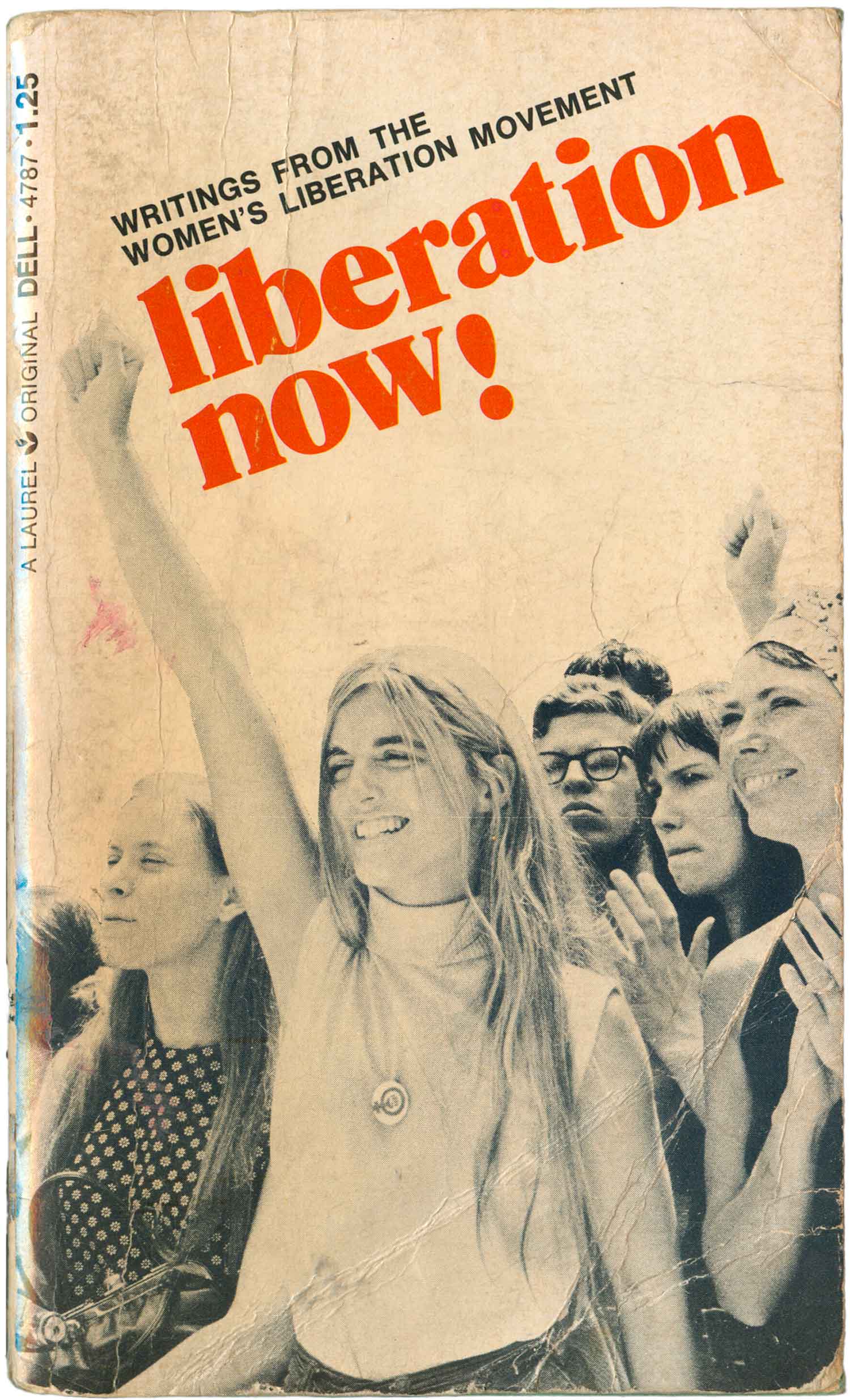
Like Black Power and the New Left, the feminist movement also played with the fist. Most well known is the graphic of a fist placed in the center of the woman symbol (seen here on the cover of a German collection of feminist writings), but lots of books featured other representations of women with fists in the air. The woman on the cover of Liberation Now! echoes the stance of the figure on the Black Panther cover above, but here her fist is in proportion to her body, so it’s actually quite small. The designer smartly highlights it by running the title directly perpendicular to it. The final fist here is one of the more interesting uses I’ve seen. It’s on a banner, in a photograph, which is set in montage in the background of a woman’s arm handcuffed to a sink. I can only imagine the designer intends to convey the idea that the feminist movement is only an aspiration for women that are chained to their domestic lives?


Students
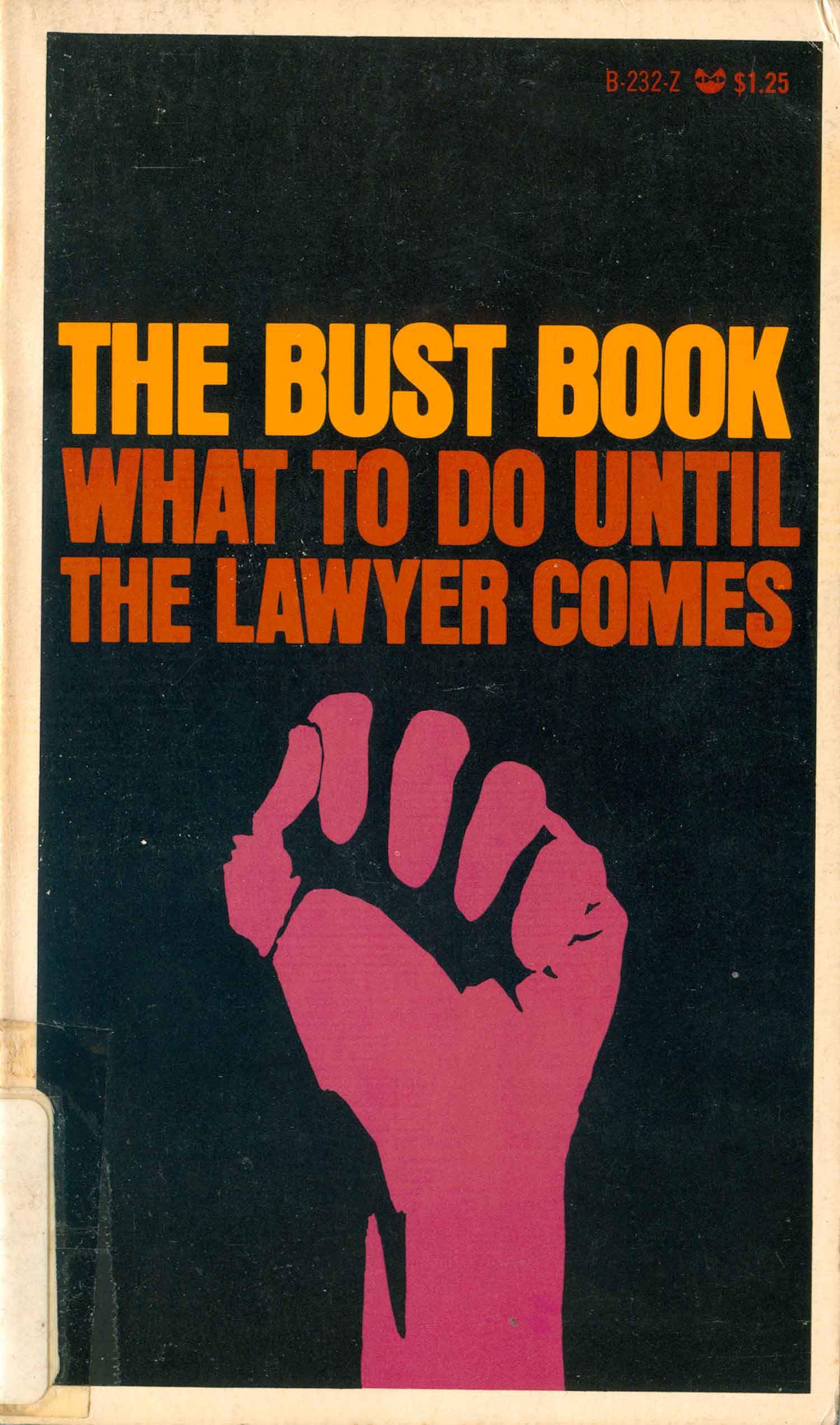
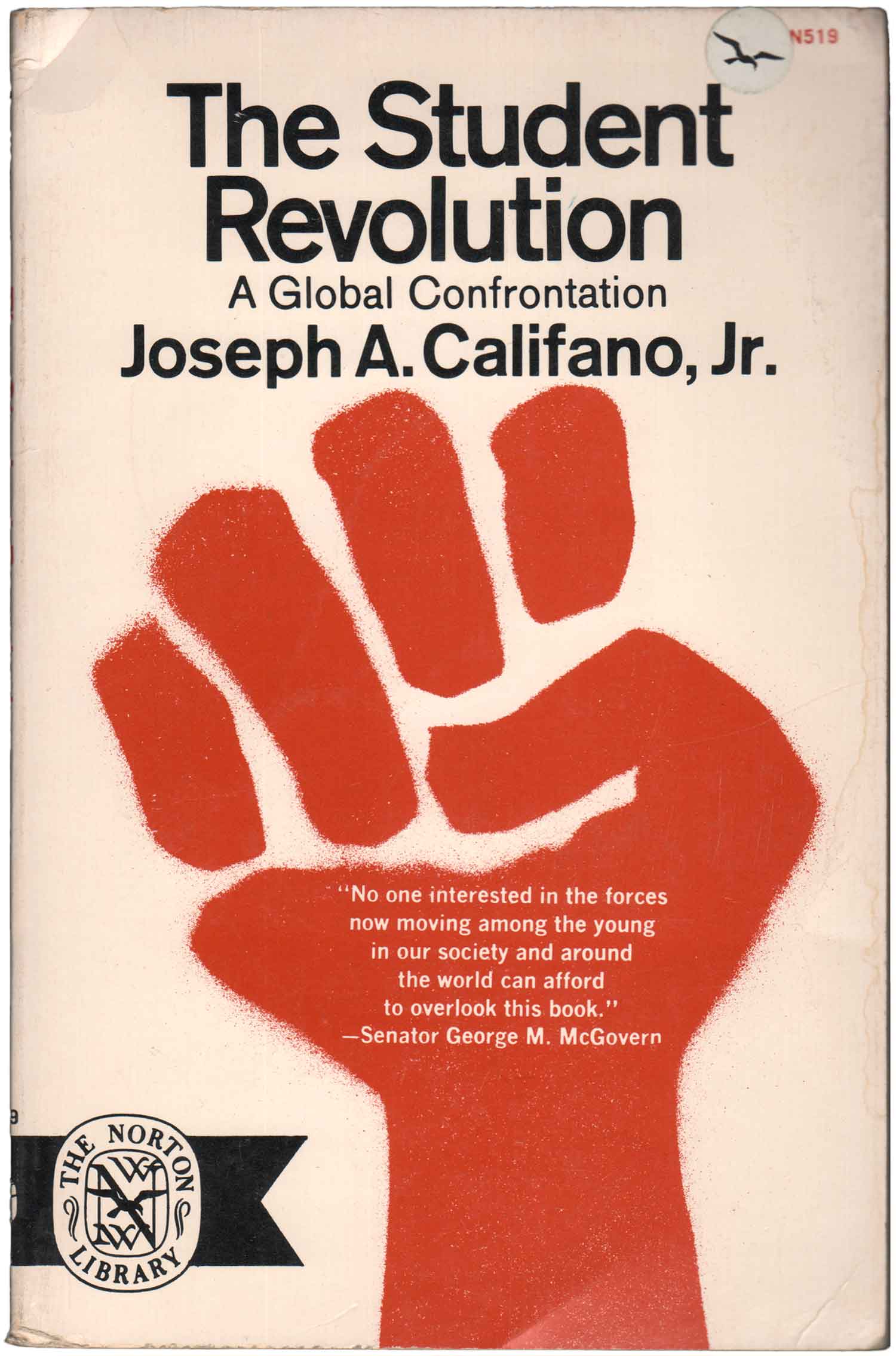
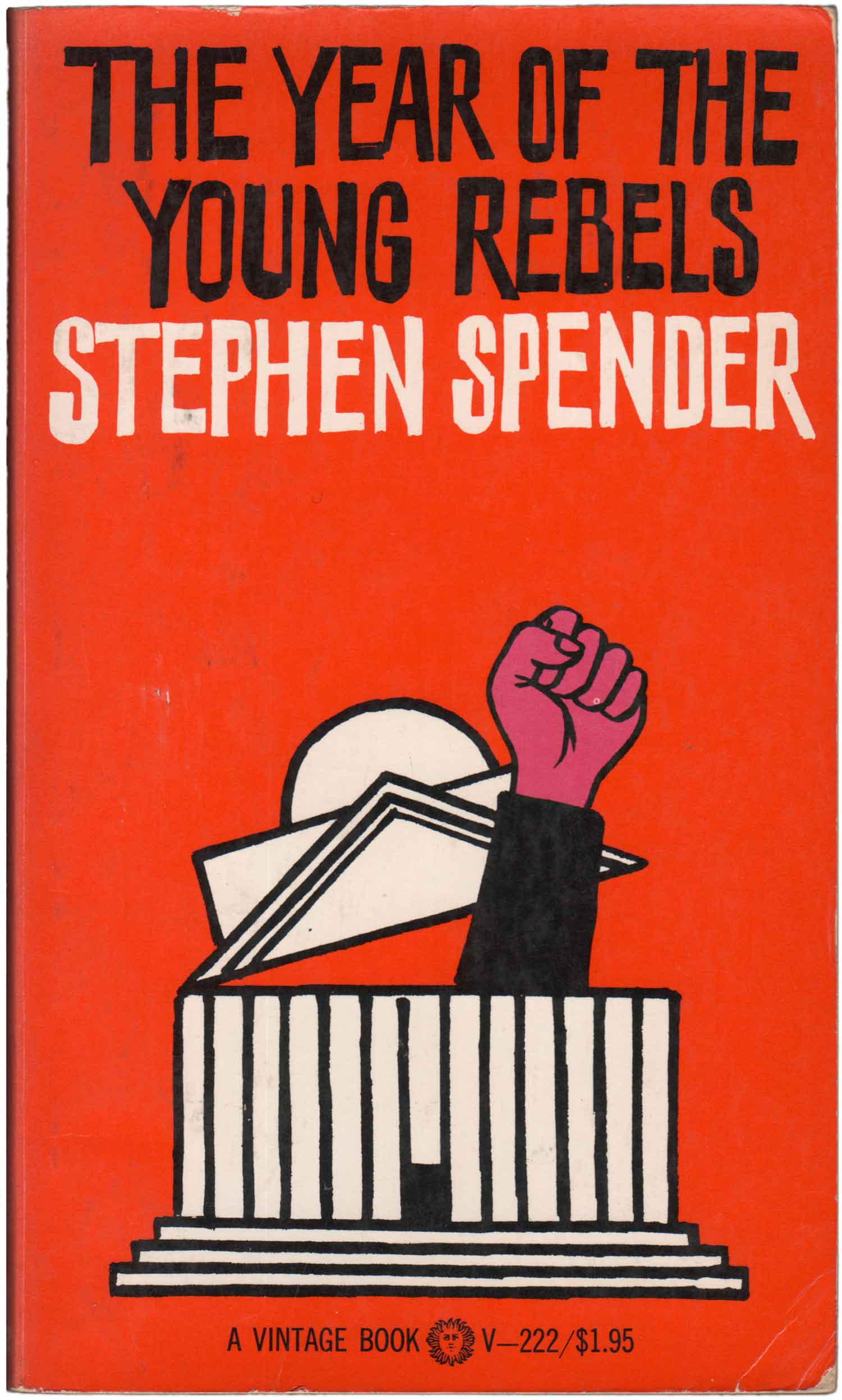
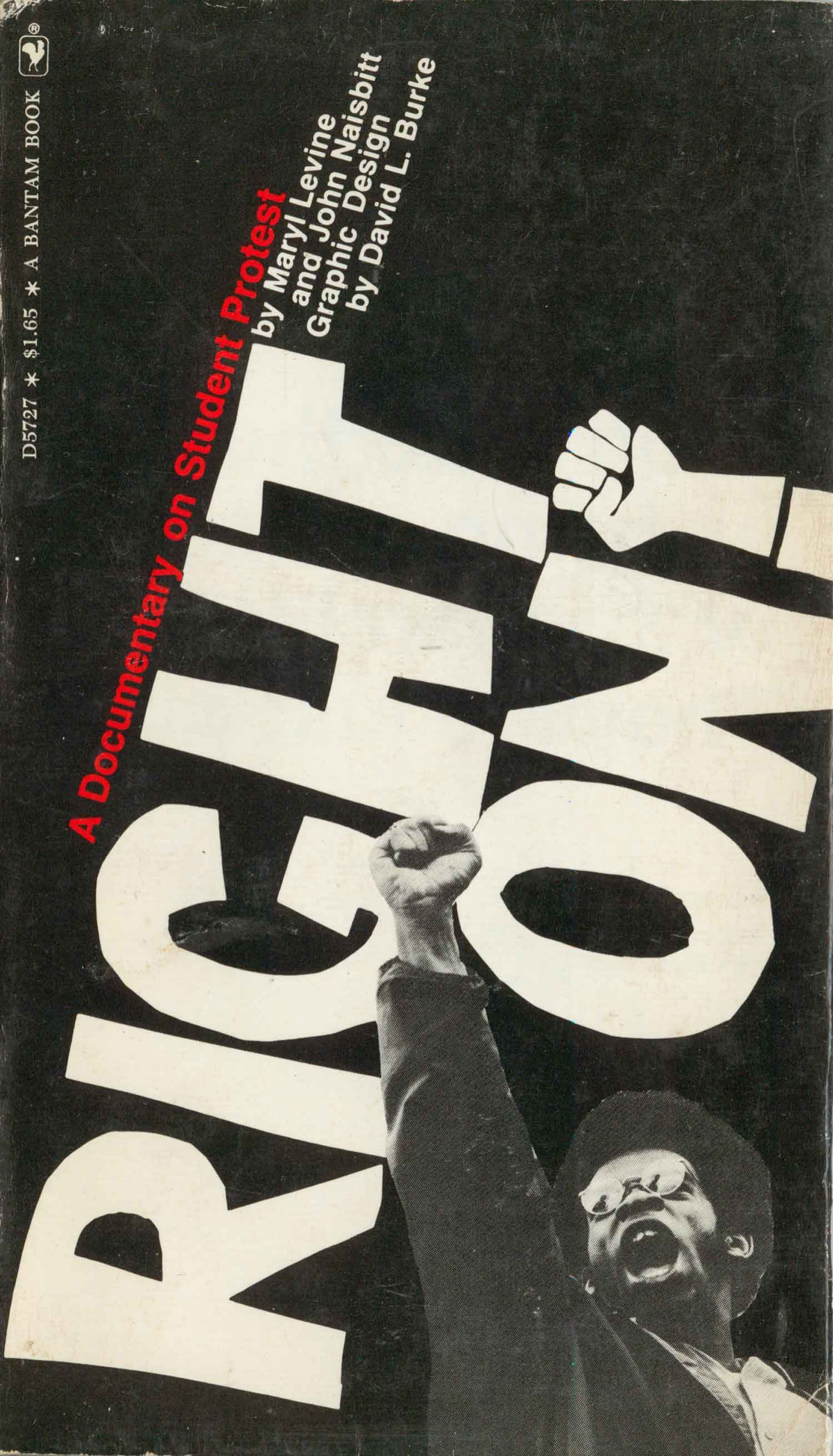
The final group in the 60s and 70s that loved a fist were students. Dozens of books came out, particularly in the early 70s, either arguing for the liberation of students or fearful of the revolt of youth. Each side were equal opportunity fist employers. Califano, Jr’s book has a stripped down design which places front and center the basic red fist used by striking students at Harvard in 1969. The Spender cover is a bit humorous, the fist popping out of the university, while the Levin cover doubles up the fists, one graphic and one photographic.
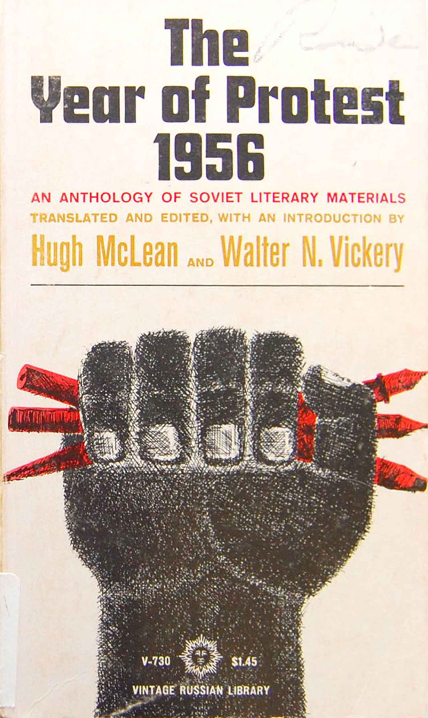
Two additional books about more recent student unrest in Eastern Europe are different attempts to rework the fist into a universal graphic of student revolt. Both feature fists holding pencils and pens, linking the revolt to intellectual labor.

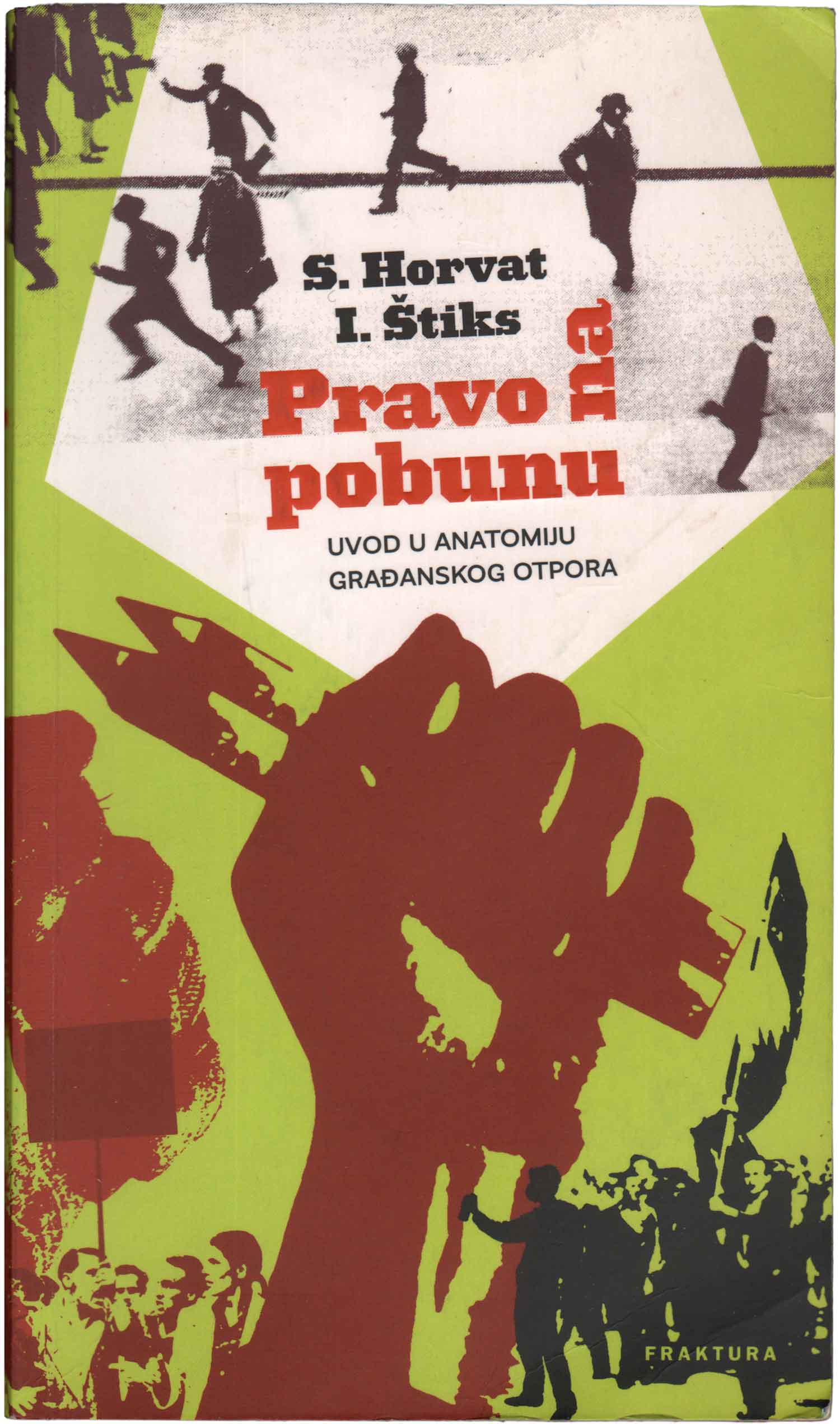
Lots of Fists
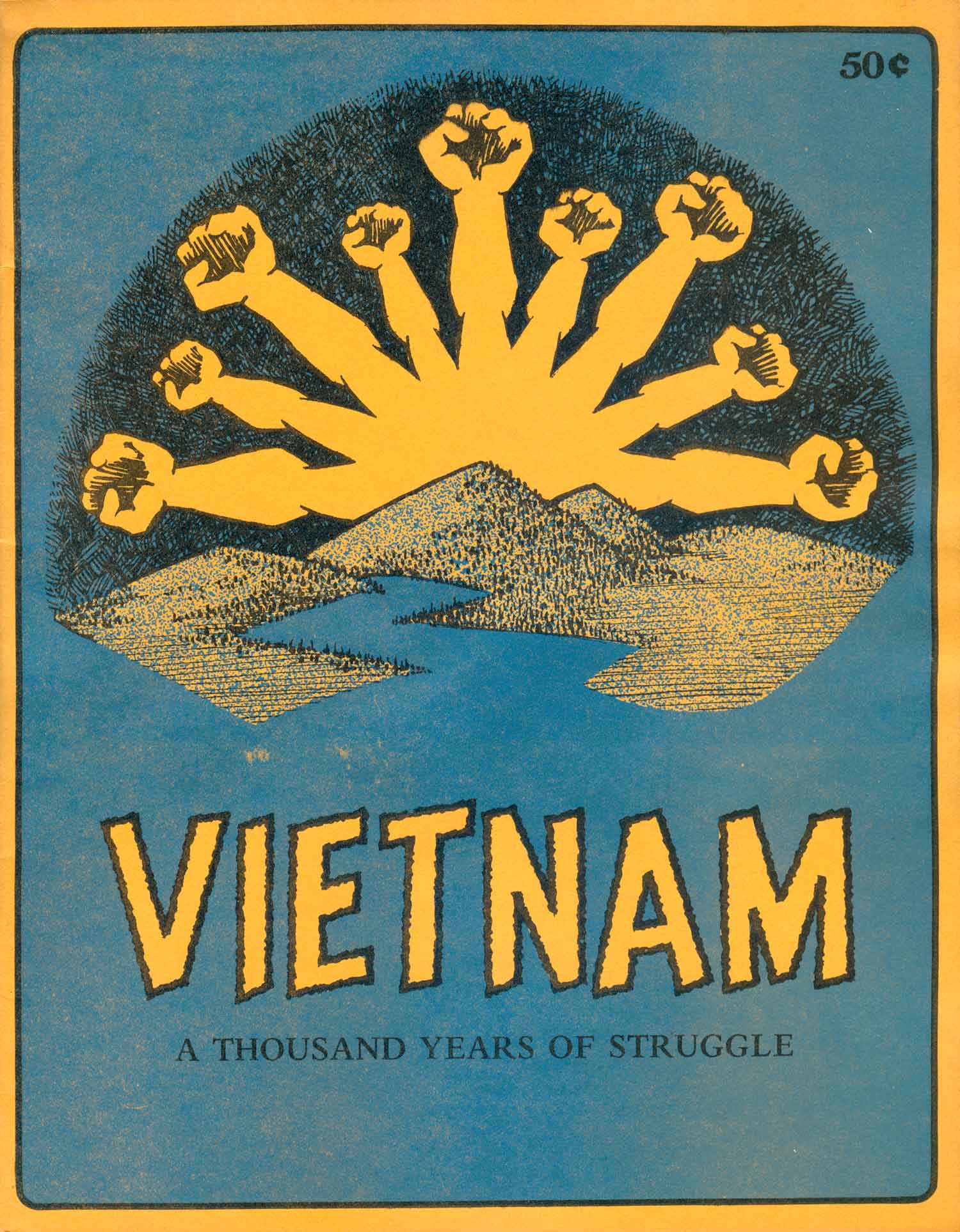
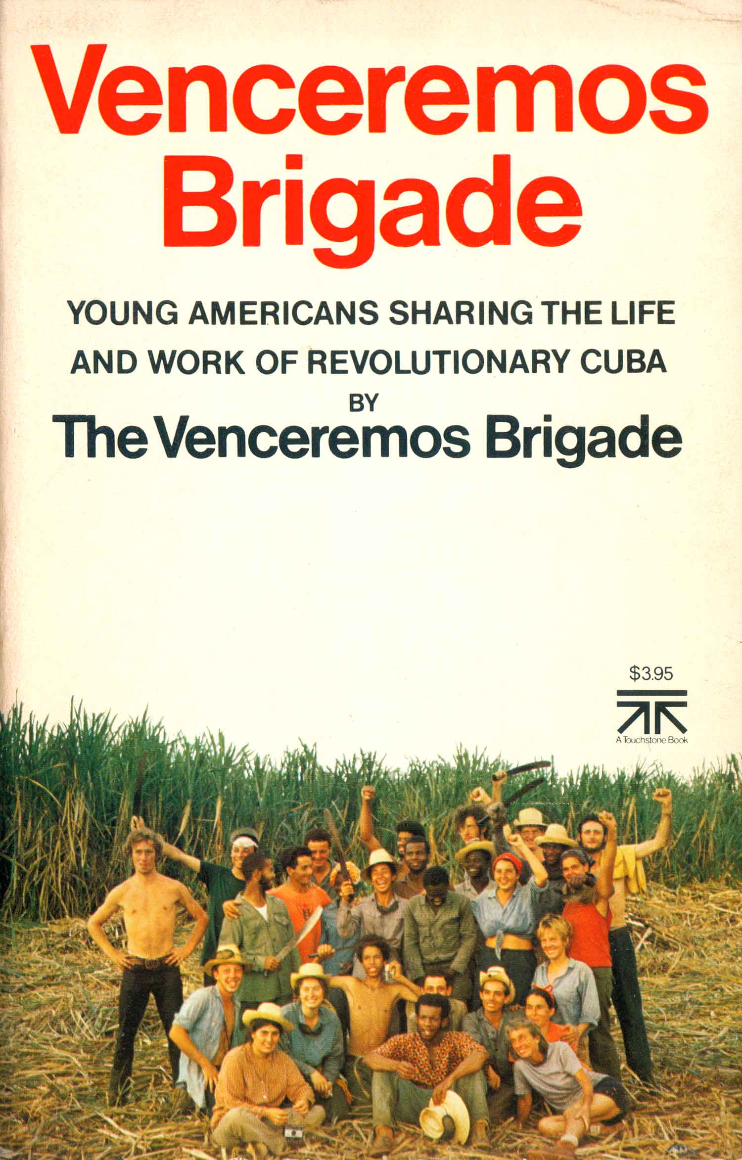
Sometimes one fist is simply not enough. It’s interesting how the raised fist feels like a solitary gesture in my mind, an individual act of resistance. Maybe that’s rooted in the image of Tommie Smith raising his fist at the 1968 Olympics. But strangely, gold medalist Smith wasn’t alone—bronze medalist John Carlos was raising his fist next to him on the podium. Anyway, here are some group shots, to illustrate some fists’ social nature. Fighting Spirit features a repeated, super-stylized fist, in classic black and red. Anarchism Today throws up three fists, one black, one brown, one white. It’s a surprising attempt at inclusiveness for anarchism at the time, still largely seen and understood as a European phenomena. But this book actually attempts to cover aspects of anarchism that have flourished in other parts of the world, so the cover my be a little over-selling it, but it’s not totally off base. Then we jump from three to nine—Vietnam as a nine-fisted sun monster rising over the mountains. This logo would eventually become an all-purpose logo for Peoples Press, the publisher of this pamphlet. The all grey and black cover of Racism and Inequality echoes Poets for the People above, but with the added bonus of a really nice line-tone running through the photograph, and a bolder sans serif type face, which works here. And finally we have a true crowd, a large Venceremos Brigade to Cuba, most of the members happily waving their fists.



Sharing Space
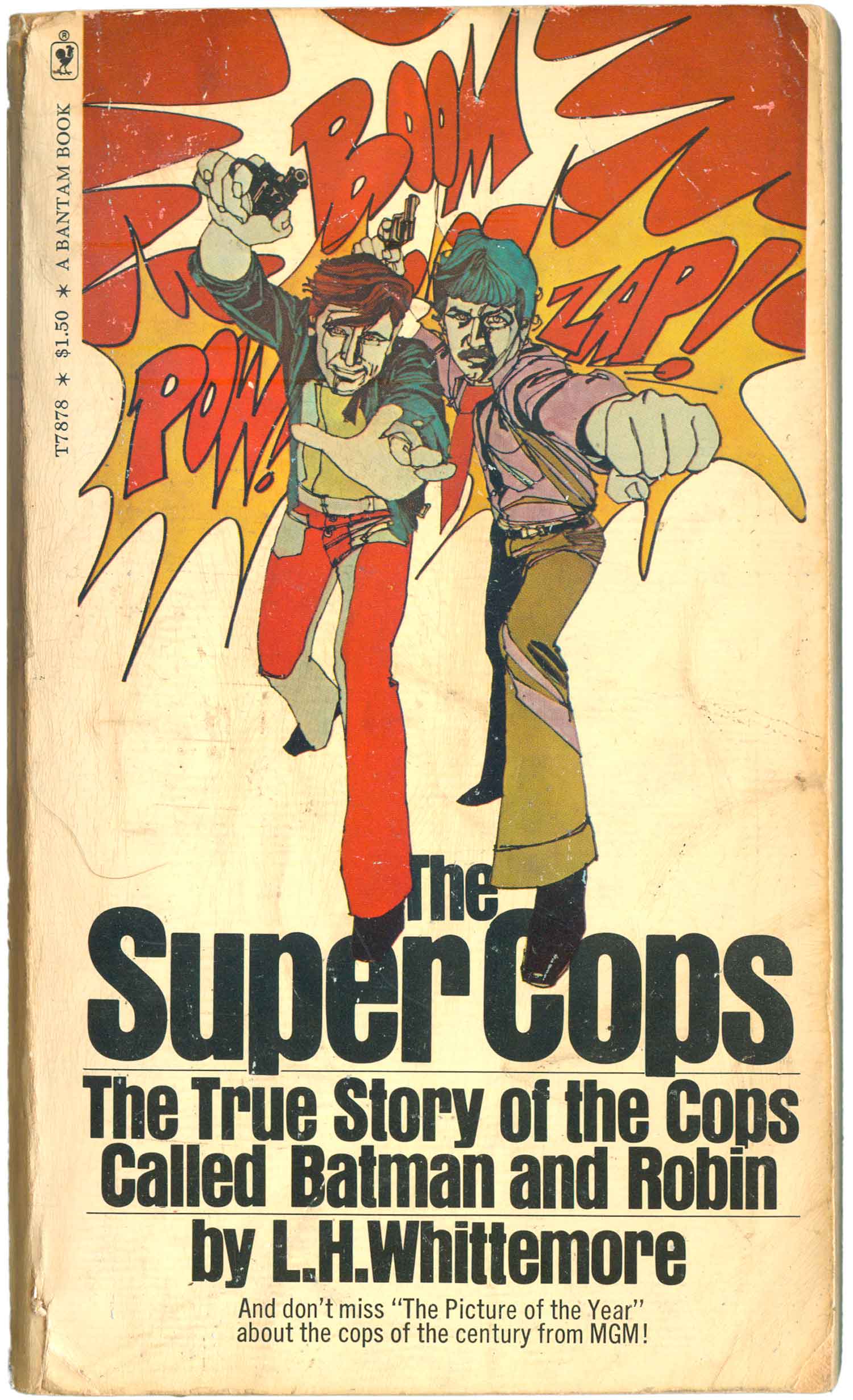
And then we have the fists mixed up with other hands. Maybe not such an interesting category in the abstract, but the Apthekar and Sternsher covers below are really striking. The former (designed by Larry Ratzkin, who designed the seminal cover for Black Power) has a quite strength, the fist feels almost vulnerable when put in a community with these other raw, awkward hands. The latter is different, although the two hands almost exactly echo the gestures of two on the Apthekar cover, they re much more solid and commanding—the fist demanding, the open hand almost as demanding, waiting for acknowledgement. As for Super Cops, it’s so ridiculous I just couldn’t resist.
& nbsp;


Rounding It Out…
At the end here I’ve got a motley crew of fist covers that just didn’t fit anywhere else, but are interesting or clutch in their own way. First is the cover of the American Friends Service Committee’s Struggle for Justice, which features Mark Feinstein’s often reproduced photograph of a fist raised out of a jail cell during the Tombs riot of 1970, a premonition of the massive Attica rebellion which pops off the following year. While Attica is far more known than the Tombs, this image is more iconic than any that came out of the Attica revolt. This photo has been used on pamphlets, posters, converted into a black and white graphic, drawn and redrawn thousands of times.
Next up is a cool hand drawn fist from a Guyanese political pamphlet by Walter Rodney. There must be hundreds of publications with hand drawn fists on them, each one unique and awkward in its own way, but this one I love, especially in relation to the pile of tools at the bottom of the page. And next to that is maybe the only fist I’ve included that has a real pre-60s feel. This image harks back to the heyday of Communist propaganda, and the fist emerging out of a worker’s shirt sleeve.
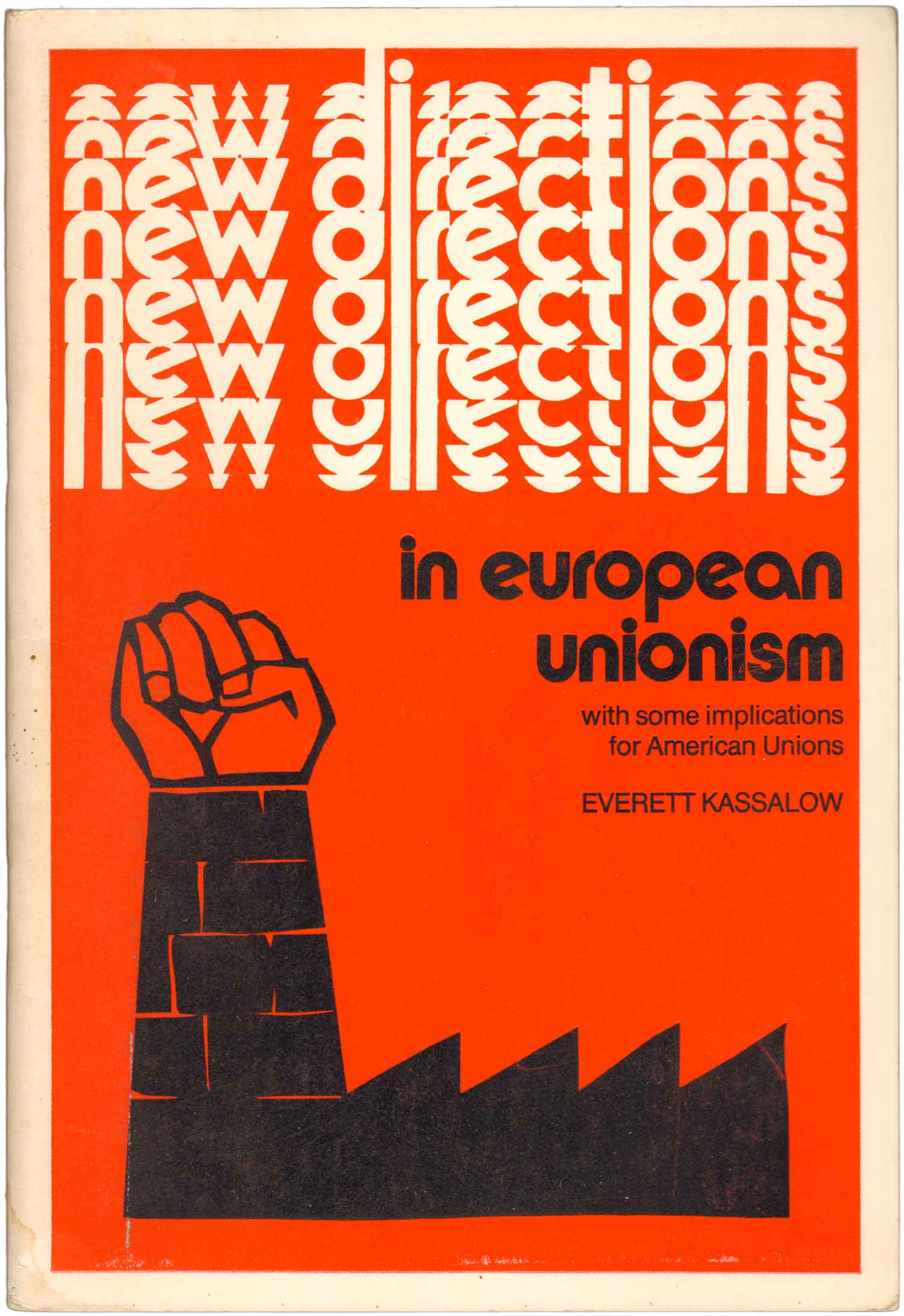
The last row has three really nice representations. Jasper’s cover has one of the more abstract fists, each part of the hand made up of a different color, and the shape represented by hollow outline only. While design is rife with re-workings of May 68 graphics, this is one of the only publications I’ve found with the classic factory/fist combo on it. And finally we have the precursor to the student rebellion fists above. Three pens are thrust up by this giant, bulky fist, illustrating the power of Soviet dissident writing from 1956.




This is just a very small drop in the ocean of publications featuring fist imagery. If you’ve got a favorite you want to share, send it along (josh at justseeds.org)—maybe I’ll pull together 50 Fists part II based on what people send me!
Bibliography
