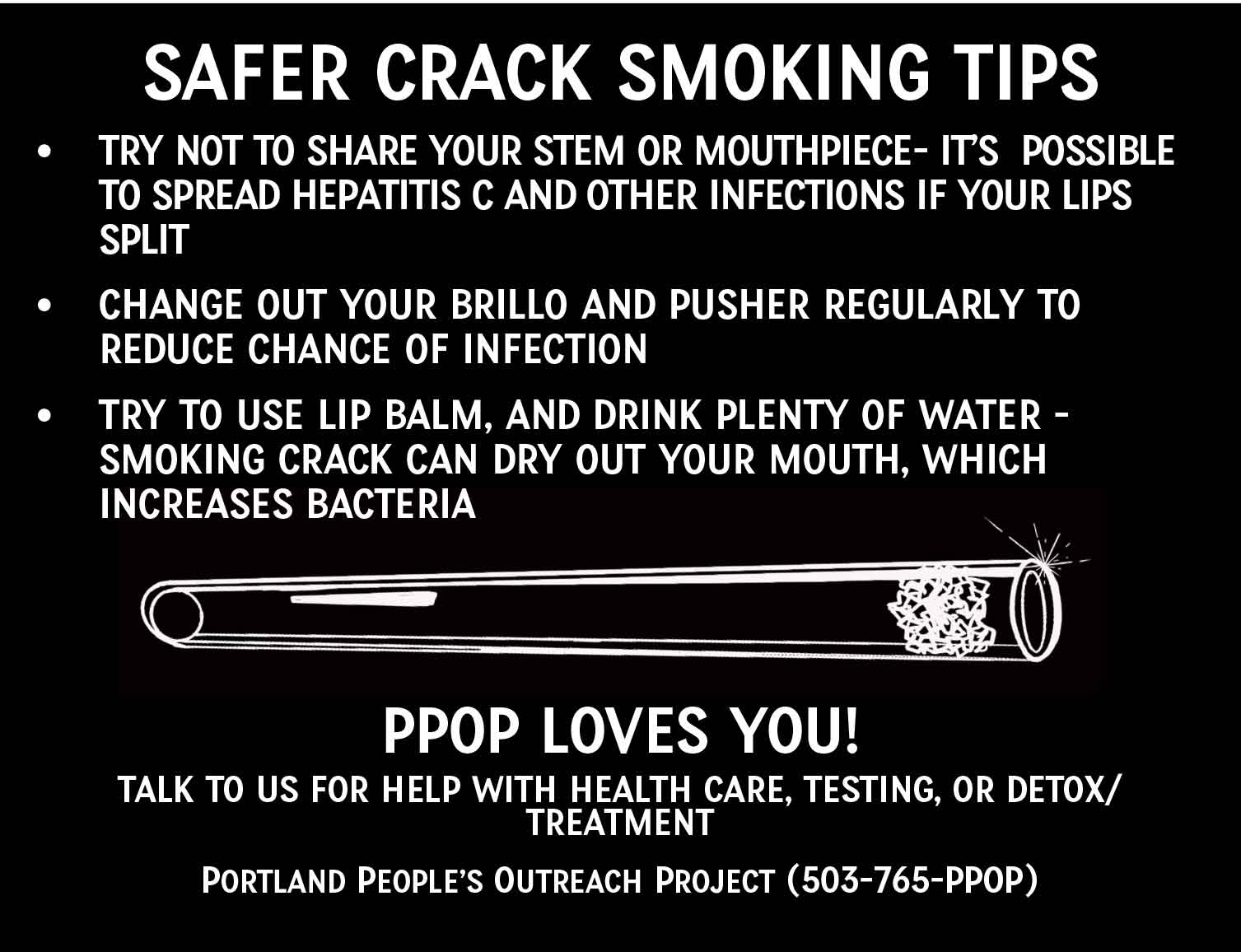
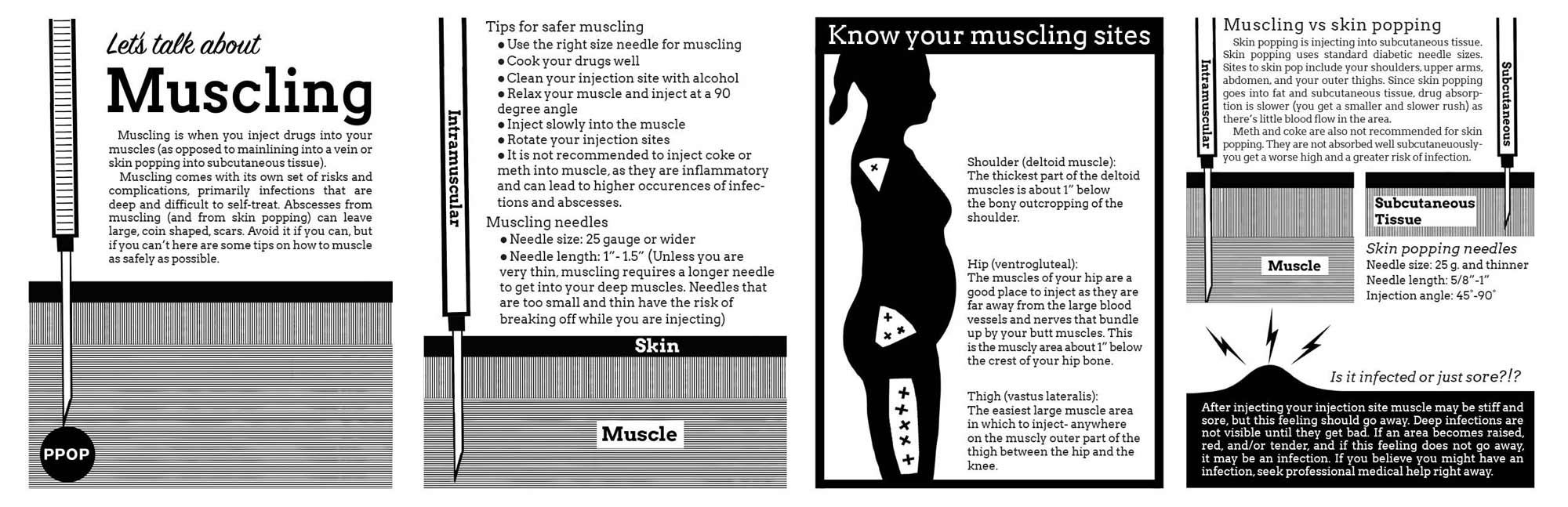
I’ve been working in both medicine and harm reduction for a decade now and have been trying to bridge my art/design background and my practices in street medicine and harm reduction.
Ten years ago it seemed that harm reduction health information (broadly speaking) fell into two camps: public health-y or punky. One conveyed a sense of authority, another authenticity, but both could be indecipherable and alienating. I hoped to create graphic health information that was both accessible and accurate. There is research about this–specifically about things like discharge instructions for treatments and medications. The take aways from that research aren’t all that surprising from a graphic design perspective: sequential graphics were effective across language and cultural barriers, that negative space improved clarity and retention. That focusing on possible exemptions and side effects just tended to confuse the issue. I definitely saw this harm reduction health pamphlets–there was a tendency to try to cram as much type as possible into a quarter sized piece of paper. It’s a well-meaning attempt to deliver a lot of information, to cover exceptions and anomalies–but the end result felt cluttered and hyper-dense. It’s also worth pointing out that symbols and infographics live in a culturally specific space, and may be meaningless if badly chosen (for example, a pictogram of a plate that showed bacon and eggs to show that a medication should be taken with breakfast, means nothing to people not familiar with this conception of breakfast).
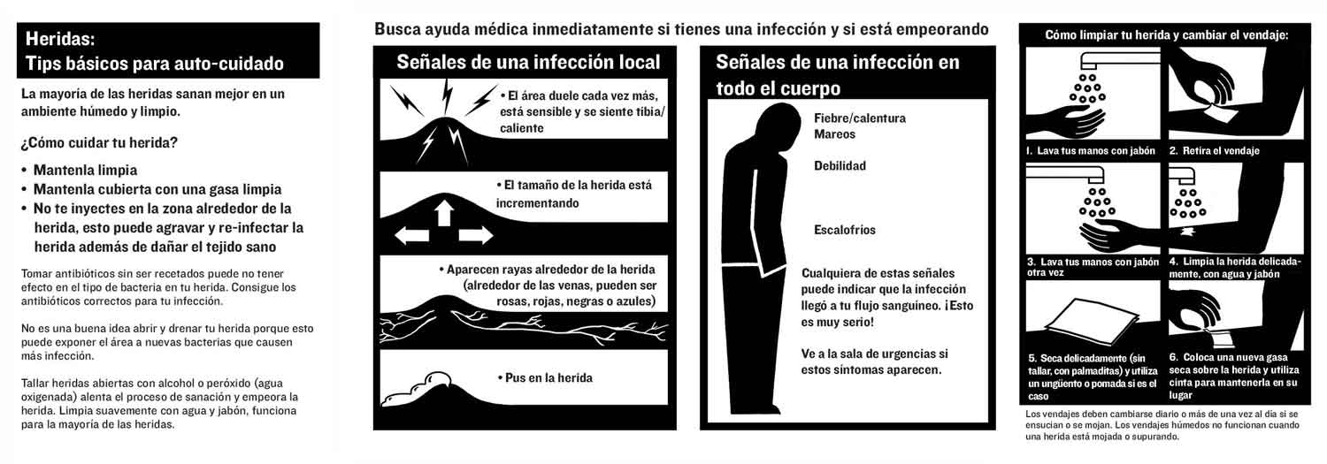
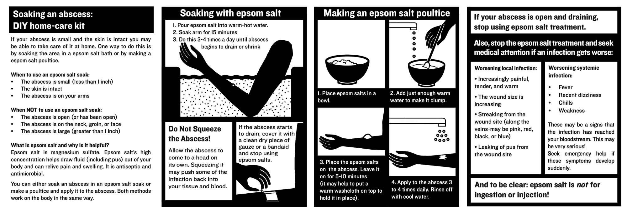
When I first started I felt like I had to be really generic looking to get information across, that my subcultural art background and tendencies were a liability. I was hugely inspired by the innovators of modern infographics and pictograms–particularly the German and Austrian socialists Gerd Arntz and Marie Neurath- who were artists and designers that created thousands of images and designs in an attempt to democratize information for a global audience of people displaced by the wars and genocides of the early 20th century. Looking back, early on, I swung too far for the generic. I hope I’ve found a better balance now, that I’ve allowed images and designs to have a little humanity and personality while still effective at getting the point across.
*Many of the recent graphics have been done with art and political direction by my friend Sam Junge, a tireless organizer for the rights and humanity of drug users. Also thanks to Justseeds comrade Andrea Narno for helping with translations and moving these projects into the future.
Here’s a link to a zip file with all of these posters and images.