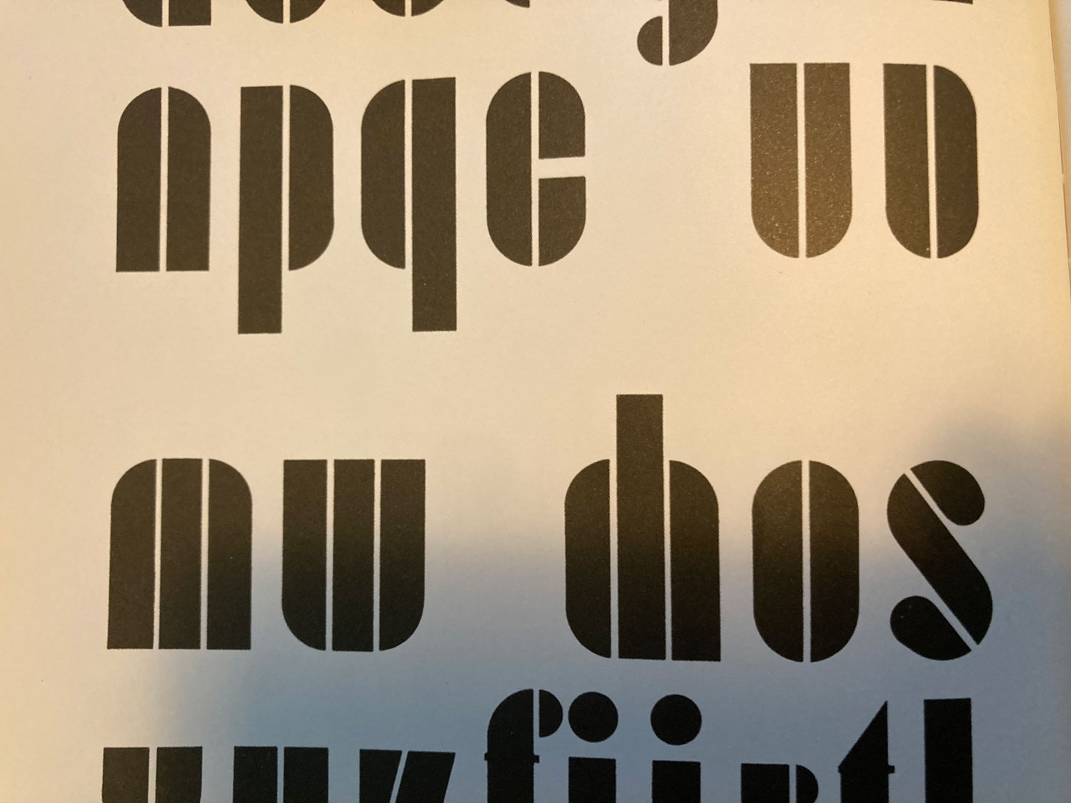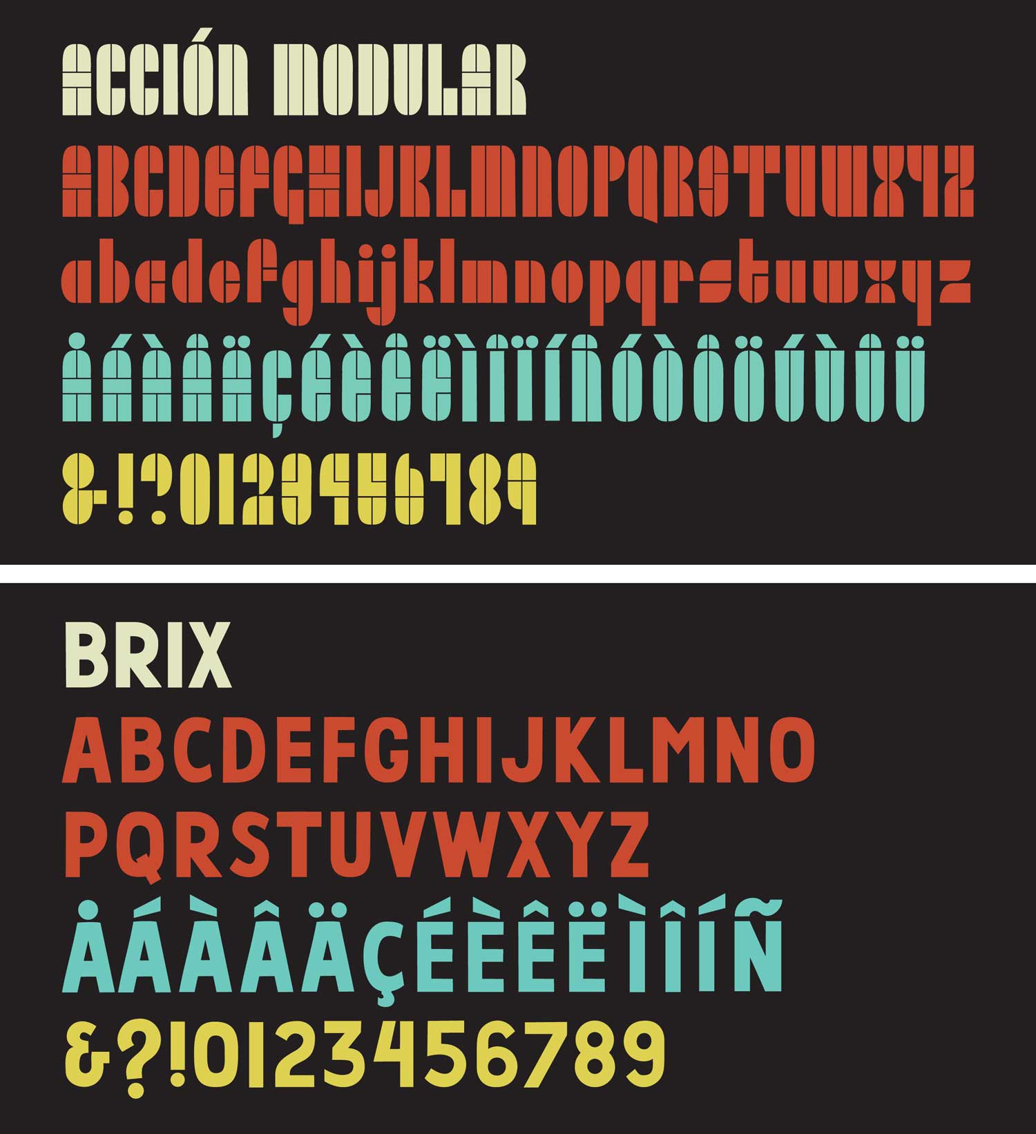
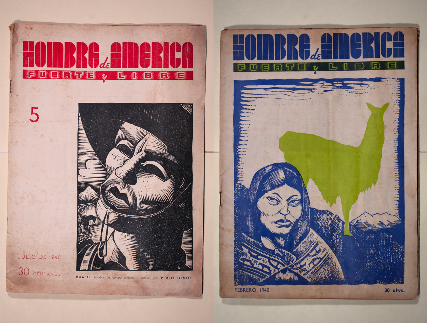
The fonts in this release are created from two found letterforms. The first font, Acción Modular, comes from the title font of the Argentinian magazine Hombre de America: Fuerte y Libre. A bimonthly publication, Hombre de America ran for 27 issues from 1940 until 1945, and was broadly left/anarchist in orientation. It was a large format magazine with stunning covers and was lavishly illustrated by contemporary South American printmakers. Hombre de America was widely distributed throughout the Americas and in international anarchist circles. The original title font, an aerodynamic modular typeface (from which Acción Modular was based)*, was eventually replaced by a more digestible, less intriguing, slab serif.
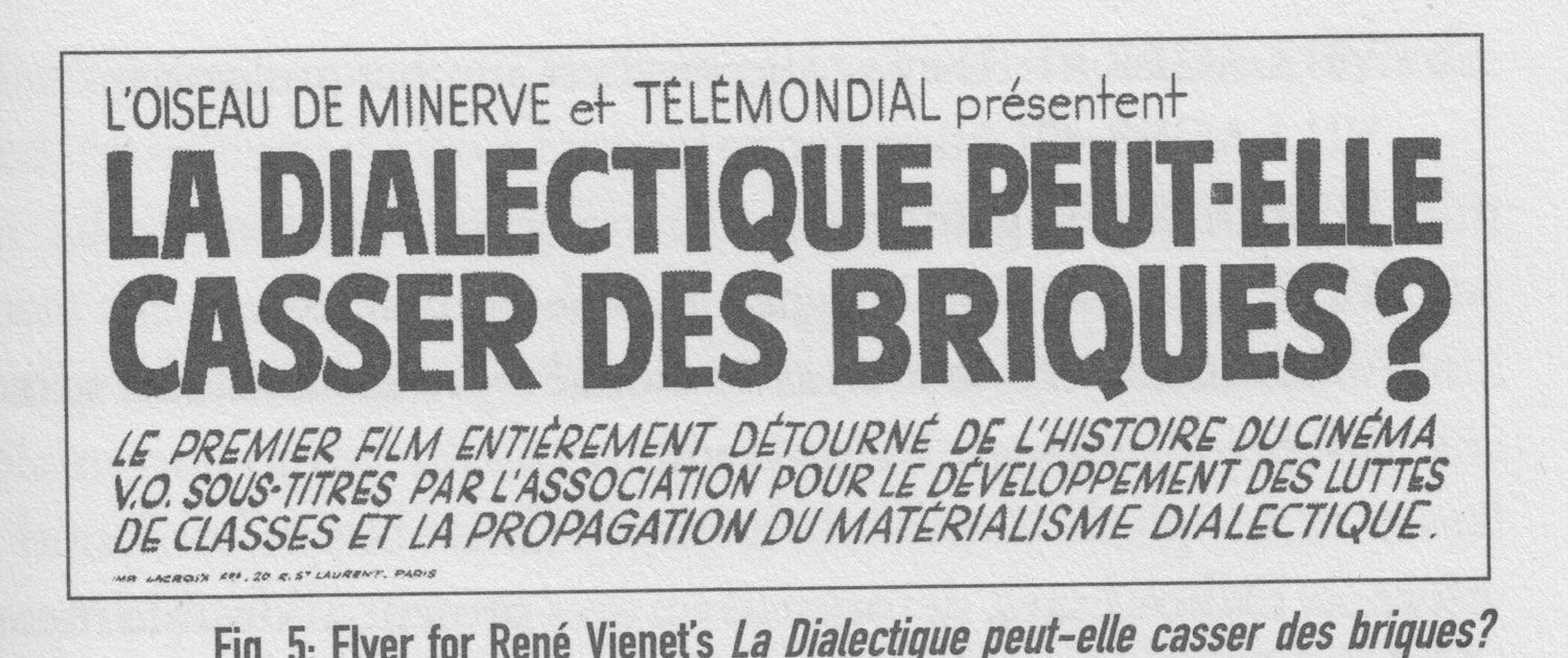
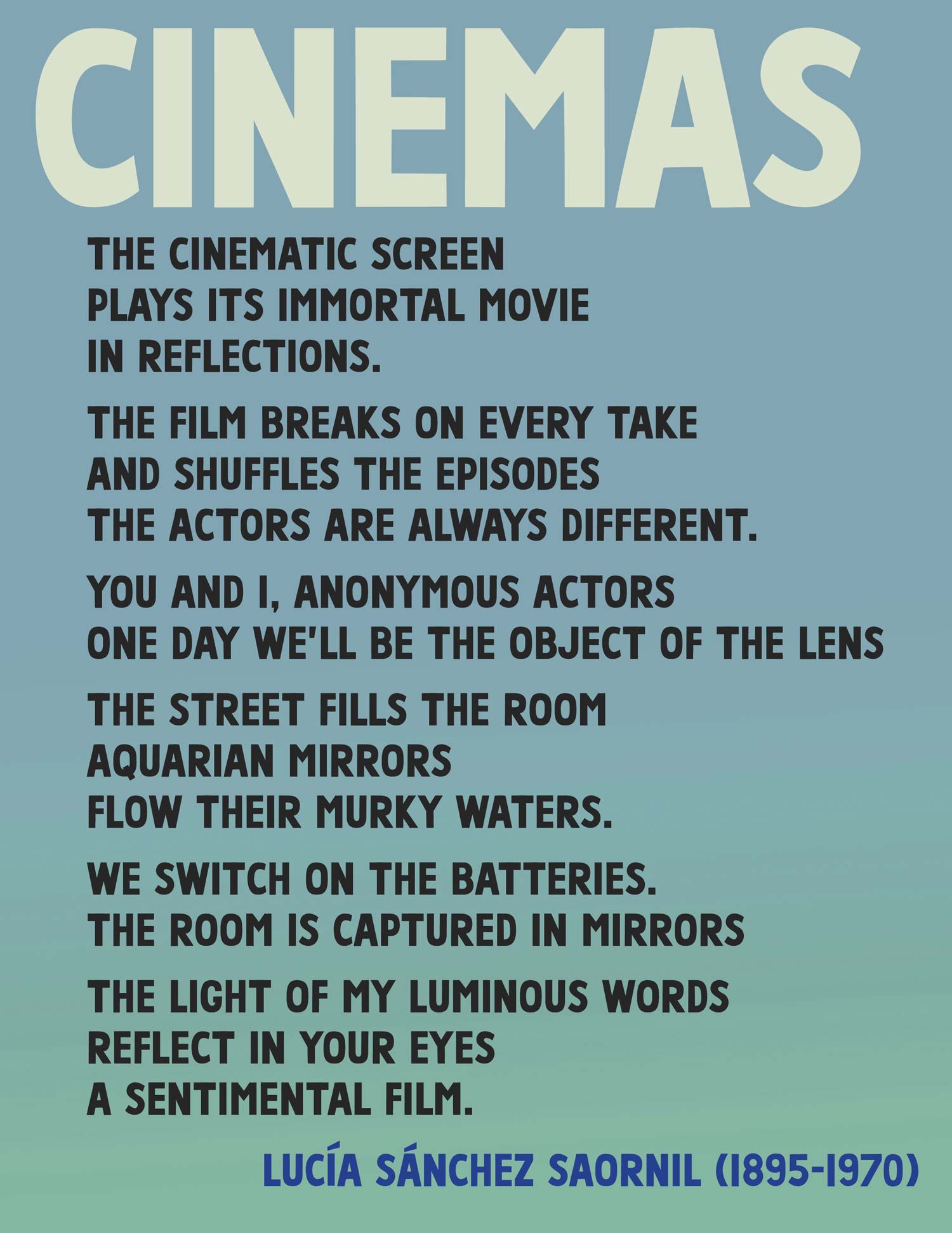
The second font (Brix) was adapted from a small advertisement for La Dialectique Peut-Elle Casser Des Briques? (Can Dialectics Break Bricks?)–a French film from 1973 that overdubbed situationist texts and dialogue on an anti-colonialist martial arts film (Crush, 1972, Hong Kong). There was nothing of note about this basic hand-drawn type sample, but it was lovely in its own right–bold and simple to read.
The attached zip file contains two OpenType fonts: Acción Modular & Brix.
All fonts are licensed under a Creative Commons Attribution-ShareAlike 4.0 International license (CC BY-SA). This Creative Commons license means that these fonts can be used, shared, and adapted; attributed when appropriate; and any adaptations must fall under the same license. This license enables reusers to distribute, remix, adapt, and build upon the material in any medium or format. If you remix, adapt, or build upon the material, you must license the modified material under identical terms.
These fonts can be used for activist projects of all sorts. These fonts can be used for liberatory social and cultural productions. These fonts are not for sale and must be shared freely.
These fonts are part of the Justseeds Open Type Project.
Justseeds Opens Type Project fonts are free! If you use fonts from the Justseeds Open Type Project and would like to donate, any donated money will go to the Justseeds general project fund. These donations help us fund art donations to political groups that are used for benefits and fundraisers, as well as special projects & site specific actions by Justseeds members and allied organizations. Any amount is appreciated. PayPal link here.
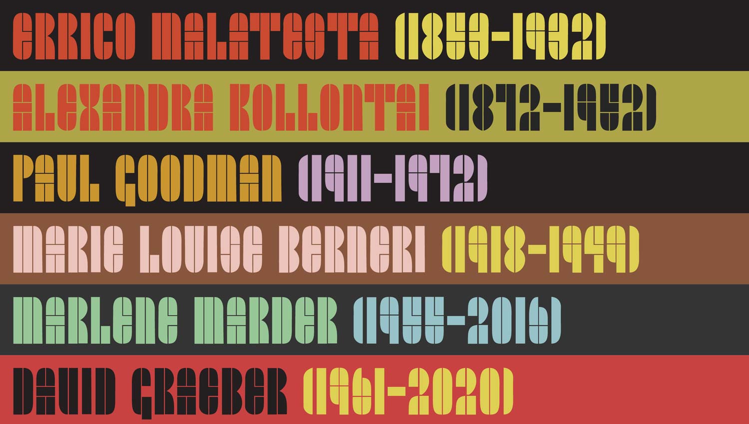
*It is worth noting that this typeface bears a strong resemblance to a lowercase modular typeface designed by English typographer Edward Wright in 1965. Wright was a noted type designer, known for his innovative and experimental work on creating letterforms for buildings and institutions from the 1960s up to his death in 1988. Wright was of Chilean/English descent and lived between Chile and Equador from 1937-1942, where he worked as an architect. It is possible that he worked with the Hombre de America editorial group in designing the masthead, and also possible that he was influenced by the same masthead and later incorporated its design into his own work. I couldn’t find any information that supported either theory–though the connection looks fairly undeniable. If you can help clarify please let us know.