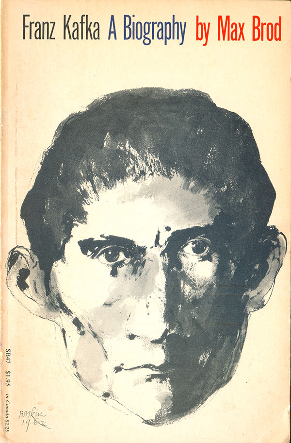
The second half of Leonard Baskin’s book cover output I’ve found is composed of facial portraits. The portrait of Kafka to the right is exceptional. The picture feels like it is a biography in and of itself, with the tight face, cropped hair, sense that the face is simultaneously both inward and outward looking. The direct stare and filling of the entire visual plain are commanding. The tight, tall Gothic titling at the top conveys what the reader needs to know, but doesn’t get in the way of the image at all.
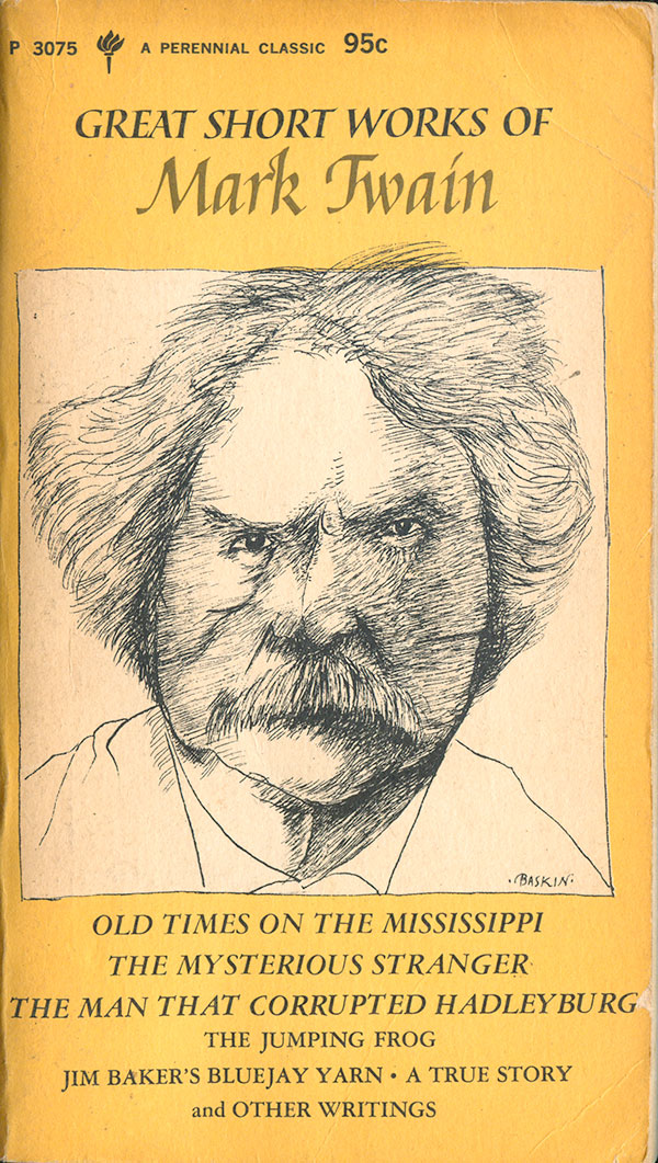
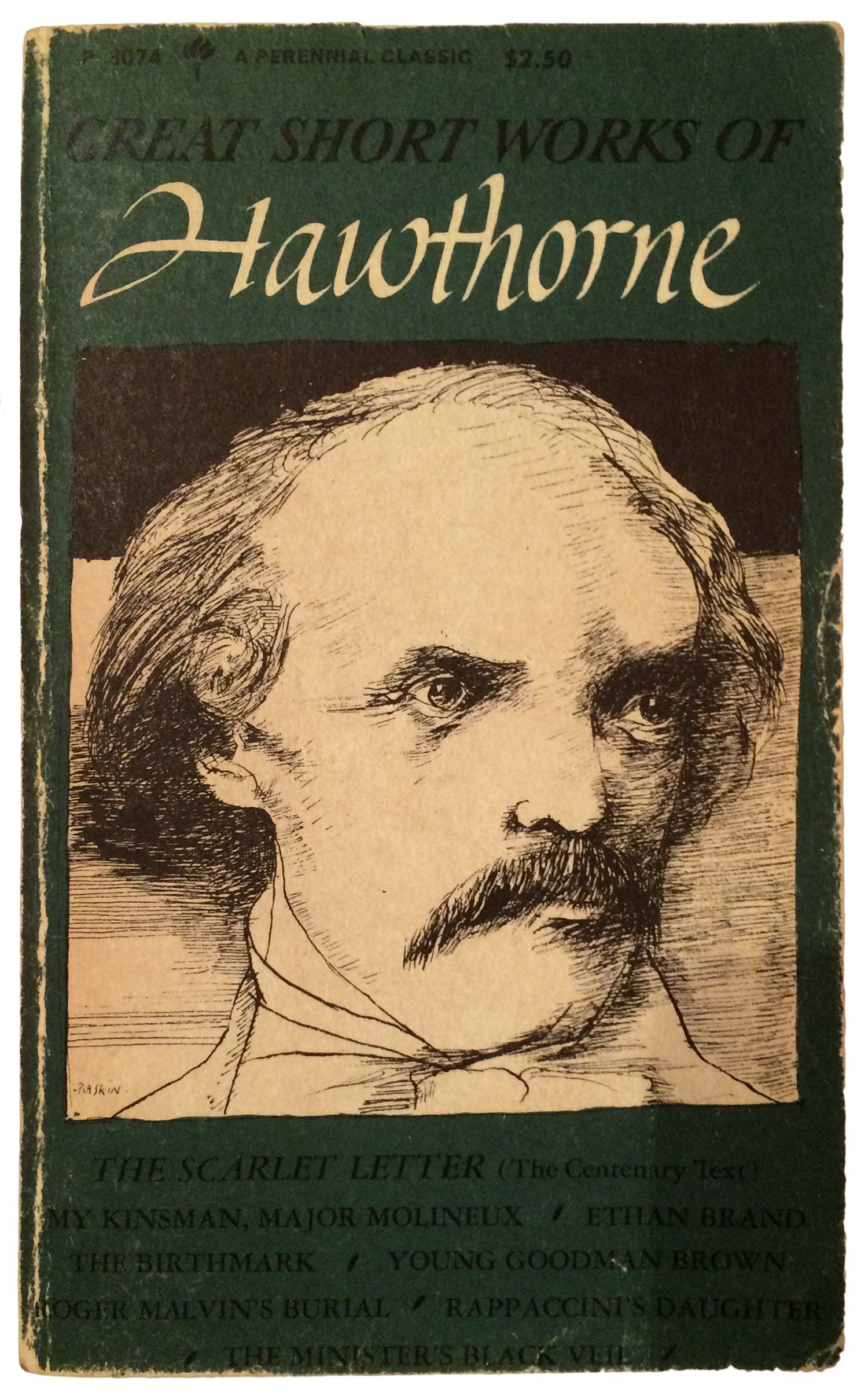
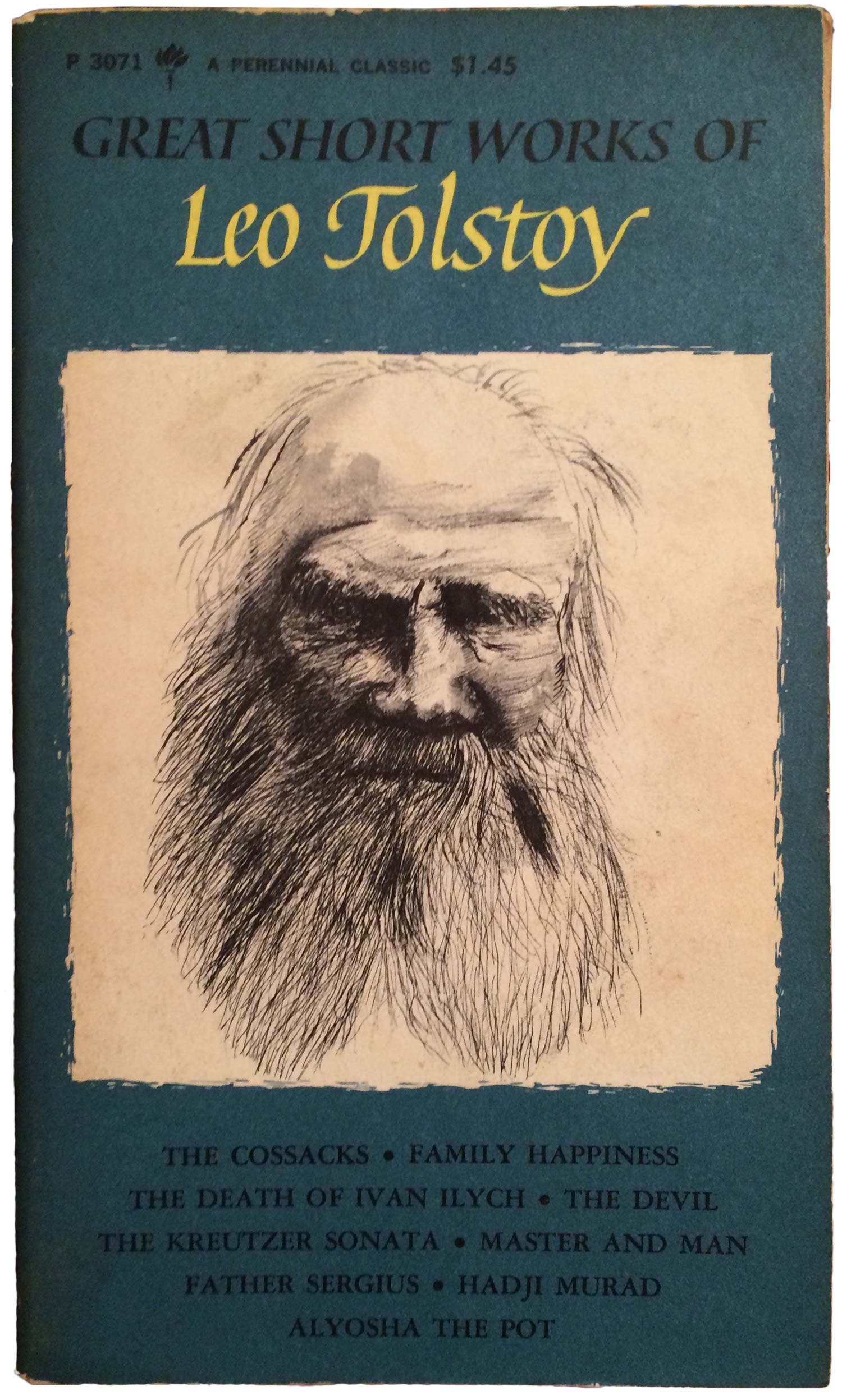
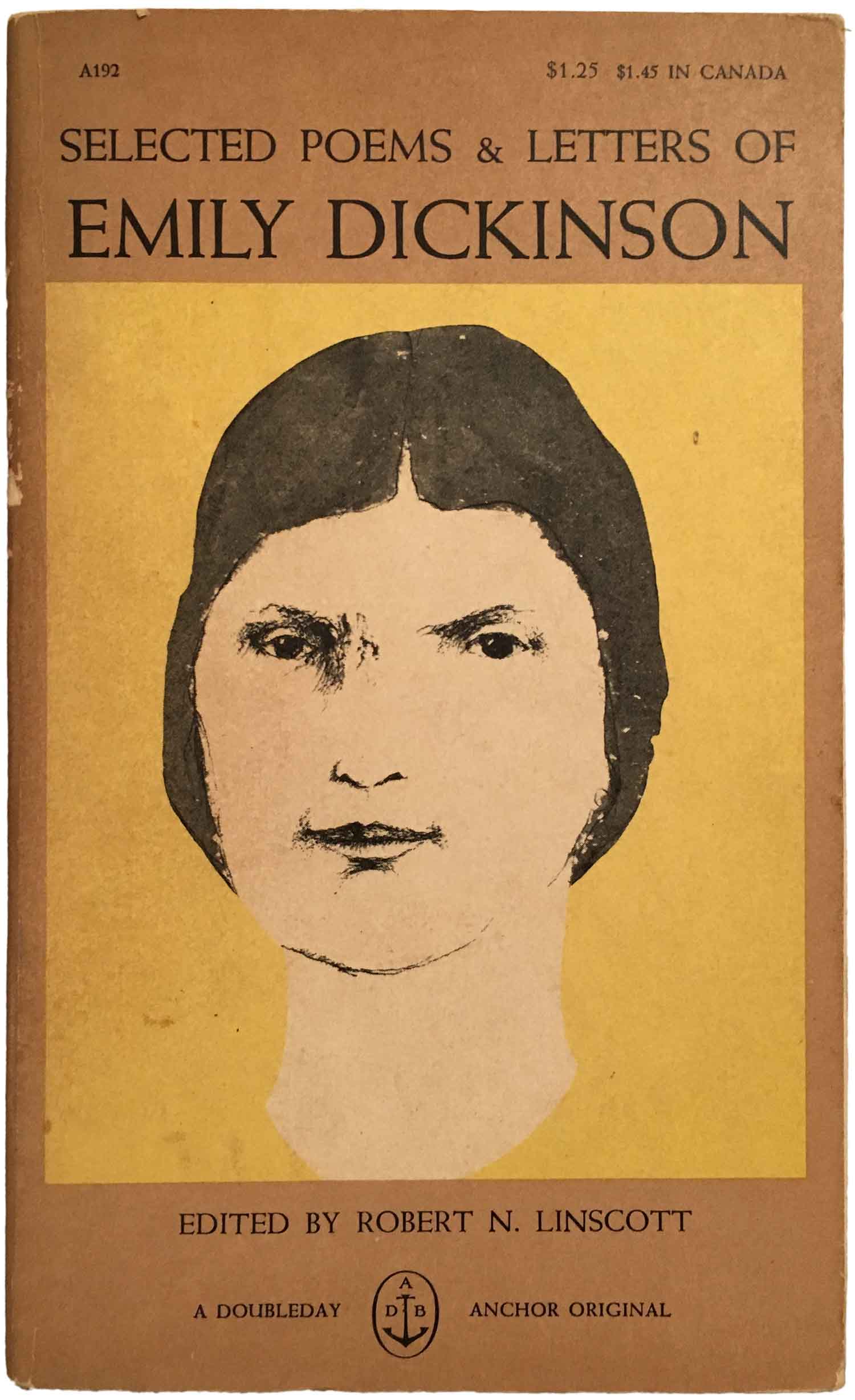
I’ve found seven additional Baskin cover portraits, all part of the Perennial Classics’ Great Short Works series. They were published between 1966 and 1970 and feature portraits of some of the biggest names in English language literature. The portraits are square and framed within bold color fields, giving the series a singular look. It works as a series conceit, but compared to the Kafka cover above they really fail, as the Baskin image has to play second fiddle to design apparatus. The portraits themselves are of varying quality, ranging from mostly line work (Mark Twain), to largely ink wash (Jack London). The Twain and Stephen Crane images have an almost comic quality, and feel like the kind of caricatures published in the New York Review of Books. The Joseph Conrad and London images are more somber or melancholy. One of the strongest portraits—and the only woman I’ve found—is not actually part of the Perennial series, but an old Doubleday Anchor, Selected Poems and Letters of Emily Dickinson.
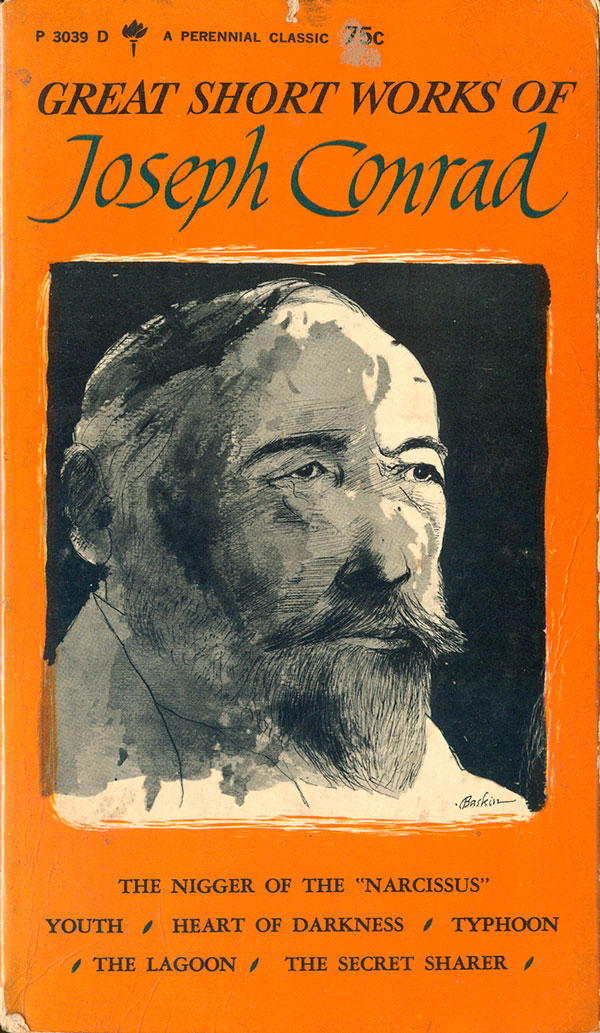

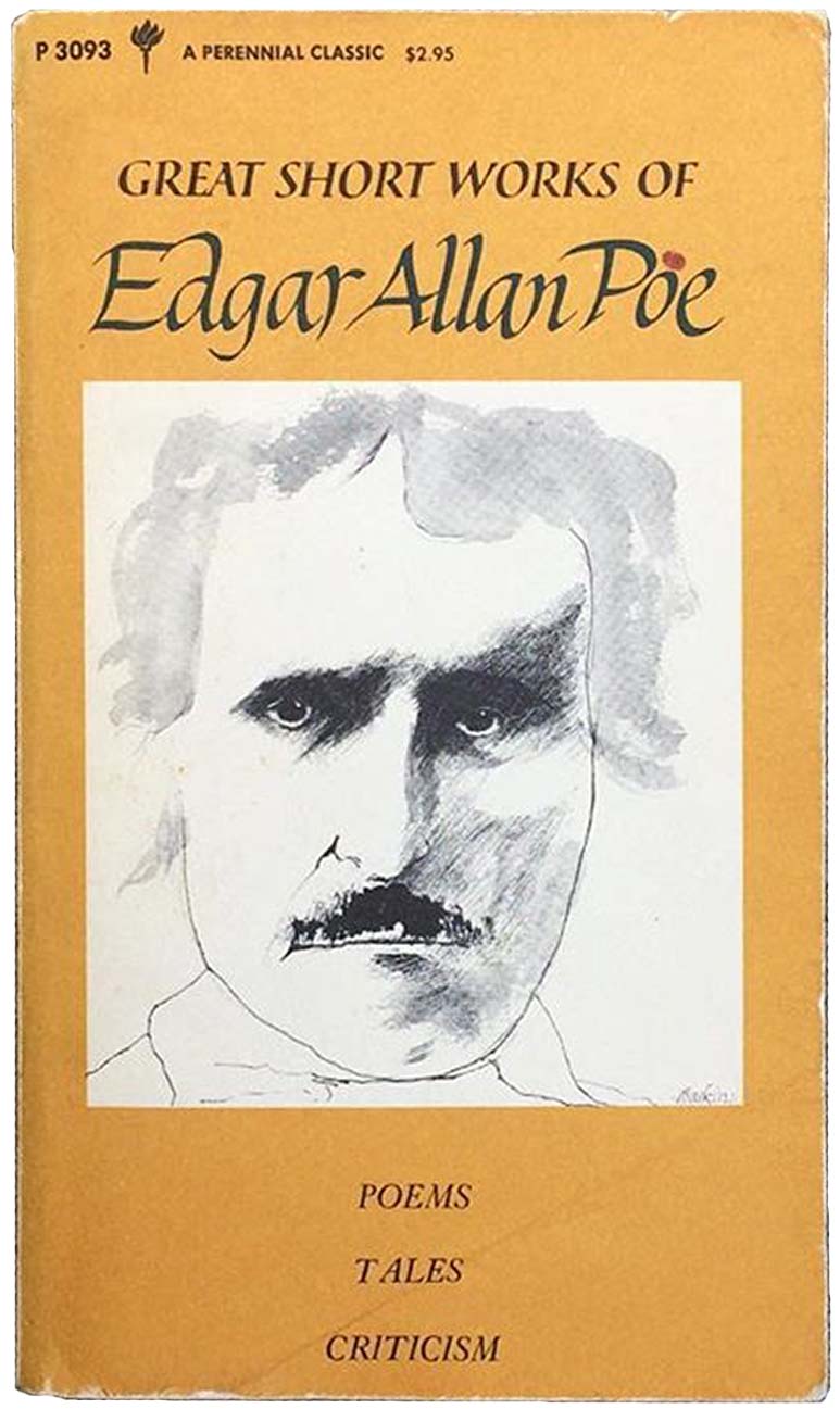
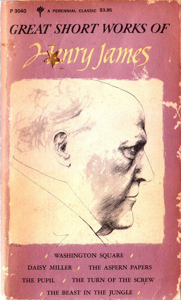
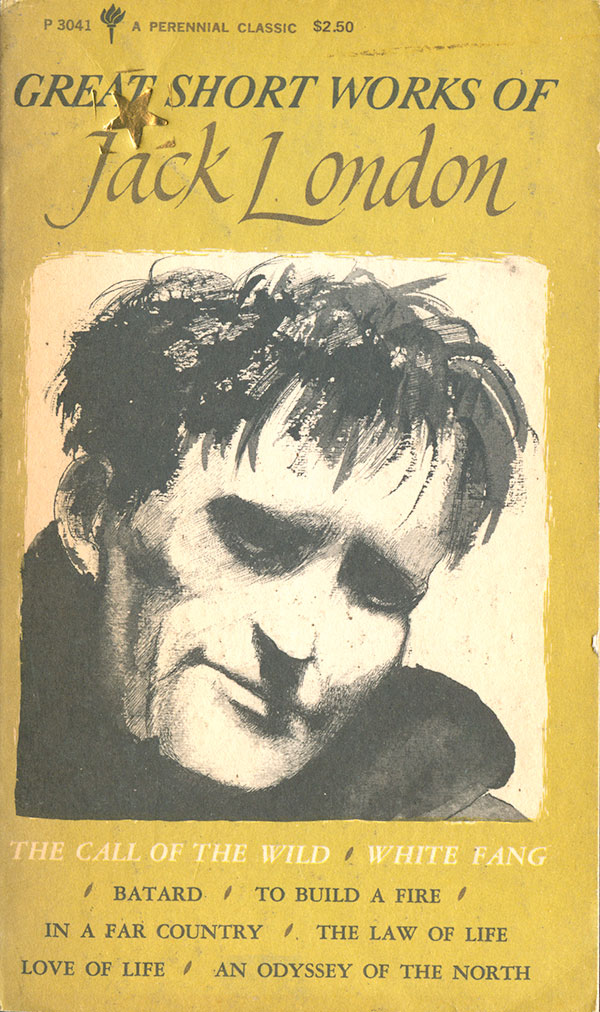
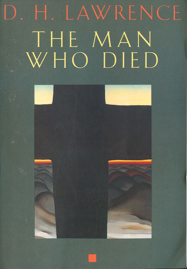
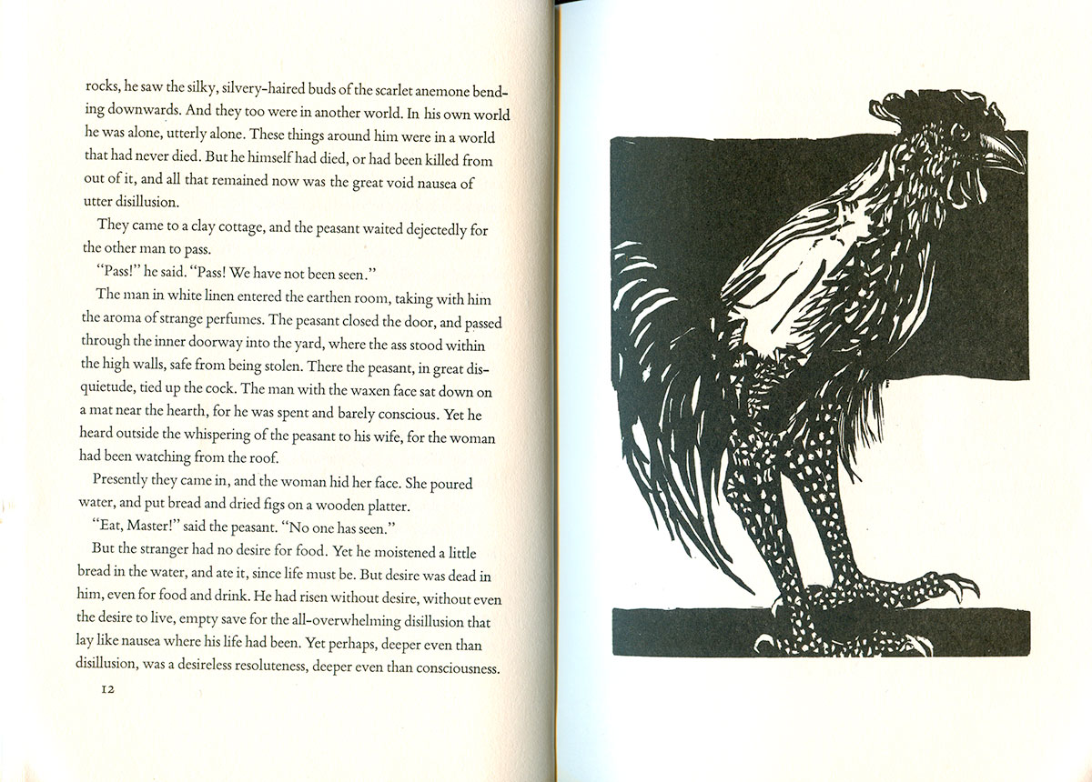
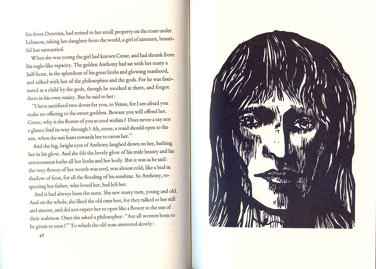
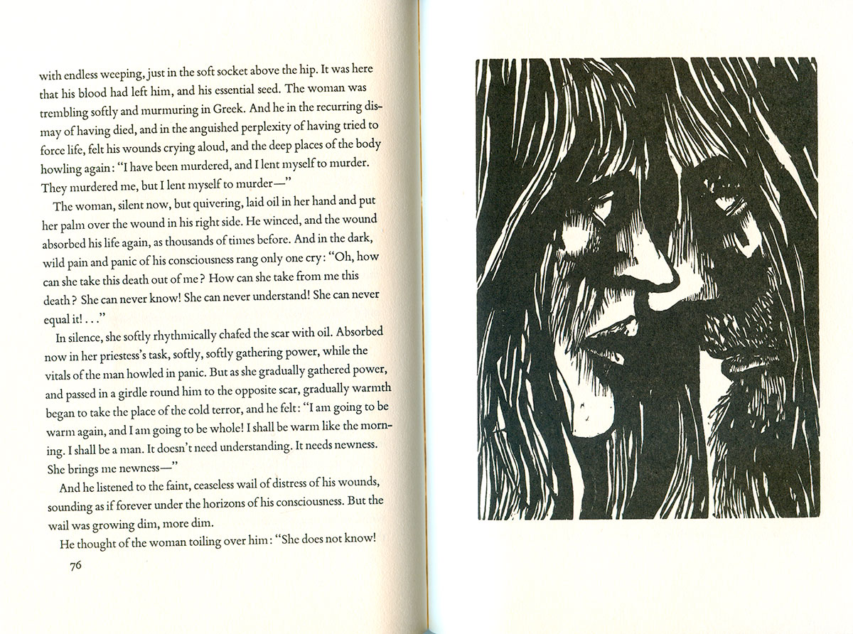
Finally, Baskin did a lot of book arts and internal illustration work. Most of his artist books are quite rare, and even those published in larger editions on major publishers can be quite expensive. That work felt a little far afield from the commercial cover images, so I’m not going to focus on it. But I did find this copy of D.H. Lawrence’s The Man Who Died for $1, which contains a nice set of Baskin prints as illustrations. The cover is actually designed around a Georgia O’Keefe painting. While I really like the painting, the design it’s embedded in does little for me. I could imagine blowing up the image to bleed, and setting the title and author in small type in the top of the right wing of the cross. But they didn’t ask me, and I suppose there is something irreverent and unacceptable about tinkering with an O’Keefe painting.



Great piece of culture. Thank you.