Part two on Polish poster artist and designer Roman Cieslewicz. Before leaving for Paris, Cieslewicz was the art director for the Polish cultural magazine Ty i Ja (You and I). He did most (maybe all?) of the covers between 1960 and 1963, then sporadic covers after that into the 1970s. His covers on the early issues are almost all straight photo-montages with humor or a sense of the unreal created by a playful use of size and relation between elements. In the later issues he brings in a lot more illustrative elements, and flat uses of color, making them look for poster-like.
Starting from older (July 62 on the left below), to newer (you’ll notice the masthead changes in 1967, the issue in the top right above is from June 67):
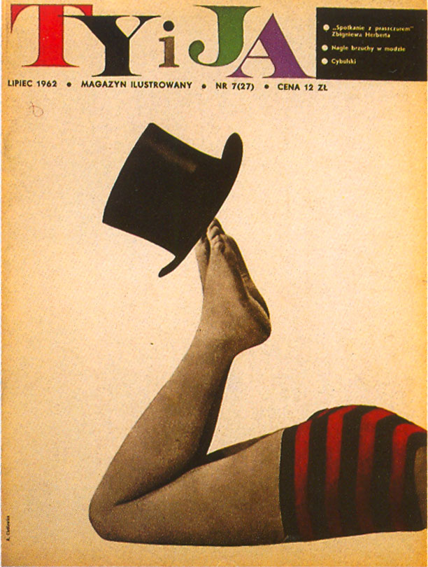
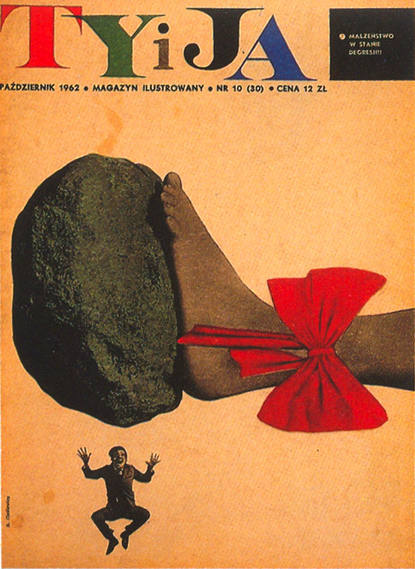
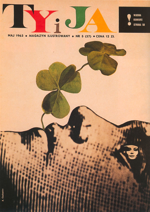
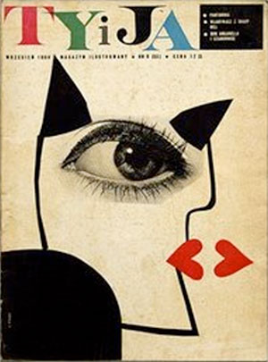
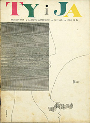
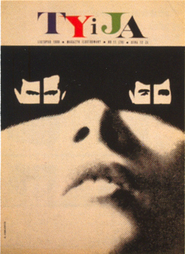
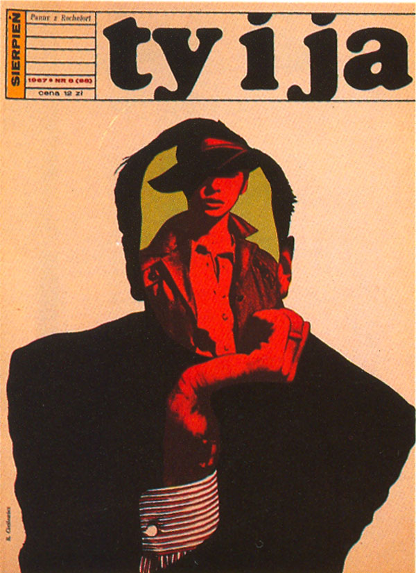
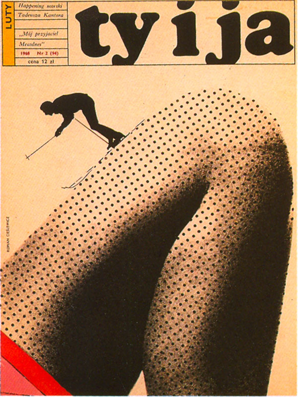
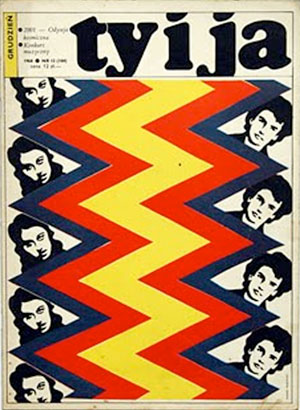
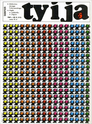
I’m unsure if these last two are actual Cieslewicz covers, but they are certainly effective:
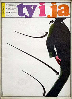
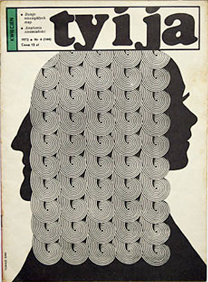
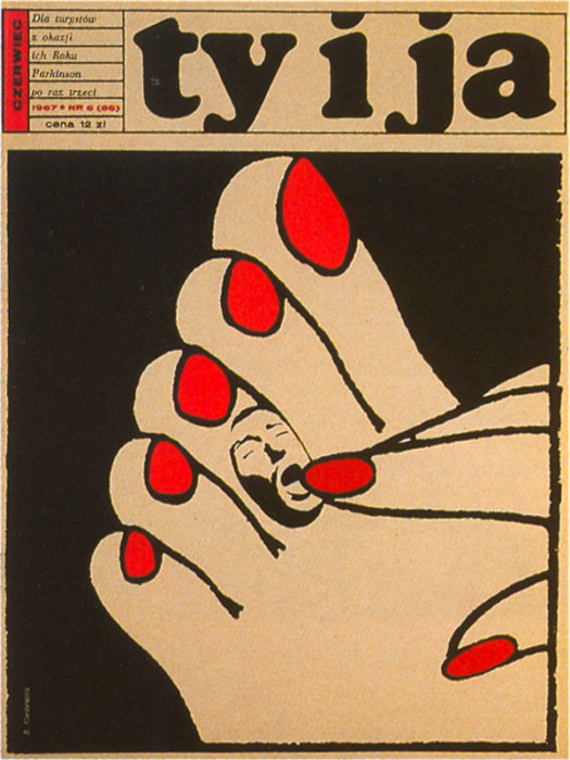

These covers are really powerful
What kind of materials were included in the issues of these magazines?