So I’ve got all these Cienfuegos Press and B. Traven covers to follow-up on last year’s posts, but I haven’t had the time to pull them all together. Instead, for this week, I’m going to take a quick look at some covers for books by Victor Serge. The inspiration for this is the covers created by the UK publishers Writers and Readers in the 1970s (yup, the same Writers and Readers that went on to do all the “For Beginners” books!).
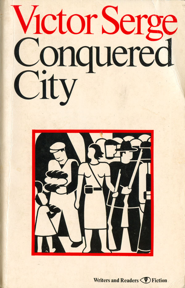
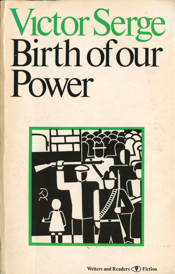
In 1977/78 Writers and Readers published the three volumes of Serge’s “Victory-in-Defeat, Defeat-in-Victory” cycle of novels about the Russian Revolution. Men in Prison is the first volume, then Birth of our Power, and finally Conquered City. The covers of these three books are simple, and maybe because of that I find them really attractive.
The design of all three books is basically identical. The focus of each is a detail of a print by the German artist and communist Gerd Arntz (who is attributed in the book, but the book’s designer is not). Arntz’ work is itself simple and captivating, and the designer lets it visually control the covers. The woodblock prints the cover images are taken from were created and printed in the early 1930s, at the same time Serge’s novels were originally published, and both the images and novels speak to a deep belief in worker’s self-organization, but a dismay at how that was betrayed in the Soviet Union. A simple colored box highlights each black and white image. The text is a classic looking serif, which I wouldn’t expect to go well with Arntz clean and mechanical illustrations, but left justifying it and enlarging it so it dominates the top half of the page makes each letter a graphic element itself. The kerning is very tight, making the words burst off the cover, and little details like dropping the dot on the “i” in Victor go a long way. Very clean and powerful as covers.

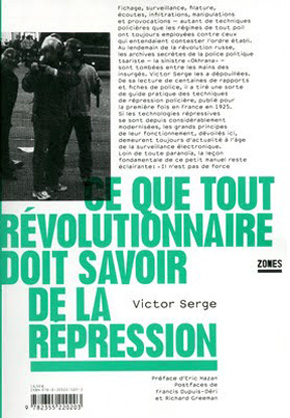
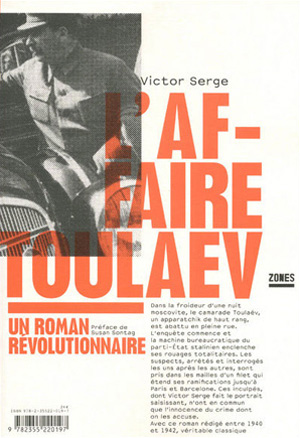
I don’t want to cheat everyone, so I’ve dug up some other cool Serge covers, some older, some new. The New York Review of Books Press has recently republished most of Serge’s novels, which is exciting to see, but unfortunately the covers aren’t that excited. They work, and are in the format of ALL the NYRB titles, and maybe that is what is a bit disappointing, that don’t really stick out. Also recently, the French publisher Editions Zones has put out new editions of What Every Revolutionary Must Know about Repression and The Case of Comrade Tulayev. The covers of both of these are wonderfully designed. Large, brightly colored sans serif type boldy sets the titles and becomes the central graphic element of the covers, creating a frame for a paragraph of text that introduces the book. Each cover also contains a photograph, but the title is printed over it, forcing an interaction between the two elements. The photo on Repression smartly brings the 85 year old book up to the present, connecting the text to current protest movements.
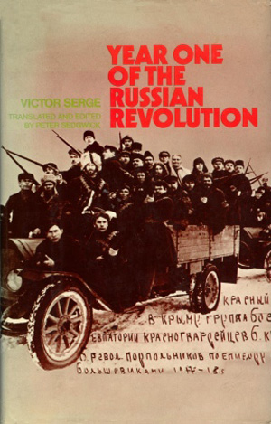
Here are a couple 1970s British editions that are pretty decent. The 1975 Oxford edition of Memoirs of a Revolutionary lets a poster image from the Soviet artist Dmitri Moor do the heavy lifting, but that’s not such a bad thing. The 1972 Penguin/Allen Lane edition of Year One of the Russian Revolution is in some ways more interesting, but also less successful. The archival image of the Russian revolutionaries piled into an car is both impressive and humorous, but their is something about the type treatment and tanned cover stock that feel contrived. I wonder how it would have looked with a more white cover (as it looks like the car is stuck in snow…).

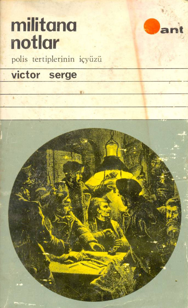
And finally here are a couple others I found, both interesting in their own way. The 1972 Spanish edition of Year One of the Russian Revolution feels ambiguous. A soldier is frisking another person, but it is unclear if this is a representation of repression or “revolutionary security.” Is the second figure just a worker, or a counter-revolutionary? Next to it is a 60s or 70s Turkish edition of Militant Notes: Making Sense of Police Terror, which I’m thinking is a version of What Every Revolutionary Must Know about Repression. The graphic is an old engraving of a secret meeting, fear and conspiracy in the eyes of the organizers. The circle it is placed in echoes the circle of the publishers logo in the top right, I wonder if all the books they published at this time had this general format? The cover follows a basic grid system, like the early Penguins, with a system of blocks, horizontal lines, and sans serif type for titles and a smaller serifed type for subtitles. I like it, although it feels a bit academic. The five horizontal lines are reminiscent of a notebook, a feeling I just can’t shake when looking at the cover.




Tere’s another one I have. Done Stanislaw Zagorski, polish poster artist, and later (after he emigrated) designer of VU’s “loaded”, I tried to post it but maybe no images allowed in the comments section…